Winners announced for this year's A' Design Awards, the world's largest design competition
The winners have been announced for the A' Design Awards, the world’s largest and most diffuse design competition, reaching over 200 countries each year.
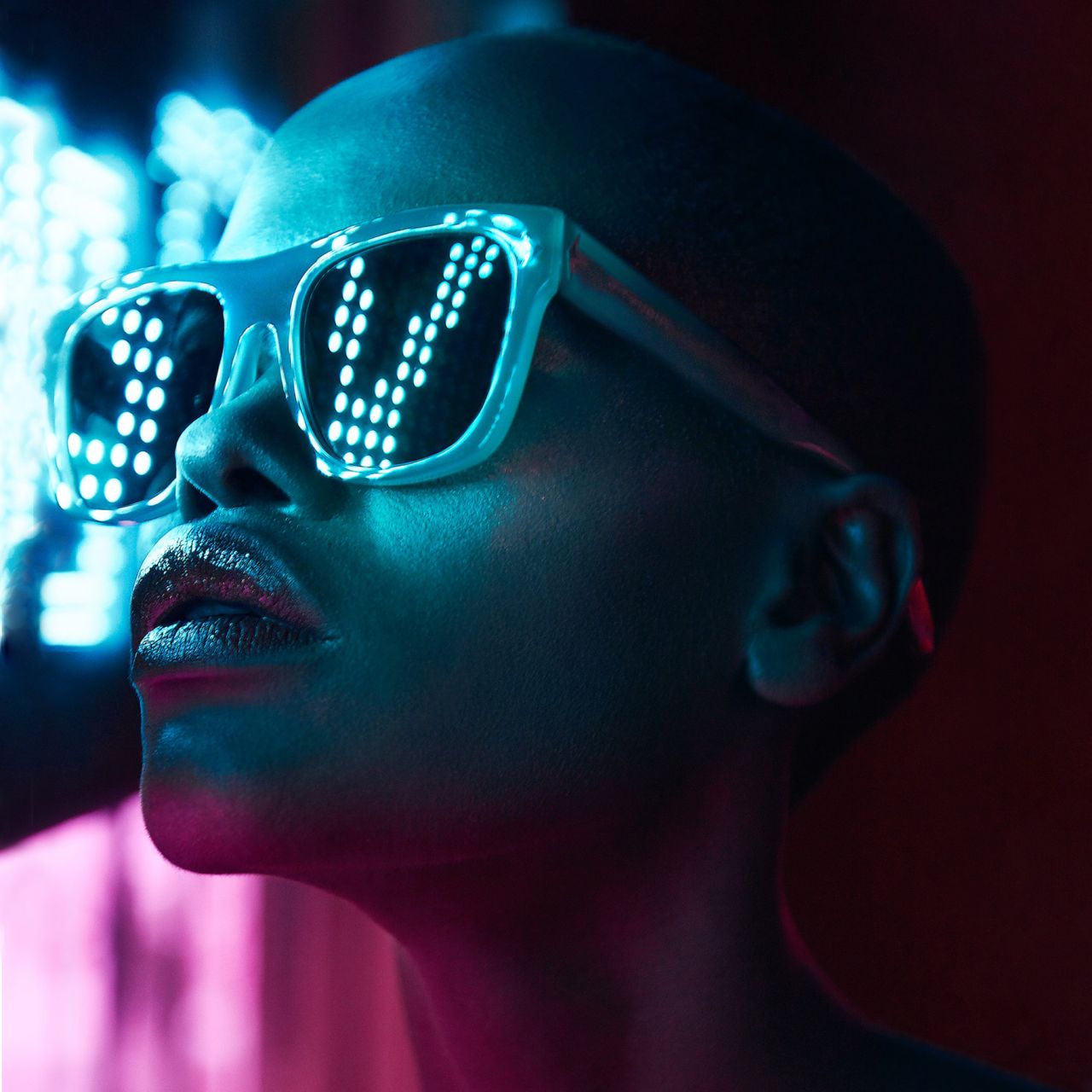
Eye Candy by Mathew Guido, Platinum A' Design Award Winner
All entries were evaluated by an expert jury, including scholars, members of the press and well-known design professionals. The panel narrowed it down to 2,437 winners from 106 countries in nearly a hundred different creative disciplines.
Here, we'll share some of the highlights, focusing on the visual arts and communications categories such as graphic design, animation, art and photography. Are you going to get involved for 2019? Keep reading to find out how to register and be in with a chance.
Pepsi Generations Beverage Packaging by PepsiCo Design & Innovation
Pepsi’s long-term brand strategy is one of continual evolution, setting the trend to be relevant for each generation of fans. In 2018, Pepsi celebrated its legacy with the global Generations campaign. As a hitmaker in pop culture and music, the brand set out to create designs that celebrated specific generations and the unique contributions made to pop culture and our collective memory. It's certainly a winner.
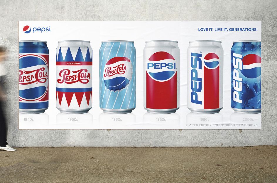
Pepsi Generations by PepsiCo, Platinum A' Design Award Winner
Eighteen Art Installation by Ketan Jawdekar
Elle Decor India approached Ketan Jawdekar to design an art installation to celebrate its 18th anniversary in India. "This interactive installation conveys the significance of being eighteen years old and relates it to a common man. Three-dimensional mirror alphabets in the spelling of eighteen were composed to form a cube that gives multiple dimensions and insights to the viewer."
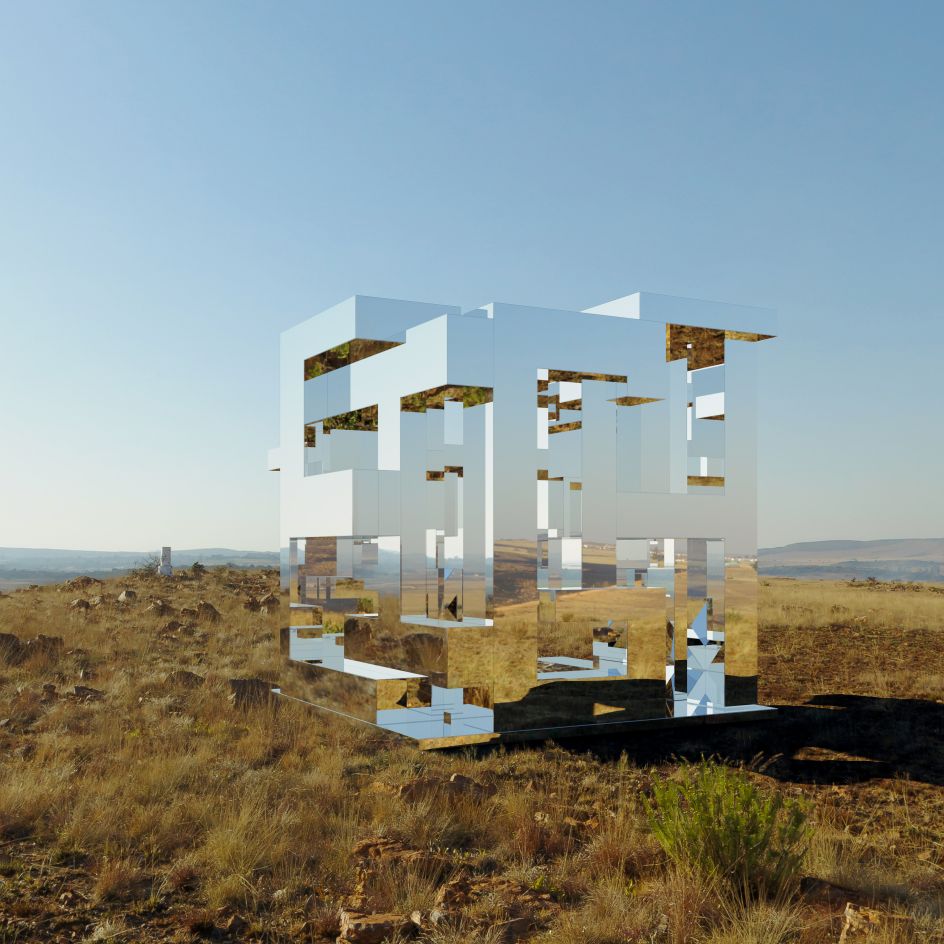
Eighteen by Ketan Jawdekar, Platinum A' Design Award Winner
Trivago Commercial Animation by Paulina Grondal
For Trivago, Paulina Grondal created an animated spot to highlight the launch of the summer holiday season in Spain. "Different styles of architecture complement each region of Spain," said Paulina. "The spot then changed at street level – on a colourful street in Tenerife with peach and pink buildings. It was important for us that the final piece appeals uniquely to the audience."

Trivago Commercial Animation by Paulina Grondal, Platinum A' Design Award Winner
Eye Candy Creative Photography by Mathew Guido
Scooping a Platinum A' Design Award for his Eye Candy photography series, Matthew Guido's inspiration came from anime and fantasy. "I really wanted to push the limits of light and colour in this series but in a way that felt real and not over-produced," he explained.
Instead of shooting in a controlled studio environment with professional lights, he decided to shoot his model wearing sunglasses in dark environments, lit only by the neon and street lights. The emphasis of the series is on the different sunglasses worn by the model in every image, bathed in vibrant neon lights from signboards on the streets at night.

Eye Candy by Mathew Guido, Platinum A' Design Award Winner
Love and Blind Brand Identity by Sparkly Identity
This brand identity for Love and Blind takes the ubiquitous Snellen eye test chart as its inspiration. The 'ㄇ' symbols in the chart stand for the sheltered workshops while the 'i' letters represent their visually impaired employees. The symbols orientation toward different directions point to the many avenues in life that lie open to the visually impaired. Lovely work.
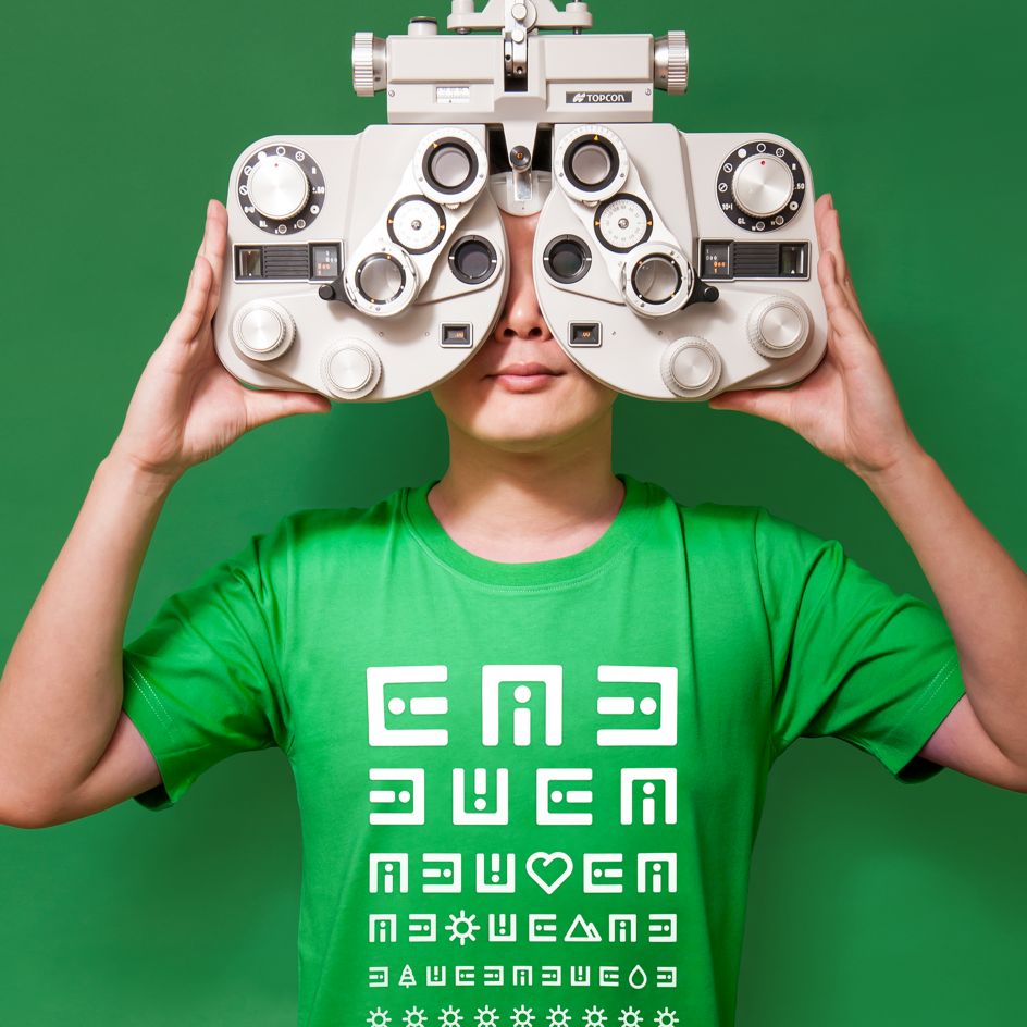
Love and Blind Brand Identity by Sparkly Identity Design Team, Platinum A' Design Award Winner
Project EGG Small Pavilion by Michiel van der Kley
Another Platinum A' Award winner, Michiel van der Kley's Project EGG is a 3D printed pavilion that scored big points with the judges. The project was first exhibited in Eindhoven during Design Week in 2014. Since then it has been shown all over the world.
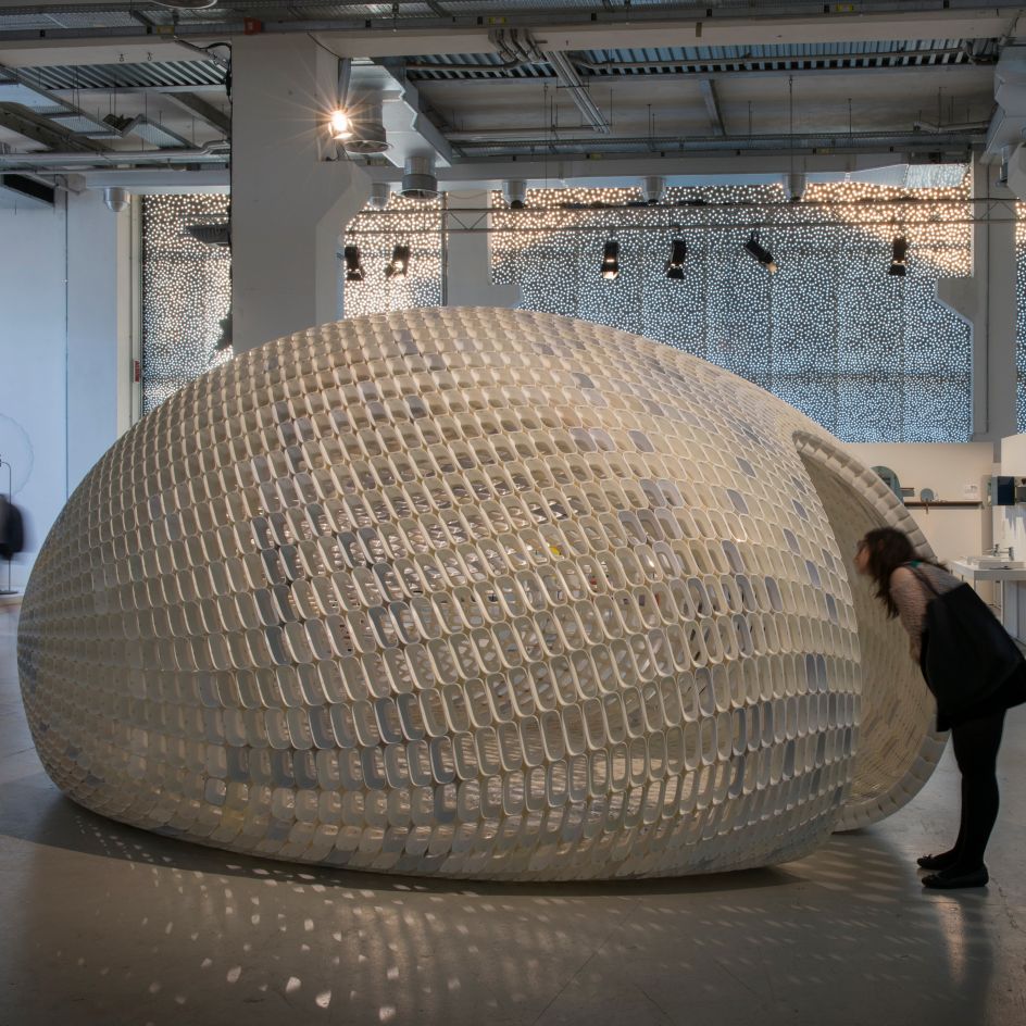
Project EGG Small Pavilion by Michiel van der Kley, Platinum A' Design Award Winner
Kaishan Chinese Spirit 18 Neo-Chinese Spirit Package by Jansword Zhu
The award-winning packaging for Kaishan Chinese Spirit 18 was inspired by ancient Chinese art while the bottle is cut to look like the surface of a mountain. It's a clever packaging design by Jansword Zhu that led to great success on the product launch.
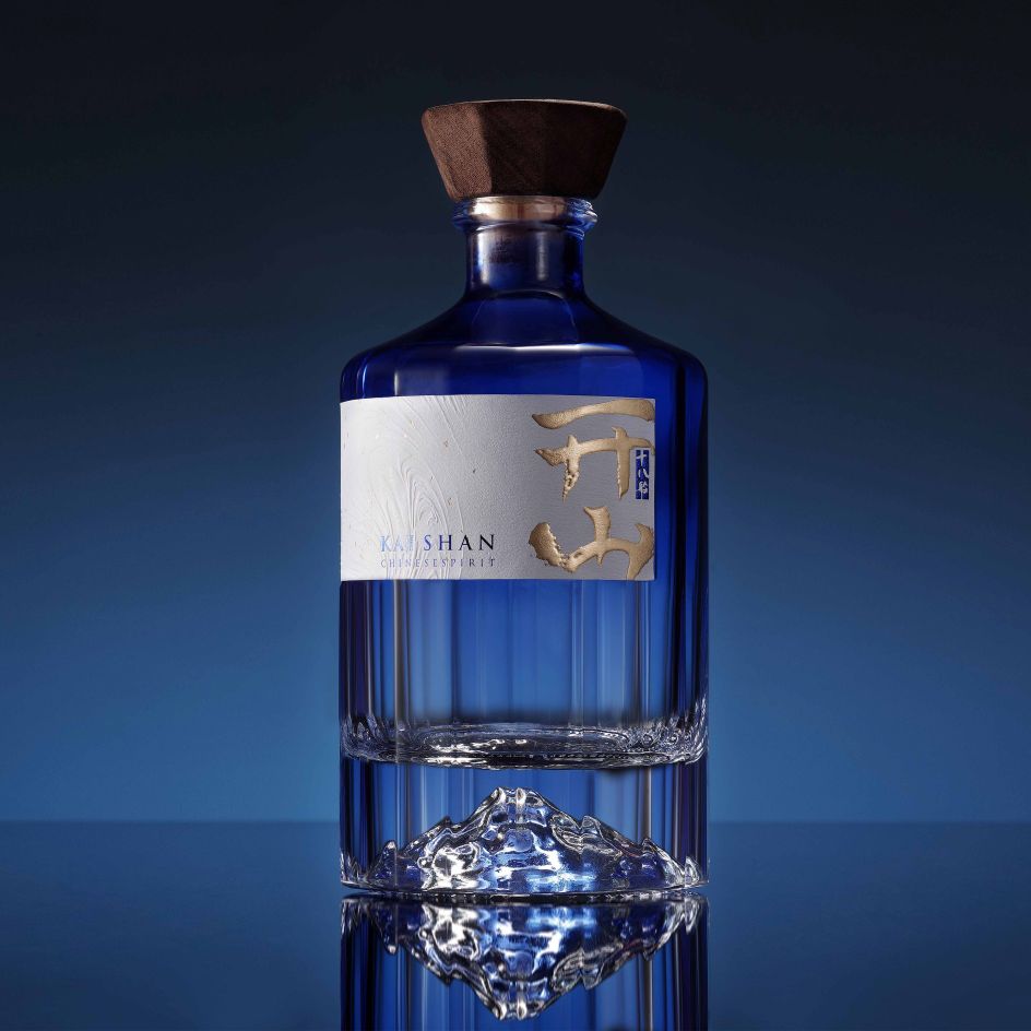
Kaishan Chinese Spirit 18 Neo-Chinese Spirit Package by Jansword Zhu, Platinum A' Design Award Winner
Pretty Little Things by Beck Storer
Pretty Little Things by Beck Storer is a glow in the dark installation for the University of Melbourne that celebrates and explores the beauty of micro-organisms, re-interpreting microscopic images contributed by students, staff and researchers, into modern abstract patterns through the blasts of a vibrant fluorescent colour palette.
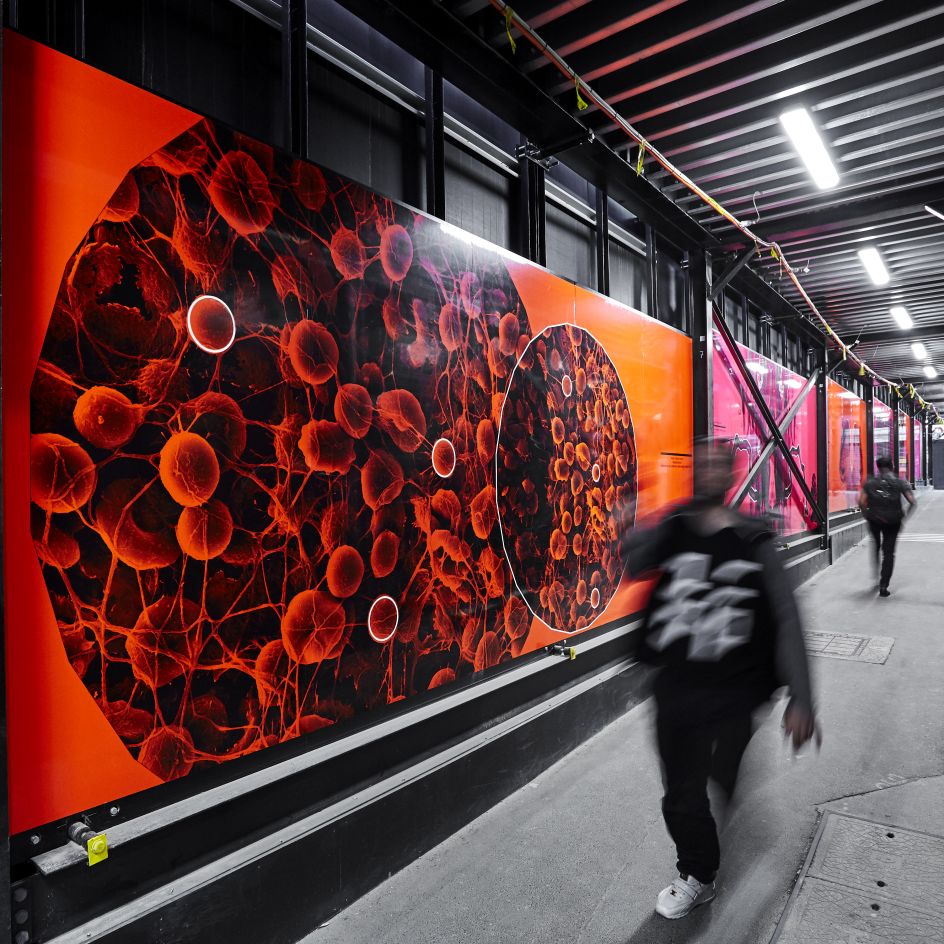
Pretty Little Things by Beck Storer, Golden A' Design Award Winner
Foorigin Raising Awareness by Lam Cheuk Yin
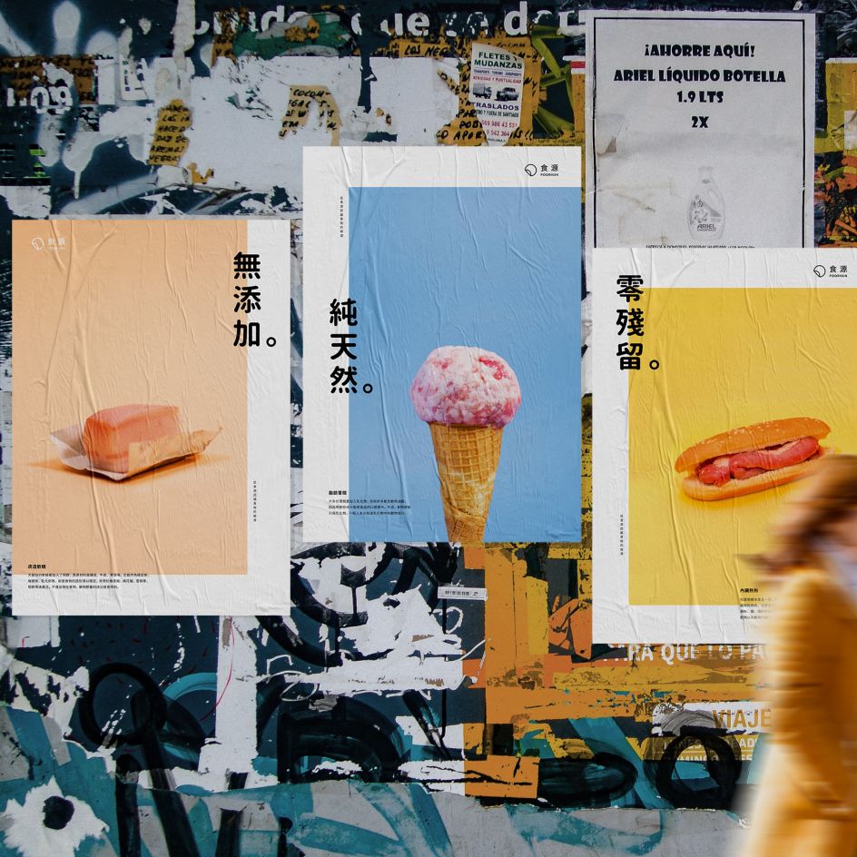
Foorigin Raising Awareness by Lam Cheuk Yin, Silver A' Design Award Winner
Under the Graphics and Visual Communication Design category, Lam Cheuk Yin won a Silver A' Design Award for Foorigin – a project to raise awareness of where food comes from. "Foorigin is not only about raising people's awareness but also challenging people's perception of food by reconstructing the existing food with its original ingredients."
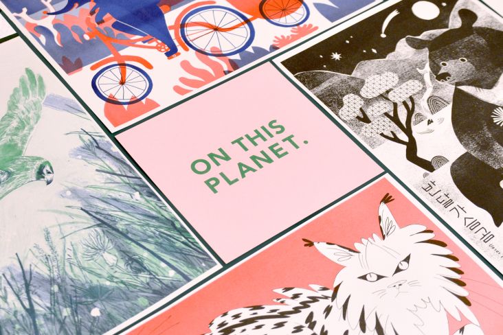
WKS Group Environmental Statement by CRENEO
For WKS Group's annual environmental statement, CRENEO created a vibrant and tactile report full of vibrant colours, helpful illustrations and clear typography. It's a well thought out piece of design by the German agency.
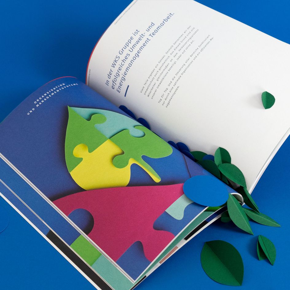
WKS Group Environmental Statement by CRENEO, Platinum A' Design Award Winner
If you want to see more of the winning work, visit designmag.org. To find out more about how to enter next year's A' Design Awards, visit competition.adesignaward.com.


 by Tüpokompanii](https://www.creativeboom.com/upload/articles/58/58684538770fb5b428dc1882f7a732f153500153_732.jpg)


 using <a href="https://www.ohnotype.co/fonts/obviously" target="_blank">Obviously</a> by Oh No Type Co., Art Director, Brand & Creative—Spotify](https://www.creativeboom.com/upload/articles/6e/6ed31eddc26fa563f213fc76d6993dab9231ffe4_732.jpg)


