Independent type foundries set to be popular with designers in 2025
Expand your typographical horizons with our curated list of the most popular independent foundries today, as chosen by the Creative Boom community.

Onsra by Type of Feeling
When it comes to shaping the visual language of brands and narratives, typography is absolutely crucial. And while the best-known fonts and the major foundries have a lot to offer, it's often a good idea to shake things up by looking further afield.
If you're looking for experimental, unique and expressive ideas for type, independent foundries are a great place to start. So we asked the Creative Boom community to share their favourites, and in this article, we've brought them all together in one handy list.
Each foundry on this list not only offers an impressive collection of typefaces but also embodies the spirit of innovation and craftsmanship that constantly drives type design forward. From bold, experimental styles to classic serif revivals, these innovative studios are redefining the landscape of type design.
1. Type of Feeling
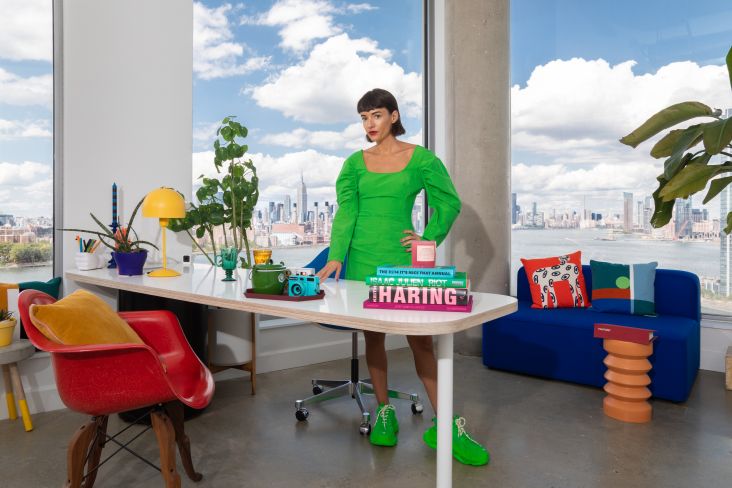
The newest foundry on this list, Type of Feeling was launched this summer by Jessica Walsh, CEO of the New York creative agency &Walsh, who was inspired by her own experiences of searching for typefaces for creative projects. Type of Feeling provides both a curated collection and custom typography services and emphasises the importance of unique typography in storytelling and brand identity. Seven carefully crafted typefaces are available, with more in development. For more details, read our news story on the launch.
Our font of choice: Jubel
Each typeface at Type of Feeling is designed to embody a unique emotional experience, illustrated through various visual mockups that help designers envision their application. Jubel (which means 'jubilation' in German) is a great example. Designed as an expression of joy and celebration, the thick strokes and lively curves exude excitement, and the 'e' almost smiles at you, reflecting a jubilant mood and celebrative feeling.

Jubel by Type of Feeling
2. Grilli Type
Grilli Type is a Swiss type foundry established in 2009 by Noël Leu and Thierry Blancpain. Viewing themselves as graphic designers who run a type foundry, they create lovely minisites for each typeface, which showcase the fonts in context and allow them to tell their own stories. They work closely with other designers, and this collaborative spirit extends to their services, which extend beyond retail typefaces to custom type.
Our font of choice: GT Super
GT Super is a typeface inspired by display serif typefaces from the 1970s and 80s, particularly those created for phototype technology. It was designed by Noël Leu, who was inspired by a newspaper clipping featuring a unique lowercase 'a' with pointed terminals. Its flowing, organic curves and pointed terminals give it a distinctive character that stands out from traditional serif typefaces. Its ability to seamlessly transition from flashy headlines to highly readable body text makes it a valuable tool for designers working on editorial design and branding projects.

GT Super by Grilli Type
3. OH no Type Co
Founded in 2015 by James Edmondson, OH no Type Co was born from a desire to create expressive and unique typefaces. It's famed for making quirky and experimental fonts with character, such as Hobeaux (2015), Ohno Blazeface" (2019) and Cheee (2020), but has also released a few more mainstream typefaces such as Obviously and Degular. The company has continued to evolve, with James taking on extra staff in 2021-22, and is known for its positive presence in the graphic and type design world.
Our font of choice: Degular
Degular is a sans-serif typeface by James Edmondson that was released in 2020 and has been one of Ohno's most conventional fonts to date. In the foundry's own words, it "aims to fade into the background [like the finest Japanese-made white noise machine as you drift off to ~dreamland~]." Degular comes in seven weights and is available in three optical sizes, each in seven weights with matching italics.
, using Degular by Ohno Type Foundry](https://www.creativeboom.com/upload/articles/83/83471127d479911a8e1a104528472fed39dc9566_944.jpg)
Porto by Noir 096, using Degular by Ohno Type Foundry
4. Dinamo
Dinamo is a type design studio based in Berlin that offers retail and custom typefaces, design software and services, including custom typeface design, multiscript systems and logo design. Its team of graphic designers-turned-type makers are known for offering a value-based licensing model, introduced in 2020. Driven by research, experimentation and collaboration, Dinamo members frequently lecture and host workshops globally, and they received the Swiss Design Award in 2016.
Our font of choice: Diatype
Designed by Johannes Breyer and Fabian Harb, with support from Elias Hanzer, Erkin Karamemet and Renan Rosatti, Diatype is a warm yet sharp grotesk that's great for reading on screen. And we don't just recommend it: we use it ourselves on Creative Boom! It's available in a multitude of styles, including standard, compressed, condensed, extended and expanded widths, as well as mono and semi-mono variations.

Creative Boom using ABC Diatype
5. Fontwerk
Based in Berlin, Fontwerk is a well-known foundry that focuses on high-quality, versatile fonts. "We love good design and believe that the best fonts are a crucial part of it, aesthetically as well as technically," they say. That's why we work with top designers from around the world to produce the highest-quality fonts." They also provide innovative font technology and type design services to agencies, designers, and brands.
Our font of choice: Nice
Designed by Jan Fromm, Nice is a versatile and expressive typeface inspired by baroque typefaces but modernised for contemporary use. Its four optical sizes (Micro, Text, Headline, and Poster) cater to different design needs, from small, legible text to large, impactful titles. Features such as generous x-heights, open forms, and proportional lining figures make it suitable for both digital and print.

Nice by Fontwerk
6. Velvetyne
Velvetyne is a collective specialising in the research, creation and dissemination of open-source fonts, with a focus on experimentation. Through workshops, public engagements and collaboration with diverse authors, they create fonts and graphical objects under open licences. This allows designers to freely use, modify and redistribute fonts, aligning with their belief that typography should be accessible and not confined to commercial markets.
Our font of choice: Typefesse
Typefesse is a playful and provocative typeface in which the letters take the form of contorted, body-like shapes. This blends the visual language of the human body with the alphabet, resulting in a unique tension between readability and voyeurism, as the body-like forms both hide within and expose themselves through the letter shapes.
7. Pangram Pangram
Known for its modern, charismatic fonts, Pangram Pangram Foundry was launched by designer Mathieu Desjardins in 2015 with the belief that "mastery is forged through practice". Its approach enables those who use typefaces the most (designers) to play and work with the free fonts in their entirety. However, once these fonts are used in a commercial project, you need to buy a license.
Our font of choice: Editorial Sans
Editorial Sans is a retro-modern face that blends classic charm with contemporary design. Its sleek sans-serif look makes it ideal for projects requiring both elegance and modernity, such as editorial layouts, branding, web design and advertising. Pairing it with its serif predecessor, Editorial New, makes for a clean and cohesive balance of typographic forms.

Editorial Sans by Pangram Pangram
8. Klim Type Foundry
Founded by Kris Sowersby in 2005 and based in Wellington, New Zealand, Klim creates typefaces rooted in the ethos of "a thing well made." Their designs blend historical knowledge with contemporary craftsmanship, viewing the alphabet as a flexible concept expressed through all typefaces. They've designed custom fonts for international clients such as the FT, PayPal and National Geographic, and their fonts are included in Apple's operating system.
Our font of choice: American Grotesk
American Grotesk is a modern interpretation of Franklin Gothic, a typeface rooted in American graphic design history. It preserves many characteristics of the latter, including its medium contrast, angled terminals and compact proportions, while modifying some features, such as smoother curves in certain letters.

American Grotesk by Klim

American Grotesk by Klim
9. The Designers Foundry
Popular for its wide range of modern and functional fonts, The Designers Foundry has been offering quality, accessible, and interesting typefaces since 2012. Founded in Canterbury, New Zealand, by Daniel McQueen, its clients include Apple, BBC, Disney, Nike, Netflix, MTV, Virgin, Random House, Hugo Boss, and GAP.
Our font of choice: Goodman
Goodman is a revitalised version of Gesh Ortega Roman 275, originally designed by Gerhard Schwekendiek. Designed by Ethan Nakache, it's characterised by a captivating emphasis on rhythm, highlighted by the interconnected serifs of its stems, which form a distinctive ellipse similar to the curve in the letter 'n'.

Goodman by The Designers Foundry
10. All Caps
AllCaps is a collective focused on developing research-informed typefaces. Its work takes shape through a collaborative process informed by research and a connection to visual culture and technology. Its output has been honoured by the Swiss Design Awards, Morisawa Type Design Competition and the Brno Biennale Award, and the group leads workshops in design schools around the world.
Our font of choice: Youth
Youth is a contemporary typeface inspired by the Bauhaus style of the phototypesetting era. It is characterised by its dynamic rounded corners and lively proportions, which lend it a unique energy, especially in bold cuts. While it has a systematic appearance, it is not modular; instead, it features optically corrected curves that enhance its contemporary balance, improving on its film-based predecessors. With a high x-height, Youth is well suited for headlines and lead paragraphs.

Youth by All Caps
11. Production Type
Based in Paris, Production Type is a digital type design agency known for its cutting-edge fonts and collaborations. Founded in 2013, it creates both retail type for design professionals and custom typefaces for the industrial, luxury, and media sectors.
Our font of choice: Wigrum
Wigrum is a sans serif typeface created in 2011 by Anouk Pennel and Raphaël Daudelin of the Montréal-based design studio Feed, initially for the book design of a Daniel Canty novel. The typeface draws strong inspiration from the geometrical sans serifs of the 1930s while incorporating contemporary influences. The font aims to infuse a "humane" quality into geometric design, featuring straight, rational shapes along with optical corrections.

Wigrum by Production Type
12. Tüpokompanii
Tüpokompanii is a type design studio based in Tallinn, Estonia, that specialises in custom, Latin and Cyrillic type design. Founded in 2022 by Andree Paat and Aimur Takk, the practice provides retail fonts, custom type design services, and education services. It embraces a "mistake-driven" approach to uncover new possibilities in typographical design.
Our font of choice: Vitamiin
Vitamiin is a versatile 'Semi-Softie' typeface featuring an uncommon mixture of rounded and sharp elements: its creators describe it as "a cross between a 'Humorous Humanist' and 'Giggly Geometric'." The font family is designed as a uniwidth system, so each glyph shares the same metrics across all styles, causing no text reflow no matter the weight or slant angle being used.

Vitamin by Tüpokompanii
13. Public Type
Public is a collective of typeface and graphic designers made up of Michael Cina, Karl Engebretson, Matt Desmond, Stefán Kjartansson, Shiva Nallaperumal and Lauren Graycar. Advocates for curious discovery and type design, they work on custom typefaces for companies of all shapes and sizes. They also facilitate workshops and allocate a portion of their profits to fund scholarships for aspiring designers in need of support.
Our font of choice: Skol
Skol is a stencil typeface family with variable widths. It was designed in 2012 to create a typographic and contemporary look to a stencil, and boasts a variable axis to help you set that perfect line of type.
14. 205TF
A small French foundry known for its high-quality fonts, 205TF's work embodies a distinctive French spirit in its designs. The foundry focuses on quality over quantity, offering a curated selection of typefaces to promote greater recognition for its creators.
Our font of choice: Plaak
Designed by Damien Gauthier, Plaak draws inspiration from the diverse lettering of French street nameplates. The designer has long been fascinated by these oft-overlooked letters, which showcase a variety of forms despite appearing to follow a standard typeface.

Plaak by 205TF
15. TypeMates
TypeMates is a font foundry founded by Lisa Fischbach, Nils Thomsen, and Jakob Runge in 2015. It operates from various locations across Germany. It offers versatile fonts for digital use, with a focus on modern design. They believe that typefaces serve as a visual language with emotional resonance rather than being merely functional, and their portfolio includes work for prominent brands such as Red Bull, Lego, and FC Bayern München.
Our font of choice: Halvar
Halvar is built for adaptability, making it suitable for complex corporate identities and specific applications. It includes a stencil display version for industrial use. The font's technical design allows for consistent word spacing across various weights, which is useful for tasks like annual reports and interface design.

Halvar by TypeMates
16. VJ Type
Born out of the design studio Violaine & Jérémy, founded by Orsoni and Schneider, VJ-Type is an independent foundry based in Paris known for its bold and experimental fonts. In its own words, its mission is guided by an "irrepressible inclination for an expressive, elegant and impeccably balanced aesthetic".
Our font of choice: Voyage
Voyage is a romantic and curvy display typeface that's a good option for both headlines and short to medium-length text. From the adventurous eye of the lowercase 'e' to the curly 'h', this typeface is characterised by delicate hairlines for maximum contrasts.
17. Arillatype
Arillatype.Studio is a type design studio based in Málaga, Spain, renowned for its transparent pricing and friendly service. Comprised of an international team with decades of creative experience, the foundry specialises in creating contemporary retail typefaces and custom fonts and collaborates with designers and agencies globally.
Our font of choice: Gambit
Optimised for branding and editorial design, At Gambit is a sophisticated typeface characterised by its sharp, confident appearance combined with graceful, delicate features, achieved through high contrast and angular wedge serifs. It navigates elegant design territories while incorporating bold gestures and intricate details. Customisation, language extensions and special licensing options are available upon request.

Gambit by Arillatype
18. Nodo Type Foundry
Famed for its functional, geometric fonts, Nodo Type Foundry was created in Buenos Aires in 2015 by Ariel Di Lisio and Aldo Arillo, who'd been collaborating for four years on various graphic design projects. They believe that "Type is the possibility of finding intention in each letterform, throughout the world's endless pursuit of expression… it is the basis from which identity grows into its entirety."
Our font of choice: NT Ciceron
NT Cicerón is a display typeface inspired by the heritage of typography masters such as Didot and Bodoni. It embodies a grandiose contrast in both its creative approach and its geometric details and is notable for its atypical features, such as the diagonal stresses that juxtapose within thick and thin strokes near its angles.

NT Ciceron by Nodo Type Foundry
19. FontShare
Fontshare is a free font service from the Indian Type Foundry (ITF). It makes high-quality, technically sound fonts accessible to all for both personal and commercial use. Between 2014 and 2016, it released several popular open-source fonts, including Poppins and Khand.
Our font of choice: Clash Display
Clash Grotesk Display is a sans serif font family designed for large sizes, featuring six styles ranging from Extralight to Bold. Its neo-grotesk design is distinguished by very small apertures in the letterforms, which provide visual appeal without being overly dramatic. This makes it suitable for both corporate identity projects and editorial designs.
20. Playtype
This Danish type foundry has more than 20 years of experience crafting fonts for print and digital. Known for crafting bespoke typefaces for global brands, it boasts an extensive online library of fonts available to individuals, graphic designers, and companies.
Our font of choice: Symphony
Characterised by Roman capital proportions and short-carved serifs, Symphony is a transitional serif that pays homage to classic movie titles. The family contains six different weights and their italic counterparts, as well as multiple swashes and stylistic sets.

Symphony by Playtype
Symphony by Playtype
Notable mentions
The 20 independent type foundries listed above are the ones the Creative Boom community were most enthusiastic about. But there are a few more notable mentions we couldn't possibly leave off this list...
Type Department
Type Department is the independent marketplace of type-focused creative media company TYPE01. Formed in March 2020, it is an extension of TYPE01's passion for championing typographic creativity. Its fonts have been chosen by brands such as Universal Music Group, Sony Music, Wired Magazine, Pentagram, and ABOUT YOU.
Brandon Nickerson Studio
Brandon Nickerson is a graphic designer living in New York City who's worked in-house for brands such as Harry's and DagneDover and freelanced for brands such as Cat Person and Nickelodeon. He has many excellent fonts for sale on his website at an affordable price for graphic designers and freelance designers.
Fat Type
Fatype is a digital type foundry established in 2012 by two passionate type designers, Yassin Baggar and Anton Koovit, born in Estonia and Switzerland, respectively. Specialised in typefaces of visual and historical relevance, they've designed custom fonts for Balenciaga, Lancel, Condé Nast, Google, the Republic of Estonia and others.
In-House Type
With over a decade of experience in type design and multilingual development, Inhouse Type offers flexible solutions to meet clients' needs, whether for startups, brand refreshes, or new projects like Netflix shows. Based in the UK, the company is committed to positivity and diversity and is a member of 1% for the Planet, supporting environmental initiatives.
Lift Type
Lift Type is a French digital type foundry founded in 2014 by Romain Oudin. It offers retail or custom fonts, and sometimes free limited-edition typefaces for specific events. There are some lovely fonts to choose from. We personally love Sans Plomb, a font family inspired by French roads of the 1980s. And Tartuffo is pretty gorgeous, too. Lots to explore and play with.

Sans Plomb by Lift Type

Sans Plomb by Lift Type

