23 incredible packaging designs to inspire you to enter the Pentawards 2023 today
Imagine being able to put 'award-winning' next to your name on your bio: what could that do for your career? Well, if you work in packaging design, the time for wondering is over. Entries are now open for the 2023 Pentawards – we explain why you should enter, how to do so, and share some amazing work from past Pentawards winners.
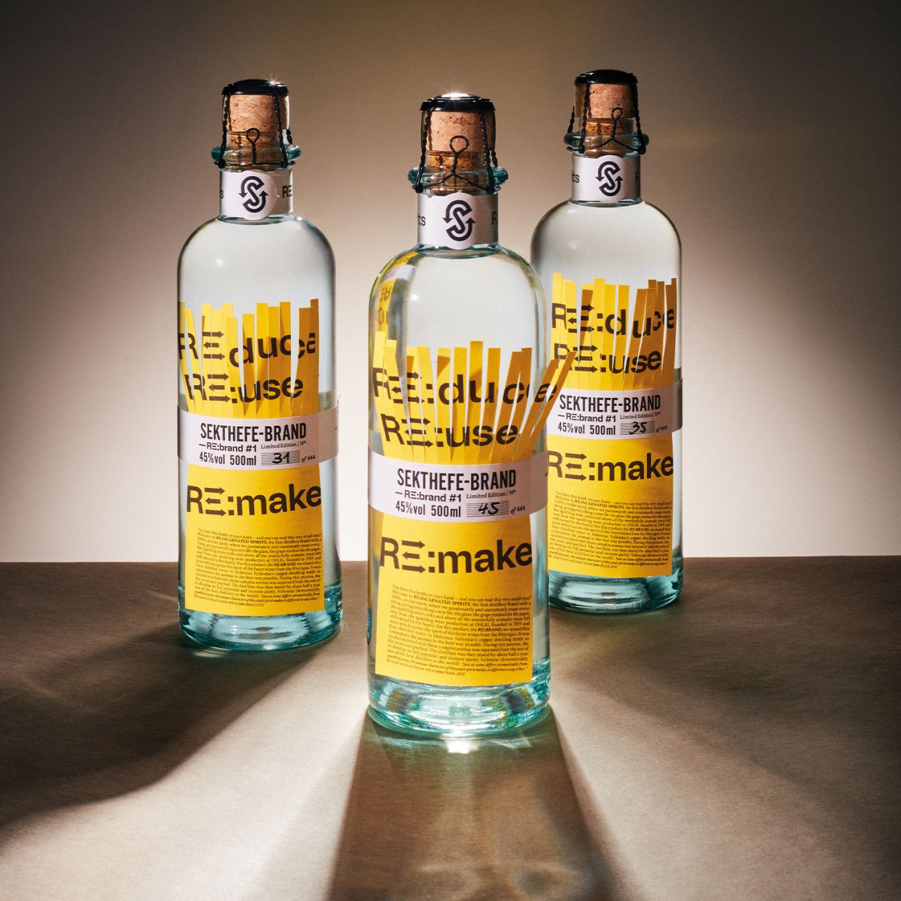
Sustainable design Platinum winner: re:incarnated spirits by Ruska Martín Associates
If you work in packaging design and have reached a certain standard, you should be getting recognition for your efforts. So why not enter the 2023 Pentawards?
Founded in 2007, this global competition recognises the best in packaging design. And it puts your work in front of a panel of 50 designers, spread across 17 countries and four continents and representing brands including Amazon, Estée Lauder, Microsoft, PepsiCo, LEGO, Nestle and Mars Food.
This year, that jury is more impressive than ever, with the addition of packaging experts from The Walt Disney Company, Netflix, PUMA, Pentagram, and Unilever. So 2023 is the perfect time to enter your work.
Why you should enter
Winning a Pentaward is a great achievement for any packaging design agency, brand or student. It can help boost your career or business, not to mention the chance to attend the Gala Ceremony and network with the leading lights in packaging design.
Even if you don't win, the Pentawards Excellence Score allows entrants to get feedback on every piece of work submitted to the competition. That means you'll get to know what the judges thought of their packaging – what they loved and the areas where they felt improvements could be made.
Best of all, you don't have to create anything bespoke: any packaging created and released to market anywhere in the world between 1 July 2021 and June 2023 is eligible for entry into the 2023 competition, as long as it hasn't been entered previously.
Categories include food, beverages, body, health & beauty; home, leisure & other markets; brand identity & connected packaging; sustainable design; professional concepts; and student concepts & brief. The competition opens on 6 February with a special 48-hour launch rate, followed by a Super Early Bird (8-10 February) rate, an Early Bird rate (13-24 February) and regular entry from 27 February-10 March. You'll find all the information you need to submit your entries here.
Meanwhile, if you need further inspiration, scroll down to see some of the winning packaging designs from past editions of the Pentawards.
1. Williams Premium Canned Cocktails by Offff
In March 2020, Rotterdam was in its first lockdown, and Williams Canteen was determined not to lose its bar. How did they do it? By doing what they do best: letting people enjoy the finest cocktails.
After some trial and error, they developed six perfect, high-quality cocktails, pre-prepared in a can allowing for a perfectly measured mix... and the taste remains optimal for months. Branding studio Offff developed six cocktail labels and two labels for accompanying 'bites', all packaging within a coordinated gift box for these eight cans.
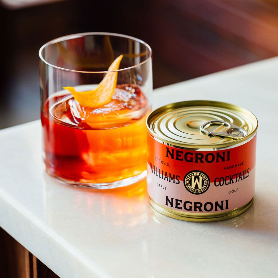
Beverages Platinum winner: Williams Premium Canned Cocktails by Offff, Netherlands
2. Pocket Neck Pillow by Urban Forest Lifestyle Ltd
Using cutting-edge aesthetics whilst prioritising sustainability and eco-consciousness, Shenzhen Urban Forest designed a compact and portable travel neck pillow where the outer silicon packaging doubles as an air pump.
Standing out for its innovation and functionality, the tree-shaped, shell-like outer packaging works both as a storage bag and a functioning air pump thanks to the elastic property of silicon, encouraging consumers not to dispose of it and cleverly revolutionising the way inflatable pillows are utilised.
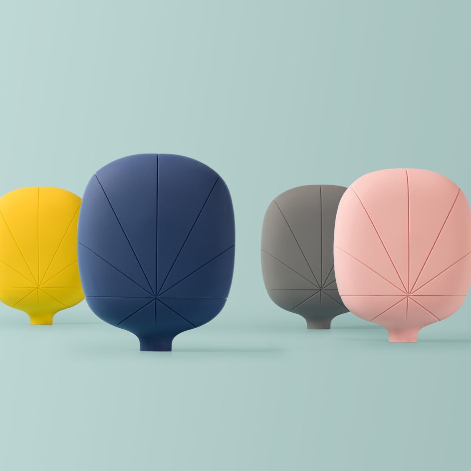
Diamond – Best Of Show 2022 winner, Pocket Neck Pillow by Urban Forest Lifestyle Ltd, China
3. Ivy's Reserve Vintage Cheddar by Big Fish
A secret recipe of Ivy Clothier, grandmother of Ivy's Reserve managing director Rich Clothier, this was not your everyday Cheddar. Big Fish's packaging has used simplicity and bold icons to make the product stand out. Strong iconographies communicate specific product benefits that are human, warm, and approachable. The care and attention to detail towards the product visuals are a homage to the product.
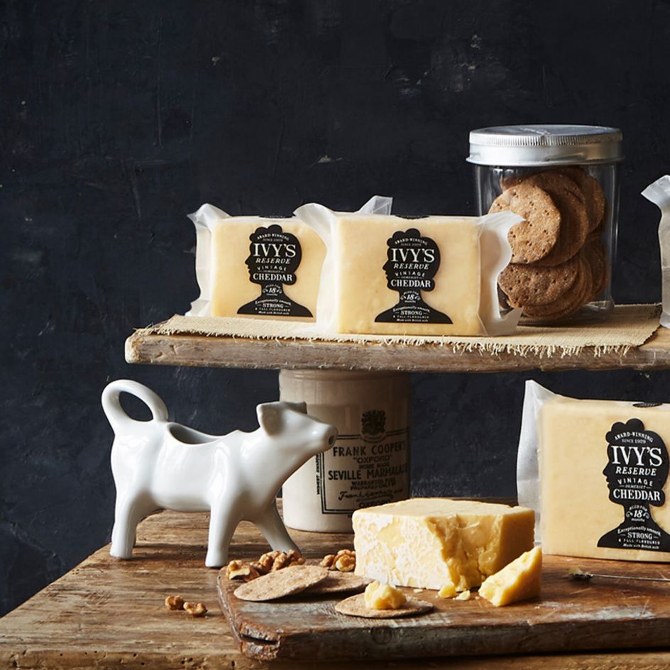
Food Platinum 2022 winner, Ivy’s Reserve Vintage Cheddar by big fish, UK
4. ShinkoQ by Grand Design
ShinkoQ is a functional "anti-pollution" product created in response to the demand for anti-virus measures with a range of products of shampoo, treatment, oil, and mist, with two different fragrance ingredients. Grand Design chose a minimalist design with only a "slash" on the front of the bottle, without a product name.
With the anti-pollution theme, this is a minimalistic and symbolic expression of the "ban" symbol. ShinkoQ was developed to blend into homes to create a design that would stand out on the sales floor with its own worldview.
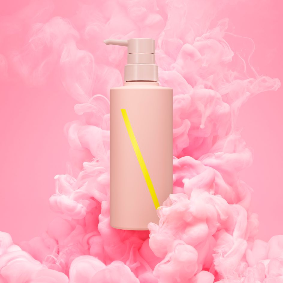
Body, Health & Beauty Platinum 2022 winner, ShinkoQ by Grand Design, Japan
5. BeanBean Coffee by BangBang
Inspired to give consumers an energised 2022 start after the accumulated fatigue of 2021, BangBang created BeanBean, six types of coffee beans produced as a limited edition with the invaluable collaboration of ZAB café.
'By creatives, for creatives', this self-promotional initiative offers coffees named after fonts, each paying tribute to all the beautiful typographic 'B's that come from The Fonderies from around the world. This series of 100% compostable bags, screen printed by hand with water-based ink, was sent as a thank you to customers and collaborators who contributed to the studio's successes.

Branding & Consumer Platinum 2022 winner, BeanBean Coffee by BangBang, Canada
6. Fuzed by Vault49
There's a rising demand for quality flavoured vapes in the US market, and Fuzed is the 'Realest Flavours Around'. It cuts through the haze, boldly communicating this new brand's unique proposition, combining the highest quality cannabis with delicious, naturally-derived flavours.
Balancing a fun attitude with natural qualities, Vault49 delivered a creative idea that took a contemporary spin on traditional bodega design inspired by grocery store signage and fresh fruit displays. The packs are bold and juicily coloured, building on Fuzed's taste credentials, giving each flavour a distinctive personality, with bespoke illustrated icons and punchy pop copy to communicate each persona and the type of high it provides.
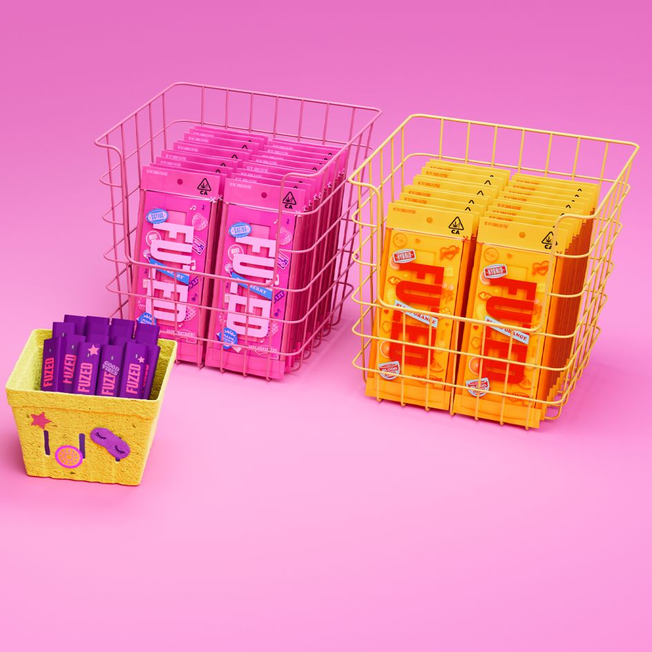
Home, Leisure & Other Markets Platinum 2022 winner, Fuzed by Vault49, USA
7. RE:INCARNATED SPIRITS by Ruska Martín Associates
The first limited edition of 444 bottles of RE:INCARNATED SPIRITS is named RE:BRAND #1. The label is printed on uncoated paper made from grape waste and post-consumer recycled fibres.
The uncoated cardboard box for safe transport is filled with recycled padding made from shredded Euro bank notes that didn't pass the quality test for public use. The glass bottle is made from 100% recycled post-consumer glass. The cork is made from recycled sparkling wine corks.
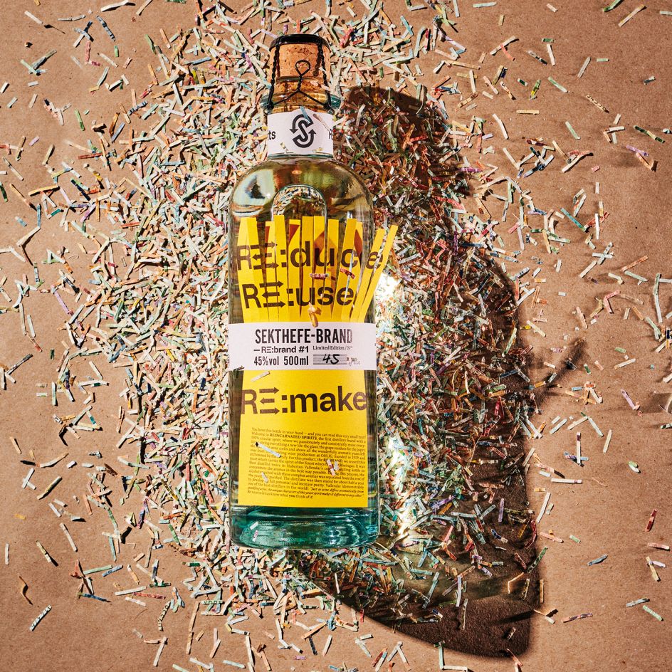
Sustainable Design Platinum 2022 winner, RE:INCARNATED SPIRITS by Ruska Martín Associates, Germany
8. Eminente Reserva by Moët Hennessy and Stranger & Stranger
With its crocodile-shaped logo and textured glass bottle, this rum was inspired by its native Cuban land that locals call "Isla del cocodrilo" (Island of the crocodile). The front label reveals the brand logo and product description using embossing, debossing and hot gold stamping. The back label, in the form of a train ticket, is an invitation to board a trip to wild Cuba. Each back label is individually numbered, making each bottle of rum unique.
With sustainability in mind, the bottle is produced at the nearest glass manufacturer in Mexico, the labels are made from cotton by-products of the textile industry and are affixed by hand in Cuba, and the intricately engraved bottle stopper is made of sustainable cork and wood coming from FSC forests.
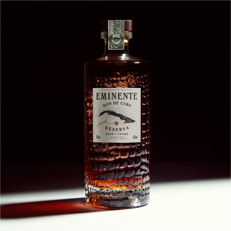
Diamond – Best Of Show 2021 winner: Eminente Reserva by Moët Hennessy, France, and Stranger & Stranger, UK
9. Pongo by CBA
Pongo is a pet-friendly aromatherapy spritz that freshens and pampers pets. It also provides emotional support through various all-natural mood-enhancing scents for pet well-being and care.
The packaging structure is a custom moulded plastic base with a modified trigger spray head that's common to all SKUs. Full-bleed shrink-wrap graphics cover the structure's body, allowing for an endless range of doggos, fun outfits, seasonal editions, and possible online customisation. Witty, canine-inspired scent names aim to put a smile on users' faces, with key ingredients and the primary benefit called out underneath.
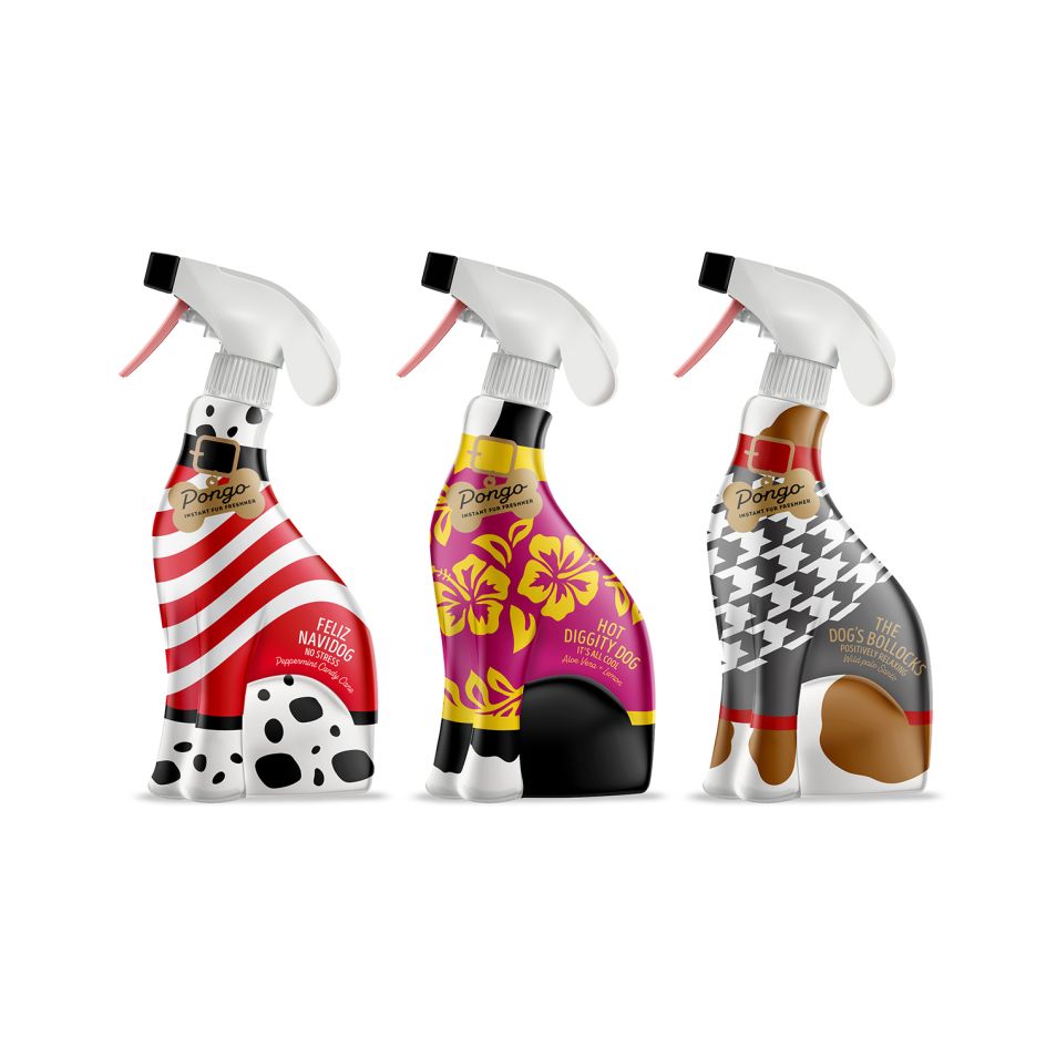
Professional concept Platinum winner: Pongo by CBA, USA
10. Vinho do Mar by Rita Rivotti
To create this unique design, the wine produced by Monte da Carochinha was immersed in the depths of the Atlantic Ocean on the Alentejo coast in Portugal for ten months. Ageing the wine this way created amazing and beautiful motifs on the bottle created by the sea. Each bottle is unique and crafted by the sea, then simply labelled with its name.

Beverages Platinum 2021 winner: Vinho do Mar by Rita Rivotti, Portugal
11. Nice Cream by Han Gao
Attempting to re-examine the food industry's design style of using pictures regularly, this packaging injects vitality and shapes the new generation of ice cream brands. The design for this low-calorie healthy ice cream packaging captures the habits of healthy food users by highlighting the nutritional elements through reorganising information levels and bright colours.
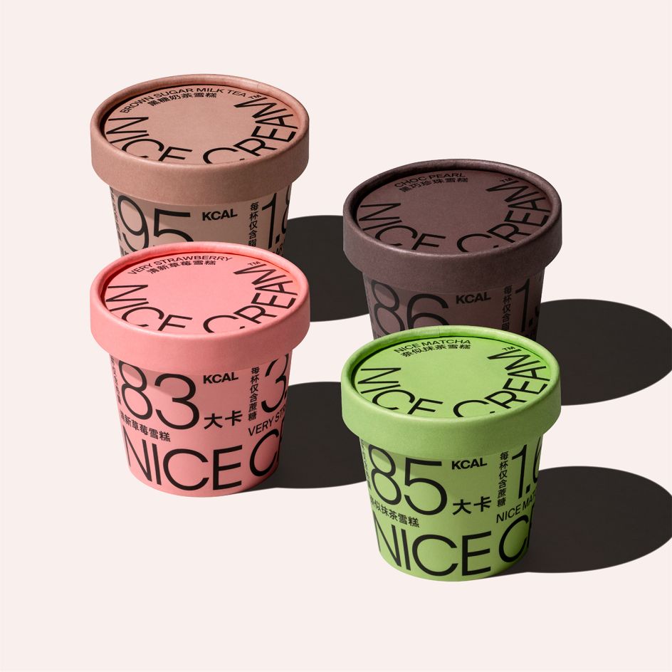
Food Platinum 2021 winner: Nice Cream by Han Gao, United States
12. FRAHM Jackets – Tough Beautiful by Supple Studio
FRAHM is a small family-run, online-only UK business that takes sustainability and men's mental health very seriously. To create memorable packaging for their jackets and to reinforce their Tough Beautiful mantra, Supple Studio used macro shots of UK native beetles – nature's tough and beautiful little creatures.
Printed large-scale on boxes and bags, the beetle idea neatly reflects FRAHM's technical garments that are great for getting outdoors in all types of weather. And to remind recipients that FRAHM supports the charity Mind – they created a bespoke packaging tape with an 'Open Up' message.
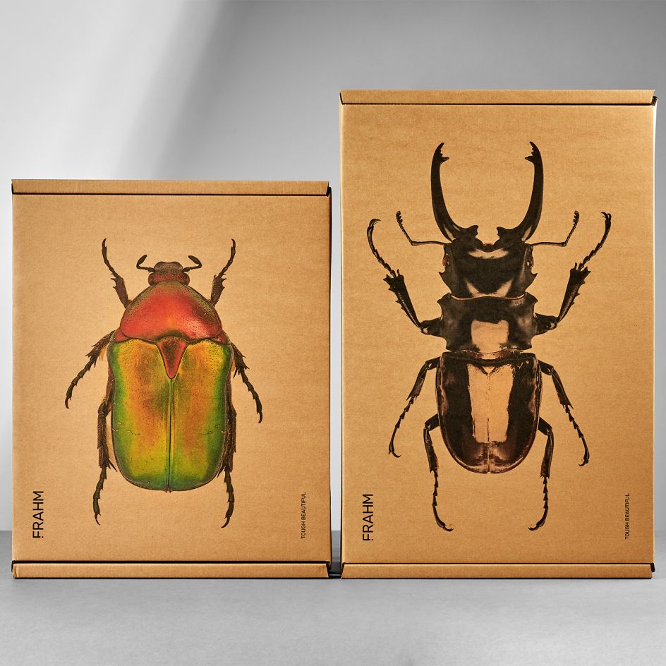
Body, Health & Beauty Platinum 2021 winner: FRAHM Jackets – Tough Beautiful by Supple Studio, UK
13. Luncheon Meat by Xiaomi
Developed with a young e-commerce market in mind, the re-design of this packaging stands out from traditional luncheon meat packaging. The front clearly expresses the brand, using the eye-catching pink and pure black colours to create the contrast, whilst the oral expression of the Chinese characters' 吃肉' ('eat meat') is transformed into the shape of a pig.
On the back of the pack, a 'piggy nose' is created, helping to make the pack more identifiable and ultimately making the product fun and engaging for the consumer.
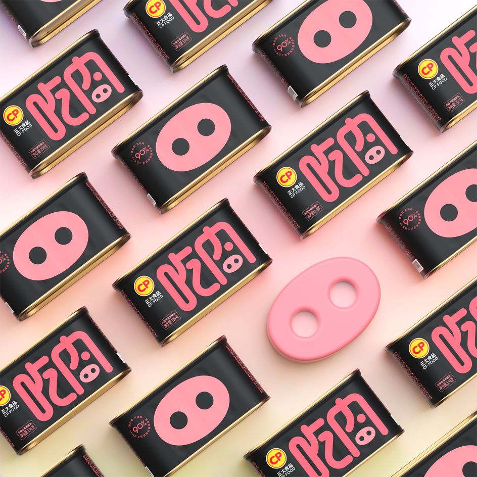
Branding & Consumer Platinum 2021 winner: Luncheon Meat by Xiaomi, China
14. ASKUL Lohaco by Bold Scandinavia
This limited-edition packaging series of kitchen storage and cleaning products from Japanese retailer Askul is inspired by the various shapes and textures found in the kitchen. Combining raw materials such as Kraft card stock with a clean Scandinavian design, the design was inspired by the various shapes and textures found around the kitchen.
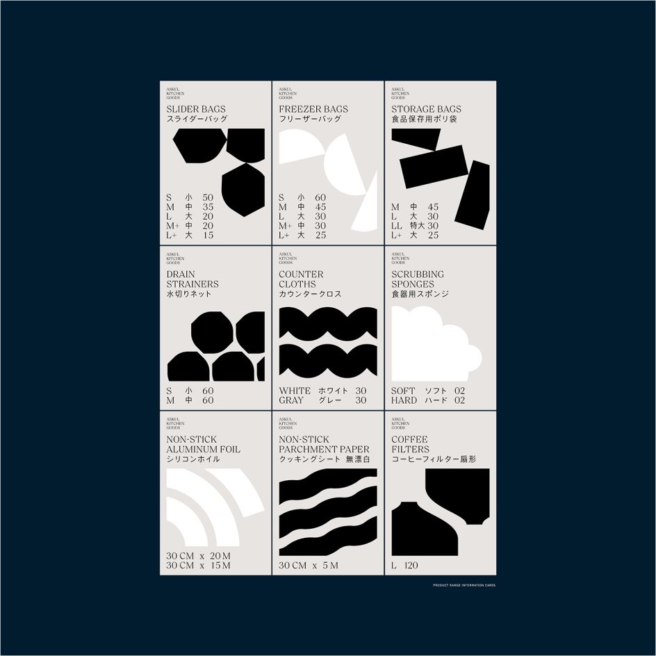
Home, Leisure & Other Markets Platinum 2021 winner: ASKUL Lohaco – Non-food by Bold Scandinavia, Denmark
15. OCEANIQ by 2Yolk
Created for a supermarket chain in Greece, this exclusive line of vegan home care detergents targets environmentally-conscious consumers. The name is deliberately misspelt to bring 'Oceanic' and 'IQ' together to showcase the smart use of plastic ocean waste in its packaging. This product, which combines packaging made of 100% recycled fishnets from oceans worldwide and mild cleansing, plant-based agents, helps protect the life of the oceanic creatures, shown in the original illustrations across the packs.
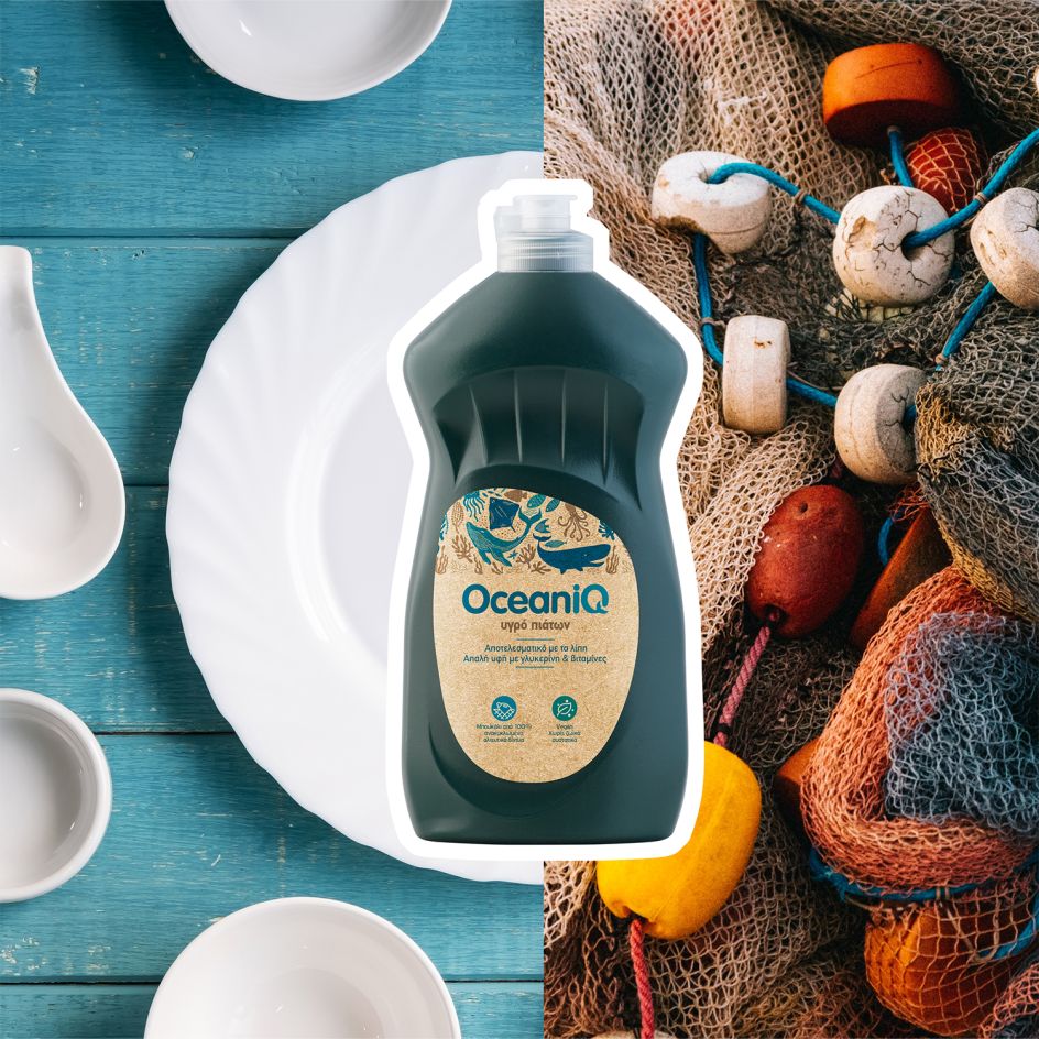
Sustainable Design Platinum 2021 winner: OCEANIQ by 2Yolk, Greece
16. Stoic by OTVETDESIGN
This packaging realistically imitates the toughness and durability of the glove material, with an effect that looks like there is a sharp object inside the pack that could break the material but doesn't – it only stretches the surface. Thanks to the clear-cut and crisp solution, the design is both neat and distinctive and will stand out on any surface, making it a key brand positioning tool.
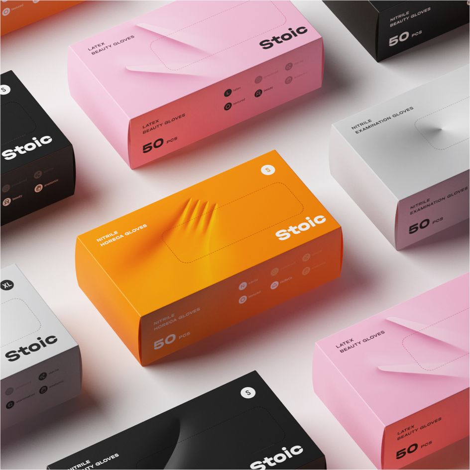
Professional Concept Platinum 2021 winner: Stoic by OTVETDESIGN, Russia
17. Air Co
With a mission to be the most sustainable alcohol brand in the world, the packaging for the world's first carbon-negative vodka brand, Air Co., is both reusable and 100% sustainable. Keeping the vodka as the star, the label is placed towards the top of the bottle giving ample space to display the liquid.
By placing the label lower, the vodka is the first to meet the eye. The label is simple, custom-made, natural and non-toxic and can be removed easily so the bottle can be used for other purposes like a water bottle, flower vase or candle holder.
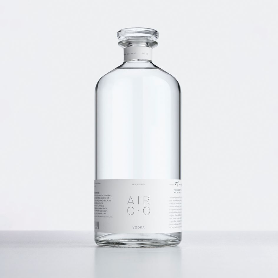
Diamond 2020 winner (Best of Show): Air Co by Air Co, USA
18. Pridem's Gin by Enpedra Estudio
The design concept for Pridem's premium gin centres around the idea of a sailor to represent and celebrate freedom. The beautiful design comprises two complex elements: a striking stopper shaped like a sailor's hat that gives the product personality and emphasises its uniqueness, and a label made up of four separate parts that wrap completely around the frustoconical bottle.
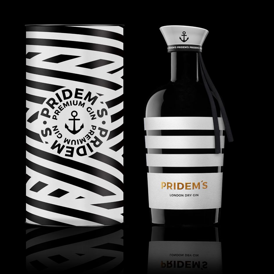
Beverages Platinum 2020 winner: Pridem’s Gin by Enpedra Estudio, Spain
19. Happy Ghost by Pavla Chuykina
The idea behind this playful design is of a ghost that first made an appearance in 1916 that has been spotted in recent years on the shelves of liquor stores. To create this character, the design uses a deep indentation at the bottom of the bottle and adds a pair of ghostly eyes, whilst the glass creates a dark fog and mystical atmosphere.
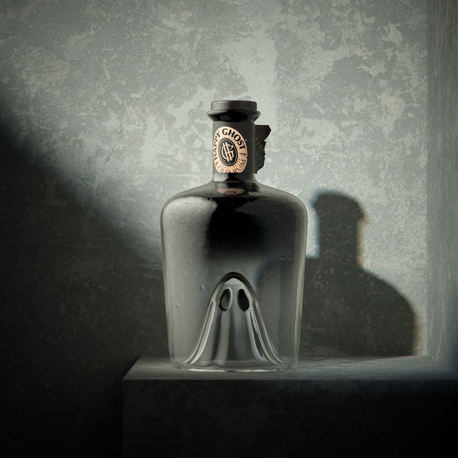
Beverages Professional Concept Platinum 2020 winner: Happy Ghost by Pavla Chuykina, Russia
20. NongFu Wangtian by ShenZhen BOB design
What struck the judges with this piece was the simplicity and effectiveness of the design. The creative idea of this product packaging is that by combining the shape of the chilli with the container, it brings the experience of picking chilli directly to the customer. Its distinctive and fun design will make it the first to be noticed on the shelves, enticing consumers to buy it to try it out and share it with friends and family.
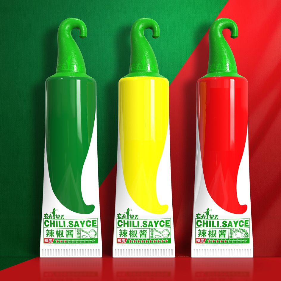
Food Platinum 2020 winner: NongFu Wangtian by ShenZhen BOB design, China
21. Chioture by Shanghai Nianxiang Brand Design & Consulting Co., Ltd.
This base makeup kit for Chioture, a vibrant and youthful makeup brand, focuses on the unpacking process of the product. Factoring in the simple and fun characteristics of the brand, an innovative design was used to effectively demonstrate the product's features: a beautiful and adorable soft-light camera.
The user unscrews the 'lens' and then pulls out the 'handle brush' on the right, which can then be placed on the 'Brand Icon Viewfinder' in the upper left corner of the camera if on the go.
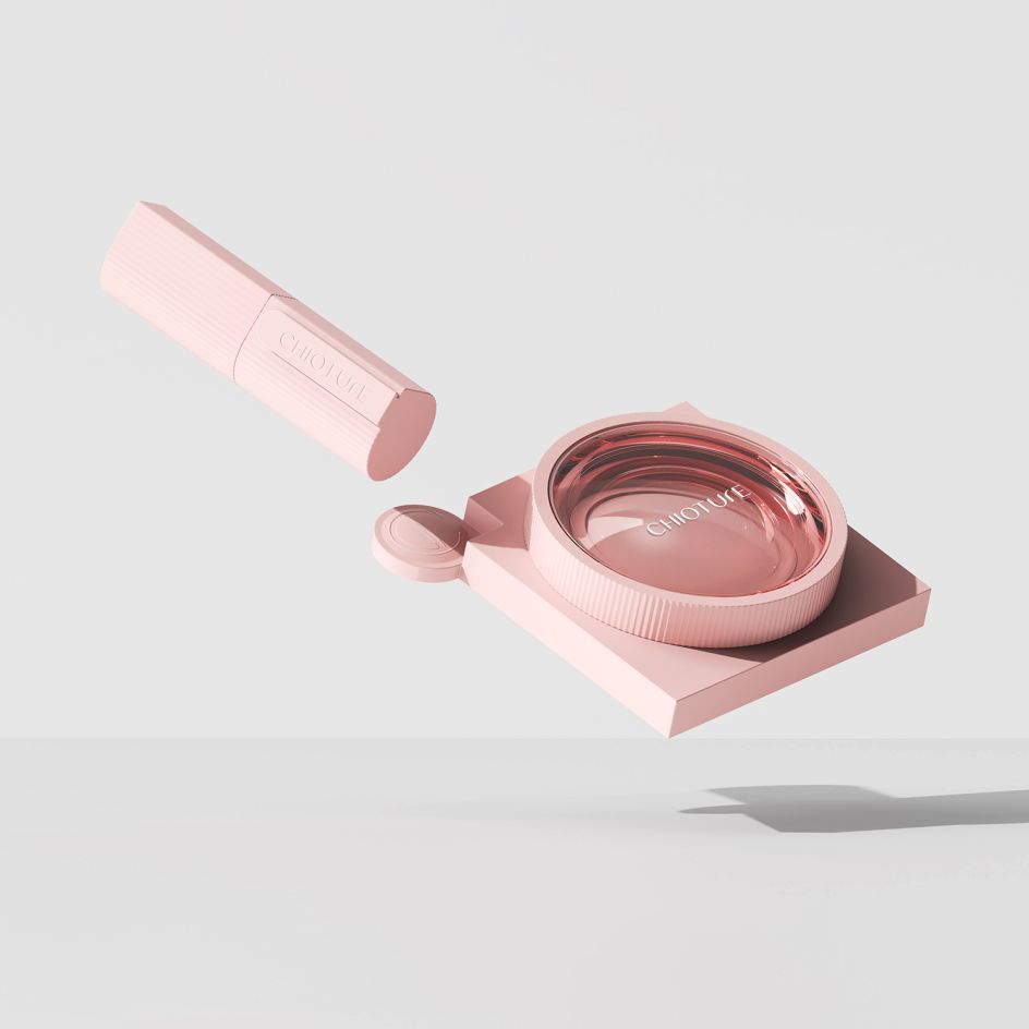
Body Platinum 2020 winner: Chioture by Shanghai Nianxiang Brand Design & Consulting Co., Ltd., China
22. HEMA by Magnet Design
This charming range of packaging for Dutch retailer HEMA contains summer water inflatables. The design concept is to show a range of summer products that look like they have been dropped into mini swimming pools, and there's even a steel step that leads into the pool on the front, bringing the image to life.
All toys have been designed exclusively by HEMA and represent the retailer's most famous icons like HEMA's smoked sausage, Takkie the Dog, Tompouce pastry and summer ice creams. HEMA's overall ambition is to stop putting plastic products into plastic packaging, so carton boxes were chosen to package and protect the products inside.
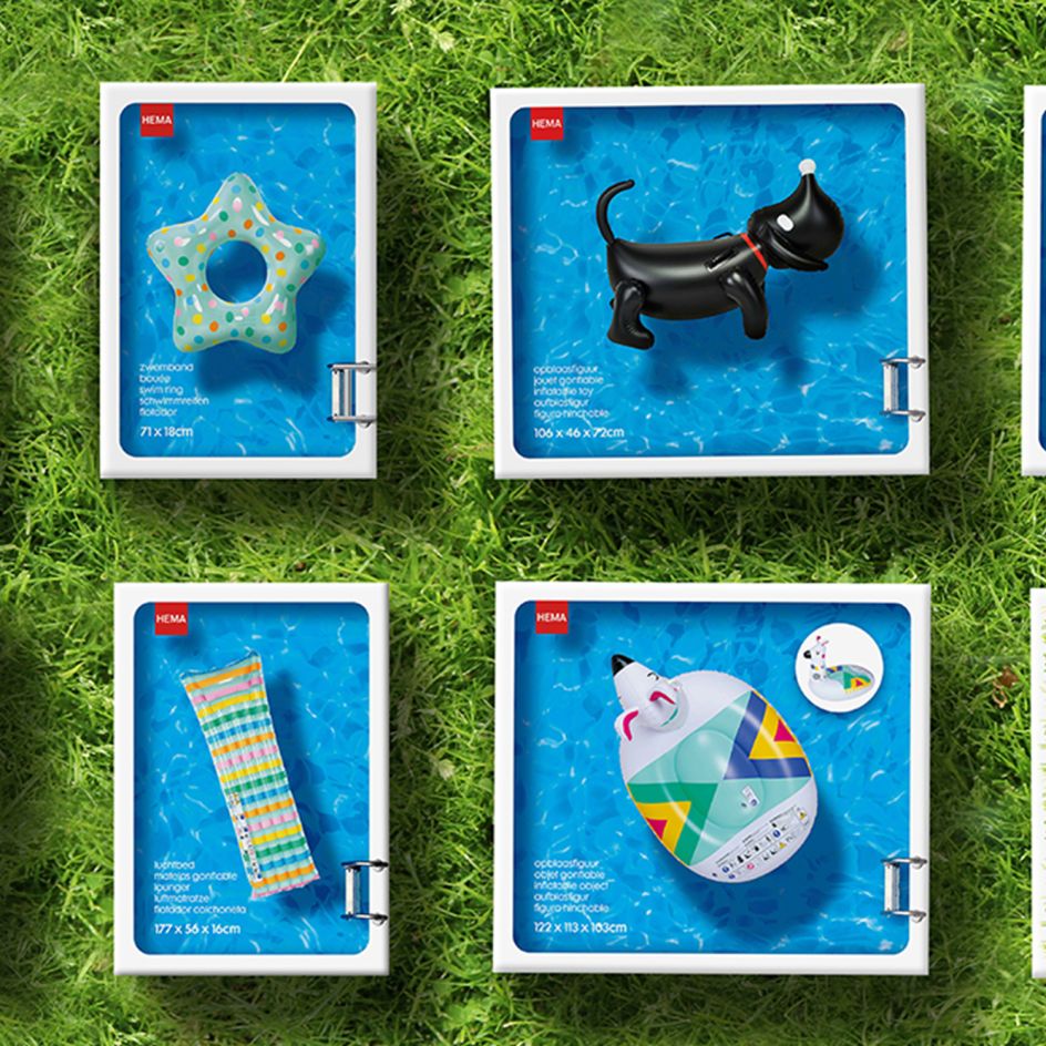
Other Markets Platinum 2020 winner: HEMA by Magnet Design, Netherlands
23. Hennessy by Felipe Pantone
Released globally at a limited quantity of 70 pieces, this Collector's Edition from Hennessy was created in partnership with the world-renowned and pioneering street artist Felipe Pantone. The result of this collaboration is a super clean, shiny white PET box that, once opened, reveals the whole world of Felipe Pantone through a prism of graphical elements and textures.
At the centre of the experience, the consumer is invited to build their own art sculpture around a customised Hennessy V.S bottle printed with the latest cutting-edge digital technologies in CMYK. The exclusive carafe stands on a pedestal in the centre of a grid of moiré-finished rods that consumers themselves can place, move and interchange to alter the bottle's optics.
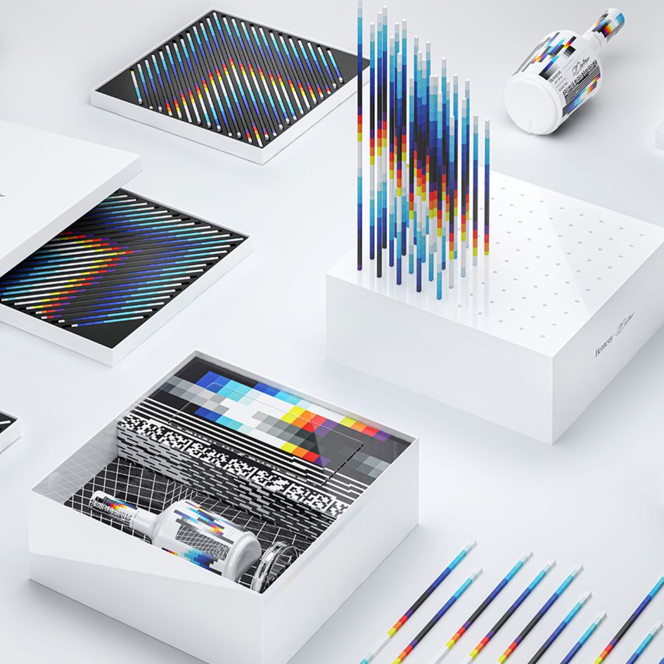
Luxury Platinum 2020 winner: Hennessy by Felipe Pantone - Appartement 103, France
Enter the Pentawards 2023 today!
Want to get recognised for your packaging design work? Then it's time to enter the Pentawards annual competition. Deadline for entries is 24 March 2023, so don't delay.
Your work will be judged by an esteemed panel of 50 global experts, and you'll get useful feedback on your designs, even if you don't progress to the second round of voting. Plus, if you win an award, you'll get an instant career boost as you make your mark on the global packaging design stage, along with serious bragging rights and the chance to attend the Gala Ceremony.
Find out more and enter your work here.


 by Tüpokompanii](https://www.creativeboom.com/upload/articles/58/58684538770fb5b428dc1882f7a732f153500153_732.jpg)


 using <a href="https://www.ohnotype.co/fonts/obviously" target="_blank">Obviously</a> by Oh No Type Co., Art Director, Brand & Creative—Spotify](https://www.creativeboom.com/upload/articles/6e/6ed31eddc26fa563f213fc76d6993dab9231ffe4_732.jpg)


