Hilarious mockup templates show what your designs really look like in the wild
Mockups give clients a very optimistic look at what their work will look like once it's out in the world, but sometimes they can be far from realistic. To give them a better idea of what to expect, Dutch designer and art director Wytze Hoogslag has created less idealistic templates which creatives are free to use.
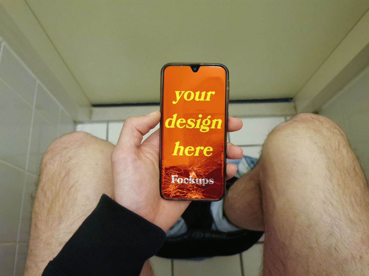
Chances are you've come across ambitiously optimistic design mockups. Whipped up by creatives to give clients an idea of how their brand will look in the wild, they often show incredible posters existing in a Utopian dream world far removed from the reality they're destined for. But if only there was a mockup that showcased designs in the real world. Well, now there is, and it's called Fockups.
Taking its name from "f*cked up mockups", Fockups displays your designs in an honest way. This includes someone browsing their phone while sitting on the toilet (we all do it), a blown-over stand and an extremely weathered and distressed newspaper sandwich board.

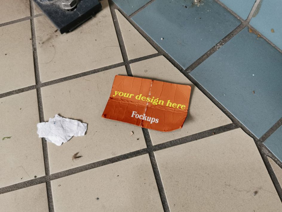
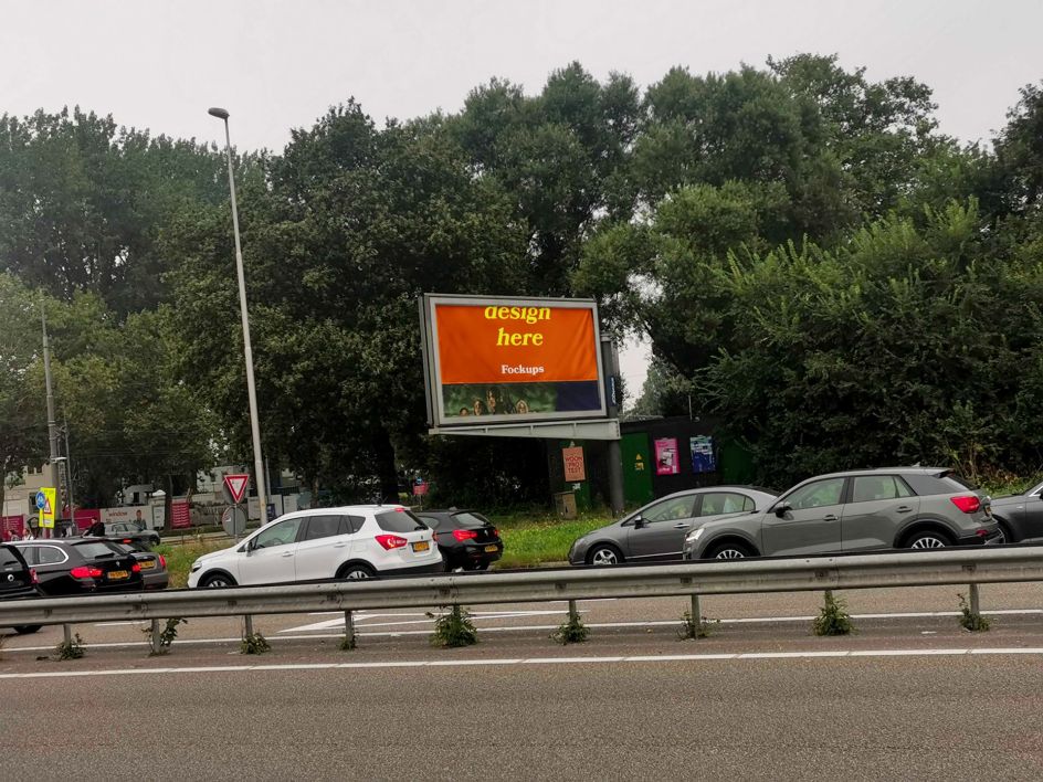
"Current mockups display these situations as too idealistic," says Wytze, who works at a creative agency called Onze Kapel. "The subjects are smoothly floating around in space, beautifully enlightened, depicted along with a blue sky or a perfect cappuccino. It does not reflect reality, which is what mockups originally should be used for."
As a designer who hates stock photography and fancy mockups, Fockups is his perfect swipe at the naive and absurd practice. With love for imperfection and amateur design, these templates are both a useful resource and a genuine expression of Wytze's creative outlook.
Created over six months when Wytze kept his eyes on public information resources such as posters and flyers that looked odd or did not communicate in the way they were originally supposed to, Fockups sees these observations turned into a collection of eight images.
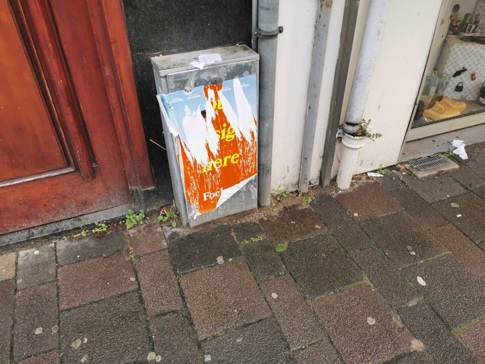
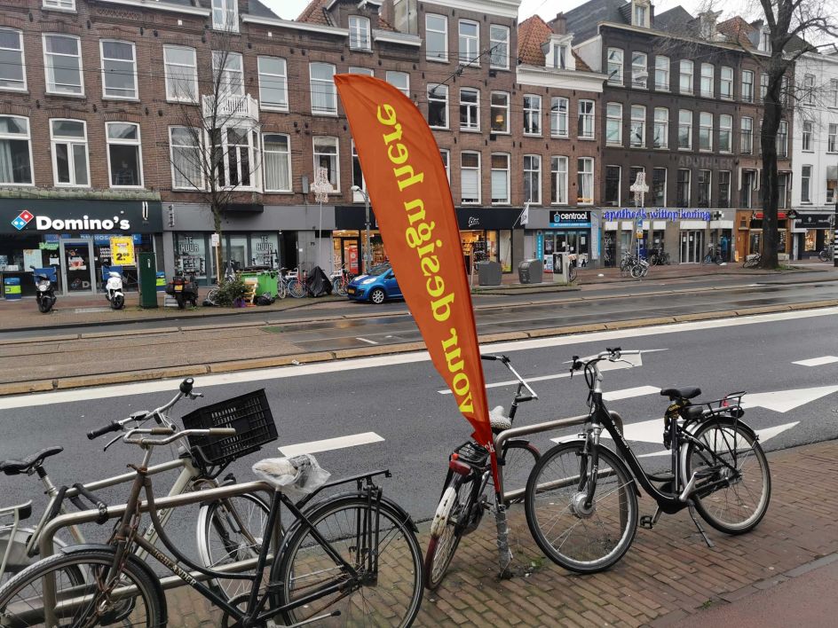
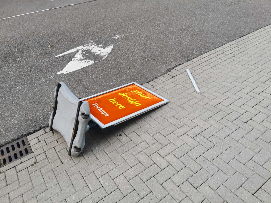
"In reality, designs face many challenges: wind, rain, time, graffiti, human stupidity or failing information carriers," adds Wytze. "Those real-life unfortunate situations are collected in the series Fockups. These f*cked-up mockups show your design in a realistic way. Because eventually, people will be checking their phones when they are taking a shit rather than looking at an expensive iPhone floating through space."
And as well as being an attack on mockups, Fockups is a broader indictment of perfections. Wytze wants people to stop pretending they're perfect in their online presence, which many of us, creatives or otherwise, is guilty of. "But let's start with the presentation of their designs."
So if you want to see what your finely-crafted designs will look like once they've left your studio, pop them into one of the eight adjustable Fockups Photoshop files. Although what would happen if Wytze popped one of these mockups into a Fockups template itself? We'll leave that with you. Something to do over lunch, isn't it?


 by Tüpokompanii](https://www.creativeboom.com/upload/articles/58/58684538770fb5b428dc1882f7a732f153500153_732.jpg)

 using <a href="https://www.ohnotype.co/fonts/obviously" target="_blank">Obviously</a> by Oh No Type Co., Art Director, Brand & Creative—Spotify](https://www.creativeboom.com/upload/articles/6e/6ed31eddc26fa563f213fc76d6993dab9231ffe4_732.jpg)


