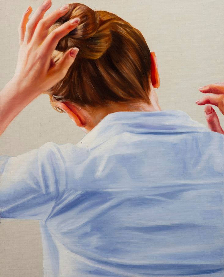
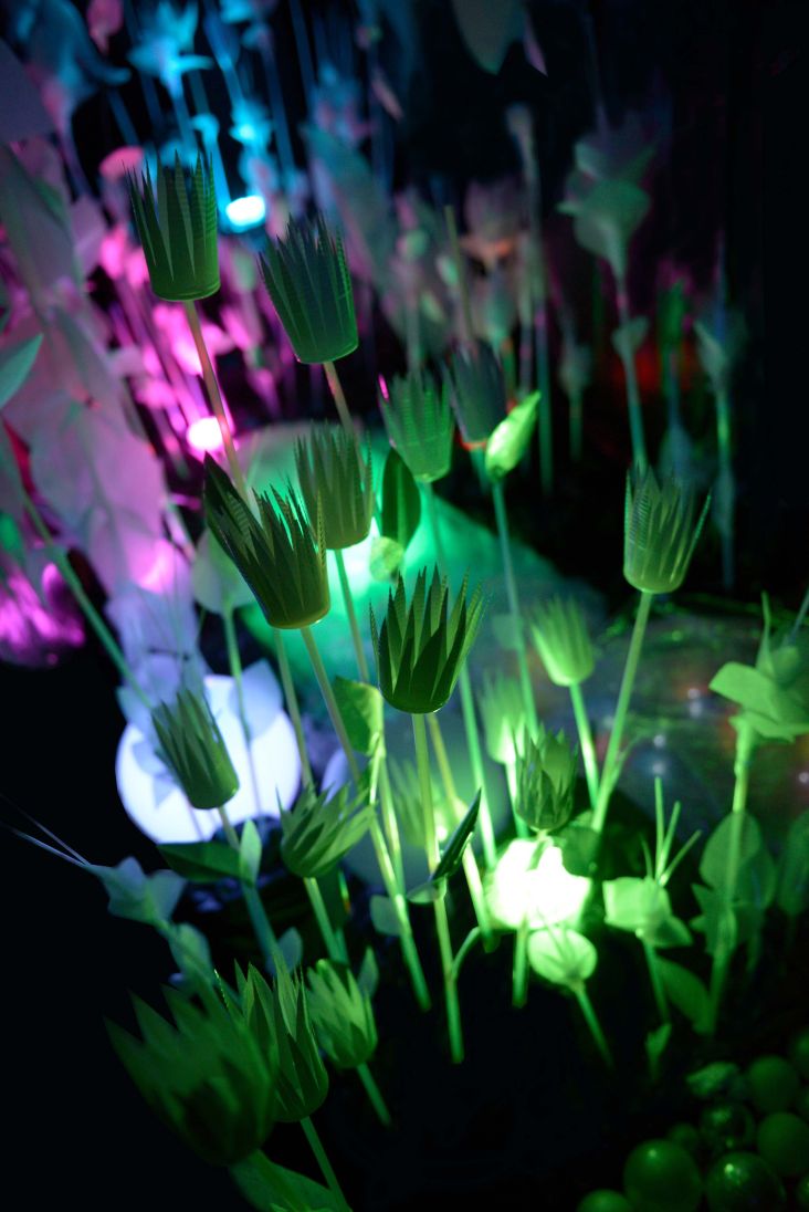
Pantone's 2019 Colour of the Year is Living Coral
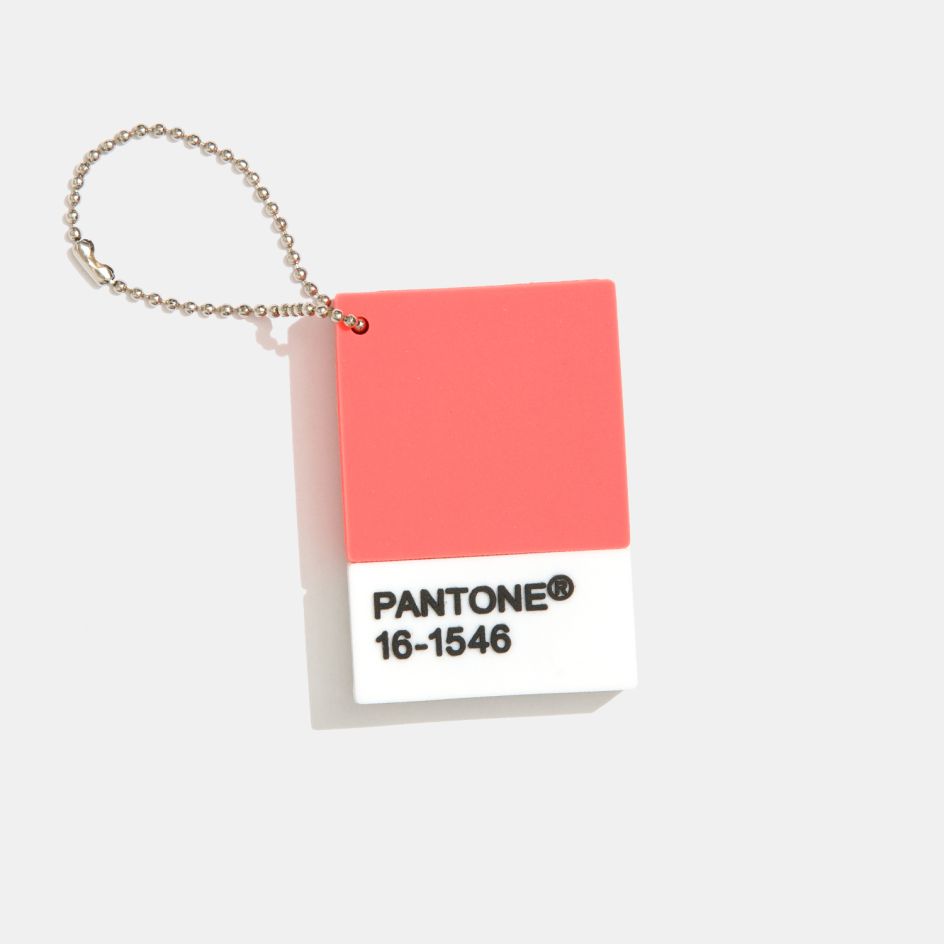
Following last year's regal and spiritual Ultra Violet shade, Pantone has today unveiled its 2019 Colour of the Year, as Living Coral – an animating and life-affirming coral hue with a golden undertone that energises and enlivens with a softer edge.
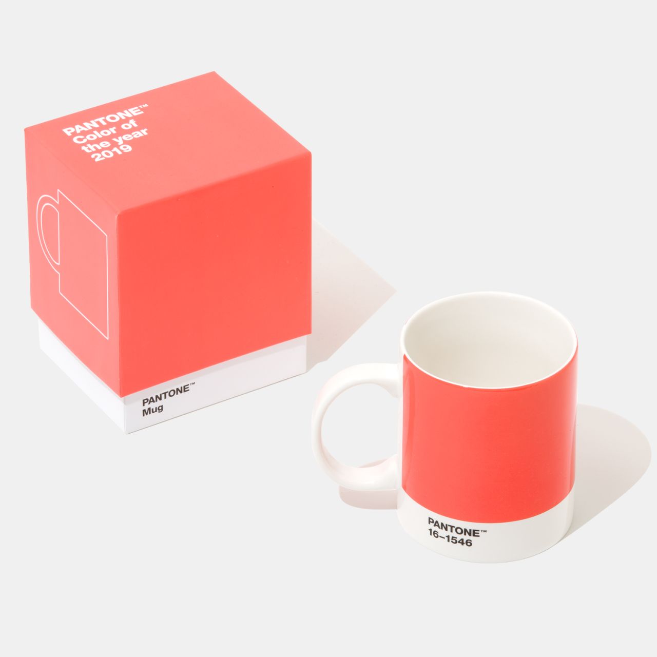
"Vibrant, yet mellow PANTONE 16-1546 Living Coral embraces us with warmth and nourishment to provide comfort and buoyancy in our continually shifting environment," reads the announcement on the Pantone website. "In reaction to the onslaught of digital technology and social media increasingly embedding into daily life, we are seeking authentic and immersive experiences that enable connection and intimacy.
"Sociable and spirited, the engaging nature of PANTONE 16-1546 Living Coral welcomes and encourages lighthearted activity. Symbolising our innate need for optimism and joyful pursuits, PANTONE 16-1546 Living Coral embodies our desire for playful expression."
Pantone adds: "Representing the fusion of modern life, PANTONE Living Coral is a nurturing colour that appears in our natural surroundings and at the same time, displays a lively presence within social media."
For 20 years, Pantone’s Colour of the Year has influenced product development and purchasing decisions in multiple industries, including fashion, home furnishings, and industrial design, as well as product, packaging, and graphic design.
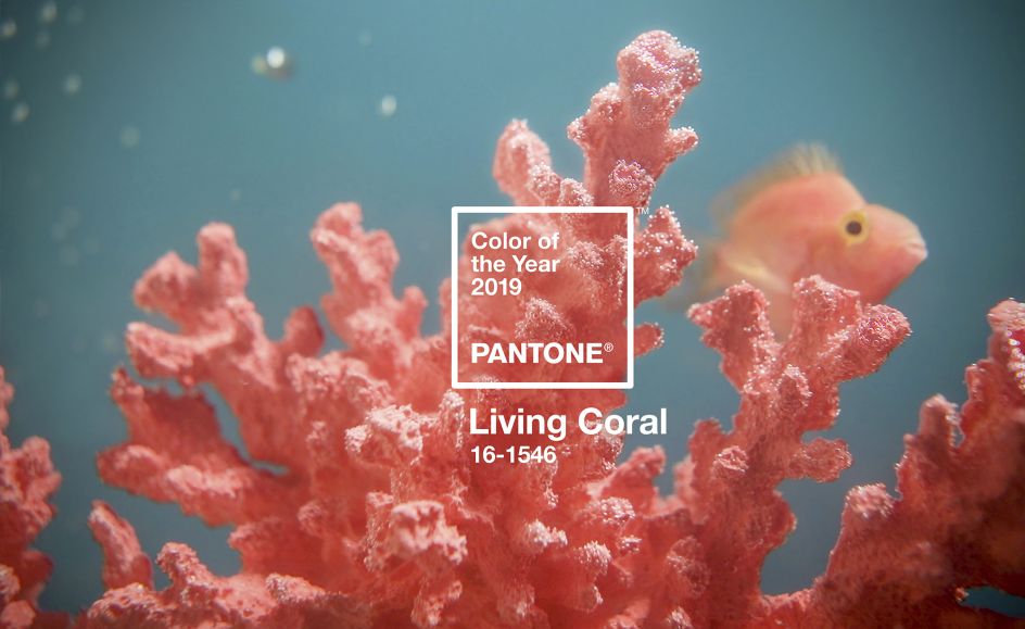
According to Pantone, the Color of the Year selection process requires thoughtful consideration and trend analysis. To arrive at the selection each year, its colour experts at the Pantone Color Institute comb the world looking for new colour influences.
This can include the entertainment industry and films in production, travelling art collections and new artists, fashion, all areas of design, popular travel destinations, as well as new lifestyles, playstyles, and socio-economic conditions. Influences may also stem from new technologies, materials, textures, and effects that impact colour, relevant social media platforms and even upcoming sporting events that capture worldwide attention.
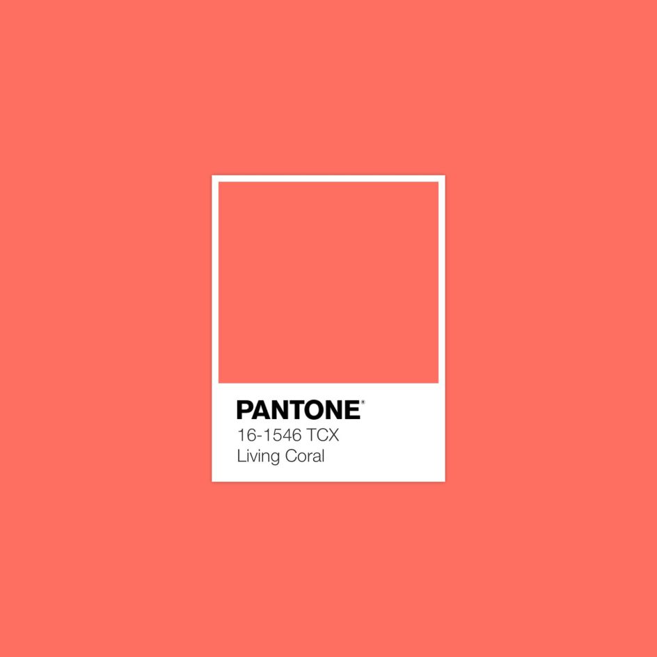
"Colour is an equalising lens through which we experience our natural and digital realities and this is particularly true for Living Coral," says Leatrice Eiseman, Executive Director of the Pantone Color Institute. "With consumers craving human interaction and social connection, the humanising and heartening qualities displayed by the convivial PANTONE Living Coral hit a responsive chord."
Pantone goes on to say: "Living Coral emits the desired, familiar, and energising aspects of colour found in nature. In its glorious, yet unfortunately more elusive, display beneath the sea, this vivifying and effervescent colour mesmerises the eye and mind. Lying at the centre of our naturally vivid and chromatic ecosystem, Living Coral is evocative of how coral reefs provide shelter to a diverse kaleidoscope of colour."
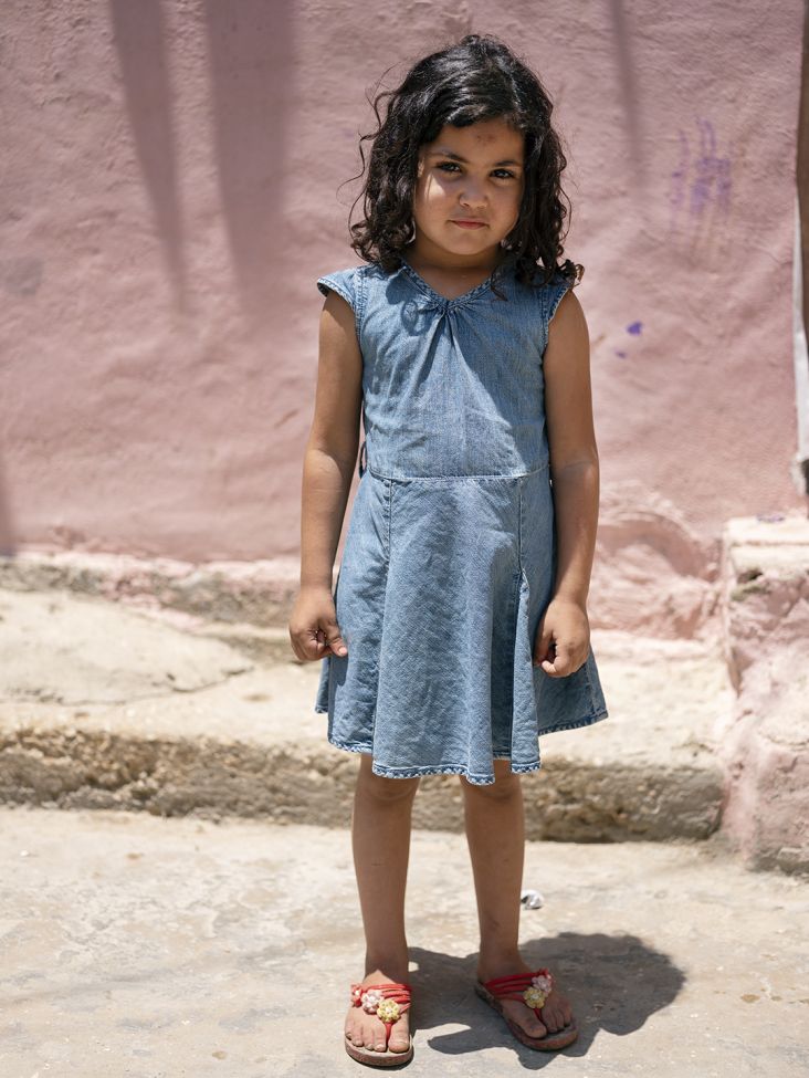
In response to this announcement, our friends at Adobe Stock have created a dedicated gallery for a glimpse of how to use Living Coral imagery in your own projects next year.
We've shared some of their recommended matching photographs below. See more at stock.adobe.com. To find out more about Pantone's Colour of the Year 2019, visit pantone.com or follow @pantone on Instagram.
](https://www.creativeboom.com/upload/articles/1d/1df33b5f7259714a7ac7139f6ab8c38312e8debe_944.jpg)
Image courtesy of Adobe Stock
](https://www.creativeboom.com/upload/articles/3e/3ea42949b88ad9fc36b059dc4a99a1dd1461a5fa_944.jpg)
Image courtesy of Adobe Stock
](https://www.creativeboom.com/upload/articles/30/30568c9179fa37400a01331ada07fc85c3845722_944.jpg)
Image courtesy of Adobe Stock
](https://www.creativeboom.com/upload/articles/3b/3bede8e0f06469feab8bcafd7c45ed5d95545212_944.jpg)
Image courtesy of Adobe Stock


 by Tüpokompanii](https://www.creativeboom.com/upload/articles/58/58684538770fb5b428dc1882f7a732f153500153_732.jpg)


 using <a href="https://www.ohnotype.co/fonts/obviously" target="_blank">Obviously</a> by Oh No Type Co., Art Director, Brand & Creative—Spotify](https://www.creativeboom.com/upload/articles/6e/6ed31eddc26fa563f213fc76d6993dab9231ffe4_732.jpg)


