Standards, a game-changing tool for creating brand design guidelines, launches today
This browser-based platform makes it easy to create online brand guidelines. We chat to founder Hamish Smyth about what Standards offers designers and why it's time to ditch the PDFs.
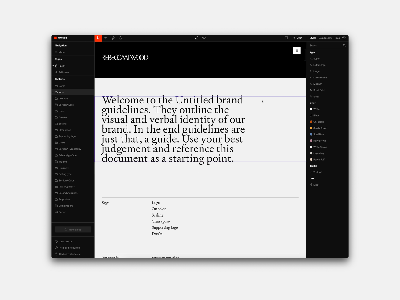
Are you still creating your brand guidelines on PDFs? Then Hamish Smyth wants a word. He believes we need to call time on this 20th-century practice, which makes it very difficult for clients and design teams to keep track every time the guidelines are updated, and fresh PDFs are sent out.
Standards allows you to design, publish and share online brand guidelines that basically look like modern, stylish websites (but without needing to know anything about code). You can invite team members and clients to view the same pages and make updates whenever you need, and everyone can see.
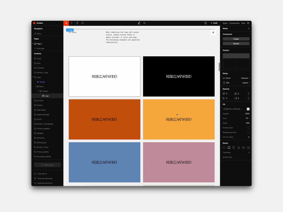
Working with multiple brands? To save time and effort, Standards allows you to design, save, and reuse modular components across all your guidelines. You can add animations and videos. You can choose to scale typography responsively with your audience's browser size or lock it in at a scale specified by you. You can even calculate all colour values from a single HEX and then instantly add them as swatches to your guidelines.
No more PDFs
For many design teams, this is potentially revolutionary. It means no more PDFs with missing links. It means no more confusion over which is the correct PDF for people to be looking at. And crucially, it's been built to offer the same level of precision and control traditionally offered by PDFs… so you're sacrificing absolutely nothing by using it.
Standards has been in development for some years now: we first wrote about it back in 2020. And in fact, it's already picked up 10,000 users, with NASA, Headspace, Rivian, Pentagram, Herman Miller, Skillshare, SeatGeek, RISD, and more as existing customers. But today it launches out of beta with a free plan and various paid plans with extra features. And to co-founder Hamish Smyth, its appeal to designers is pretty straightforward.
"Branding designers like me have been doing guidelines pretty much the same way for 20 plus years, making them as PDFs," explains the Australian-born, New York-based designer, who's also co-founder of Brooklyn studio Order. "The rest of the design industry has moved to a lot of online tools, but it feels like guidelines got left behind. So many of us are still making these clunky, huge PDFs that are hard to update.
"Every designer agrees they're a pain to make, given their complexity and length. For instance, you can't easily put a video in a PDF or link things within the document. It's just an outdated technology for what we're trying to do."
Obviously, a website is a pretty obvious solution to that. "But to create a website is a very expensive, time-consuming ordeal. So we wanted to create a tool allowing you to do that without code. Yes, there are generic website builders out there today that are very good, but we wanted to make a tool that was specifically made to do guidelines.
"So Standards is basically a web builder that's specifically tailored to help designers create guidelines easily and gives you the ability to share them widely and update them rapidly. I guess the short pitch is: no more PDFs!"
Control issues
Hamish recognises that some designers are conservative and might be trepidacious about "losing control" by placing everything online, but points out that with Standards, your site can be password-protected and is set to be private by default. That said, people still ask him if they can export their sites as PDFs, to which the answer is a respectful no.
"I understand that people want a deliverable sometimes, and having a digital file, that PDF document, is hard to let go of," he says. "But we strongly believe that guidelines should be online because it's just a better format. You know, once you've sent a PDF to a client if you need to update it, that means there are two documents. Then there are three, then four, and version history becomes a big problem. So having a website that continually updates solves that issue."
For a long time, he says, there was still an argument for sticking to PDFs regarding design precision. "The level that you can design a PDF is typically higher than what you can do with a simple web builder," he explains. "So that was one of our goals: to create a tool that allows you to output something that is PDF-level quality."
In short, they didn't want designers to say: I don't want to use Standards because I can't make it look as good as I want. "So we've been working hard to cancel that out as an argument and build in great typography controls, colour controls, all those sorts of things we take for granted with desktop-grade software. This allows you to create the kind of documents you're used to making with PDFs but on a website. Without needing to code!"
Best in class
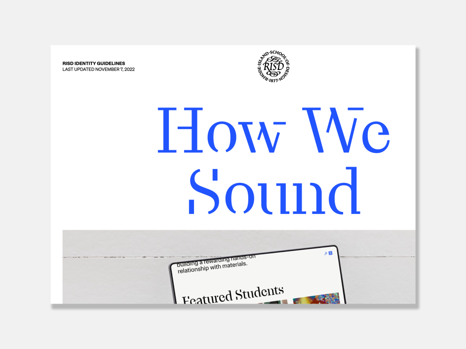
If you're struggling to imagine what this all looks like in practice, there are some great examples shared on the Standard website. "The one I like most was made by Gretel for RISD (Rhode Island School of Design)," says Hamish.
"Gretel worked with us early on in the development of Standards and actually helped us test out many early features. Their project with RISD has been very successful: it was a huge rebrand, and it's now been transferred over to RISD in-house. So they manage the project, update it, and push the tool quite a lot."
Another one close to Hamish's heart is the site made for Sveriges Skolledare (Sweden's School Leaders) by Oké design. "He's done several guidelines with us now, and it's just a very simple, very clean, one-page site.
He ends by saying, "I think that's the most important thing we want to convey. Many guidelines look like they've been designed to show off to other designers. Sometimes people forget that the result is supposed to be a functional thing that people can use. And so just having a simple thing with download buttons and being on a one-page website is great."


 by Tüpokompanii](https://www.creativeboom.com/upload/articles/58/58684538770fb5b428dc1882f7a732f153500153_732.jpg)

 using <a href="https://www.ohnotype.co/fonts/obviously" target="_blank">Obviously</a> by Oh No Type Co., Art Director, Brand & Creative—Spotify](https://www.creativeboom.com/upload/articles/6e/6ed31eddc26fa563f213fc76d6993dab9231ffe4_732.jpg)


](https://www.creativeboom.com/upload/articles/a1/a1be57bc5ec32ca3cd9b95b8b6e12d299d66f35c_732.jpg)


