20 of the best graphic design projects to inspire you to enter this year's A' Design Awards
You don't have long to enter this year's A' Design Awards, the world's leading annual competition that gives you the chance to be internationally recognised and join the very best artists, architects and designers.
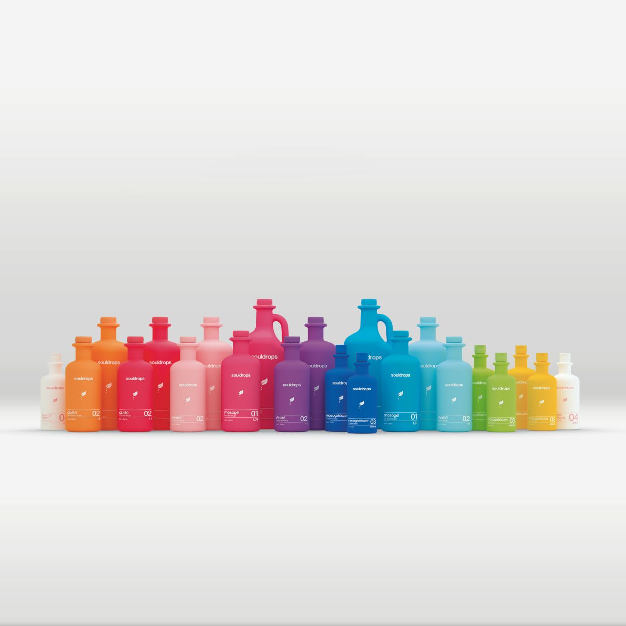
Souldrops Detergent by Réka Baranyi
Every year projects that focus on innovation, technology, design and creativity secure an A' Design Award. Categories range from Good Industrial Design and Good Architecture Design to Good Communication Design and Good Product Design, and there are 100 of them to choose from, so there's something to suit every creative discipline.
For now, we're delving deeper into last year's winners, focusing on the winning graphic design projects from packaging to visual communication. This will hopefully give you some encouragement to put forward your own work for consideration. Scroll to the bottom to find out how to enter. In the meantime, here are Creative Boom's top 20 graphic design winners of the A'Design Awards in 2017.
1. Excalibur Limited Edition packaging by Fengsheng Cai
The inspiration behind the design for Excalibur whisky by Fengsheng Cai came from the legend of the sword of King Arthur as well as his armour.
Featuring the bottle inside the packaging, it rises up slowly with the opening of the outer case. "The package is shaped like a teardrop diamond," explains Fengsheng, "meaning every dip of the whisky is as precious and glorious as the diamond."
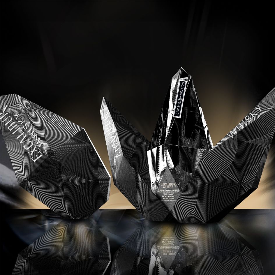
Excalibur limited edition packaging by Fengsheng Cai
2. Omdesign 2017 promotional packaging by Omdesign
Omdesign's promotional packaging celebrates the 165 national and international awards they have won in the last three years, using sustainable materials in light of Portugal's devastated forest following fires and extreme drought in 2017.
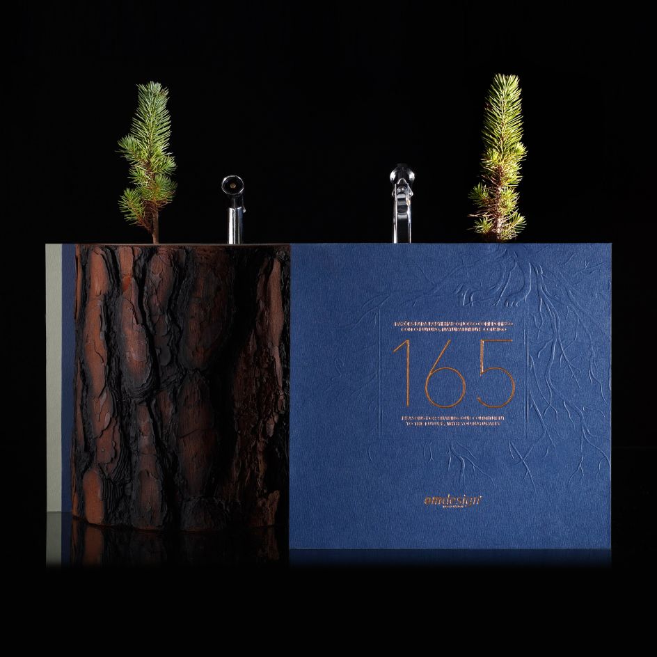
Omdesign 2017 promotional Packaging Promotional packaging by Omdesign
3. Amaro 33 packaging by YG Design
For Amaro 33, a new grappa-based liqueur, YG Design created contemporary packaging for a traditional drink that would appeal more to a younger audience. During the day, the label looks elegant and modern, but at night it brightens up and glows in the dark.
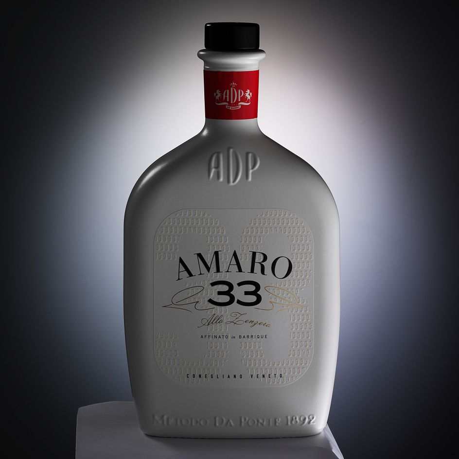
Amaro 33 by YG Design
4. Souldrops Detergent by Réka Baranyi
Souldrops is a laundry detergent brand whose packaging and identity by Réka Baranyi really stands out from the crowd. You could call its design revolutionary, as there is no other detergent in the world that shares the same look and feel. We especially love the reimagined bottle shapes and the dreamy palette of pastel colours.
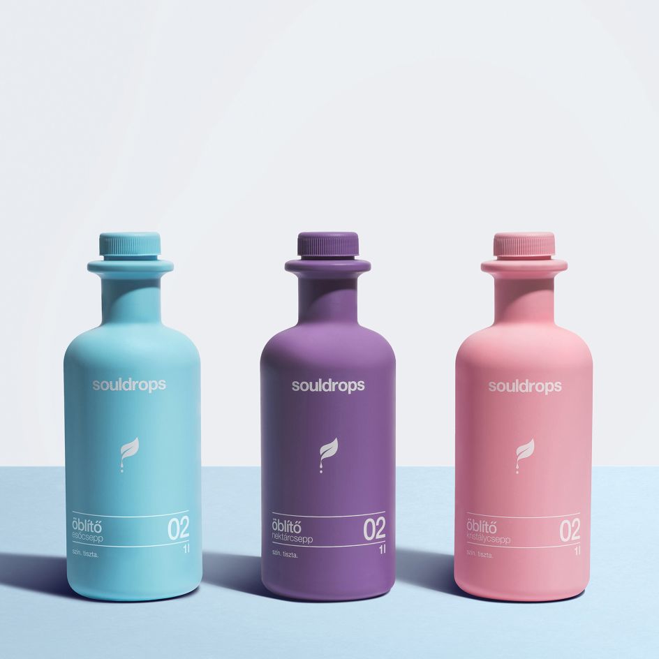
Souldrops Detergent by Réka Baranyi
5. Santaren Rum Bottle by Estudio Maba
A narrative design inspired by old engraving graphics, the packaging for Santaren rum suggests that the drink takes a long time to produce. That it's old and therefore full of feeling and history. Estudio Maba's packaging evokes a calm elegance of the distilling process as its amber hues contrast delicately with its lush textured label.
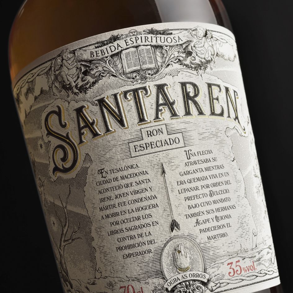
Santaren Rum packaging by Estudio Maba
6. Flo Alkaline Water by Matter Branding
"With water being an elemental part of existence, the main concept behind the brand is how nature comes to life with the nurturing quality of water, a quality that flows through every aspect via the cycle of life," explains Matter Branding of its packaging design for Flo Alkaline Water.
Matter adds: "We were approached to work on the creation of a premium brand for the only Alkaline water to be released in Egypt, with a brand name and design that are unique and strong enough to become the most aspirational, Egyptian, water brand in the market. With a modern, progressive and artistic persona, we set to work to create an intricate brand that conveys its values of being bold, sophisticated and vibrant."
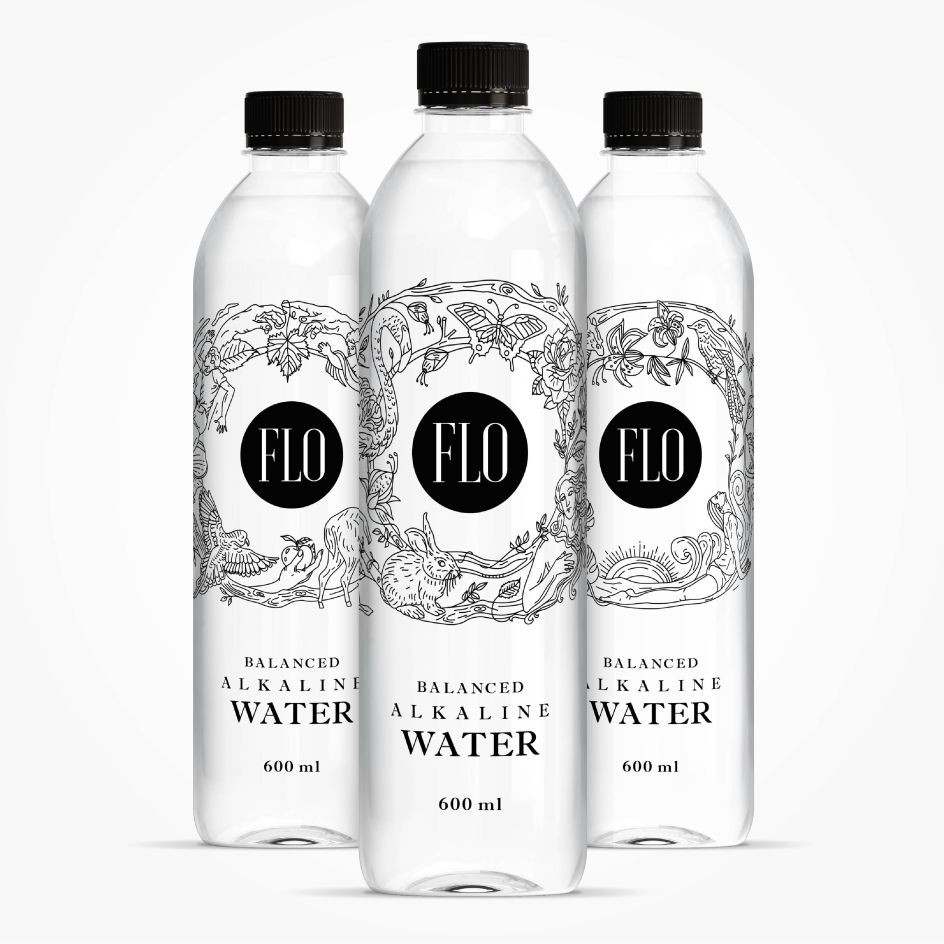
Flo Alkaline Water by Matter Branding
7. Licha Packaging by Uvisual
Licha, a local tea brand in Taiwan, is inspired by "the affection of gifts", emphasising the brand experience of "sweet quality, fresh mellowness and long lasting aftertaste". Licha has always worked closely with local tea farmers in Taiwan to source teas with a rich and full flavour and an enduring aftertaste. Its products include gift sets, teas and iced teas.
Uvisual's brand expands on the idea of sending gifts by creating western-styled sophistication, integrating the classic and the chic, and highlighting characteristics of different products with bright and colourful packaging, thus promoting the fine teas of Taiwan to the world.
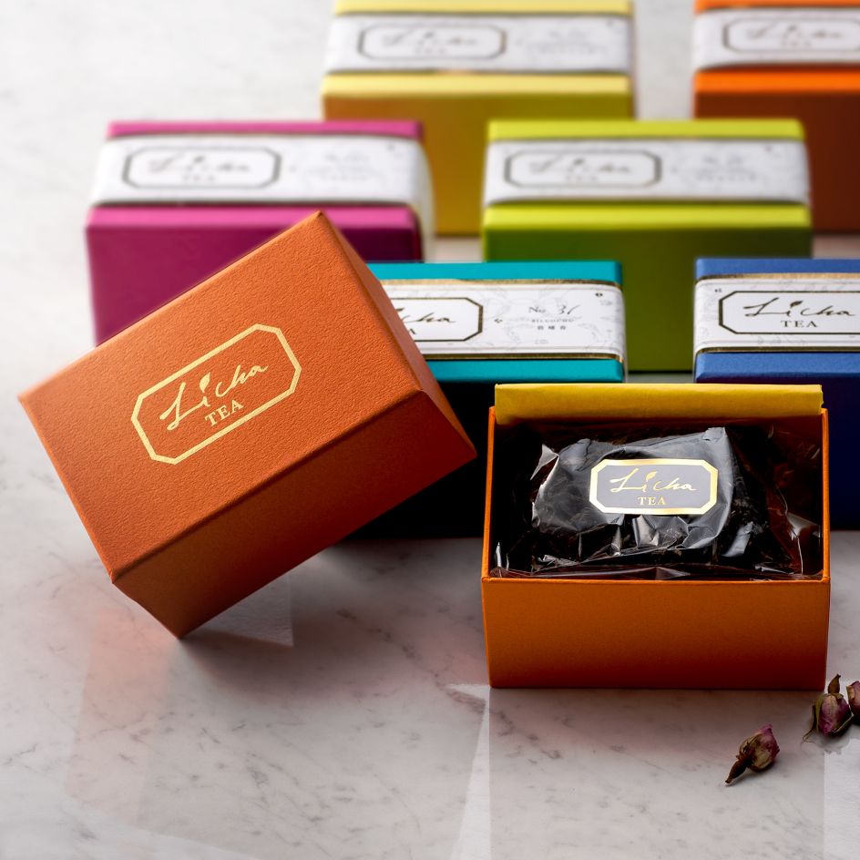
LiCha Packaging by Uvisual
8. Maker Oats brand packaging by PepsiCo Design
PepsiCo's brand packaging for Maker Oats was inspired by Scandinavian simplicity. The design language embraces simple geometry paired with clean iconography and san serif letterforms while also translating traditional premium cues into a modern interpretation.
Simple, natural, and high quality are the design principles the agency used to create the Maker brand. Black and white with an intense hit of colour. Simple iconography to communicate. A few little moments of delight to show you how thoughtful Maker Oats are.
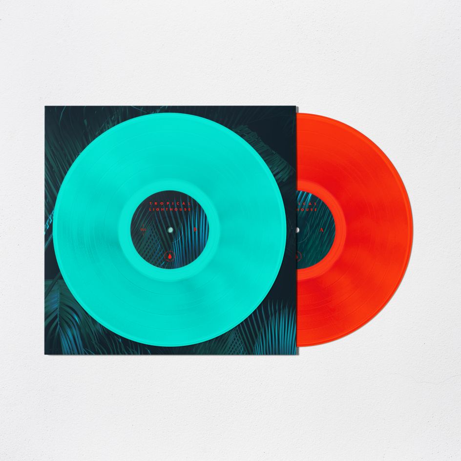
Tropical Lighthouse vinyl record by Robert Bazaev
9. Tropical Lighthouse vinyl record by Robert Bazaev
This project by Robert Bazaev was inspired by tunes and sounds of the tropical forest, and the main musical inspiration is oeuvre of the musician and artist Mtendere Mandowa famous under his stage name Teebs. His music contains special beats and vibrations combined with a light vibe of retro creating alien landscapes in imagination.
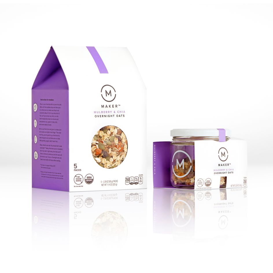
Maker Oats brand packaging by PepsiCo Design and Innovation
10. In The Mood for Coffee packaging by Salvita Bingelyte
"I immediately thought of monkeys since they are a common thread among the five coffee regions represented," says designer Salvita Bingelyte of her packaging for In The Mood for Coffee. "I was inspired by their expressions and behaviours, which seem to reflect their moods, much like us humans.
"By using monkey illustrations with expressions that reflect their mood, it creates an impressionable and long-lasting image, playful and a bit ironic, especially with a hat on their head."
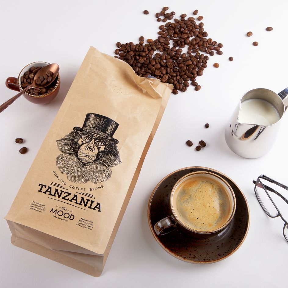
In The Mood for Coffee packaging by Salvita Bingelyte
11. Death by Chocolate by Alain Aebersold
We love this album artwork by Alain Aebersold for Death by Chocolate, a Swiss rock music band. Inspired by the album's name, Crooked for You, Alain wanted to work with a crooked and surreal landscape, as he explains: "I got a lot of inspiration from old science fiction illustrations of others worlds. Worlds with landscapes that aren't seen on earth, something special, and at the same time familiar.
"Another inspiration was all the iconic music artworks. Artworks like The Dark Side of the Moon from Pink Floyd or Unkown Pleasures from Joy Division. Something that sticks in people's heads. Something that becomes one with the music."
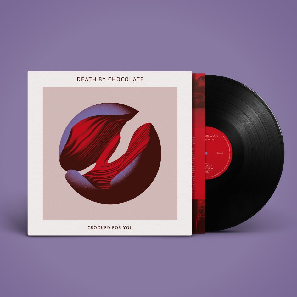
Death by Chocolate by Alain Aebersold
12. Calendar 2018 Puzzle by Katsumi Tamura
This clever 3D calendar is something you have to put together yourself. Designed by Katsumi Tamura, it's a puzzle that becomes a useful tool as well as an attractive desk accessory.
"I think it's wonderful if there is a calendar that's like a toy," Katsumi explains. "Users can change the form freely and make various forms: waterwheel, car, and original object. The puzzle is a calendar consisting of various pieces in circle, triangle and square shapes. Play with the colourful, patterned pieces and put them together any way you like."
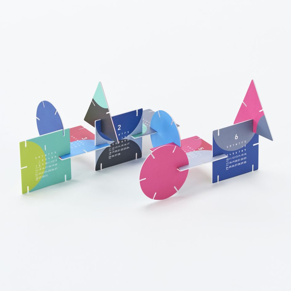
Calendar 2018 Puzzle by Katsumi Tamura
13. Mangata Patisserie Bakery visual identity by M — N Associates
As Mangata Patisserie launched to become one of the most luxury bakeries in Saigon, serving beautifully designed cakes to a sophisticated audience, M — N Associates was appointed to create an identity to reflect its high-tea concept. "The owner has been wandering, researching and studying for a long time in French and Belgium to find exclusive recipes," says the Saigon consultancy.
"Endorsing the minimal lifestyle of Northern Europe, the name is chosen for its unique meaning, a feeling for falling in love, romantic and delight, like a beautiful novel, a love song, something comes without thoughts but from the bottom of hearts."
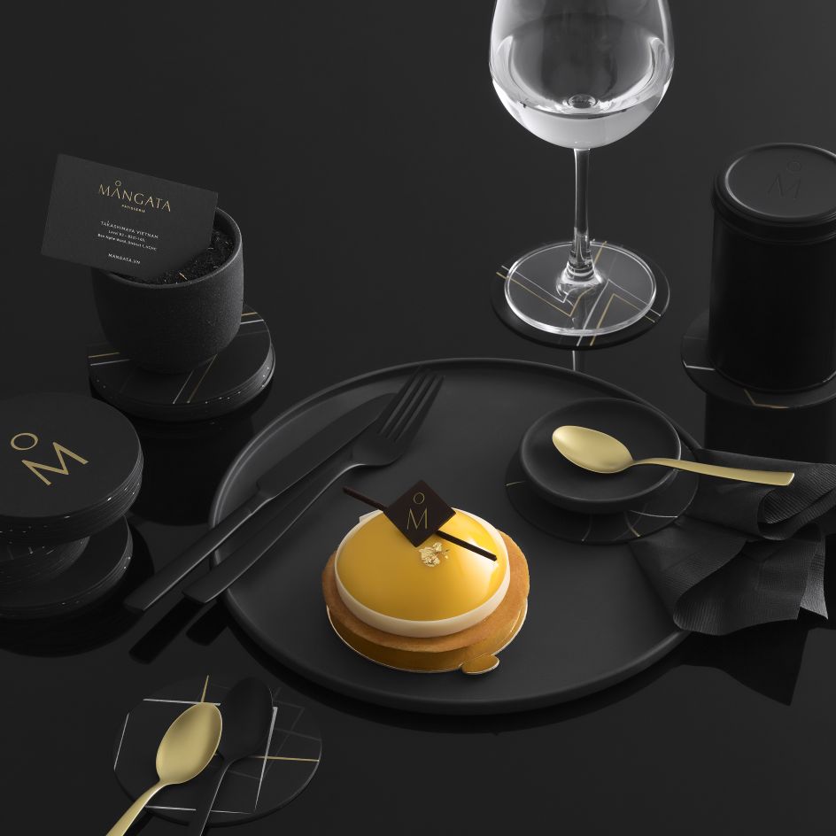
Mangata Patisserie Bakery visual identity by M — N Associates
14. Way of Knowledge book design by Yuta Takahashi
Inspired by the designs of cloisters and leather bound bibles found in churches and the images of "doors we imagine when we visualise the human thought process", Yuta Takahashi combined these concepts for his book design for Way of Knowledge and the Holy Spirit, written by Michael Debus.
As the likely readers are researchers and people well versed in their fields, Yuta also took inspiration from the writing implements and notebooks they might use.
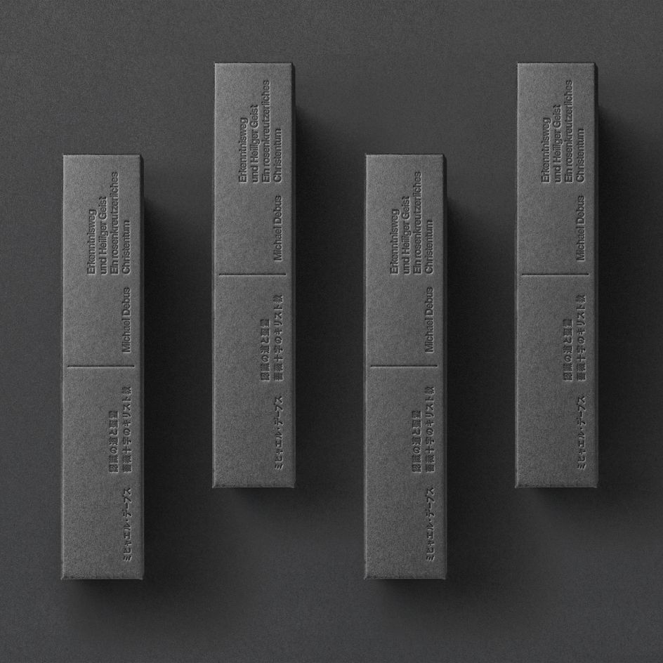
Way of Knowledge book design by Yuta Takahashi
15. Tri-leg calendar by Katsumi Tamura
Another great 3D calendar by Katsumi Tamura, this time focusing on a more minimalist design. The Tri-leg is made up of three-legged units. "By assembling the triangular pieces and stacking them so they are easily visible, you can create a beautiful work of calendar art," explains Katsumi.
"Quality designs have the power to modify space and transform the minds of its users. They offer the comfort of seeing, holding and using. They are imbued with lightness and an element of surprise, enriching space."
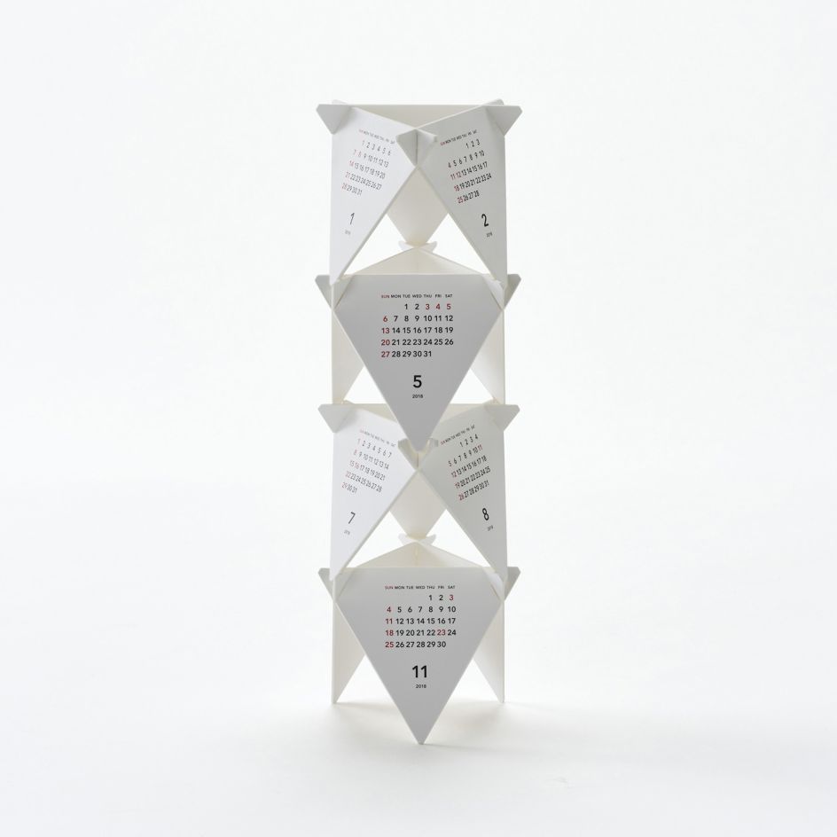
Tri-leg calendar by Katsumi Tamura
16. Different Everyday by Bao Xiying
Bao Xiying's unusual dot-to-dot calendar is a clever concept: as each day passes, you can join the dots until, at the end of each month, you have drawn a completed building. Each month stems from the buildings in Tongji University in Shanghai, China.
"I deeply admire the modern and unique architectural style on campus and I can often be inspired by the academic atmosphere and interaction created by these buildings," says Bao. "Tongji University is celebrating its 110th anniversary in 2017, which is why this calendar is designed exclusively."
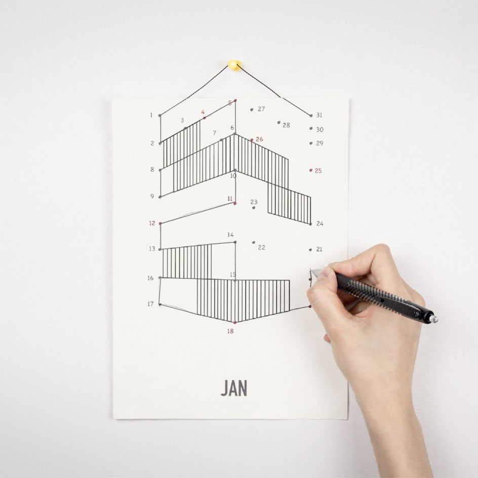
Different Everyday by Bao Xiying
17. Anti-Glitch Foundation by André Arruda at Papanapa
Anti-Glitch Foundation is a post-production company which approached Brazilian studio, Papanapa, to develop its new visual identity. It wanted the new brand to represent the technological, creative and automated process behind its services.
"Our research and exploration process lead us to a rich visual universe inspired by the 8-bit language; the incomprehension and inconsistency left by glitches, and the half-tones present on low-res technology," says designer André Arruda.
"We also incorporated many film structures' concepts such as fragments, montage, exaggeration and conflict, as the fundamental basis for the entire visual system, increasing the narrative within the brand.
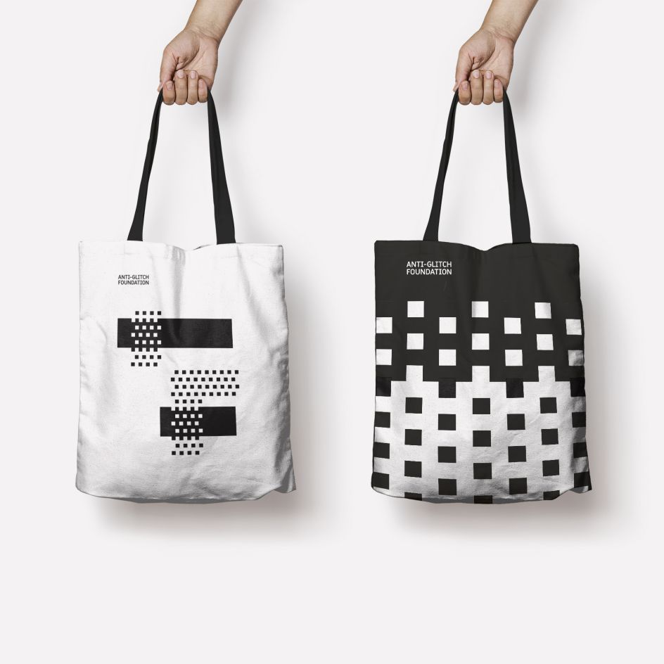
Anti-Glitch Foundation by André Arruda at Papanapa
18. Haymarket brand identity by 25AH Design Studio
For Haymarket, a Scandinavian luxury hotel based in Stockholm, 25AH were inspired by the building's strong history and by the 1920’s art deco movement. "Our objective was to create an identity that felt natural at the same time as it was unexpected. We, therefore, created the concept 'Greta Garbo meets Lady Gaga' which we used as our strategic tool when creating the brand identity."
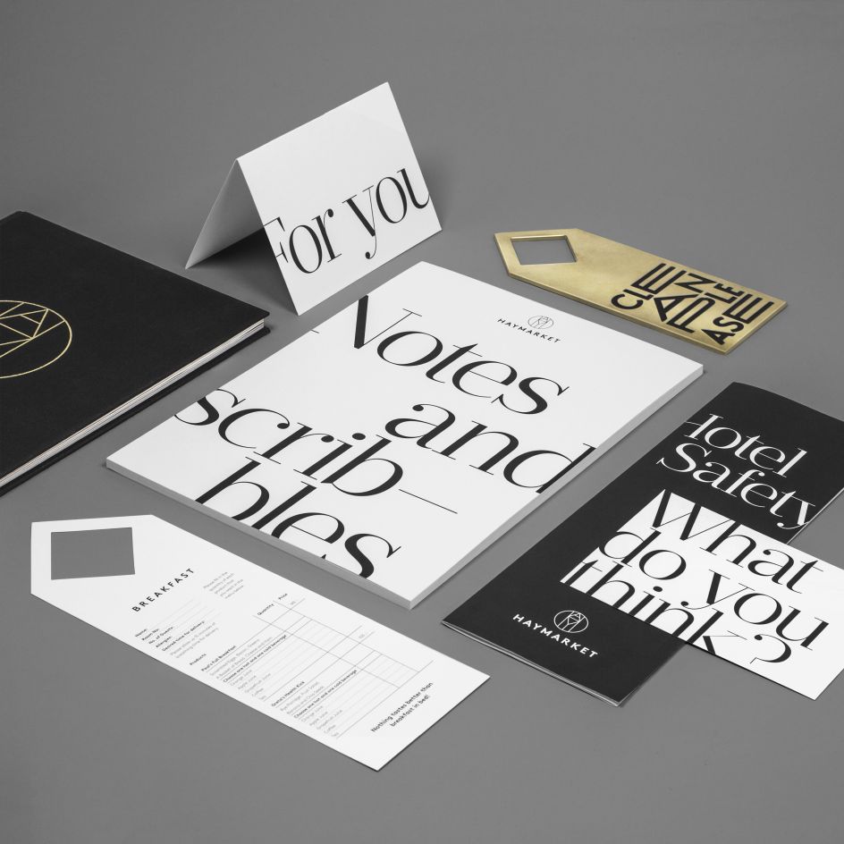
Haymarket brand identity by 25AH Design Studio
19. SAHB Poster by Naoyuki Fukumoto
Naoyuki Fukumoto created this wonderful poster design for Space, Art & Human Body, an exhibition at the Tokyo University of the Arts in the Faculty of Fine Arts.
"In order to appeal directly to the concept of this exhibition, I superimposed a double image of the astronaut and Vitruvius. Astronauts are symbols of 'Universe', Vitruvius is the symbol of 'Art' and 'Human Body'," Naoyuki explains.
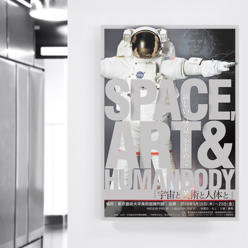
SAHB Poster by Naoyuki Fukumoto
20. Watson Vegan Truck by Donovan Bernini
Donovan Bernini's visual identity for Watson Vegan Truck is inspired by fast food trends but also from ancient craft store signs which used capital lettering fonts. Because the brand's unique selling point was based on organic food and a premium offering, the identity used a dominant pastel green colour and a refined graphic design.
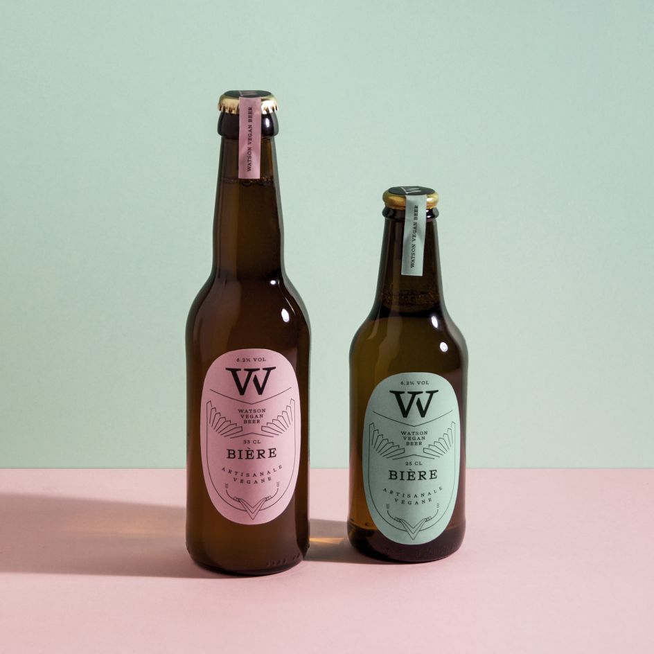
Watson Vegan Truck by Donovan Bernini
If you want to submit your work and enter the 2018 A' Design Awards, you have to register online and follow the simple instructions. Entries will be judged by an international panel of over 200 leading designers, prominent academics and influential members of the press.
If you win the coveted prize, you'll get special treatment with lots of publicity, an award trophy and certificate, a gala night of celebrations at Lake Como in Italy (with the chance to network with the best in the industry) and inclusion in an exhibition for all the winners. You'll even be included in a special edition, hardback yearbook of published works.
Of course, we don't need to remind you that awards are an excellent way to showcase your skills and expertise. They add that extra layer of credibility, proving to potential clients that you're worthy of their attention. Winning an A' Design Award also means you can add its logo to your website and marketing materials for life.
Deadline is 30 September 2018 and winners will be announced on 15 April 2019 (watch this space, as we'll be sharing them on Creative Boom too). To find out more about the A' Design Awards, visit whatisadesignaward.com.


 by Tüpokompanii](https://www.creativeboom.com/upload/articles/58/58684538770fb5b428dc1882f7a732f153500153_732.jpg)


 using <a href="https://www.ohnotype.co/fonts/obviously" target="_blank">Obviously</a> by Oh No Type Co., Art Director, Brand & Creative—Spotify](https://www.creativeboom.com/upload/articles/6e/6ed31eddc26fa563f213fc76d6993dab9231ffe4_732.jpg)


