Five things that most impress D&AD Judges
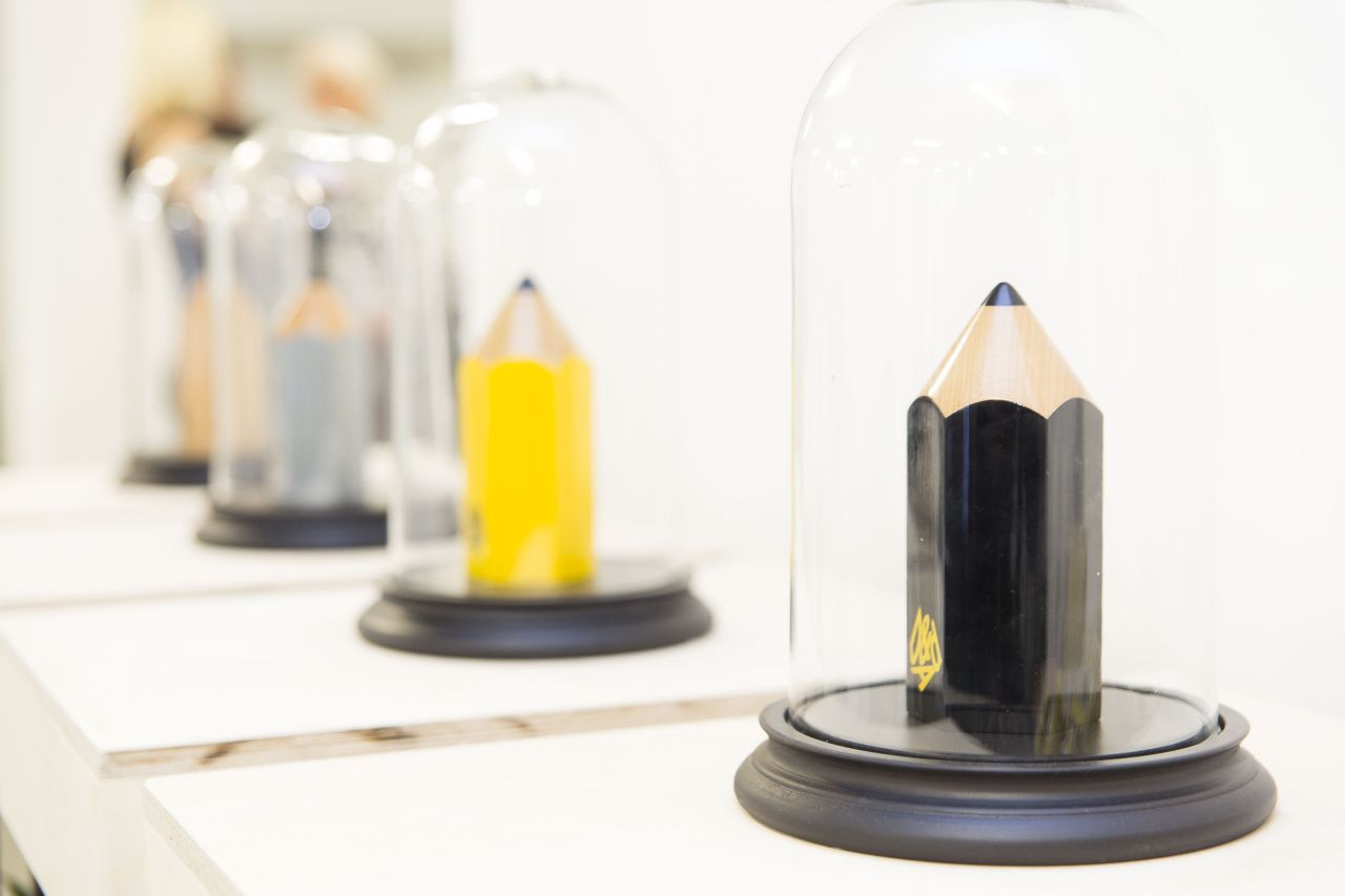
This week saw one of the biggest events in the design and ad-land calendars: the announcement of the projects that have received a prestigious D&AD pencil.
All images courtesy of D&AD
As well as being a handy bookend and a client-impressing studio ornament, these awards signify that an agency or creative has made a piece of work that has stood out from hundreds of others. Perhaps it was nominated for the sheer skill behind its craft, its harnessing of new technology in a truly effective way for a campaign, or for its capacity to engineer positive social or environmental change.
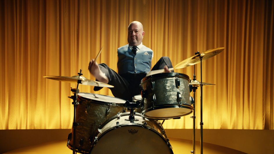
In total, 732 Pencils have been awarded this year, with five Black Pencils – the highest accolade – dished out. Two of these deservedly went to ‘We’re the Superhumans’ by 4Creative and Blink for Channel 4/Paralympics, with the other three going to Meet Graham’ by Clemenger BBDO Melbourne for Transport Accident Commission Victoria, The Swedish Number’ by INGO Stockholm for The Swedish Tourist Association, and ‘DOT. The first Braille Smartwatch’ by Serviceplan/Serviceplan Korea for Dot Incorporation.
The projects are a varied bunch, chosen from categories as diverse as Direct, Digital Design, PR, and Film Advertising.
So what makes a project a winning one? What are the judges looking for?
1. Bravery
The Skittles campaign for last year’s Pride event in London exemplified a client willing to take a risk and made it a standout piece of work for R/GA London’s Integrated Executive Creative Director, Rodrigo Sobral, one of the judges of the Art Direction category. Created by adam&eveDDB, the campaign saw Skittles shed its famous "rainbow" and give it over to the LGBT+ event: as the voiceover explains, "…this Pride, only one rainbow deserves to be the centre of attention—yours."
The Skittles packaging was reduced to only black and white, and even the candies themselves lost their colouring and briefly became plain little white dragées. "They’re playing with the most important part of the product, and it makes for a powerful emotional connection with the brand," says Sobral.
"Whenever you have an idea that makes everyone uncomfortable, stick to it. You know you’re breaking new ground."
2. Harnessing new technologies, when they’re relevant
Deft handling of the latest digital wizardry might look impressive, but it’s no use unless it’s relevant to, and actively enhances, the project in hand. In his judging of the Crafts in Advertising category, Chief Creative Officer of Americas at Havas Worldwide Toygar Bazarkaya deemed The Webby Awards Type Voice site to do just that. Created by Ogilvy New York, the site invited users to speak into their device and would design type spelling their vocal messages according to their voice. It reacted to pitch, tone, and the speed of the vocal delivery to form different letterforms and styles, and users could then share their typographic creations online.
"We’re seeing something you couldn’t have seen five years ago," says Bazarkaya. "It showed an attention to detail, and obsessiveness and relentlessness.” Crucially, the execution was completely relevant to the aim of the campaign: “The idea at its core is that it’s ‘the voice of the people,’ and the fact it’s promoting something that’s integrated into the work itself is brilliant."
3. Emotional Connections
"When we were judging, something we often asked ourselves was ‘does this bring you joy?’" says Victoria Talbot, creative director of Human After All of her time on the Crafts for Design panel. As well as being ruthless about the technical execution of elements like the graphics and typographic design, she looked for something that affected her on a more emotional level.
That’s why Through The Dark, an interactive music video for Hilltop Hoods caught her eye. Released through Google Play Music and created by R/GA Sydney, Talbot says the poignant animation managed to reduce a room full of hardened, cynical creatives almost to tears. "It wasn’t just something new, but something beautifully executed,” she says. “It’s a music video that does something very different from what you’d expect a music video to do. It gave me goosebumps."
4. Don’t worry about being "cool"
If you’re reading this, you’re likely involved in the creative industries in some capacity, or at least have more than a passing interest in them. So it’s worth remembering that the majority of the projects D&AD celebrates weren’t designed for designers; they were intended for the consumers or users the client wants to reach. Such audiences are less jaded than us; and less likely to sigh in despair at over-used design trends (script hand-rendered type, for instance; or illustrations of moustaches).
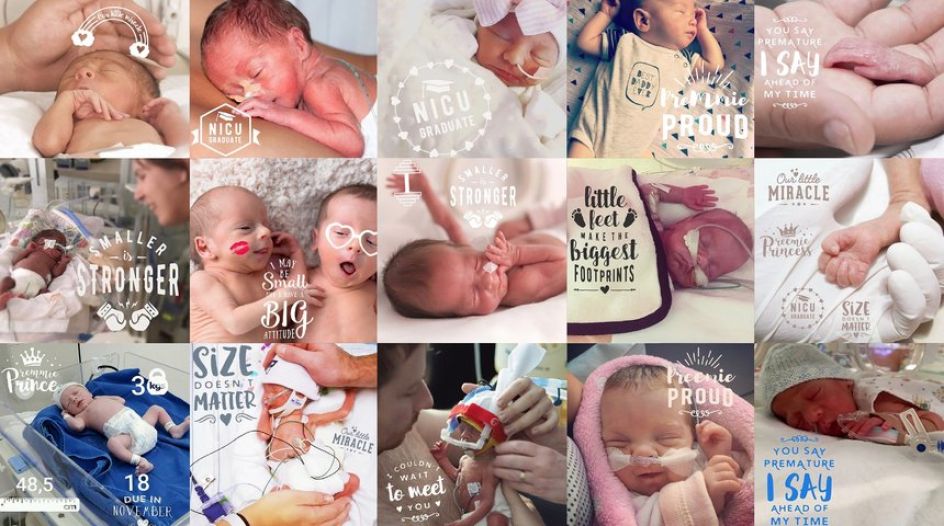
As such, the value of a campaign or piece of design lies in how well it affects a change or improves the lives of its users. That’s what pushed through the Premmie Proud app for Writing for Design judge Elise Valmorbida, a writer and founder of word-design.
The app was designed by BWM Dentsu Sydney for BabyLove and looked to help parents of premature babies share the news of their new arrival in the same way as those of full-term babies would across social media. As Valmorbida points out, good design isn’t always about being “cool.” She says: "It’s sincere and non-jaded, and that’s truly impressive. It’s something that feels like empowerment."
5. Creativity for Good
According to D&AD CEO Tim Lindsay, what unites the Black Pencil-winning projects “is a clear desire to create a better world, whether it’s promoting diversity, safety or inclusivity but what is fantastic is that they win this coveted award for their craft. Proof that creativity as a force for good lives outside of a single category but has become an all-encompassing theme.”
Sobral agrees: "Design and advertising aren’t just used to sell. We have a responsibility to use our ideas to have a positive impact and improve people’s lives."


 by Tüpokompanii](https://www.creativeboom.com/upload/articles/58/58684538770fb5b428dc1882f7a732f153500153_732.jpg)


 using <a href="https://www.ohnotype.co/fonts/obviously" target="_blank">Obviously</a> by Oh No Type Co., Art Director, Brand & Creative—Spotify](https://www.creativeboom.com/upload/articles/6e/6ed31eddc26fa563f213fc76d6993dab9231ffe4_732.jpg)


](https://www.creativeboom.com/upload/articles/0c/0c4eb84a3d8112c994a45f84e88a9629563248da_732.jpeg)

](https://www.creativeboom.com/upload/articles/83/83fd4b3c88204af628d58ea896dc7585d7806b5f_732.jpeg)

