Five great examples of About pages and how to create your own enticing profile
Your website is the shop window for your business, so it has to be good. What steps can you take to improve it? If you're short of time, consider concentrating on your About page.

Image licensed via Adobe Stock
It's one of the most important aspects of your online portfolio. Potential clients want to know if you're the right person for the job, after all, and that decision can be made in as little as a few seconds.
First, we'll share five excellent examples of About pages that we love and then we'll go through how to create your own version. If you've got a spare minute today, read our tips and then take action to boost your chances of turning clicks into clients.
Great examples of About pages
1. ToyFight
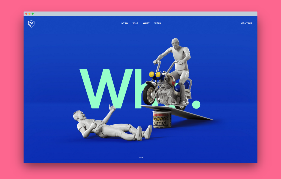
We love this cheeky website by Manchester studio, ToyFight. Bursting with personality and a healthy dash of humour, it's fun without being too OTT. The digital self-portrait characters, or "toys", are dotted throughout the entire website, and they come alive on the About page. It's ok not to take yourself too seriously, but it has to make sense to your brand. (Did you spot the clever mick-take on the homepage?)
2. Eight Hour Day
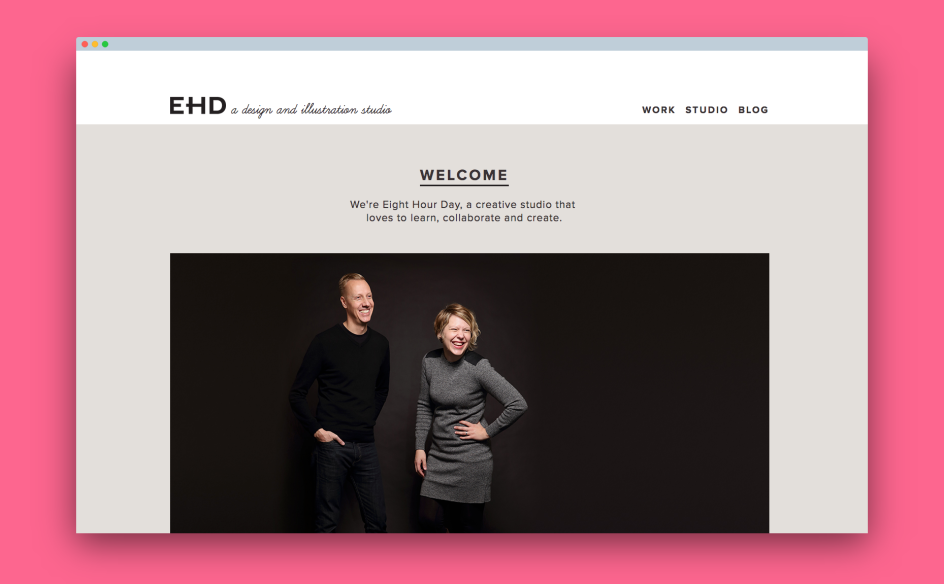
We love the honest, straightforward and friendly charm of Eight Hour Day's About page. It has everything to give the impression of credibility, trust and experience. You instantly want to hire them. They get straight to it in their introduction: "Hi! We are Nathan Strandberg and Katie Kirk, two individuals with a passion for creativity — creativity makes us happy."
They're not shy about who they are or how small their business is; they're just open. And that's hugely appealing. It instantly shows the human side of their studio. It helps that they have a great opening one-liner: "We're Eight Hour Day, a creative studio that loves to learn, collaborate and create." Speaking of collaboration, that's a definite theme running throughout their entire website. They know who they are, what they do, and who they want to work with.
3. Malika Favre
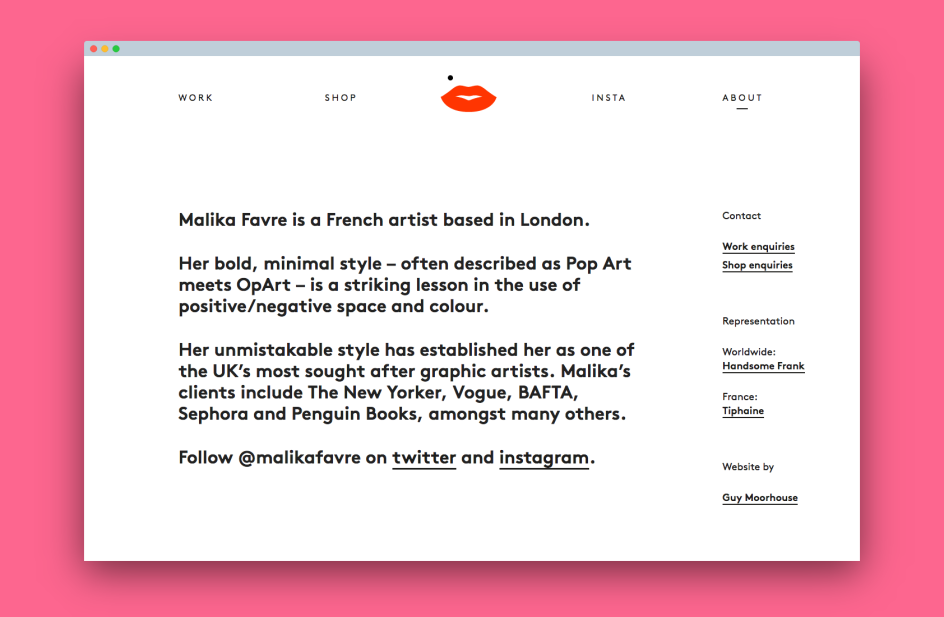
Don't overthink it. A great About page can get straight to the point without any waffle. Add a degree of mystery, perhaps. It's why we love sharing French artist Malika Favre's profile. It's clean, minimalist and gets straight to it. I suppose you can do that once you're one of the most sought-after illustrators on the planet, but we use it as an example here to show you the beauty (and power) of highlighting your best possible attributes with as little copy as possible.
4. Handsome
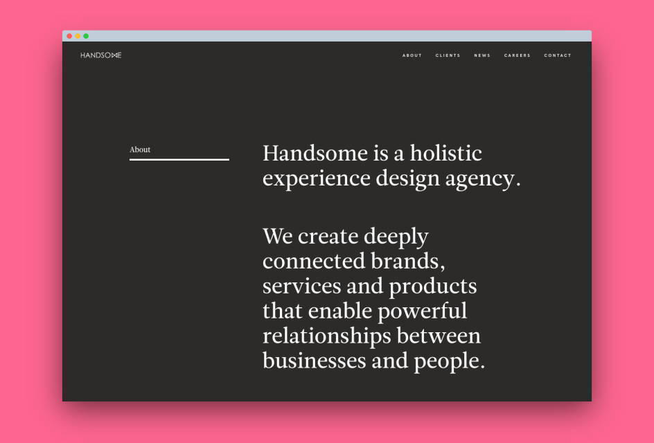
Clean and straightforward, Austin, Texas agency Handsome has an About page that focuses purely on words. With an elegant typographic-led design, it relies on what it says and avoids any use of imagery – something we wouldn't normally advise, but it works perfectly here. It suits their brand and who they are. It focuses on lots of persuasive content – their process, how they make a difference. And it even includes a list of their services for an extra dash of credibility. It just works.
5. Mixd
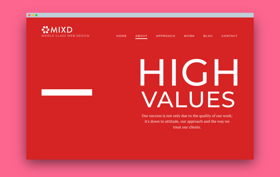
"Our success is not only due to the quality of our work; it's down to attitude, our approach and the way we treat our clients." – The opening line on this Leeds agency's About page is enough to convince us to scroll down and discover more. And when we do, we're delighted to see that this seriously beautiful intro line resonates with everything they do. This company seems legit, friendly and honest. We like them. Instantly. We especially love the team photographs and descriptions – particularly Jason Hobbs and his fantastic hair.
How to create an awesome About page
Now we've given you a nice mix of inspiration; it's time to consider your own About page. The following tips will help you create or improve your own. Bear in mind that this isn't a one-off job; you should continuously track conversions to see if further improvements need to be made.
1. Consider the whole point of an About page
About pages tend to be underestimated. A mere after-thought. Something that you cobble together after you've sorted the rest of your website. But really, the About page is the most important aspect. It's your biggest selling opportunity – a chance to make an excellent first impression. It should answer that all-important question: why should someone hire you?
Before you make or improve your own, you should consider the purpose of an About page. Why it even exists in the first place. Its goal is to:
- Tell your story and why you do what you do
- Describe the type of clients that you work for
- Show the "real" side of your business, featuring yourself or your team
- Include things that inspire trust and credibility
- Persuade potential clients to choose you over anyone else.
Once you understand why an About page is so much more than a digital CV, you'll begin to see what you need to pull together.
2. Know thy audience
Before you even begin to create your About page, you have to know who you're targeting. A freelance designer, for example, might be talking to agencies while a small studio could be attracting marketing managers of SMEs. You might be aiming for both.
Consider your audience and think about their wants and desires. Why would they click on your website? Because you'll need to understand them if you want to make a connection.
Knowing who you're talking to will also define the kind of copy you write and what you put on your About page. If you're not sure or want to target as many people as possible, then keep it simple. Avoid the jargon, stick to the facts and try to add a conversational style to your copy. Imagine you're down the pub with a close friend. How would you describe who you are and what you do to them? By writing as though you're talking to an individual – rather than a company – you'll avoid the trap of formal copy and instead come across as friendly and authentic.
And if you want to do a little more research, consider your existing clients. If you've got a good relationship with them, ask them why they chose you, why they liked your website. Even ask family and friends. The more insight you have to play with, the better.
3. Consider your passion
Every great website has a purpose, a running theme – if you will. What's the whole point of your own business? What's that thing that drives you to get out of bed every morning? Why are you doing this?
You need a mission to help tell your own story – something you keep referring back to, not just on your About page, but throughout your entire website. Eight Hour Day do this well. They always talk about collaboration and working in partnership with their clients to understand their business while Handsome is all about creating "deeply, connected brands" – something that resonates throughout its website.
That running theme makes it clear what you're about, and the consistency inspires trust (more on this later) as you repeat your mission throughout your entire website.
4. Get straight to the point with a killer intro
What is it that sets you apart from the rest? How can you make a difference to any brand? Why should anyone hire you over anyone else? The very first line of copy on your About page should be your most enticing. It also happens to be the most challenging thing to write.
Although writing your welcoming intro can be overwhelming, our tip is to start writing. Don't worry about the number of words at this stage – just type.
Write as much as you want. Aim for three solid paragraphs about you. Consider answering these questions. Who are you? What do you do? Where do you do it? How do you do it? Get it all out onto your screen. Don't overthink it.
Once you've got your first draft, have a break and let yourself process everything. Give the brain a rest, and when you next sit down at your desk, you'll be ready to edit that first draft and make it even better. Keep repeating this process until you get it right.
Eventually, you'll see a structure emerging. You'll spot patterns, and your intro line will reveal itself. Keep drafting and re-drafting until you've got that killer line.
5. Inspire trust and credibility
Gaining trust and credibility from your About page is super important. It can make or break whether someone gets in touch.
One of the things we love about Eight Hour Day is their instant appeal. They have a super simple intro that gets straight to their company mission. They have a high-quality photograph of the two of them, laughing and looking happy. The only copy on their page is less than 200 words long and, again, it gets straight to the point. It avoids any corporate bullsh*t. It's simple, honest and inspires trust. Further credibility is achieved by their simple list of clients that they've worked for, not to mention the lovely shot of their studio.
Have you got a decent profile pic? Hire a photographer and get some professional shots immediately. Who are your clients? Add their names to your About page. Have you won any awards? Add those too. How about your social media profiles? Or any media coverage?
Bottom line, what extra touches can you add to say to a potential client, "pick me! I'm trustworthy" and convince them to pick up the phone?
6. Add some personality
Remember you're talking to another human. You don't have to rely on corporate jargon or add loads of unnecessary adjectives to describe how wonderful you are. Cut the bull and be yourself. People are turned off by pretension and stuffiness. They want real. They want personality.
This is why we love ToyFight. They stand out because their own characters are leaping from their About page. From the toys that represent themselves to the doses of humour dotted throughout, you can tell these people don't take themselves seriously. And it's appealing. They've ditched the usual "template" About page and have made something unique.
What's unique about you? What makes you different? How can your About page reveal more of your personality? You don't have to go crazy. A few dashes here and there is all it takes.
7. Don't forget to add a call to action
Remember that your web visitor is on a journey. They searched for a "freelance designer in Manchester", they found you and they were inspired to read your About page. Now what? You need to help them along their way by giving them a handy "next step".
Perhaps you can add your social media accounts or encourage them to sign up to your newsletter? Read your latest blog or check out your most recent projects? Or what about a simple "get in touch" at the bottom of your About page?
To conclude
Ok, let's wrap things up. If you want to craft your killer About page and inspire potential clients to contact and hire you, then you have to sort the following:
- Always keep in mind the purpose of an About page: to sell, sell, sell!
- Consider your audience: who are you targeting? What are their problems that you can solve?
- What's your passion? Every credible website has a running theme, a purpose. What's yours?
- Every great About page has a killer welcoming line – take your time to perfect your own!
- Inspire trust and credibility to persuade visitors that you're the real deal and worthy of their time.
- Don't forget to add the human touch. Add your personality to make a connection.
- Add a call to action to take visitors on a journey to "checkout", i.e. to get in touch and enquire.
So the next time you have a spare morning – when your brain is refreshed and ready for action – consider your own About page. Is it something you're proud of? Does it include all of the above? Would you want to hire you?


 by Tüpokompanii](https://www.creativeboom.com/upload/articles/58/58684538770fb5b428dc1882f7a732f153500153_732.jpg)

 using <a href="https://www.ohnotype.co/fonts/obviously" target="_blank">Obviously</a> by Oh No Type Co., Art Director, Brand & Creative—Spotify](https://www.creativeboom.com/upload/articles/6e/6ed31eddc26fa563f213fc76d6993dab9231ffe4_732.jpg)


