How to stand out from the crowd and win creative industry awards
For our latest tips articles, we're calling on the expertise of the industry. For our first area of focus, we'll be taking a look at what's won creative awards this year and what creatives can learn from it, thanks to the help of Asa Cook, Creative Director at Design Bridge.

Image licensed via Adobe Stock
Another creative awards season has come and gone, with lots of brilliant work being celebrated from a diverse range of agencies and clients.
Along with some of my fellow Design Bridge creative directors, I've been on various judging panels in recent years, and I've noticed a shift in the industry in terms of what judges are looking for.
One of the main observations is that brands, both big and small, are being awarded when they take risks. This has been led by start-ups and smaller businesses that can often afford to take the biggest chances, such as Magpie's disruptive (and already iconic) branding for Bandido coffee and B&B Studio's minimal design for Lone Wolf vodka.
But the bigger players are also being awarded for risk-taking too, such as "BEANZ MEANZ HEINZ" by JKR and the Lacoste "Save our species" campaign by BETC Paris, both of which removed key brand assets from their packaging yet remained recognisably on-brand.
Another observation is the continuing rise of film, both as a part of brand campaigns and awards entries. It felt like most of the awarded entries had accompanying films this year. A great film can indeed be a compelling way of adding context and expressing the creative idea to a judging panel.
But while film should be celebrated and encouraged, as the people judging these entries, I think we need to be careful not to move to a place where only campaigns with multiple touchpoints or the need for a video explainer are considered award-worthy.
We need to find ways to judge these projects fairly alongside brilliant one-off pieces of graphic design or standalone pieces of packaging and ensure that we're judging the creative work and execution itself, not just the impact of the film that accompanies it.
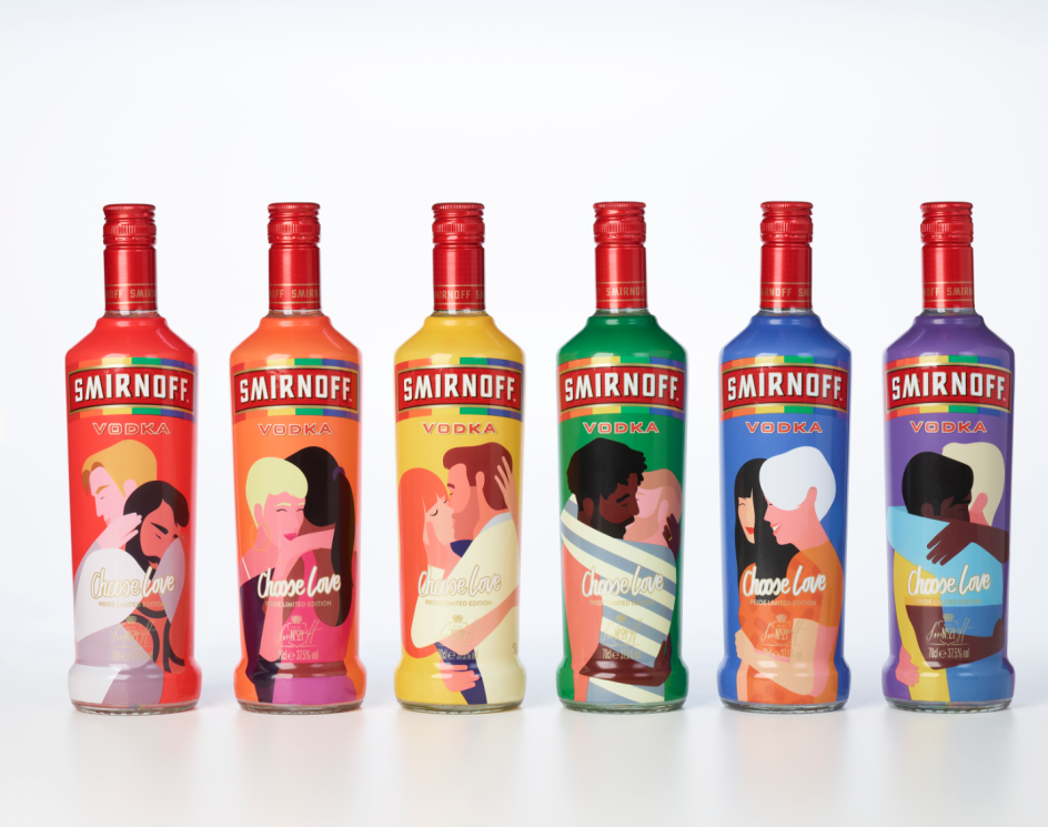
Smirnoff – Choose Love
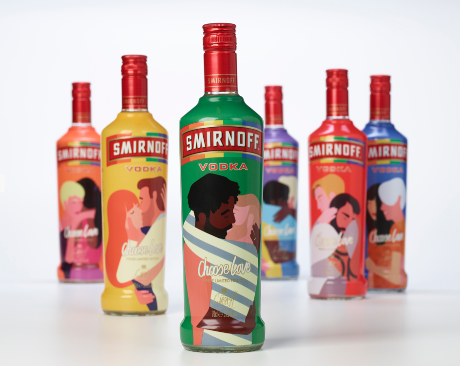
Smirnoff – Choose Love
These discussions got me thinking more broadly about judging criteria in design awards, and how they might be changing. For example, another popular topic of conversation among panels was how much consideration should be placed on a design project's success on social media. Questions I heard from fellow judges this year were things like, "Did they blog about it?", How many likes did it get?" and "Did it go viral?"
While the popularity and shareability of a piece of creative work are important factors in considering its merits and the impact it has made, I don't believe they should be the driving force. After all, a campaign might have gone viral for the wrong reasons and may actually have detracted from a brand's reputation.
At that point, might we be awarding design based on how many shares it had, for better or worse, rather than on its design merits? What about the brilliant design projects that didn't get social media traction but are impeccably well crafted and executed?
It's an interesting dilemma that's emerging. It left me wondering if shareability/social media/viral credentials need their category or at least a more uniform way of being judged across the board. After all, it's not always easy to quantify how much a project was shared, nor the impact it has on a client's business.
Our Smirnoff Choose Love design, for example, was shared on Instagram and Twitter. A lot. But for us, the positive, inclusive message delivered by our clients, who replaced the Smirnoff 21 design with these bold, provocative and celebratory bottles in all Tesco stores during Pride 2017, was far more important than how much it was shared on social media. That said, there was a positive impact on sales, and it also helped us become joint Design Agency of the Year at FAB Awards.
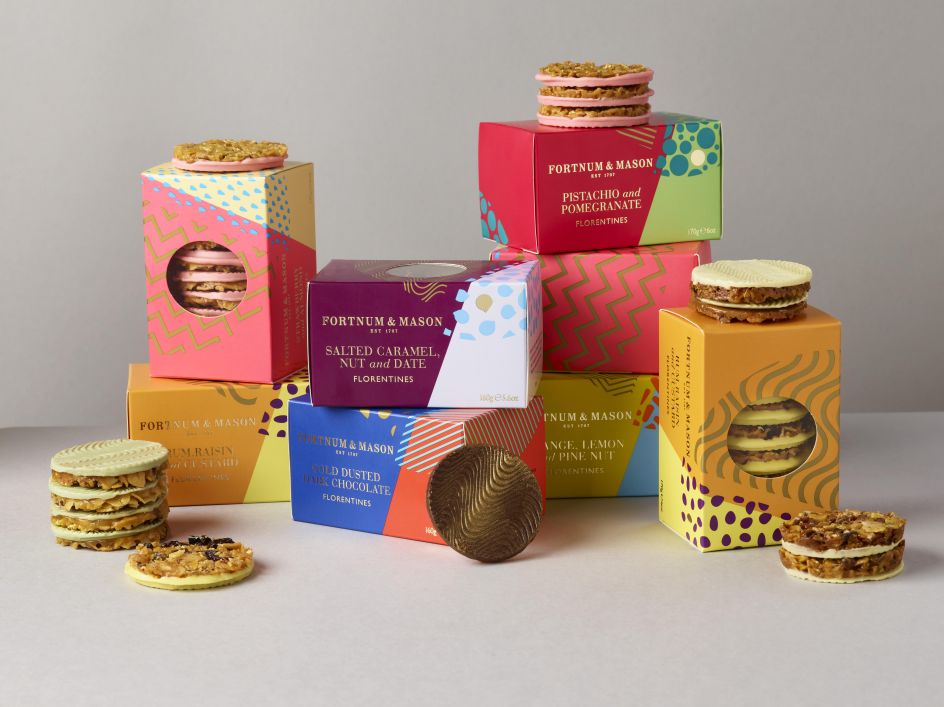
Fortnum and Mason Florentines
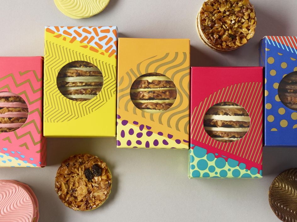
Fortnum and Mason Florentines
I was left scratching my head at The Archaeologist that was awarded at Cannes this year. This was the €1,000 bottle of gin that is made from steeping the spirit with old Harley Davidson engine parts. The film they made to tell the story was incredibly well made, and the bizarreness of the product no doubt caused a storm on social media. But I'm not convinced that the actual design stood up against other design projects in the category. And after all of that, did anyone buy it?
At the other end of the spectrum, Studio Sutherland's award-winning work for Start-Rite does an excellent job at what it's supposed to do - a contemporary refresh of a heritage shoe brand; bold, unique and emotionally engaging. It's easy to see the idea of the serifs on the lettering as just a witty visual idea.
But I think the genius of this work is that it's the perfect expression of the idea "Keep Exploring", so the humanised lettering is not just appealing for children, it's also aspirational for parents who want their children to begin to discover their independence.
The posters build on this by expressing the same idea entirely differently. This shows that awards judges are looking for depth of thought and meaning, not just that 'smile in mind' moment.
Our work for Fortnum and Mason Florentines picked up awards this year for the same reason. At first glance, the patterns feel like an expression of the flavours of the biscuits. But the hidden story is the transformational effect that Italian fashion had on mid-century London – the home of the famous store and the provenance of the biscuits all rolled into one neat visual thought.
Ultimately, creative awards should celebrate the power of a great idea and an excellent execution. As the media landscape continues to shift and develop, judging panels and juries need to be clear, than ever before, about what their collective criteria is to ensure that this remains the case.
Asa Cook joined Design Bridge in 2002 with a first-class honours degree from the University of Northumbria at Newcastle. Since starting as a Junior Designer, he progressed through each role to become Creative Director in 2012. Asa has won 28 internationally recognised design awards at Design Bridge across a broad range of brands, including Tate & Lyle sugars, Unilever spreads, and Smirnoff vodka.


 by Tüpokompanii](https://www.creativeboom.com/upload/articles/58/58684538770fb5b428dc1882f7a732f153500153_732.jpg)


 using <a href="https://www.ohnotype.co/fonts/obviously" target="_blank">Obviously</a> by Oh No Type Co., Art Director, Brand & Creative—Spotify](https://www.creativeboom.com/upload/articles/6e/6ed31eddc26fa563f213fc76d6993dab9231ffe4_732.jpg)


