Instantly improve your graphic design portfolio with these expert tips
Are you seeking your dream graphic design job? Or looking to land that freelance gig? Then ask yourself: is your current portfolio all it could be?

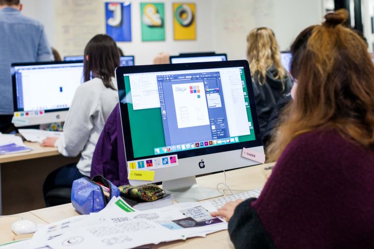
Image courtesy of Shillington
Perhaps a little bit of extra effort is all you need to raise your portfolio to new heights. But where do you start?
To help you out, we asked some of Shillington's teachers and graduates to share their top tips for revamping an existing graphic design portfolio. Any graphic designer looking to give their portfolio an instant boost needs to read on now.
1. Get ruthless with editing
A common mistake, that's made particularly often by recent graduates, is to include too much work. But when it comes to a portfolio, less is more; so be ruthless, and only include the very best work you have.
As Shanti Sparrow, head of teaching at Shillington New York points out: "You are only as good as your worst project, so you must learn to edit and let go. By including projects of varying quality, an employer may think you are inconsistent. Ask a peer or mentor to honestly critique your work and either 'improve or remove' the problem areas."
So what should be left after your ruthless editing: what should the core of your portfolio look like? Danielle Molyneux of Studio Dotto believes a strong portfolio is one featuring only "projects you’re proud of and therefore will talk about with genuine passion".
2. Craft the message your portfolio sends
Of course, including your best work is only part of the story. Your portfolio sends a clear message about who you are as a designer, and who you want to be. And so you need to ask yourself what message it's currently sending.
As Jimmy Muldoon, a teacher at Shillington New York, points out: "Does your portfolio reflect who you are today? As people and designers, we're constantly evolving. Make sure your portfolio authentically represents who you are now."
Clare Terry, director of Shillington Australia, puts it more bluntly. "Like attracts like, so ask yourself: does your folio reflect the work you'd like to attract? If not, add more of those clients and projects in."
3. Include a broad range of work
What if you don't have enough actual client work, to craft the 'message' about the kind of work you want to pursue in future? In that case, it's perfectly acceptable to include other types of work than straight commissions.
For example, Terry recommends you could add entries to any design competitions you've entered. While Sara Mazzoni, Shillington's global head of marketing and communications, suggests you could add a self-initiated brief, for example using Briefbox – which offers a 20 per cent discount to friends of Shillington that you can access here.
4. Focus on the process
Another thing we hear time and time again from interviewers is that most graphic design portfolios are lacking sufficient focus on process.
Your first instinct may be to go for eye-candy: the kind of wow-factor visuals you'd naturally put on Instagram to amass likes and positive comments. But remember that a portfolio is doing a very different job to a social media account; it's a starting point for discussion. So it needs to be populated with work you can talk about, whether that's in a casual chat with a commissioning editor or a formal setting with an interview panel.
With that in mind, Anthony Wood, global director at Shillington, recommends you: "Develop an in-depth case study of a project to showcase your conceptual thinking, process and the development of a project. This shows you are an original thinker and can take on client feedback by showing the various iterations."
It will also provide an excellent springboard for discussing your work at interview. "How you talk about your work says a lot," stresses Molyneux. "So be ready to explain why you’ve made certain decisions—it demonstrates your thinking and highlights what makes you different."
Designer and illustrator Jane Bowyer concurs. "You should be able to talk confidently and thoughtfully about the projects you include in your portfolio," she stresses. In that light, she adds, not every project you include needs to have been an unqualified success from start to finish. "Don't be afraid to discuss where things went wrong with a piece of work, but consider talking about what you learned from the experience, rather than focusing on the negative."
5. Perfect the presentation
Although the point of a portfolio is to encourage discussion of process, the presentation itself is of course also important. Wood has a useful tip to help raise the visual appeal of your portfolio above that of your rivals. "Great work can be let down by poor and inconsistent presentation," he notes. "So shooting a project, or updating mockups can really transform a portfolio."
You'll also need to make sure your portfolio is provided in a range of formats. For example, you'll need an e-mail-friendly PDF portfolio to accompany your presenting portfolio, which shouldn't be too big to avoid crashing recipients' email server limits. A larger version may be preferable for presenting on iPad, enabling you to include more projects (although not too many, as noted above). And you may also need to create different versions of your portfolio, targeted at various jobs that you're applying for.
6. Support your portfolio
Don't forget that your portfolio is not the only thing potential employers will be checking out. There are several obvious places they'll go to research your work before the interview.
So make sure you have a slick website. In this day and age, not having a website looks a little suspicious, or can even come across as lazy, especially as platforms like Squarespace make it easy to put one together without needing web design skills.
It's also useful to have a presence on an online creative platform like Dribbble or Behance — but don't spread yourself too thin; only commit to one of these if you can devote enough time to do one well. An outdated profile is only going to worsen your chances of consideration.
Employers will also be expecting you to have some social media presence, too. Again, focus on one or two platforms you can consistently maintain, rather than trying to populate all of them. And also be smart about mixing the personal with professional. No one wants to trawl through your holiday snaps on Instagram before they can get to your creative work, so it's essential to have a design-specific account that's separate from your friends and family stuff.
Conclusion
We hope we've given you some useful ideas for improving your portfolio. It might sound like a lot of work, but it's our experience at Shillington that's it's well worth it in the long run. Design is an increasingly competitive industry, and whatever you can do to raise your game and stand out from rivals is going to stand you in good stead for getting that dream job or promotion. We wish you the best of luck!


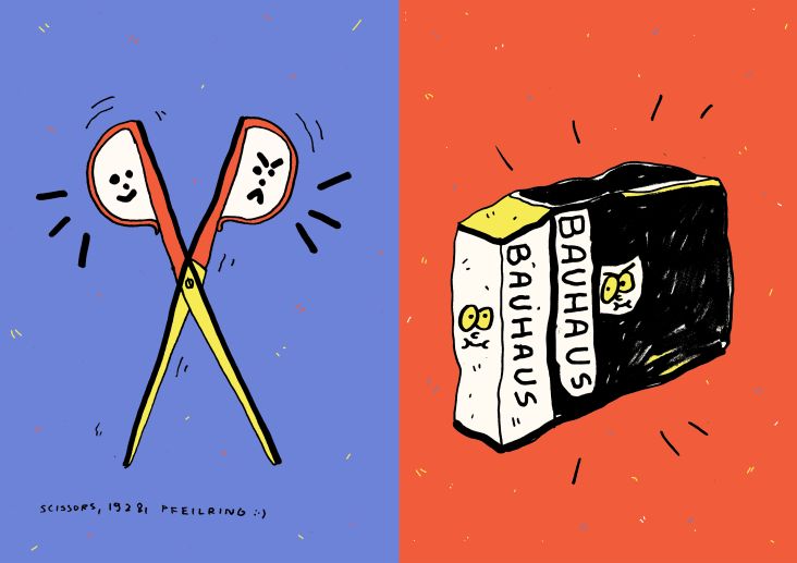
 by Tüpokompanii](https://www.creativeboom.com/upload/articles/58/58684538770fb5b428dc1882f7a732f153500153_732.jpg)


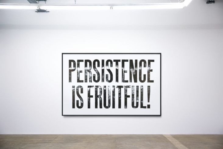
 using <a href="https://www.ohnotype.co/fonts/obviously" target="_blank">Obviously</a> by Oh No Type Co., Art Director, Brand & Creative—Spotify](https://www.creativeboom.com/upload/articles/6e/6ed31eddc26fa563f213fc76d6993dab9231ffe4_732.jpg)


