The emotional story behind Irish Heart's logo and branding
When it comes to design challenges, branding a national heart foundation is one of the toughest. You don't have a lot of room to manoeuvre (the central heart graphic is pretty much a given), but you don't want to look cliched and unoriginal either. Pentagram pulled it off recently with their rebrand of Canada's Heart Foundation, and We Make Design have squared the circle too, in a project that engaged all their emotions and passion.
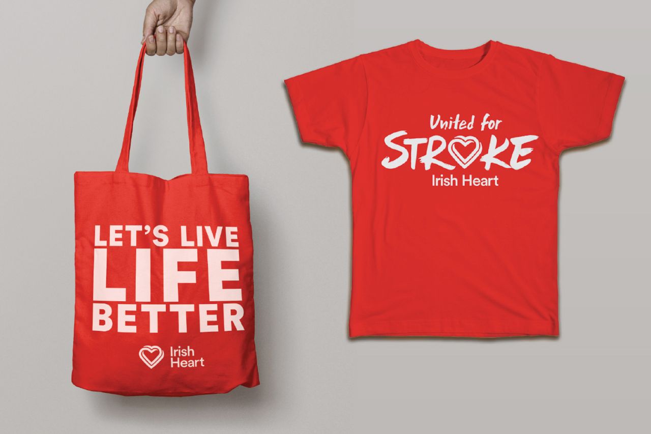
"We are on a genuine mission to do good and impact the way people live their lives," says Adam Gallacher, creative partner at the Dublin studio. "So when the opportunity to rebrand the Irish Heart Foundation arrived, we didn't take the responsibility lightly."
He explains just how important the project was to Ireland, and why branding could make a difference. "Heart disease and stroke combined are our nation's greatest killers and those who are struck are often left debilitated, with a loss of their former selves and former lives. There is a wide awareness of the two illnesses but a frightening lack of knowledge of the causes, signs and of who it affects, and even less knowledge of how to avoid them or deal with them."
The problem, though, wasn't the lack of information being supplied by the Foundation. "It was that, for whatever reason, the message was not getting through."
Working with brand strategist David O'Connor, the Foundation had decided its messaging needed to move from fear-based to hope-based. "So our core branding concept was the idea that all of our lives are connected," says Gallacher.
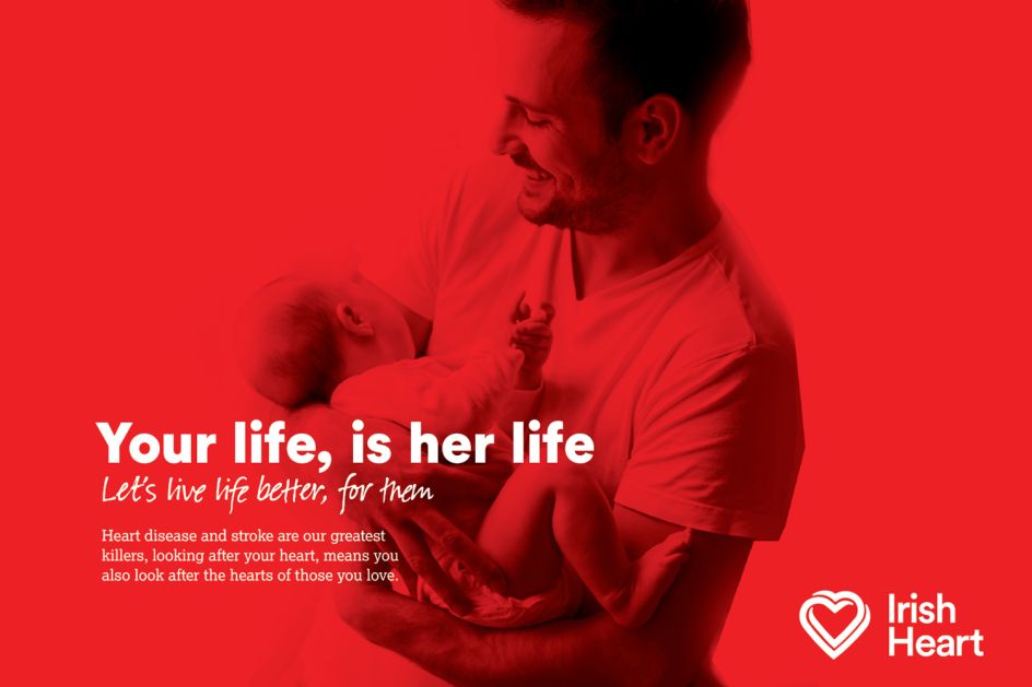
"Losing someone you love can be an unbearable weight, and it's a weight we wouldn't want to impose on those we love." The new branding conveys this idea visually as connected hearts. "The idea is that to look after your own heart was to look after the hearts of your loved ones in turn."
The team also wanted to make all of the messaging more accessible; less governmental in tone, less of the jargon, introduce more warmth.
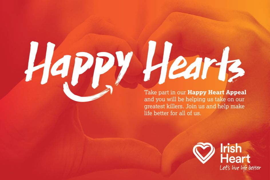
"We wanted to talk to core audiences just like they talked to each other. We chose to externalise the line simply as 'Let's live life better', a statement with hope and positivity at its core, but also a gentle incentive to action and an opener to a conversation, as to how and why we can live our lives better."
With the core strategic framework in place, We Make Design set about creating the visual aspect of the rebrand.
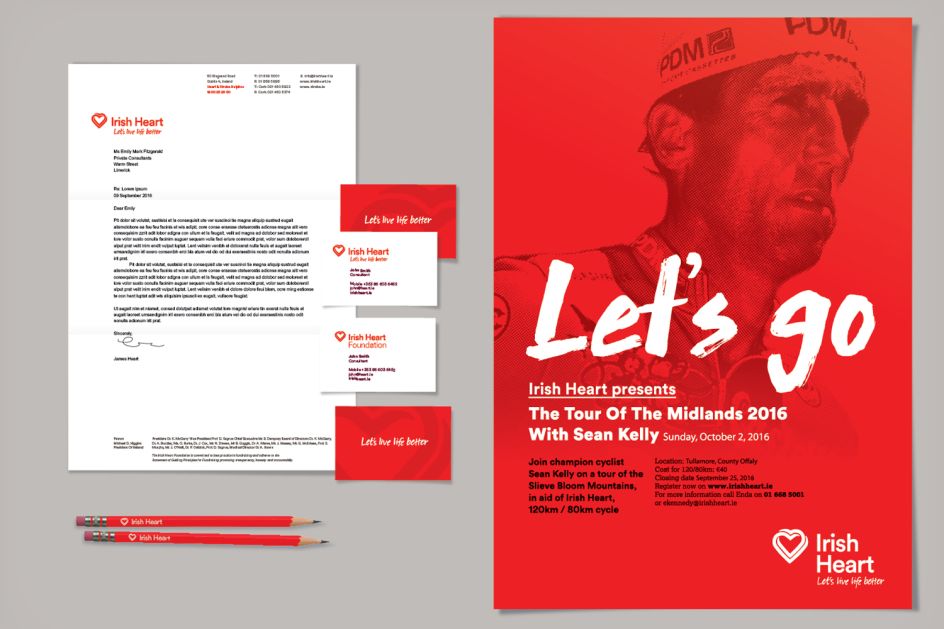
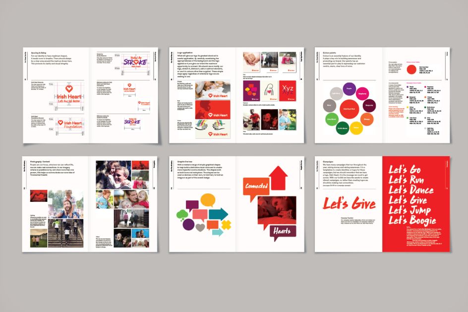
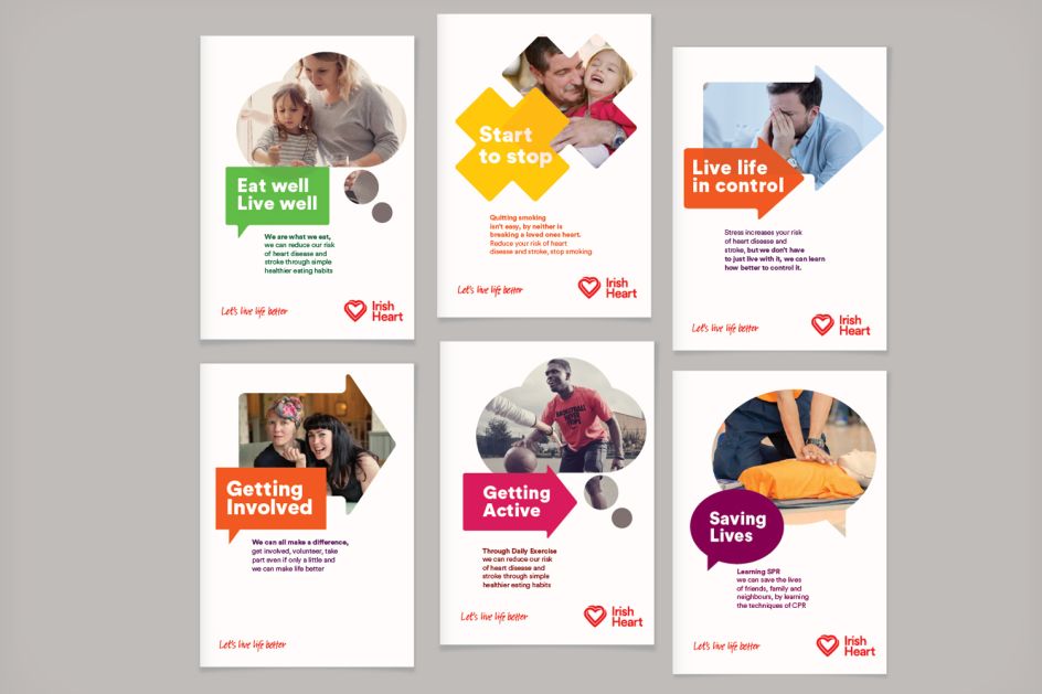
"As with the language and core messaging, we wanted to simplify and humanise wherever possible," says Gallacher. "The ‘heart’ symbol was a mandatory necessity, but making one of the world's most used and recognised symbols unique, meaningful and ownable was a real challenge. The colour red was also a given, but we wanted to inject more diversity and introduce a broader tonal range. We tackled this by creating a distinct heart icon which reflected our connected hearts concept, and surrounded the core red with a broader palette to inject more vitality into everything they do.
"We then built a broader design system which allows for diversity in communications from core comms to targeted campaigns, and an overall image style that includes both illustration and photography. We explored various possibilities regarding their name, simplifying it to 'Irish Heart', removing its no longer needed ‘Foundation’."
](https://www.creativeboom.com/upload/articles/c0/c0f4833513a758427120283374013d6da0e2b37d_732.png)



](https://www.creativeboom.com/upload/articles/16/1644496f2bf60696662c3d4c008da08ce3631a30_732.jpeg)

