Mother's ads for StreetEasy turn the epic drama of buying a home into Renaissance-style paintings
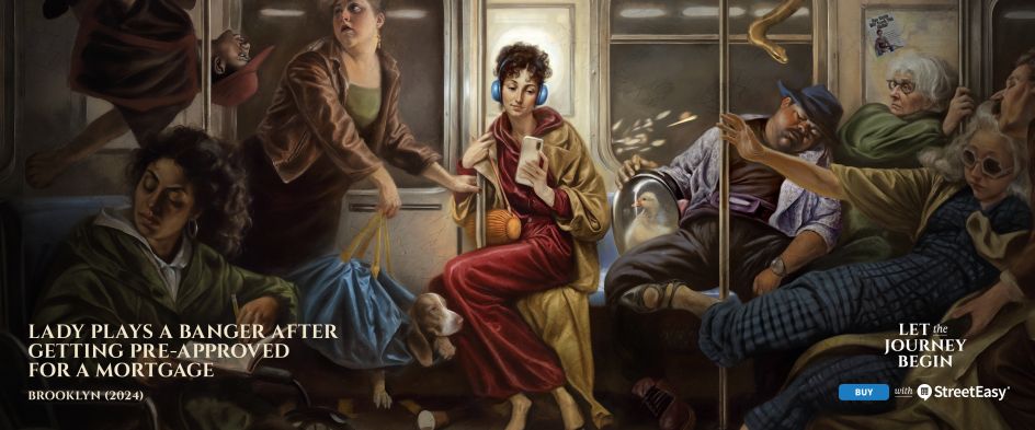
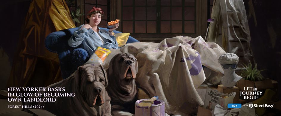
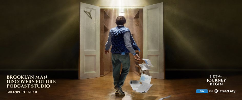
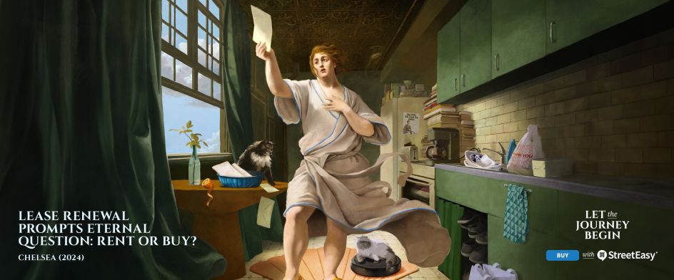
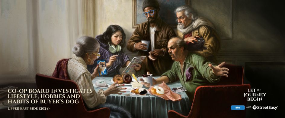
The Herculean struggle of buying a home has been visualised with suitably stunning imagery in Mother's latest campaign for StreetEasy, which depicts each stage of the process as epic Renaissance-style paintings.
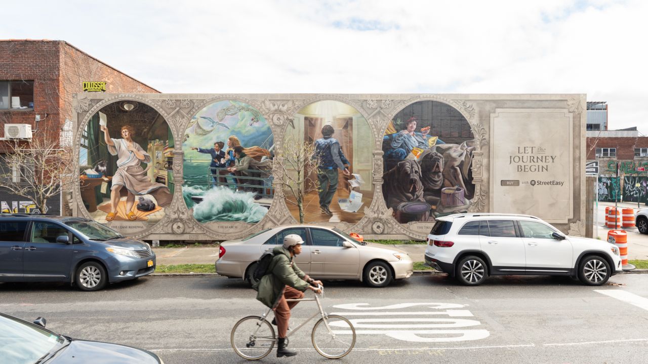
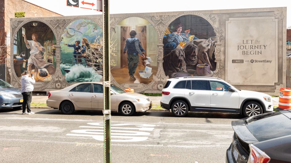
Titled Let The Journey Begin, the classical art-inspired campaign targets potential property buyers in New York. Packed with intense emotions and humorous Easter eggs that nod to life in the city, these visuals have recently been taken to the next level with four gigantic mural paintings in Williamsburg and Nolita.
Given that buying a home is one of the most stressful experiences a person can have, depicting the experiences involved as being on a par with the monumental significance of Renaissance paintings is a smart move. The visual approach effectively cuts through the noise of advertising that New Yorkers are faced with on a daily basis.
The campaign is the first time that independent creative company Mother worked with real estate company StreetEasy. But with the StreetEasy brand having long championed insightful, creative work, Mother knew they would work well together.
"Furthermore, because Mother New York has had the honour and privilege of working with other iconic New York brands such as the New York Public Library, Brooklyn Org, and NYFW, we knew we have both the love, passion and New York expertise to live up to the standards of the brand and our neighbours in the city," Evan Carpenter, Group Strategy Director at Mother New York, tells Creative Boom.

The idea for an old-art approach emerged in part from the complex challenges posed by the housing market. StreetEasy hears all too often from buyers that the process of house hunting involves conflicting emotions, from nervousness to excitement, defeat, and determination, which brings to mind the epic experiences often found in Renaissance paintings.
"This style has a unique ability to capture the drama and evoke these intense emotions with its use of light and shadow, and we felt it nicely mirrored the buyer's journey, which is also full of drama, emotions, and many ups and downs," says Jason Ferguson, Creative Director, StreetEasy.
"We were able to use this to our advantage to mix the old world with new in an eye-catching and unique way to break through to the hard-to-reach NYC audience."
The campaign appears on subway cars and taxi tops and is instantly recognisable thanks to its skillful recreation of Renaissance-era artworks. Everything from the composition to the expressions and the colours is a dead ringer for classical paintings, although inviting a comparison proved to be something of a challenge for Mother's art team.
"True Renaissance masterpieces are revered for good reason," adds Evan. "We knew honouring this genre of art would be no small feat. We fully immersed ourselves; at one point, Mother's office was filled with so many pinned-up creative references from different artists that it began to feel like we were living inside the art.
"All that research and appreciation for the art helped us figure out how to apply it to modern-day New York. From lighting and posing to facial expressions to the composition of the characters, it was all inspired by classical art."

To make the classical art appeal to modern audiences, the creative teams were keen to sneak in knowing nods and winks for New Yorkers to pick up on. These help the ads break through the noise and catch people's attention with details that resonate with them.
"They create these delightful moments, which can be especially nice on a subway commute when you have the time to be drawn into the art," Jason explains. "We're building a campaign for New Yorkers, by New Yorkers, so it was important to us to make sure everything about how we depicted the buying process felt authentic.
"Adding in that extra layer of detail to make sure that's the exact right angle of the bridge from the ferry, or that an intersection looks just right, really goes the extra mile with this audience. Specificity is how we keep ourselves from falling into cliches."
When it came to depicting the long, drawn-out process of buying a house, StreeEasy and Mother decided to break the journey down into key moments. By appealing to buyers at every stage of the procedure, the campaign ensured it stayed relevant to everyone, including renters.
"Our brand is, of course, so deeply ingrained in the real estate transaction in NYC, so we reviewed survey responses from buyers who reported the most overwhelming moments," says Bridget Sullivan, Director of Integrated Marketing at StreetEasy. "From there, we sat down with some of our real estate agent partners to discuss the highs and lows of the process and plot out the entire buyer's journey.
"We chose seven key, recognisable moments that we felt had the greatest potential to be easily recognisable to anyone ever considering buying a home in the city. Buying a home here can be so personal depending on the particular home you're looking at. Still, by highlighting so many of these key moments, we knew the campaign would be more likely to resonate for buyers across all stages of the journey."
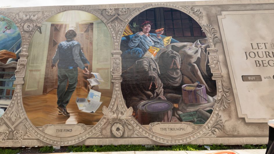
Taking the campaign to the net level, four images from the series have been realised as gigantic murals at Wythe & N. 14th St in Williamsburg and Spring & Lafayette St in Nolita. StreetEasy's partners at Colossal and Overall helped them to find these locations, which were deliberately chosen due to their local foot traffic.
"The mural in Williamsburg has been the perfect opportunity to bring the journey to life on a street level," Bridget adds. "The images and style were carefully chosen by the creative teams at Mother, Buck, and StreetEasy. For the Williamsburg location, we had such an incredible 'canvas' from which to work, so we didn't want to just pick one milestone to feature because we know the campaign works best when you get more than one moment in the journey.
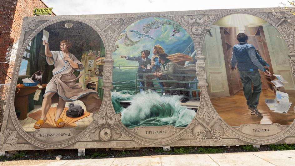
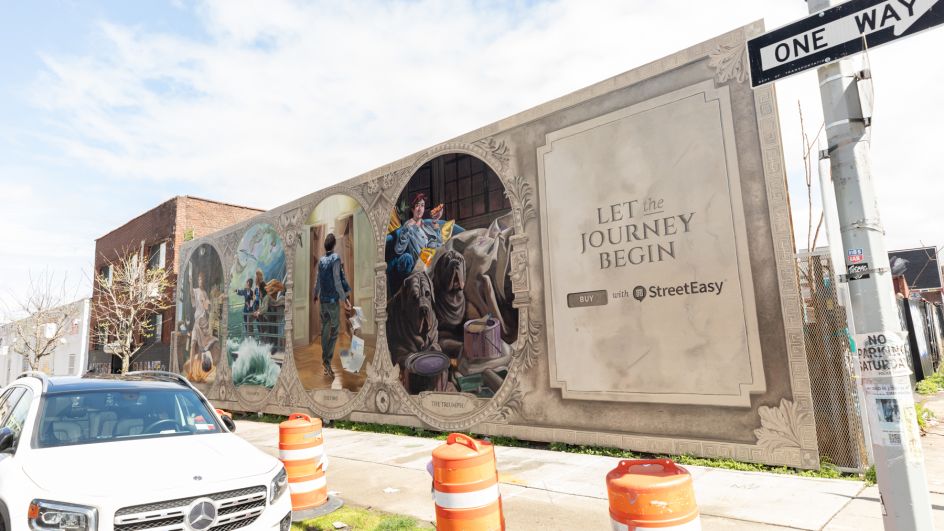
"The homebuying journey in NYC is unique and personal to each buyer, so we carefully selected these four milestones because they represented each phase of the journey well and were universal moments that any buyer could recognise and relate to."
And judging by the overwhelmingly positive response on social media, Let The Journey Begin has gone down well with its target audience of house-hunting New Yorkers. "It's incredible to see people stop in their tracks on the street by the mural and look up from their phones on the subway to admire the campaign the way they would look at art in a gallery," Bridget concludes.
"I think a huge part of that is the incredible amount of detail the team put into this campaign – the longer you look at it, the more it resonates with you as a New Yorker. It's been fun to watch people find the Easter eggs and call them out on social media."
Editor's Picks


Trending


Editor's Picks
Further Reading