New 'sexually unapologetic' designs for CBD range TOCA use 'flamboyantly fluid type'
New York-based type foundry Otherwhere Collective and designer/creative director Andrew Bellamy have created a seductively cheeky rebrand for TOCA, a range of high-potency CBD anal and vaginal lubes.
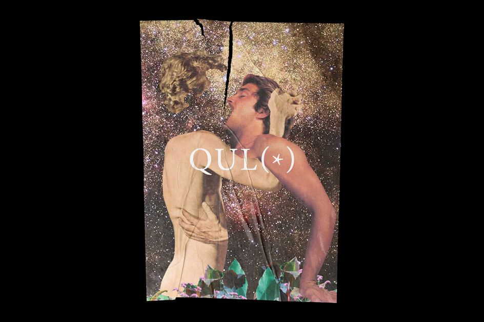
The new designs centre around a custom typeface, OC TOCA, which bears deliciously flamboyant, curving letterforms with an aesthetic that marries French turn-of-the-century, Art Deco elegance and eroticism with stylishly hippie-leaning '70s vibes.
"It's a rebrand more in line with their personality: it's elegant and sensual, playful with a subtle subversion and a sense of humour, positioned as affordable high-end," says Bellamy, who adds that the brand had said it "wanted to make some noise and talk about things considered taboo so that was a green light to break out of the cliché botanicals photography and be a bit more subversive and incendiary."
The references for the designs include collage artist Linder Sterling (she of the iconic cover design for The Buzzcocks single Orgasm Addict); rapper Foxy Brown; Grace Jones; Roxy Music (specifically the sleeve design for Country Life), Barney Bubbles' stunning work for space rock legends Hawkwind; vintage porn; German architect and industrial designer Peter Behren; Herb Lubalin and Ralph Ginzburg's collaborations on seminal1960s/70s editorial design for Eros, Fact and Avant-Garde; Jamie Reid (he of Sex Pistols sleeve design fame); Austrian graphic designer and painter Alfred Roller; designer Busby Berkeley (who's known for his cinematic "elaborate dancing-girl extravaganzas"); Austrian graphic artist Koloman Moser; and the rather brilliant campy, retro-futuristic 1970s/80s music genre, space disco.
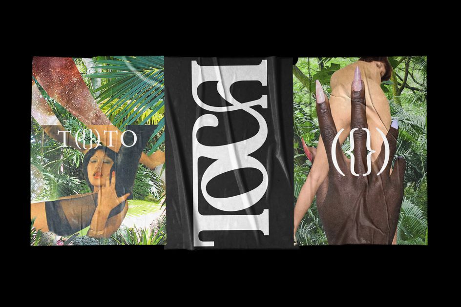
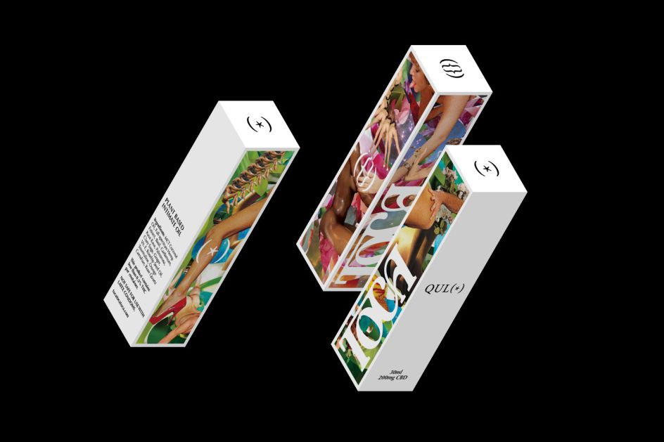
It's a superb list of some of our very favourite things and explains a lot about this stunning design work. While the branding largely builds on the "flamboyantly fluid custom type" that offers a "cheeky typographic wink", as Bellamy terms his letterforms and their meaning; the designs also rely heavily on a suite of colourfully sensual, seductive imagery that the designer describes as "unapologetic cosmic."
TOCA is an American brand based in San Juan via Miami, and the brand name is taken from the Spanish for "touch." The other words that the brand is built around—Qulo and Toto—translate as "arse" and the slang for vagina in Spanish.


Editor's Picks


Trending


Podcasts


Editor's Picks
Further Reading