DixonBaxi designs tangram-inspired identity for Storey co-working spaces
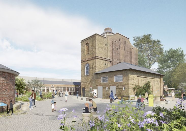
Geometric shapes are seen across the fresh identity to house imagery and represent the diverse businesses that use Storey.

DixonBaxi is behind the new identity for co-working space Storey, which uses overlapping tangrams to represent the diverse businesses that use it.
The studio has had a long-standing relationship with the brand's parent company, British Land, working with them on various projects over an eight-year period. Storey was the first project that kicked off the partnership, and in this new brief, DixonBaxi was tasked with elevating Storey's identity to suit a more premium, refined, and sophisticated space, according to design director Karun Agimal.
With multiple locations across London, such as Broadgate and Paddington, Storey considers its customer experience to be flexible and effortless. This is helped by the fact that every possible detail has been thought through and beautifully designed.
"While the old work once served its purpose, the brand's evolution made it apparent that it no longer aligned with Storey's current vision and future goals", says Agimal. On top of this, Storey is also investing in new office spaces, so it was the perfect time to align the portfolio with a refreshed look and feel.


From the offset of this new project, Storey's goal was to better represent its locations, office spaces, environment, and values. Agimal notes that the brand also needed to "reflect how it has evolved to the market's needs as much as how it fits within the British Land experience and offer".
According to the studio, through its new, refined design system, Storey communicates its commitment to adaptable and personalised workspaces, with every interaction feeling consistent, thoughtful, and premium.
Storey's new logo is inspired by a tangram puzzle (a dissection puzzle consisting of various polygons) and consists of two simple, overlapping shapes. Agimal explains that DixonBaxi chose this symbol to symbolise "the harmonious partnership between Storey and the businesses it helps to empower".
Essentially, the square form represents the workspace, while the tangram shapes in the system reflect the individuality of each business. Because they can stretch, grow, and evolve, the geometric shapes make for a flexible brand mark and graphic device.


They are used selectively to frame people and hero images, "maintaining a balance between graphical elements and authentic imagery, thereby enhancing brand recognition", says Agimal.
Iconography is designed to match the rest of the graphic system and is used for clear and efficient storytelling. Agimal describes how the animation states of the icons "add charm and delight and are used for digital presentations, website and social marketing", while static versions are used for on-site wayfinding.
Another refreshed visual element of Storey is its new colour palette, influenced by the material choices in the physical spaces. "
During our immersion trip around the Storey spaces, our team was immediately captivated by the thoughtful design choices: the blend of greenery and sandalwood, right the way down to chair colour and brass finishes", says Agimal. "It quickly became a key element of the brand toolkit." The palette comprises warm and inviting hues, including primary colours like Wood, Marble, and Forest, which sit alongside secondary hues for infographics and floor plans.
DixonBaxi believes this contributes to "a mature yet vibrant visual identity that aligns with the brand's premium positioning".


The brand's tone of voice was equally important to the visuals for this brand, as Storey wanted words to match the sophistication of its spaces. "We avoided the banter and buzzwords associated with chaotic co-working spaces and, instead, we opted for a jargon-free, straightforward approach with every word carefully considered", Agimal explains.
Storey's new identity is applied cohesively across everything from brochures to digital platforms, with every touchpoint being designed to echo the brand's core values of flexibility and simplicity.