Vocation Brewery reaffirms its roots with new identity and packaging
Global studio Turner Duckworth designed dimensions for the brewery's identity, commissioning illustrator Brian Steely to showcase the personality of each brew through illustrations.
Turner Duckworth is behind Vocation Brewery's new visual identity and packaging system, which sees its much-loved "eye" emblem reinstated more consistently across the brand.
The Yorkshire-based brewery approached the studio directly to work on the project. Initially, the brief only included a packaging refresh; however, after a visit to the brewery, Turner Duckworth decided that the project should go further.
Ultimately, Vocation Brewery wanted to grow its brand and increase its market share, but while it had a lot of untapped potential, the studio had a real design challenge ahead of it.


Turner Duckworth creative director David Thompson describes how the brand's previous aesthetic "lacked cohesion across media" and says it hadn't yet found "a truly unmistakable mark, resulting in a loss of shelf impact and consumer recall". In light of this, the brewery needed a way to tell its story as a unified brand, with a reinvigorated positioning and a visual identity as bold and expressive as its product.
"The redesign needed to build meaning, to be brand-first, distinctive and dimensional," says Thompson. He adds that the team was thrilled to work on a product created by "like-minded individuals with a focus on craft".
Communicating the spirit of the brewery and going beyond the visual identity was a core part of the brief. The approach was to return the brand to its roots, stripping it back and reaffirming its principles.
Vocation Brewery built its foundations on "its commitment to brewing and the belief that great craft beer should be for the many", according to Thompson.

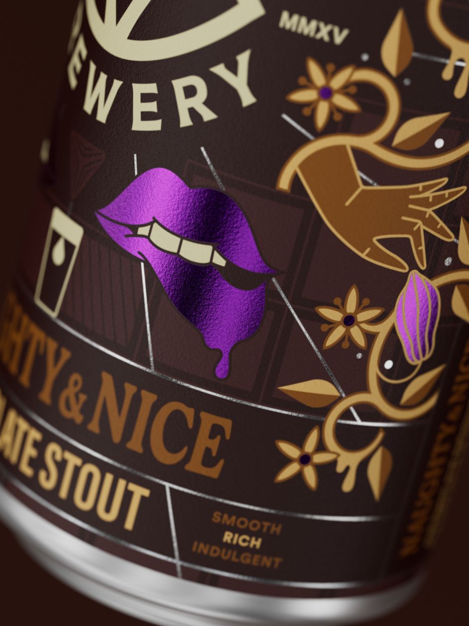

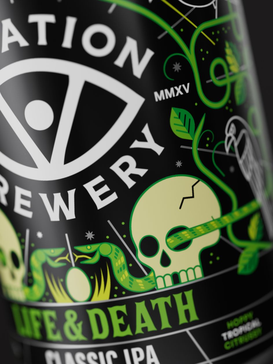
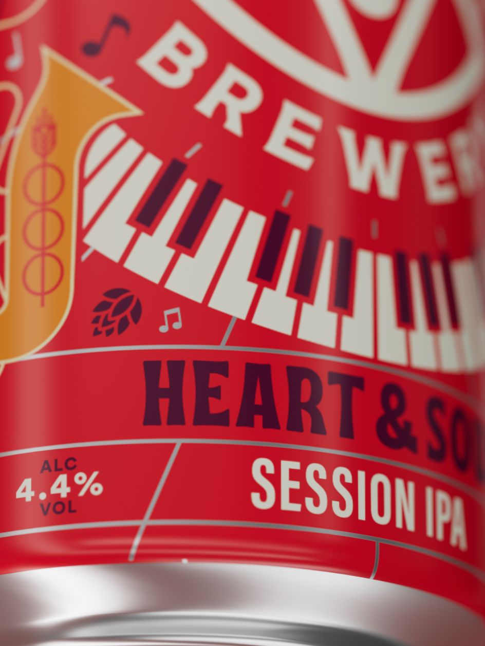
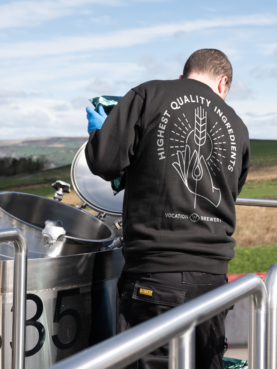
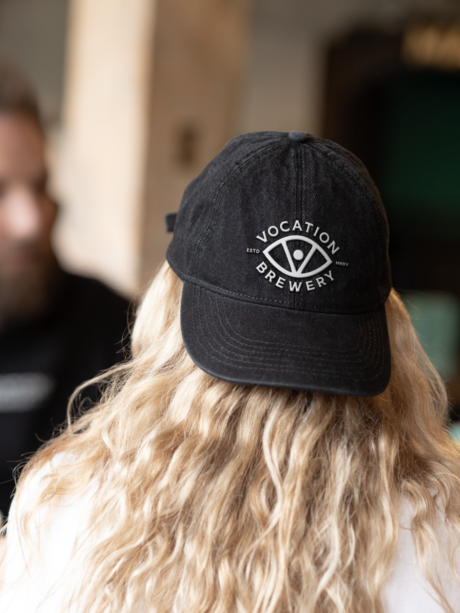
The eye symbol was one asset well-loved but underused in the identity. It has been part of Vocation Brewery since its inception and is recognised by its consumer base, but it wasn't used consistently.
"We saw the eye as emblematic of the brand's unwavering focus and visionary outlook on brewing", says Thompson. The emblem now plays a central role within the brand world, metaphorically "keeping watch" over the brewery and creating cohesion across media.
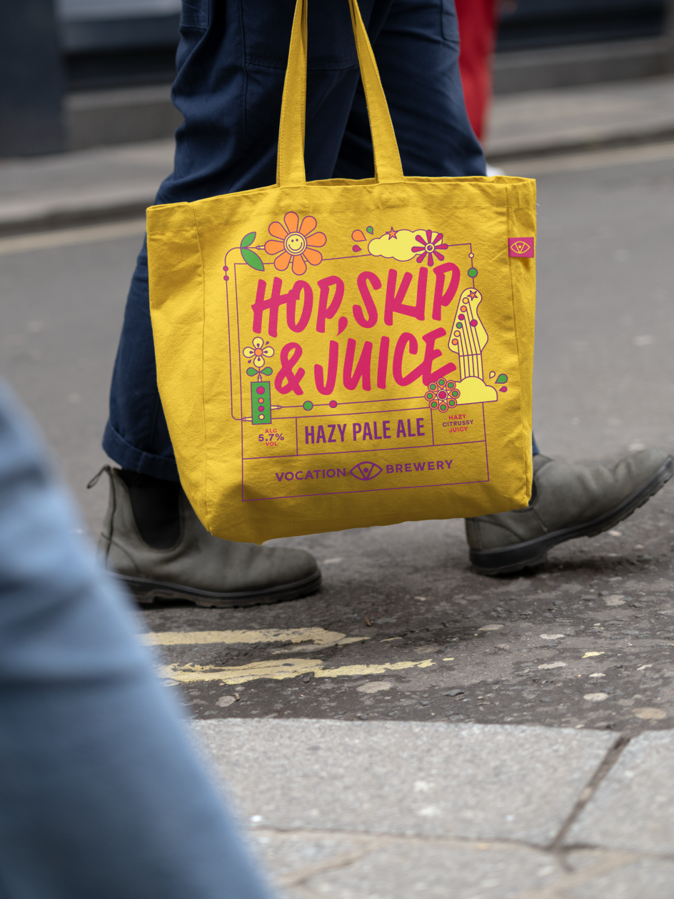
To enhance the brewery's storytelling and bolster off-pack assets, Turner Duckworth commissioned illustrator Brian Steely to create a suite of new, meaningful illustrations. Thompson says, "With equal parts precision and passion, Brian's approach to illustration is similar to Vocation's approach to brewing.
"We knew from the very first stage of the project that we wanted to partner with Brian to develop the illustrations for all seven of Vocation Brewery's core and most well-known beers because his attention to detail is phenomenal, offering something new to discover sip after sip."

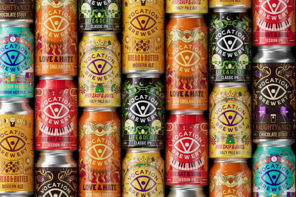
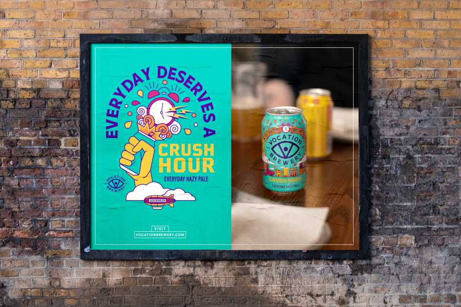
Turner Duckworth also took the brand in a new typographic direction. Each brew now has its own distinctive type style expressive of its personality, which complements Steely's illustration style. One thing that hasn't changed much is the brand's colour palette. Thompson explains how the studio was "highly respectful" of the Vocation Brewery experience, of which colour is a huge part, so the team opted to maintain the familiarity of the existing colours to avoid confusion.
For the sake of legibility, Turner Duckworth made some minor tweaks to the colour palette but stuck to a "If it ain't broke, don't fix it" mantra.
Thompson likens brands to people in the sense that "what we say and how we say it is as important in shaping the way people think of us as what we do and how we look". Vocation Brewery's new principles for tone of voice were developed to ensure that copy and communications are always on-brand when talking about its pursuit of brewing exemplary beers.

"Craft beer designs are getting more adventurous in recent years," says Thompson, "So how can brands stand out while staying true to themselves and remaining authentic?
"The truly successful brands have the patience and discipline to create brand stand-out, tapping into relevance and authenticity while standing for something important and leading consistently with a brand-first approach. When you start there, then rest takes care of itself."