Pioneer Brian Sanders on five decades of illustration, 1960s London and the art of Stanley Kubrick
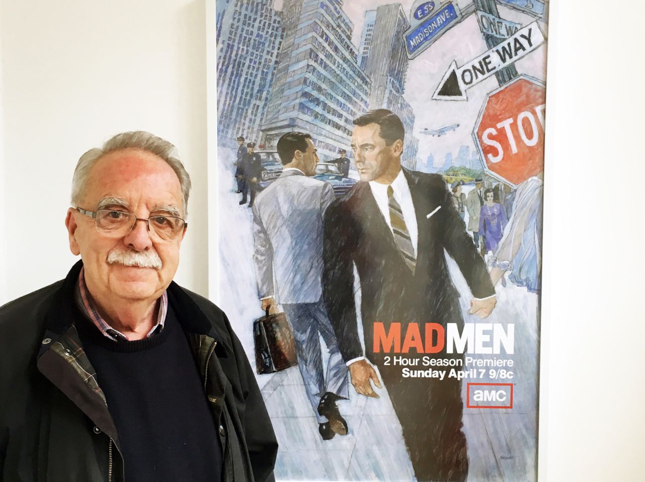
A veteran of the golden age of magazine illustration and co-founder of the Association of Illustrators, Brian Sanders has spent the last 50 years producing trailblazing artworks for magazines such as The Sunday Times and Nova Magazine during the 1960s, as well as unprecedented illustrations for 2001: A Space Odyssey with Stanley Kubrick and the series six of AMC's Mad Men.
Now, many of these prominent works can be seen during the first solo exhibition dedicated to the pioneering British illustrator, launching today at Lever Gallery in London. Chronicling Sander's long and successful career, the show will also include previously unseen and unpublished artwork.
Sanders rose to fame in 1960s London, when magazine illustration was booming. The work was experimental and reflected the excitement of the 'Swinging Sixties', mirroring the fashion and music of the defining era. The medium was new, the compositions were off-kilter and the colours were brighter, sharper and more striking. American illustrators had a huge influence on the style and work of their English counterparts, with the US artists using acrylic paint to create what was referred to as the 'bubble and streak' effect, initially developed by US masters such as Bernie Fuchs.
Notable work from this period, which will be on show at Lever Gallery, includes Ho Chi Min, commissioned for the cover of The Sunday Times Magazine, 1970s tennis star Roger Taylor also for The Sunday Times, plus Sanders’ illustrations of Le Mans and his portrait of Sean Connery's Bond set against Sanders' own Aston Martin DB3.
In 1965, Sanders was commissioned by Stanley Kubrick to spend months on set with unfettered access during the making of 2001: A Space Odyssey to illustrate the film sets and scenes of Kubrick and his crew in production. Sanders would draw on the set two days per week and work on larger paintings in his studio. This was a rare occurrence, as Kubrick often worked with a closed set, and was the only person allowed to take photos on set.
Much of this work by Sanders remained unpublished for decades. When Mad Men series creator Matthew Weiner, inspired by the painterly illustrations of the 1970s TWA flight menus, wanted a nostalgic image to promote the sixth season of the acclaimed series, he turned to Sanders to produce an illustration for the series six poster and DVD packaging. This captivating illustration was emblazoned across buses and billboards and propelled Sanders’ name back into the limelight in 2011.
With such a diverse and exciting career, that still thrives today, we were honoured to speak to Sanders to find out more about his 50 years in the industry, and whether he can impart any wisdom on being a successful illustrator.
Illustrators everywhere will be dying to know what's the most important thing you've learned in your illustrious career?
Basically, not to be late with work. A lot of other people’s jobs really hang and depend on this. Also, be prepared to move with the times, the only reason I’ve been in the industry for 50 odd years is because I’ve changed constantly.
If you look back on my career, I think this has helped me stay relevant. For example, at the end of the '70s I was commissioned to do my first set of stamps and it led to a time where I did nothing but stamps. An American organisation then commissioned me to do stamps for the Marshall Islands and that led to the next project. I did a history of the Second World War in postage stamp, that was a five-year run and they immediately gave me another project after this. It was horses for courses really, whatever jobs would turn up, I adapted to.

Warren Beatty, Nova
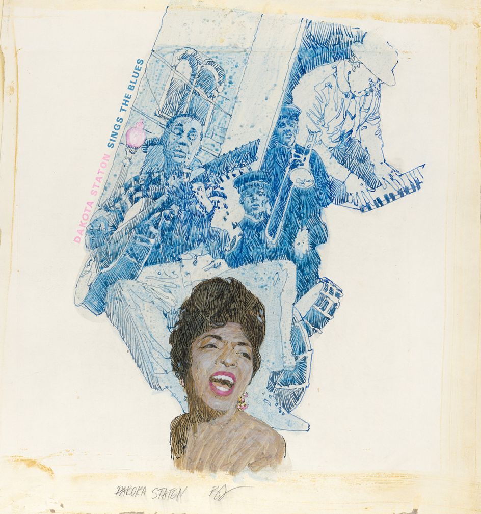
Dakota Sings the Blues, 1960s
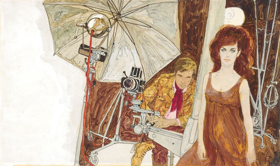
Damernas Vald, Danish Magazine, 1960s
So you rose to fame as a 1960s commercial illustrator. What's been the biggest change since then?
I would say the technique of what we refer to as Bubble and Streak. In the '60s everyone was using a form of this. Generally, a lot of the illustration was looking a bit tired as everyone was doing the same thing. At that time, I took a step right back and began using watercolour, which I’d been taught to use by the art master at grammar school. I went very far back in order to become different as no one else was doing it at the time.
Is the industry cyclical in terms of trends?
Yes, I think it is, as, with so many industries, so much is cyclical. I think there has been a resurgence lately in figurative illustration that slightly imitates the acrylic work of the '70s. It's true that what we are seeing today in the illustration industry is a resurgence of the styles and techniques that were typical of the '40s or '50s.
"Be prepared to move with the times, the only reason I’ve been in the industry for 50 odd years is that I’ve changed constantly."
Are there any tools or techniques that you've never stopped using?
I wish I could use the computer better, but I use every technique from watercolour to pencil drawings and pen. So I suppose you could say every old-fashioned technique really.
What would you go back and tell your younger self?
I've been very lucky really. I've been consistently in work and originally I think I was in the right place at the right time. I always found that my address book was more important than any degree award. I just got on with my work and one thing led to the next.
What's the one moment that defined your career?
There are a couple of these, but the first one was when Joy Hannington saw some work I had done and gave me some work for Homes and Gardens.
Homes and Gardens was a defining moment and then came the three colour supplements, I worked for all of them and that gave me a superb amount of visibility. It really was a shop window par excellence. I did so much work for Michael Rand on The Sunday Times, he gave me series after series for about five years – that was a defining era, if not moment.

Ho Chi Min, Sunday Times Cover
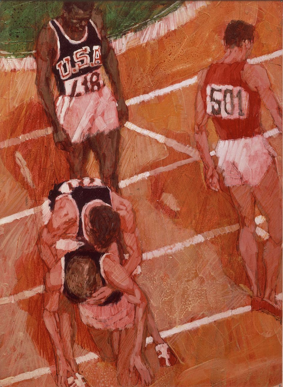
Olympic illustration, 1965
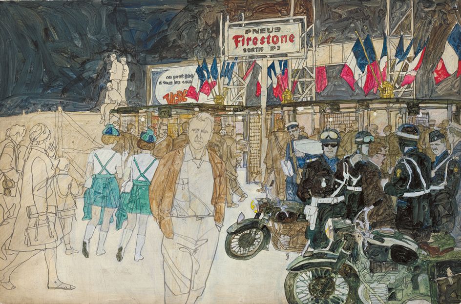
Le Mans
You have an upcoming show at The Lever Gallery – any particular works that stand out, and can you tell us something interesting behind them?
There are obviously a lot of 2001: A Space Odyssey images, which weren’t published for a long while. It was a wonderful brief to be able to draw on the set and go back to the studio to paint the bigger pictures. I could do whatever I wanted and it was absolutely lovely not working to a tight brief.
Also when I saw what Stanley had built, it was just incredible. There was the centrifuge, which you see the inside of in the film, with people running around the ceiling and various parts of it. That alone must have been 30 feet high. I remember when it started up for the first time, all of its lights were connected to one big console and they began to pop!
So he was very much in new territory, obviously in collaboration with other people but he invented new concepts such as a mounted camera where the actual camera itself would revolve. The invention was amazing, I was quite young at the time so to be able to work with him on the set was really incredible.
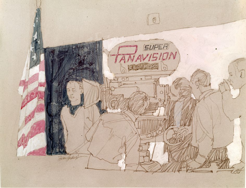
Kubrick looking through panavision, 2001: A Space Odyssey

Moonpit 1, 2001: A Space Odyssey

Kubrick with camera team and revolving camera. Keir Dullea in tube passage, 2001: A Space Odyssey
Brian Sanders: Selected Works: from 2001: A Space Odyssey to Mad Men will go on show at the Lever Gallery, 153-157 Goswell Road, London EC1V 7HD from today, 12 May, until 31 July 2017. More information can be found at www.levergallery.com.
All images courtesy of Brian Sanders
](https://www.creativeboom.com/upload/articles/c0/c0f4833513a758427120283374013d6da0e2b37d_732.png)


