Graphic designers are always being told to 'play': here's how to do just that
If you’ve ever been to a design conference, ever, you’ll have likely heard a fair bit of chatter about the importance of “play” in creativity.
That quote which may, or may not have been said by Picasso—that“All children are born artists, the problem is to remain an artist as we grow up”—gets bandied about a fair bit.
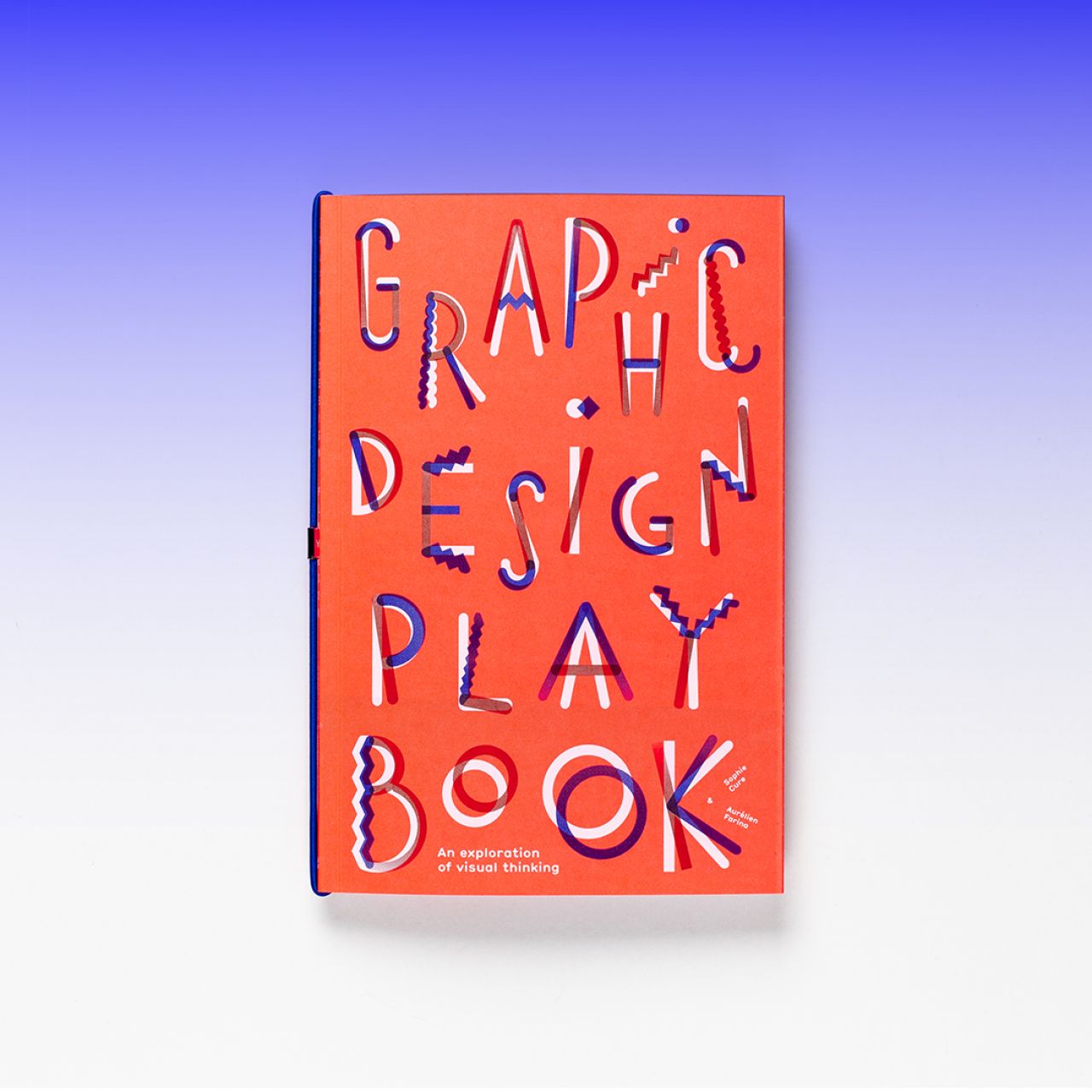
Now, a new tome from publisher Laurence King, Graphic Design Play Book: An exploration of visual thinking by Paris-based graphic designers Sophie Cure and Aurélien Farina offers up the idea of design and play in a fun new way.
It can act as both a simple introduction to the basic principles of graphic design; and a gentle, fun way for those who already design to think about their craft in newer, simpler ways.
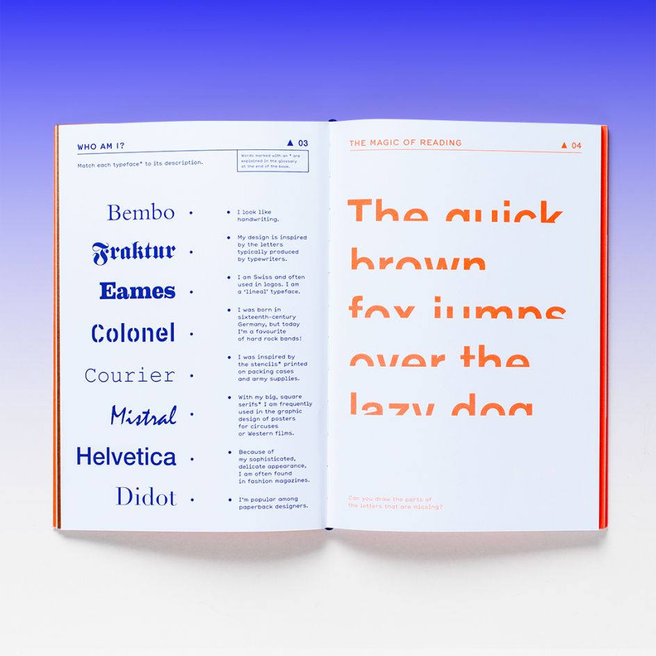
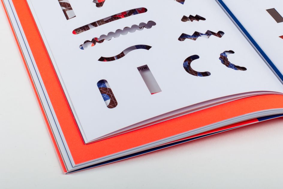
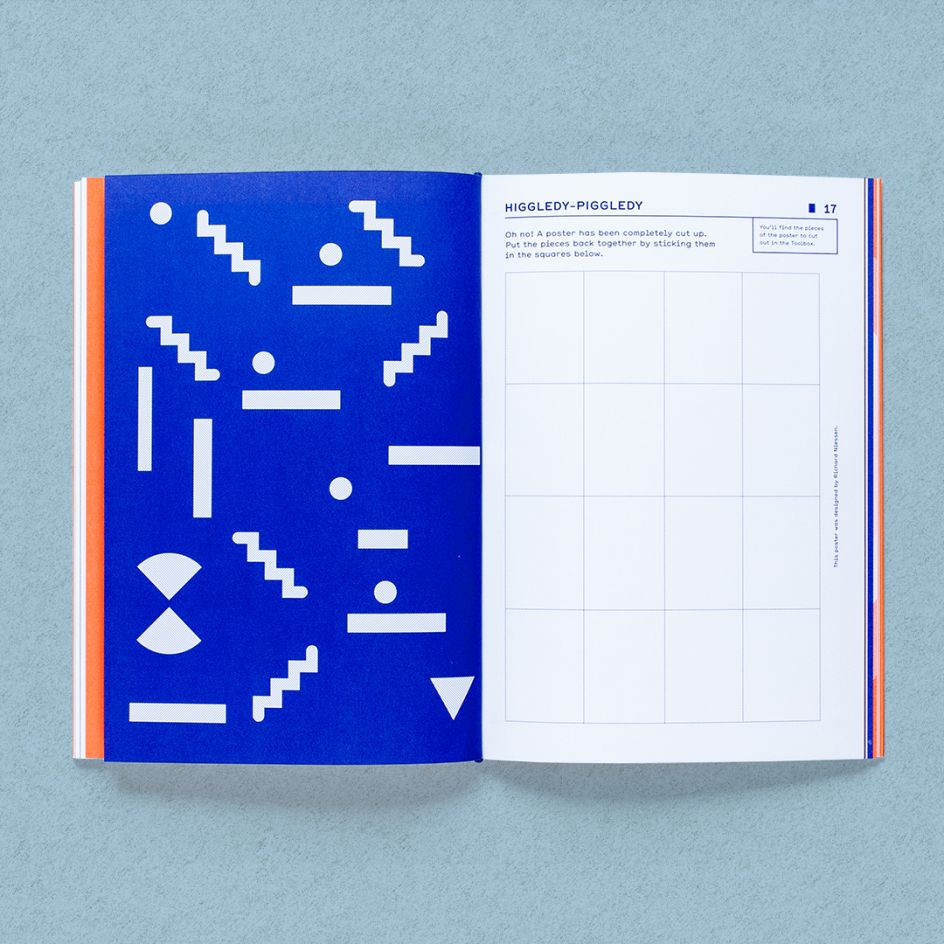
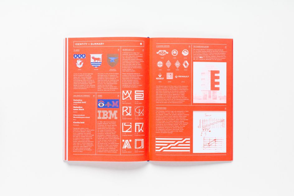
The book features various games, activities, puzzles and visual challenges to demonstrate the machinations of disciplines such as typography and branding, or the ways in which things like signage or posters are made. Such activities include spot the difference, matching games and dot-to-dots—likely more suitable for kiddie creative types than those already studying or praising design, but also a fun way for those who are already well into the design world to get away from their screens and start working in lovely analogue for a moment.
The design of the book itself is both straightforward and very bold, using arresting bright orange and blue with subtle gold touches throughout. The idea is that the book is very interactive—we’re encouraged to literally, for instance, “dot the ‘i’s’”; draw typographic ligatures; design Memphis-like totems from simple geometric shapes and so on.
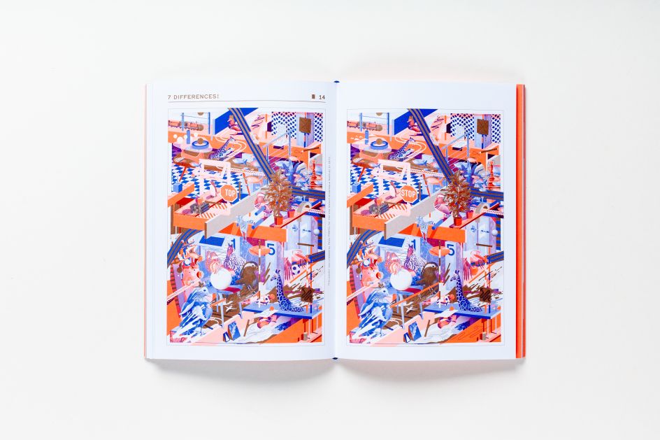
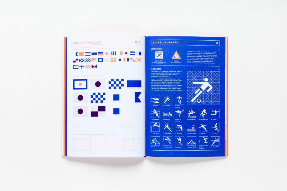
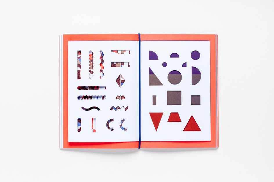
The problem is it looks a little too nice to spoil. That’s especially true of the midsection of the book, dubbed the Toolbox. Here, we see some of the gorgeous pictograms by Otl Aicher, the German graphic designer and typographer best known for having designed pictograms for the 1972 Summer Olympics in Munich.
These pullout stamps sit alongside stickers, die-cut templates, and coloured paper to help readers complete the activities.
Truly something that’s just a beautiful, slick, and very enjoyable little publication, what makes it as appealing for grownups as well as the primary school graphic design brigade are the illustrations, which include typefaces by Aicher alongside those from typographer Pierre Di Sciullo, Otto Neurath (the man behind Isotype, or the International system of typographic picture education, a method for assembling, configuring and disseminating information and statistics through pictorial means) and pictogram designer Gerd Arntz.


 by Tüpokompanii](https://www.creativeboom.com/upload/articles/58/58684538770fb5b428dc1882f7a732f153500153_732.jpg)

 using <a href="https://www.ohnotype.co/fonts/obviously" target="_blank">Obviously</a> by Oh No Type Co., Art Director, Brand & Creative—Spotify](https://www.creativeboom.com/upload/articles/6e/6ed31eddc26fa563f213fc76d6993dab9231ffe4_732.jpg)


