Have you noticed how more and more illustrated work is appearing in advertising, packaging and branding recently? I certainly have, and from my vantage point as a journalist in the design industry, I don't think it's a coincidence.
More and more, I'm hearing from brands that they're discovering illustration offers something photography cannot. Namely, the ability to create new, bespoke worlds that capture people's imagination and communicate values with unparalleled clarity.
From packaging to festival installations, 2025 has seen brands pushing the boundaries of what's possible when they collaborate with talented illustrators. And here are six standout examples, each created by illustrators represented by Handsome Frank, which showcase the diverse ways the discipline is transforming brand storytelling right now.
1. Cinematic storytelling: When Nissan took over Piccadilly Circus
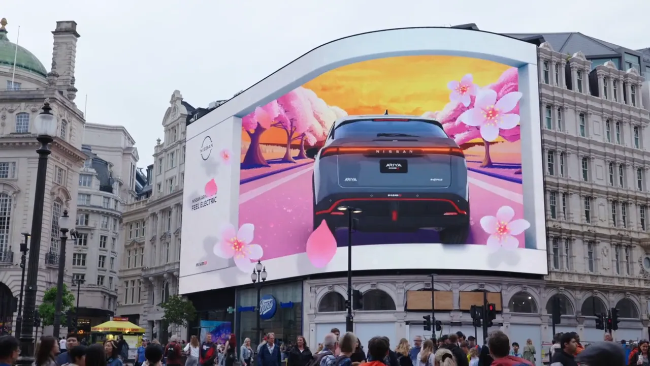
The Japanese automobile manufacturer Nissan is well-known around the world. However, with the industry currently undergoing a transformation with electric technologies, no one's future is certain, and conventional advertising can no longer be relied upon. That's why Nissan took a fresh direction, working with illustrator Matt Saunders. Together, they created a spectacular 30-second infinity zoom animation that took viewers on a journey through futuristic worlds: from racetracks to cyberpunk Tokyo nights.
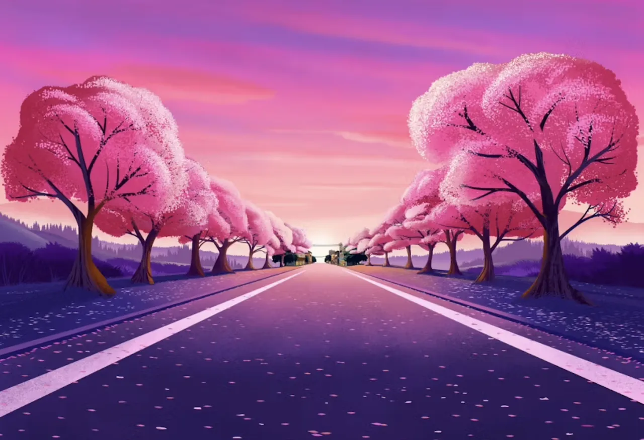

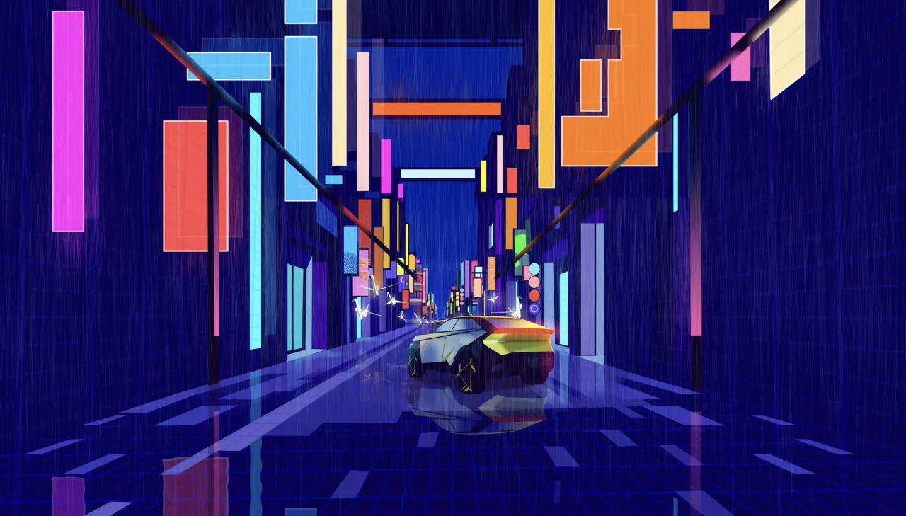
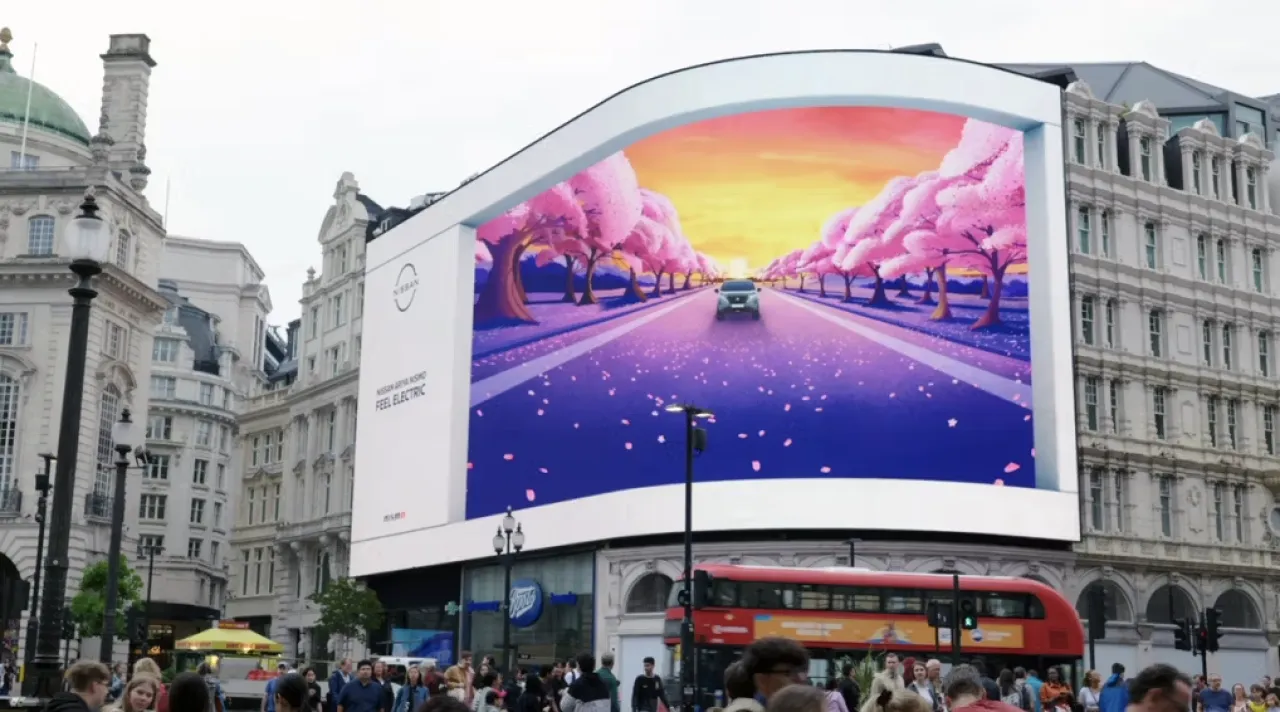
The technical achievement was staggering. Matt worked with production agency Grand Visual for four months, constructing each scene in three detailed sections: background, mid-plane, and foreground, all anchored around a single central point. And while the project was originally designed for online use, the results were so compelling that Nissan booked Europe's largest advertising display—the 783.5m² Piccadilly Lights screen—to show it off to the world.
Key takeaway: When brands give illustrators ambitious briefs and the time to execute them properly, the results can literally stop traffic.
2. Festival culture: Costa Coffee's experiential illustration
Boardmasters is an annual five-day festival held in Newquay, Cornwall, that combines a major music event with surf, skate and BMX competitions. It was a great opportunity, then, to promote coffeehouse chain Costa Coffee to a youthful, hip and influential audience. Yet the brand didn't just want to slap a logo on some merchandise; it wanted to create a tangible experience that people would want to engage with.
As such, Costa commissioned illustrator Luke McConkey to create a series of vibrant artworks that would become integral to their festival presence. In keeping with the vibe of the event, Luke's approach was refreshingly organic. "I just kind of let things start happening, much like when you're at a festival," he explains. "It's all just happening at once, and stuff happens because other stuff happened."
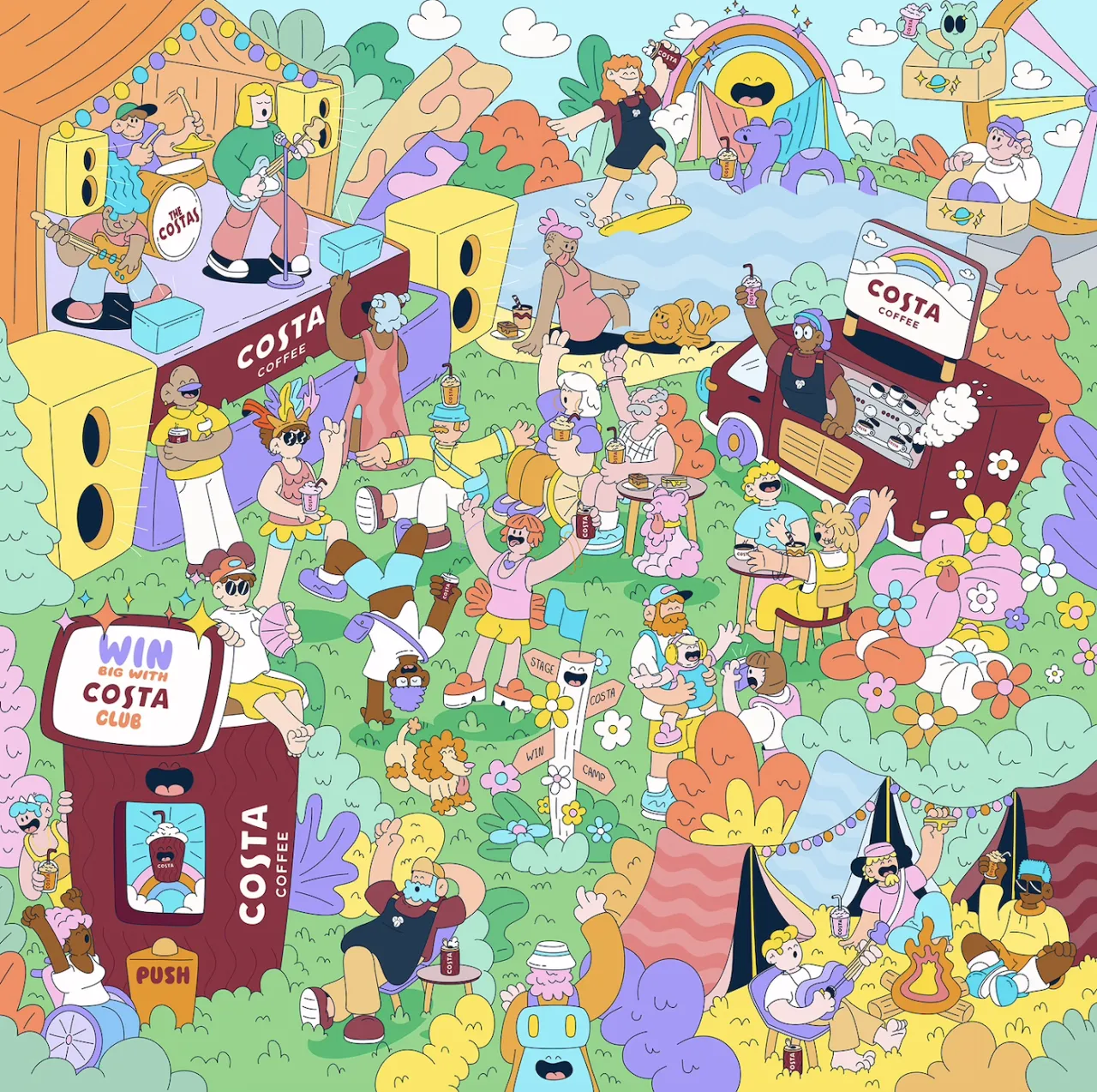
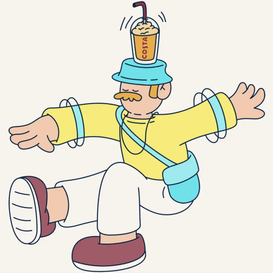
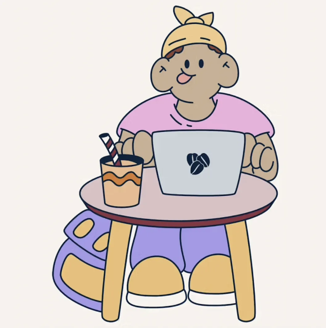
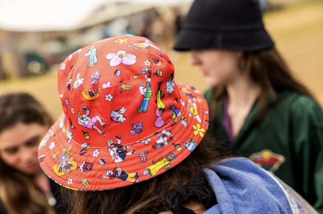
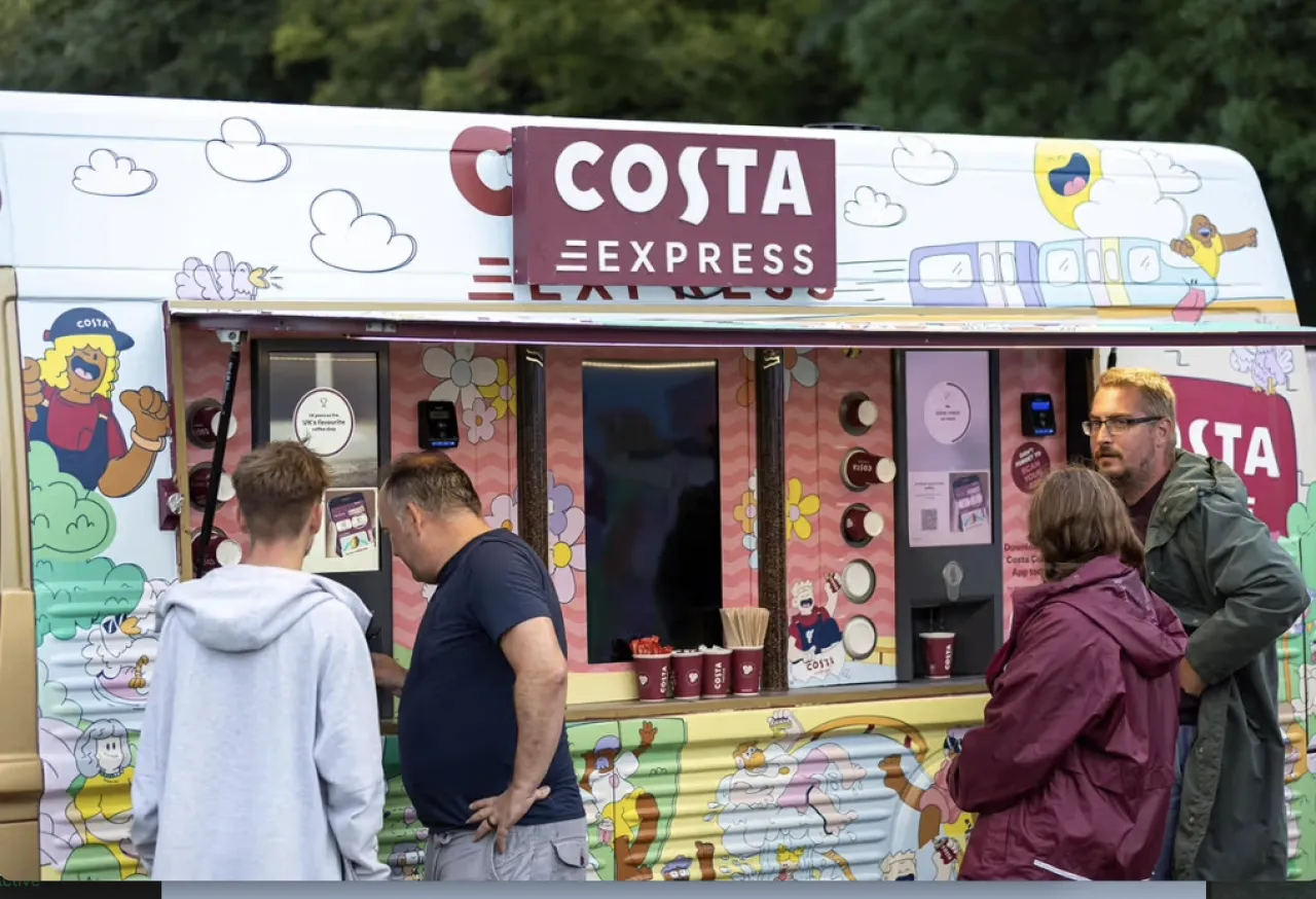
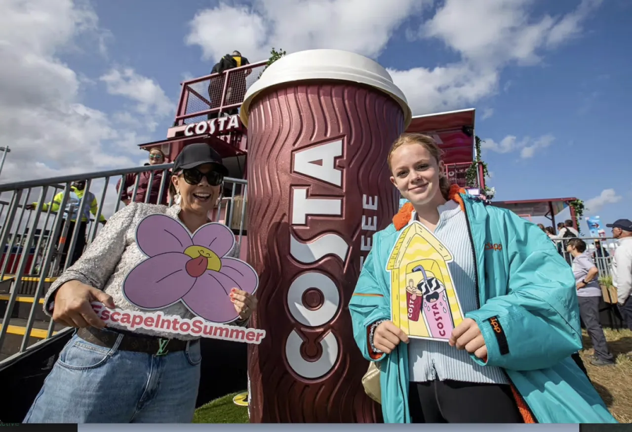
Luke even included himself, his wife and son in the festival scene; "These people make their way into my work subconsciously," he notes. When done authentically, this kind of personal touch can truly inject a sense of humanity into brand experiences.
All in all, Luke's detailed visuals adorned everything from the main installation to highly coveted reversible bucket hats, which became the festival's must-have accessory.
Key takeaway: This case demonstrates that brand activations at pop-culture events can be effective without being corporate intrusions. Illustration can help transform them into spaces people actually want to inhabit and will remember fondly for years to come.
3. Fashion collaboration: When illustration meets streetwear
Founded in 2016, Spanish sneaker brand HOFF has quickly carved out a reputation for its colourful and unique sneakers. Each shoe design is an ode to a particular city, neighbourhood or destination, and the brand often incorporates a landmark or map of the location on the sole.
For their latest collection, HOFF needed an illustrator whose work could match their bold aesthetic whilst bringing something fresh to their location-based concept. Malika Favre proved the perfect match. Known for her instantly recognisable minimalist style, Malika's skill lies in simplifying images to their essential elements, whilst making them pop through masterful use of light and shadow.
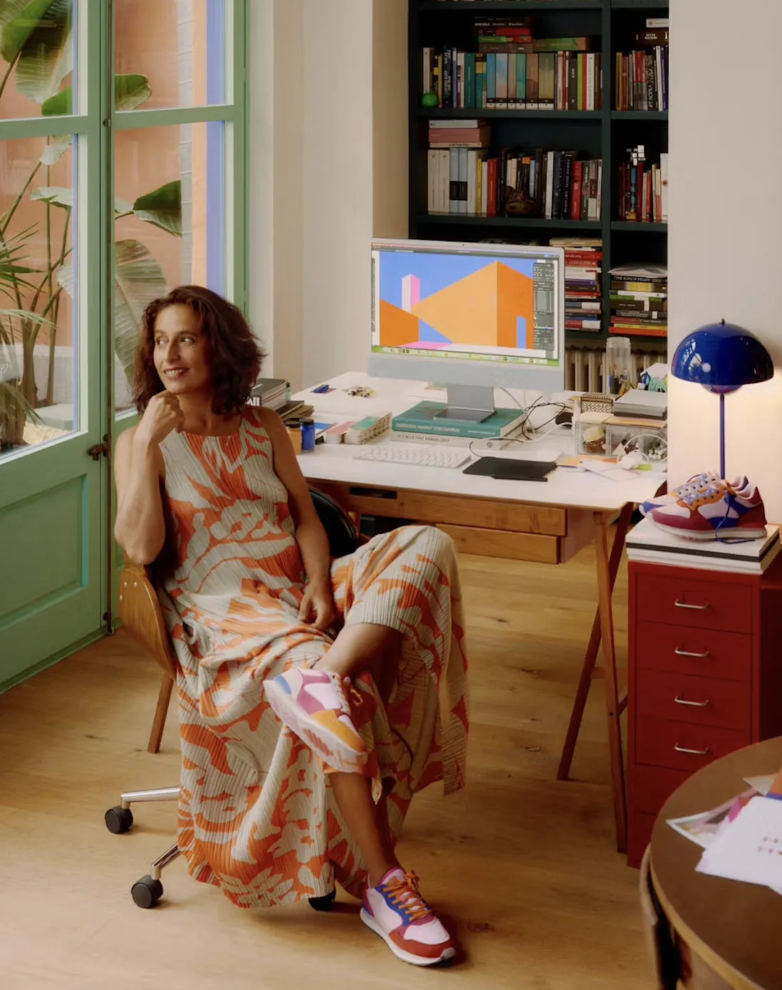
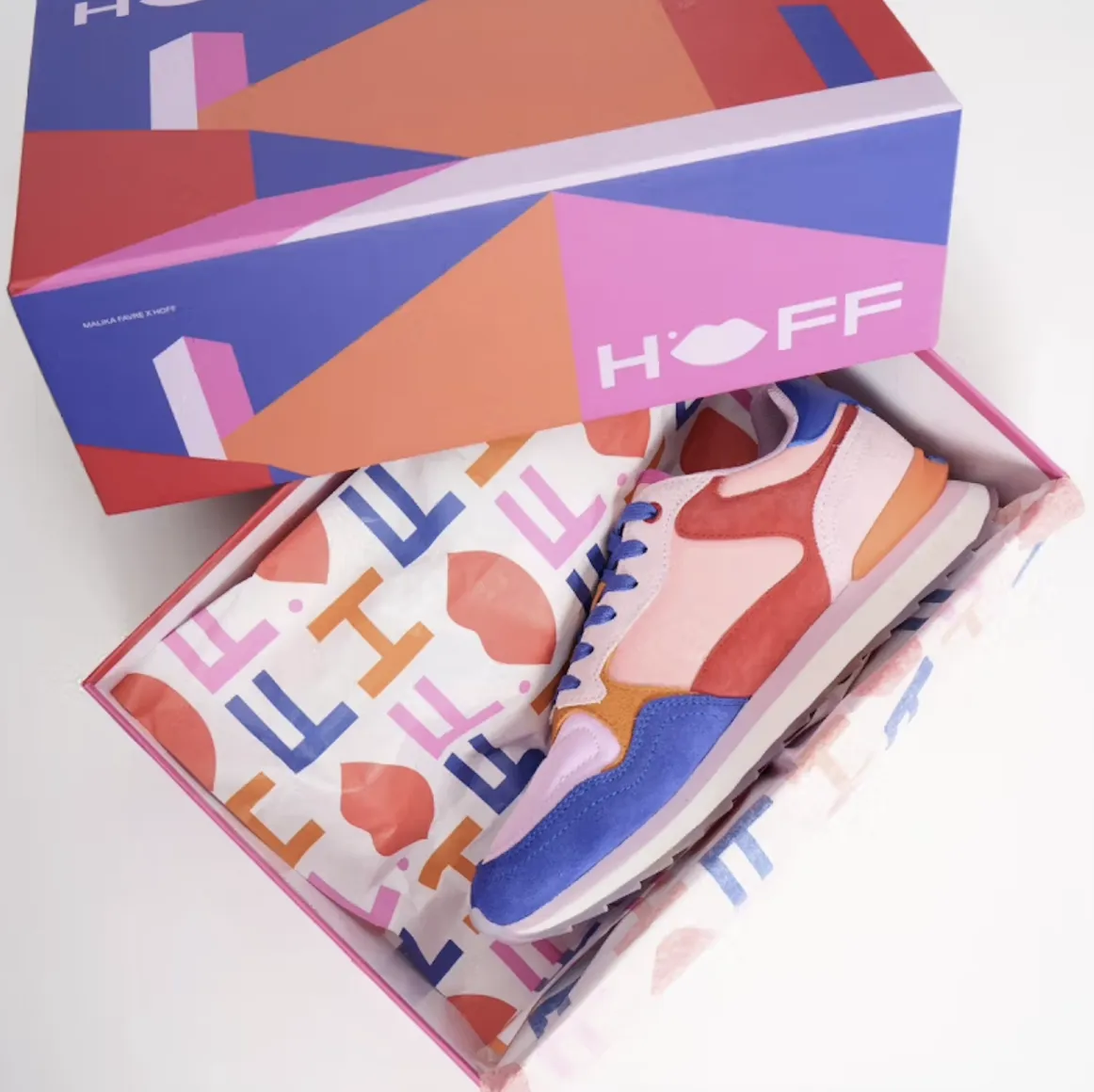
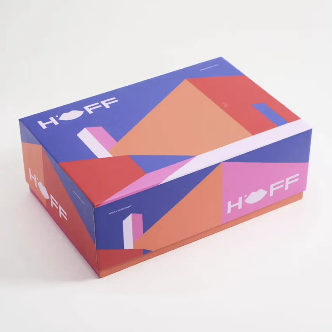
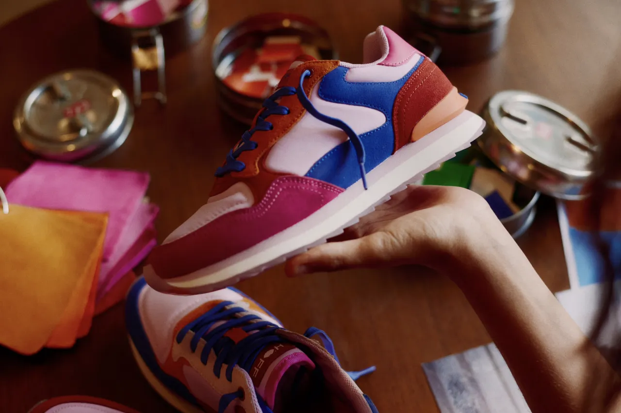
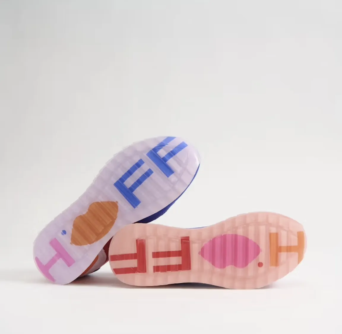
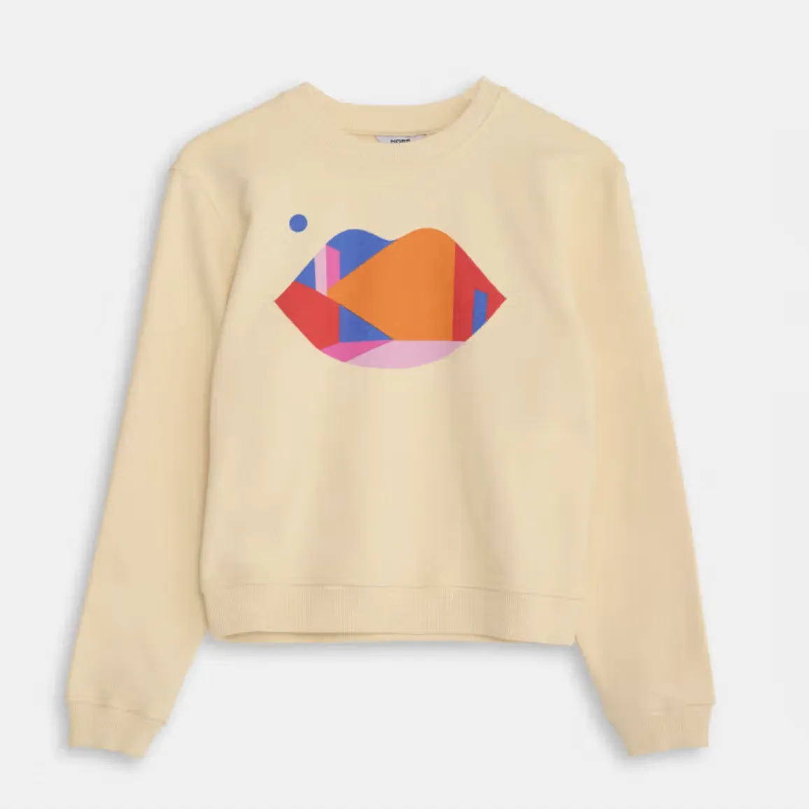
The results can be seen in the Mexican Bauhaus collection, which features a striking sneaker in two vibrant colourways, plus a sweatshirt and tote bag, all sporting Malika's signature lips logo. Drawing inspiration from her favourite place, Mexico, the collection captures the country's iconic colours and architecture through reds, pinks and oranges against light blue skies.
"Colour is incredibly important and I was instantly attracted to it," Malika explains. The collection captured Mexico through what she describes as "a minimalist, architectural vibe where colours and shapes bring the designs to life."
The natural alignment between HOFF's destination-focused philosophy and Malika's ability to distil places into their visual essence created a collection that felt authentically connected to both brand and artist.
Key takeaway: The right artist can become a genuine creative collaborator, bringing their artistic vision to enhance a brand's aesthetic rather than simply decorating products.
4. Retail storytelling: Tesco's destination-driven packaging
Supermarket packaging typically prioritises function over form. But supermarket chain Tesco's Finest tea range bucked this trend by commissioning Tom Haugomat to create five destination illustrations. Working with design agency Coley Porter Bell, Tom crafted vibrant and romantic imagery that transported consumers to tea-growing regions around the world.
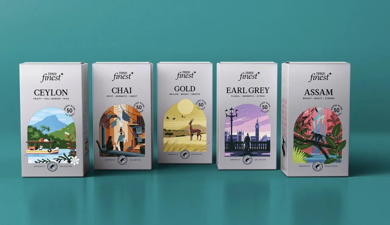
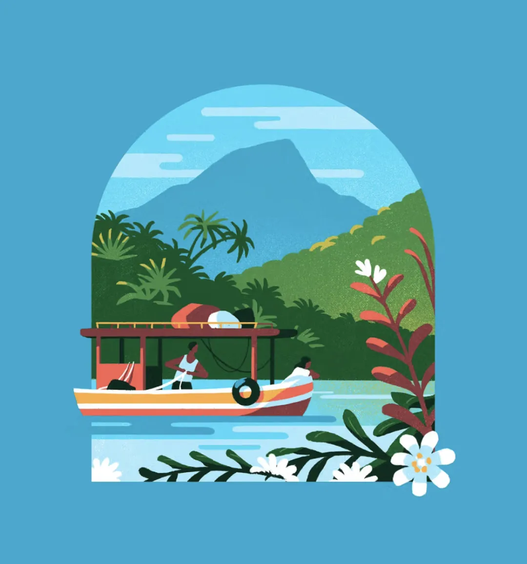
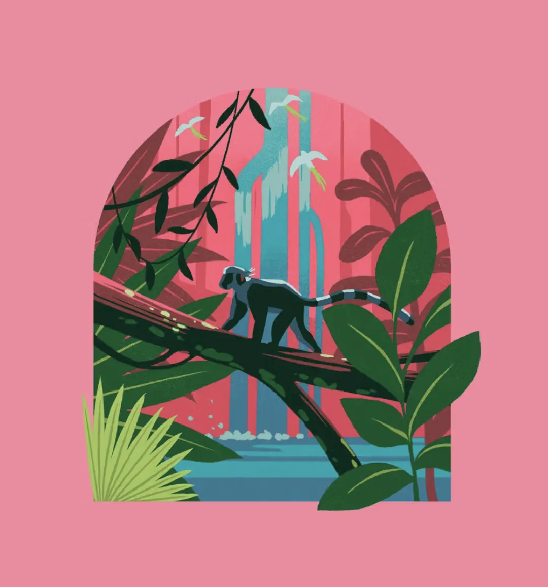
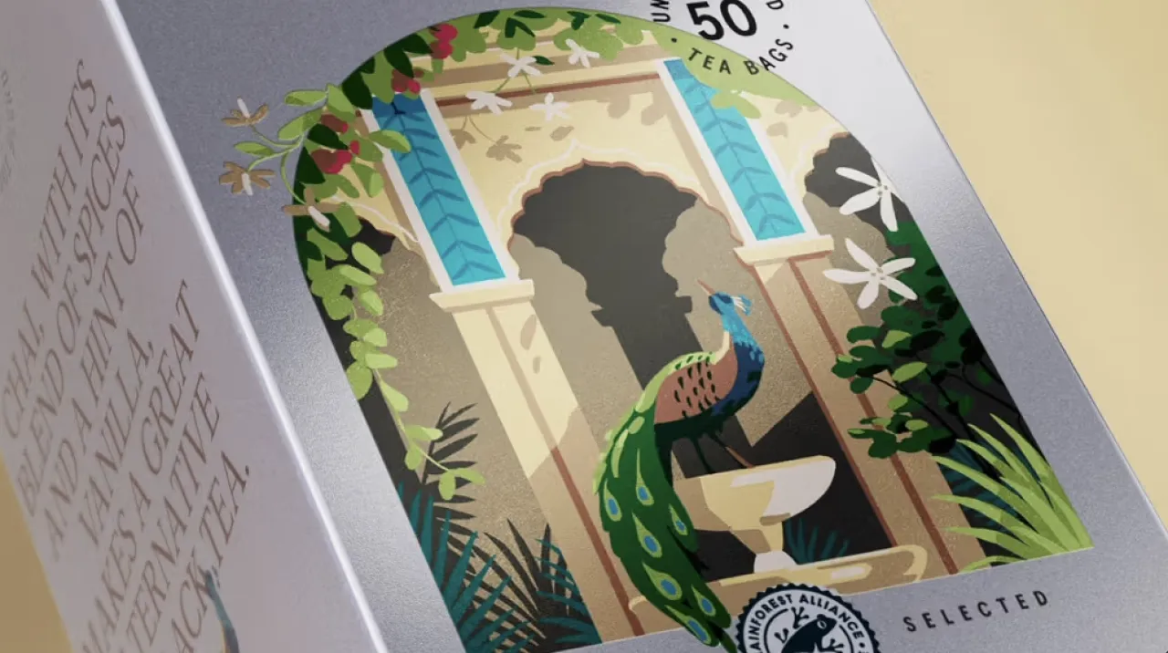
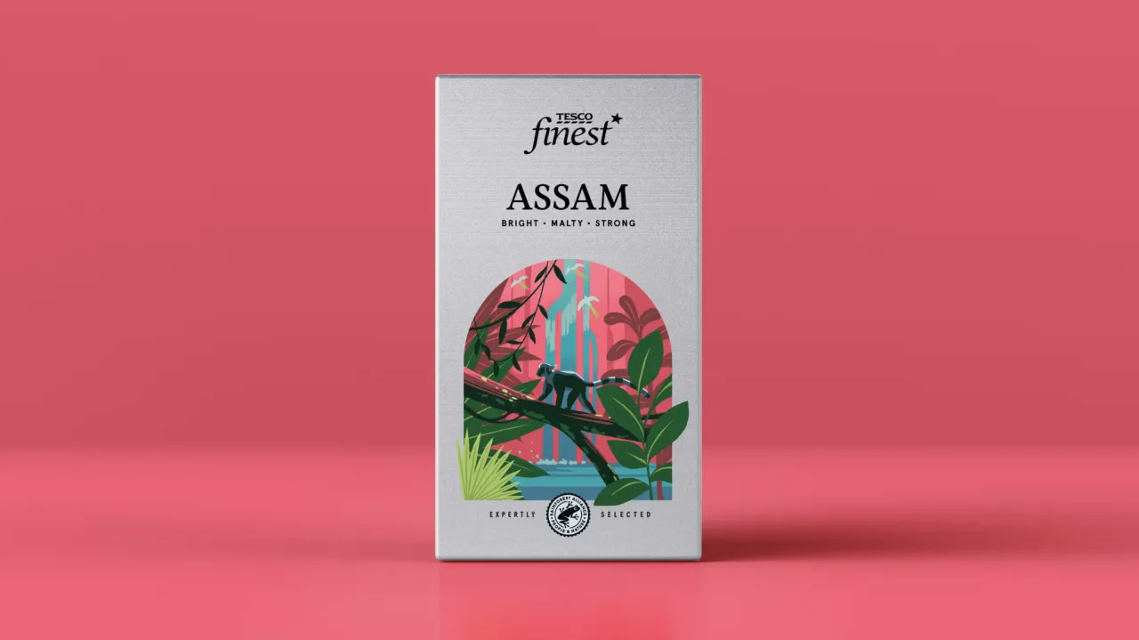
Each illustration required both compositional strength and extractable elements that could work across different pack surfaces. Tom's cinematic quality and subtle textural imperfections conveyed the "handmade, authentic quality" that the brief demanded.
Key takeaway: This project demonstrates how illustration can magically transform mundane retail categories into premium experiences. By investing in bespoke artwork that tells the story of its products, Tesco elevated its tea range from a commodity to a craft.
5. Public transport celebration: TfL's community-focused campaign
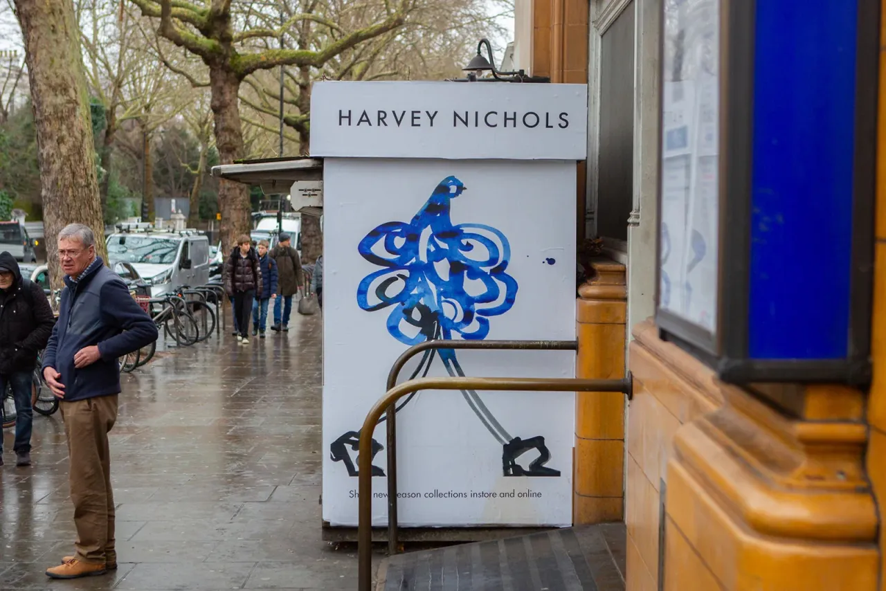
Transport for London (TfL) is a local government body responsible for managing and operating most of London's transport network. Their 25th anniversary campaign, Making Every Journey Matter for 25 Years, highlights how illustration can help public services connect emotionally with their communities. Charlie Davis was tasked with creating three initial artworks celebrating London landmarks and moments, from the 'Baby on Board' badge to the Night Tube.
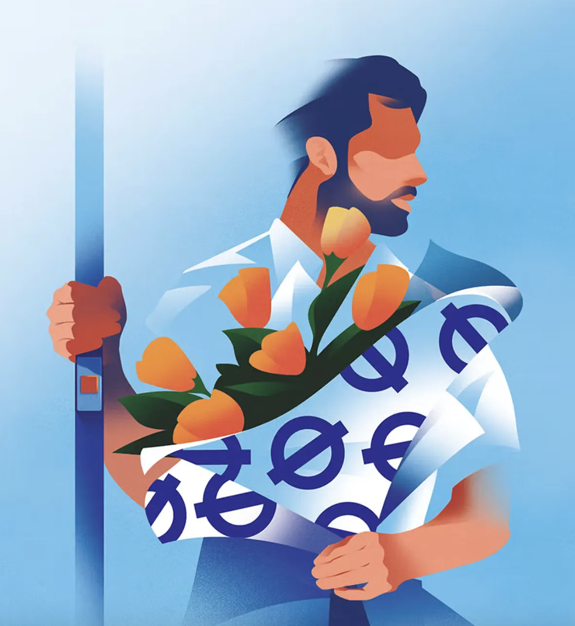
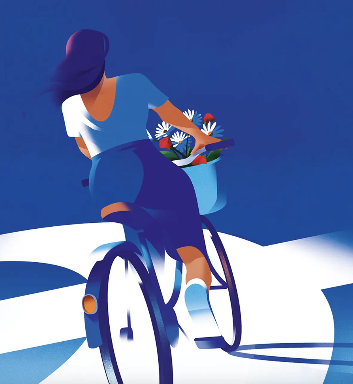
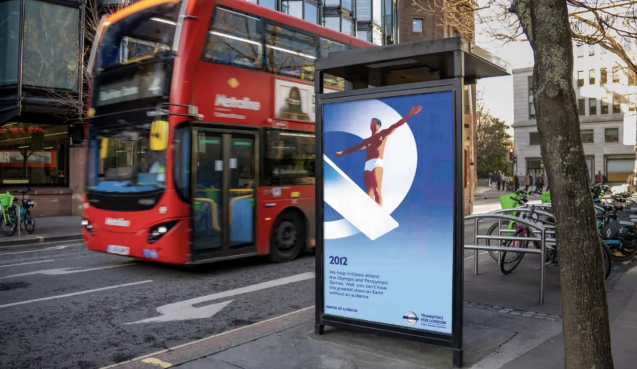
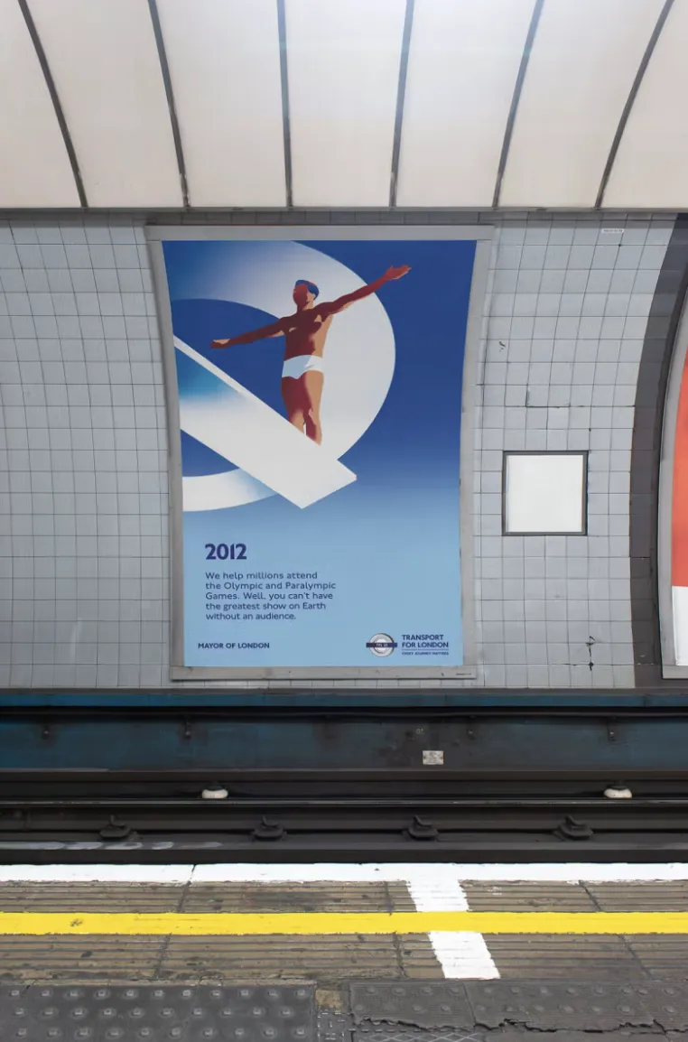
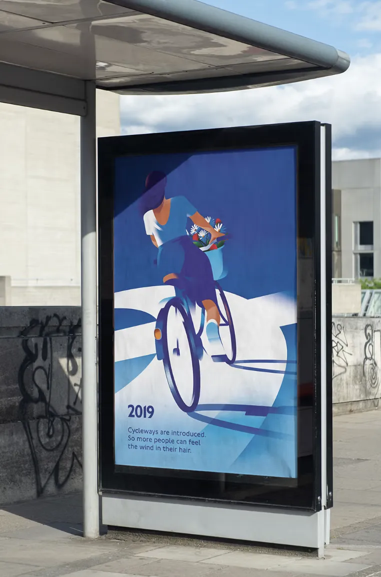
The campaign reimagined familiar transport icons whilst celebrating key London moments, including the 2012 Olympics and the introduction of cycleways. By using a London-based illustrator, TfL ensured the work felt authentically connected to the city it serves.
Key takeaway: This case demonstrates that illustration can help public bodies and institutions convey their values in a way that feels personal rather than bureaucratic.
6. Sensory storytelling: Opihr Gin's Spice Route in paper form
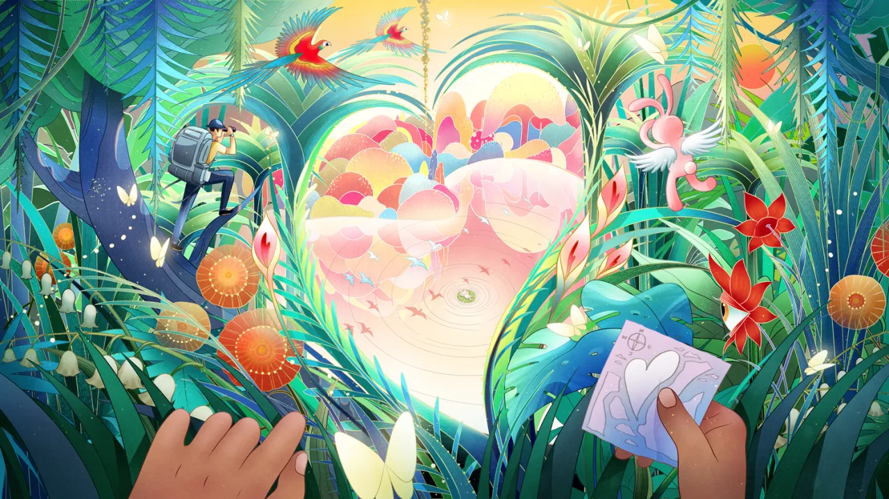
Premium gin brand Opihr wanted to capture its adventurous spirit in a single image: one that would transport viewers to the origins of its botanicals. Paper artist Helen Musselwhite set out to create a key visual that would act as a 'portal' into Opihr's world of flavour. Constructed entirely from paper, her artwork combined arches, exotic flora and fauna, and the gin bottle itself at the centre, as if glimpsed through a window onto the Spice Route. Each layer was carefully designed to add depth and texture, reflecting Opihr's tagline: "Let the taste take you there."
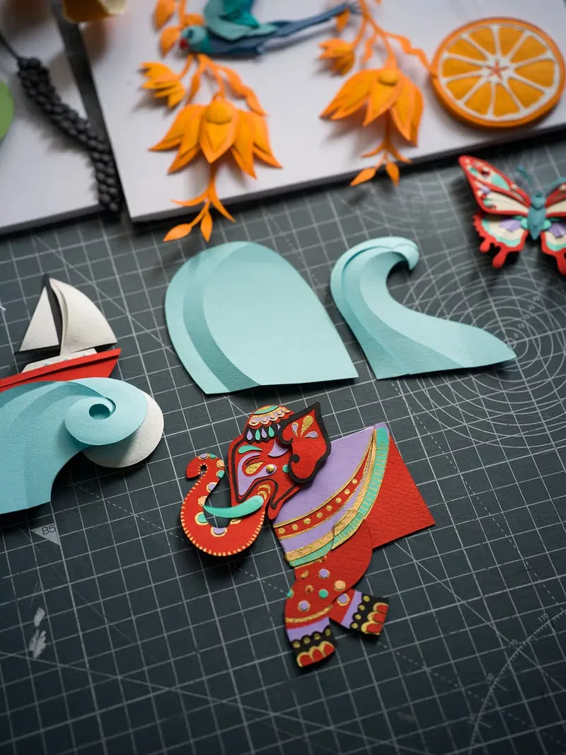
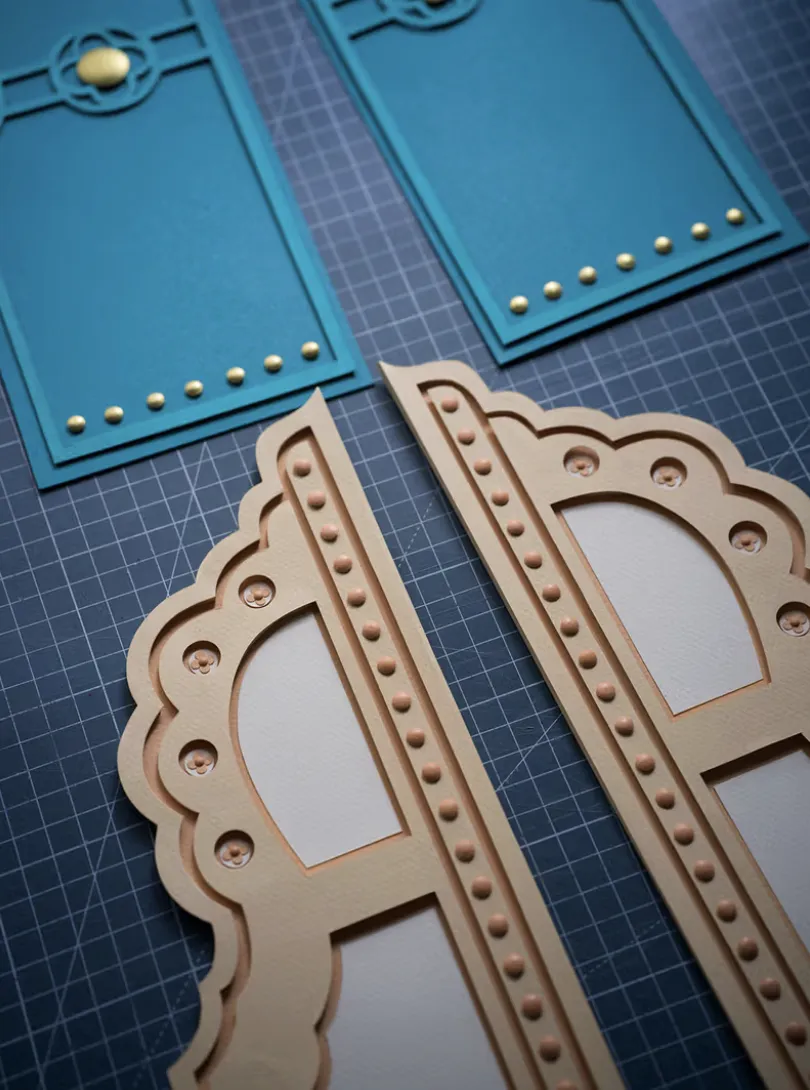
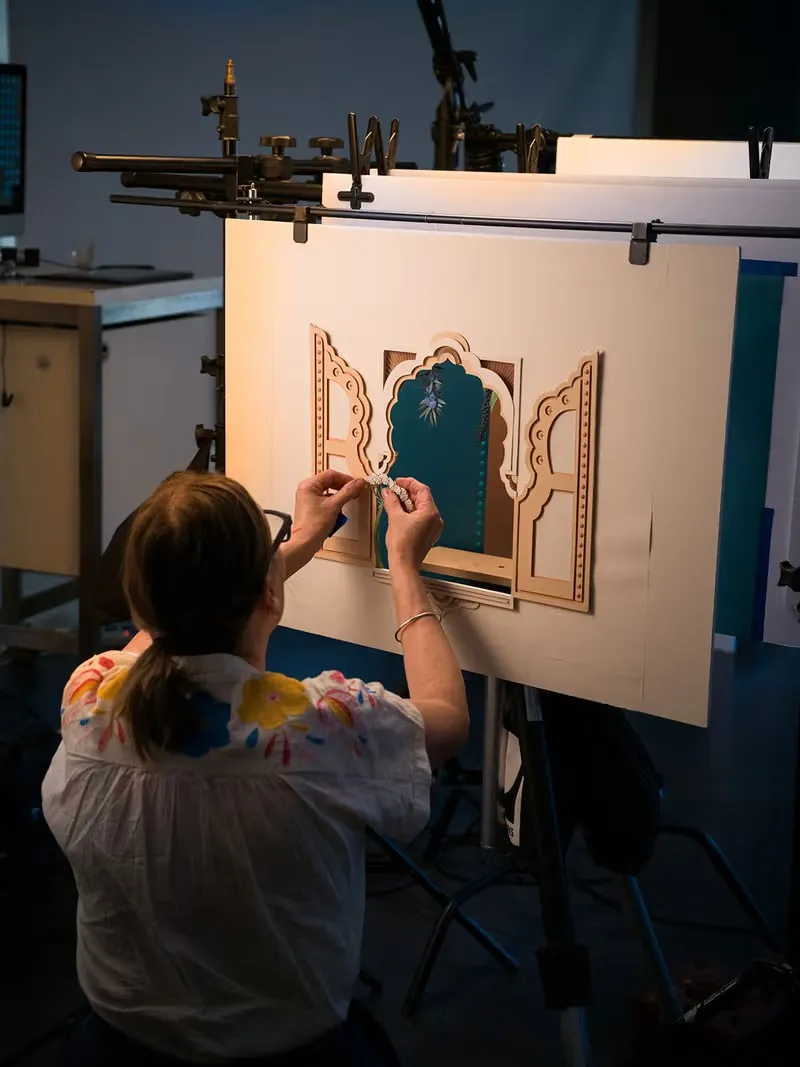
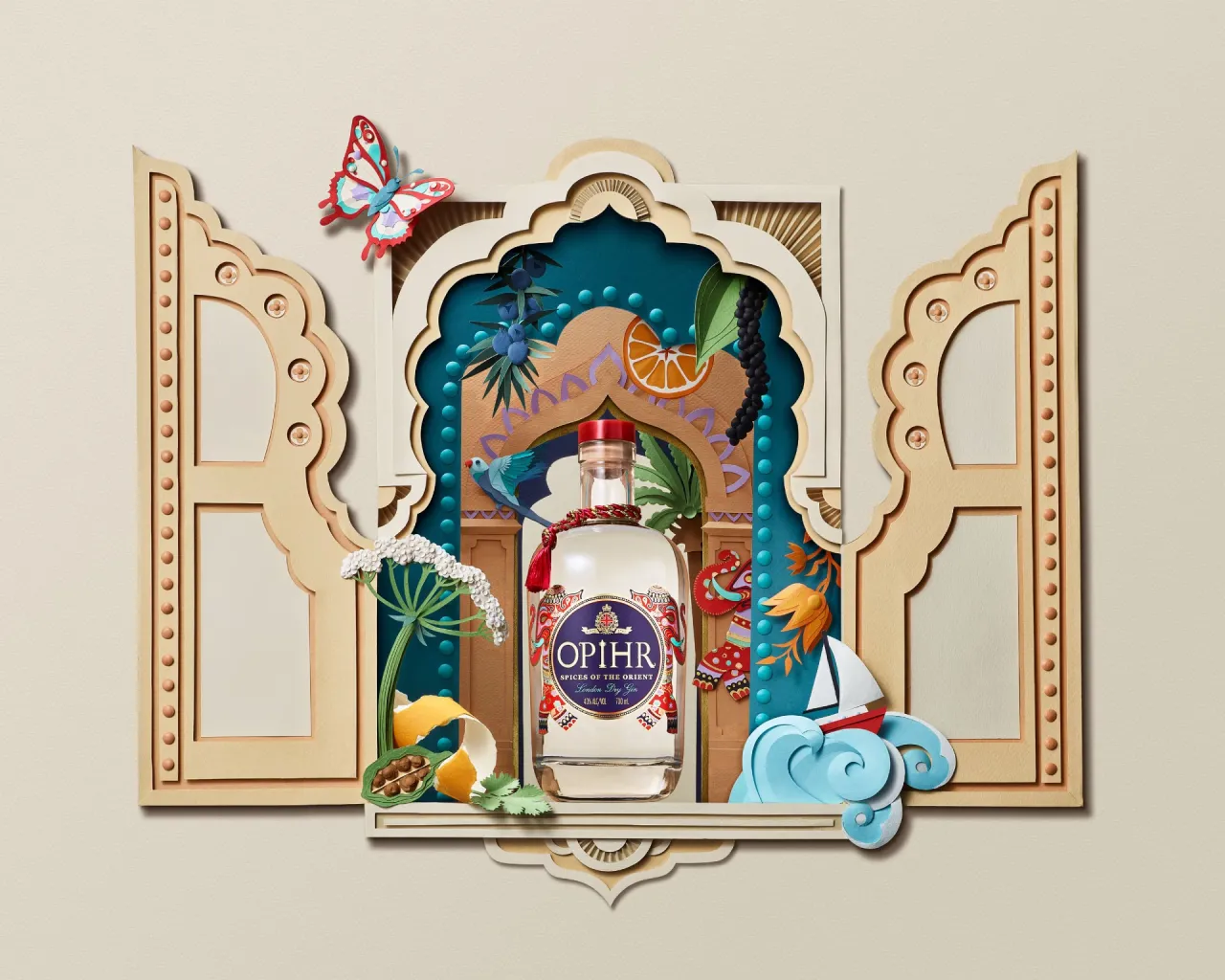
The result is a richly tactile piece of brand storytelling — part sculpture, part illustration — that embodies the craft, colour and curiosity behind Opihr's identity. It proves that in a world saturated with slick digital visuals, something handmade can still feel the most luxurious of all.
Key takeaway: When a brand's story is rooted in craft and heritage, a tactile medium like papercraft can make its values feel both authentic and unforgettable.
Branding in illustration: key trends
These six cases reveal several key trends shaping how brands use illustration in 2025:
Collaboration over decoration. The most successful projects treat illustrators as creative partners, not just 'brush monkeys'. Luke McConkey's organic approach to the Costa project and Matt Saunders' months-long collaboration with Grand Visual demonstrate the power of genuine creative partnership.
Authenticity through personality. Each project succeeded because the illustrator's style naturally aligned with the brand's values. Malika Favre's minimalist aesthetic complemented Hoff's playful boldness, whilst Tom Haugomat's romantic sensibility elevated Tesco's premium positioning.
Multi-touchpoint thinking. In today's world, illustration commissions need to assess how well artwork will work across multiple touchpoints. Tom's extractable elements for Tesco and Charlie's designs for various TfL locations show how smart planning maximises the impact of creative work.
Experience over advertising. The best campaigns today aren't just top-down, but use illustration to create experiences people want to engage with. Costa's festival installation and Nissan's Piccadilly Lights spectacle transformed advertising from something to be endured into something to be enjoyed.
As brands continue to seek authentic ways to cut through digital noise, these case studies suggest that commissioning the right illustrator isn't just about creating visually appealing images: it's about building genuine connections that run deep and last long after the campaign has concluded.

Editor's Picks





Trending

Latest Jobs
Client Director at Koto
Full-time·Berlin·€70k-€85k
Graphic & Motion Designer at The SHARP Agency
Full-time·Leeds·£26k–£33k
Digital Marketing Executive at Arise
Full-time·Sheffield·From £23,750
Senior 3D Motion Designer at Art&Graft
Full-time·London·£50k-£65k
Midweight Editor at Earworm
Full-time·Bristol·£28k-£32k
Design Lead at Madeo
Full-time·New York City·$85k–$120k