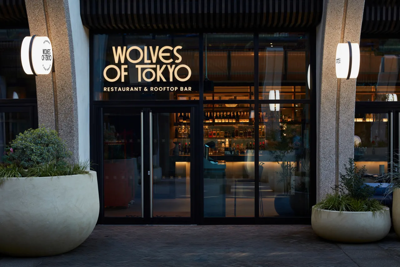
The best restaurant brands don't announce themselves. They accumulate in small decisions repeated until a room feels inevitable rather than designed. Wolves of Tokyo, the new Japanese restaurant and rooftop bar at Olympia—London's newest destination for food, drink and live music—is a useful case study in exactly that kind of accumulation, and can offer lessons to anyone who works across branding and spatial design.
I was kindly invited to sample the tasting menu last weekend, working my way through sashimi, karaage and yakitori towards a mouthwatering sea bass maki that's stayed with me ever since. As for my surroundings, what struck me wasn't any single flourish. It was how consistently yet subtly the room repeated itself: lacquer red against midnight blue on the tables, the coasters, the menu, the bathrooms and the signage outside, all pulling from the same small, disciplined palette.
Nothing shouted. Everything matched. The food and the dining experience were allowed to speak for themselves. That kind of restraint is harder to achieve than it looks, and it's the result of a specific way of working. One that the creative studio behind it, Run for the Hills, was happy to walk me through.
Under one roof
Founded in 2012 by Anna Burles and Chris Trotman, Run for the Hills deliberately keeps both branding and interior design under one roof. Chris leads the graphics and naming side, Anna the spatial design. And while many studios would develop a name and identity first, then hand it over to an interiors team to interpret. Run for the Hills does the opposite.
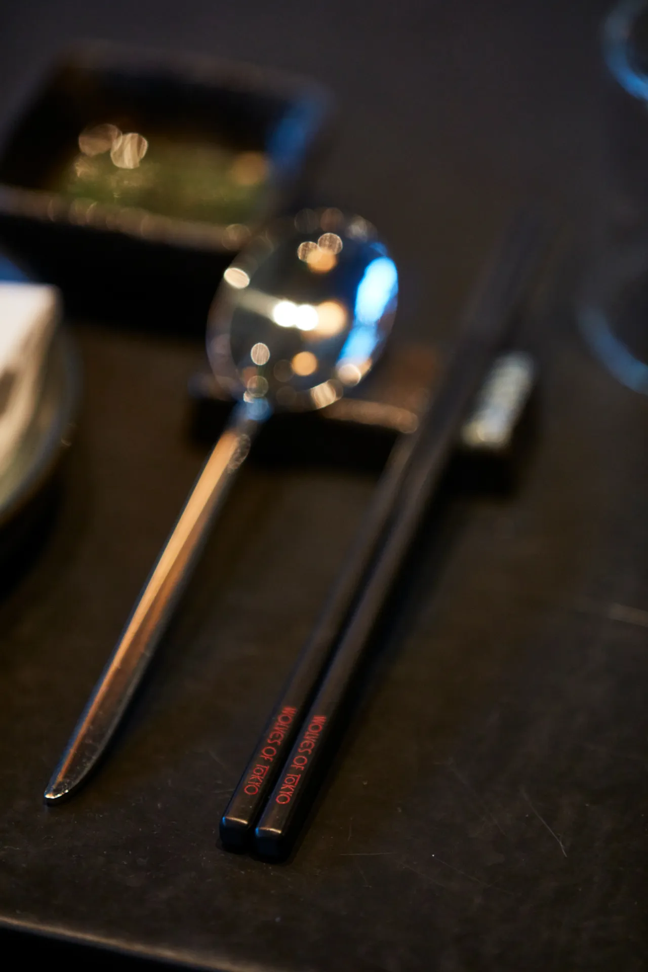
"The interiors team and the branding team work on projects together, which I think is a better way of doing it," Chris says. "Otherwise you take the brand one way and the interiors another, and it takes longer, because you have to do it sequentially."
At Wolves of Tokyo, that meant the colour palette wasn't handed down from a logo. It came from the room itself—the blue lacquer of the tables and the red of the custom waitstations—and was only then pulled back into the graphic identity.
The lesson for any studio working across disciplines is straightforward. Colour, material and typography decisions made in isolation tend to compete once they meet in a real space. Decisions made together, in contrast, tend to reinforce each other.
Let the brief set the mood
The cinematic, moody direction for Wolves of Tokyo was there from the very first briefing document, well before anyone had settled on a name. "We're harking back to the golden age of Japanese film in the 1960s and 1970s, but also a bit of Western noir too, in the shadows created by window blinds and things like that," Chris explains. "We wanted it to be moody, and the colour palette was set early on: deep blues and reds, contrasting."
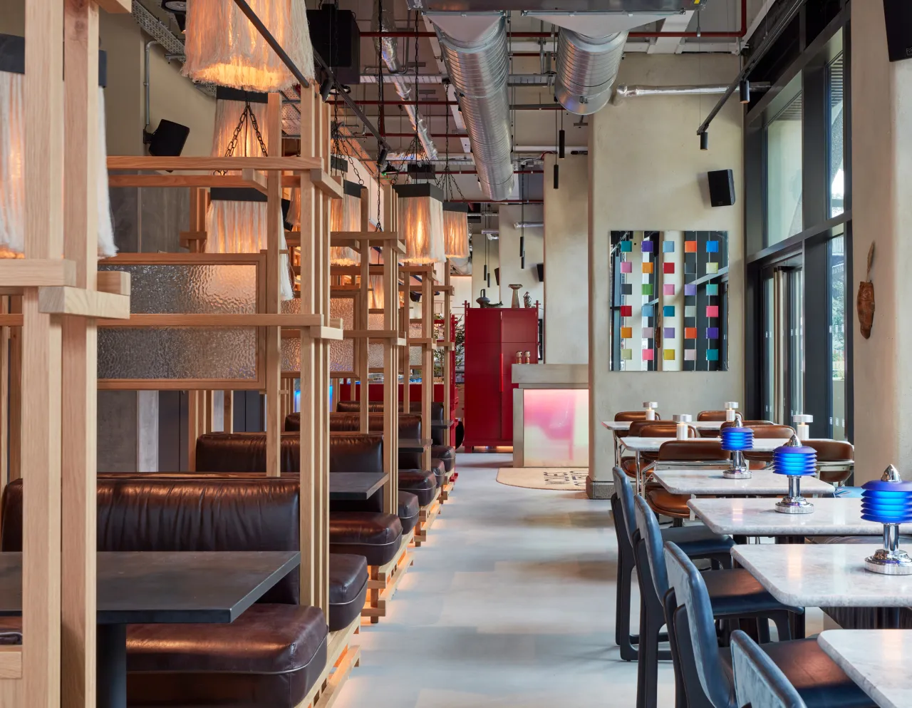
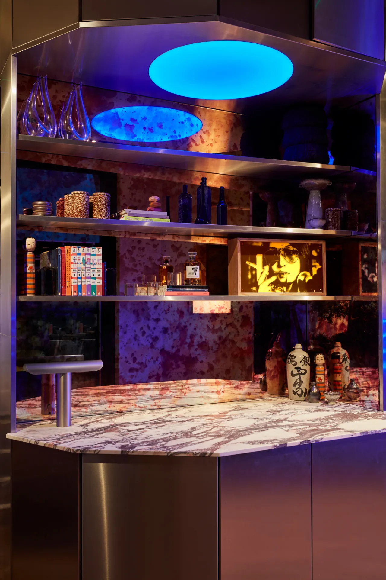
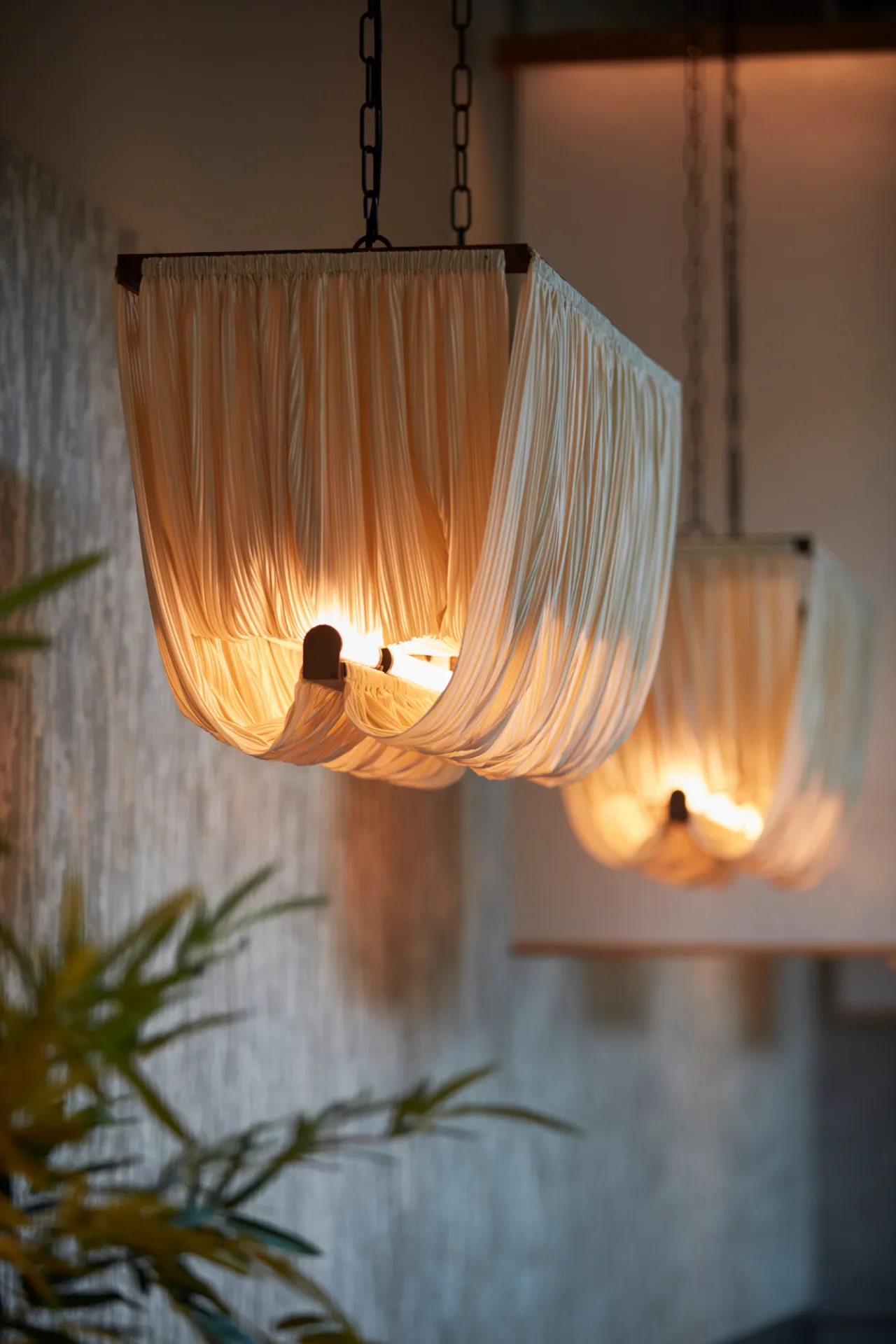
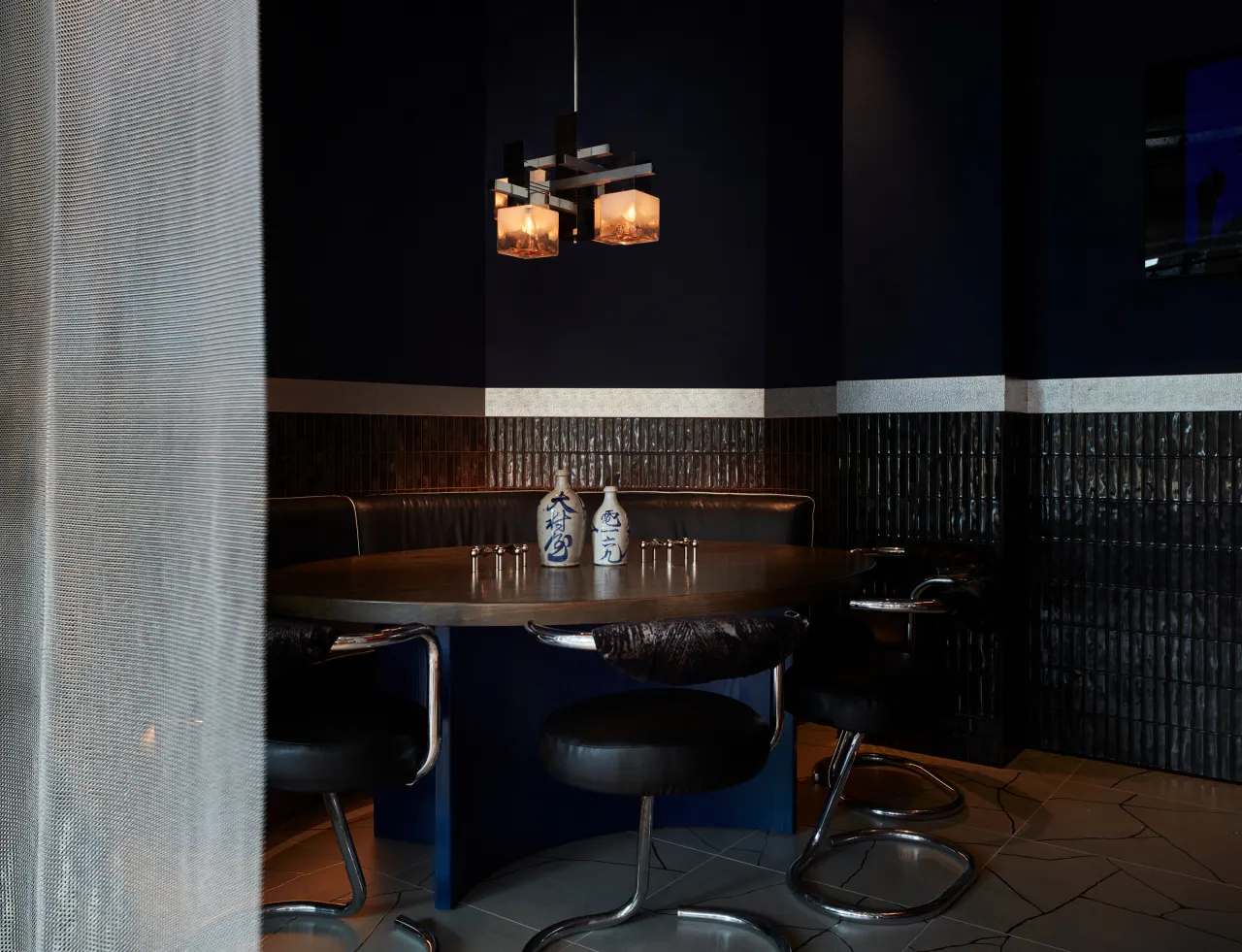
That sequencing matters. Establishing tone before vocabulary meant the eventual name had something specific to live up to, rather than being chosen first and retrofitted with a mood. The naming process, meanwhile, was a lesson in restraint. Rather than reaching for an obviously Japanese word, the team wanted something that read as unmistakably 'Tokyo' without leaning on the language directly.
They surveyed restaurant names across Melbourne, Sydney, New York and London, worked through Japanese idioms and food culture, and built a long list running from 'Neko Noir' to 'Dumplings Over Flowers' (a Japanese phrase meaning substance over style), before Wolves of Tokyo rose to the top.
The client's instinct was that the name should signal the cuisine clearly without tipping into pastiche, and that instinct shaped everything downstream. "They didn't want any clichés or tropes," Chris explained. "So there are lots of Japanese touches—crosswork, wooden slats and things like that—but it's more subtle."
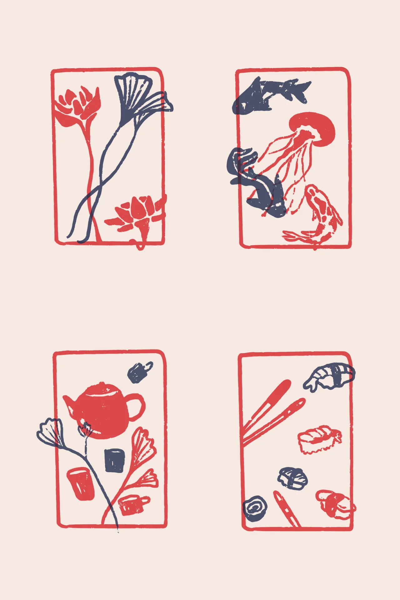
Sitting in the restaurant, that restraint is obvious. Nothing here looks like a theme park; quite the reverse. And the Japanese references (koi carp, lotus flowers, hand-pressed illustration) are so gentle, they feel discovered rather than laboured.
Give the brand a story worth finding
The most instructive detail for a branding audience is probably the smallest. The logotype hides a torii gate in its letterforms; it is visible once you've spotted it and invisible until then.
A fictional character, Lady Zee, was invented as the notional leader of the Wolves, and her private apartment doubles as the restaurant's main private dining room. "The Wolves aren't a stabby gang," Chris qualifies. "They're more like a West Side Story, PG-12 gang."
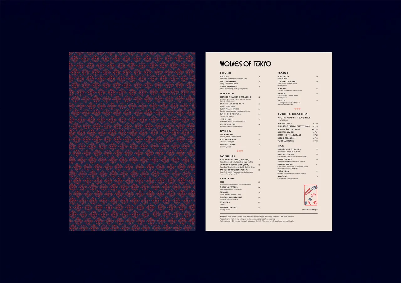
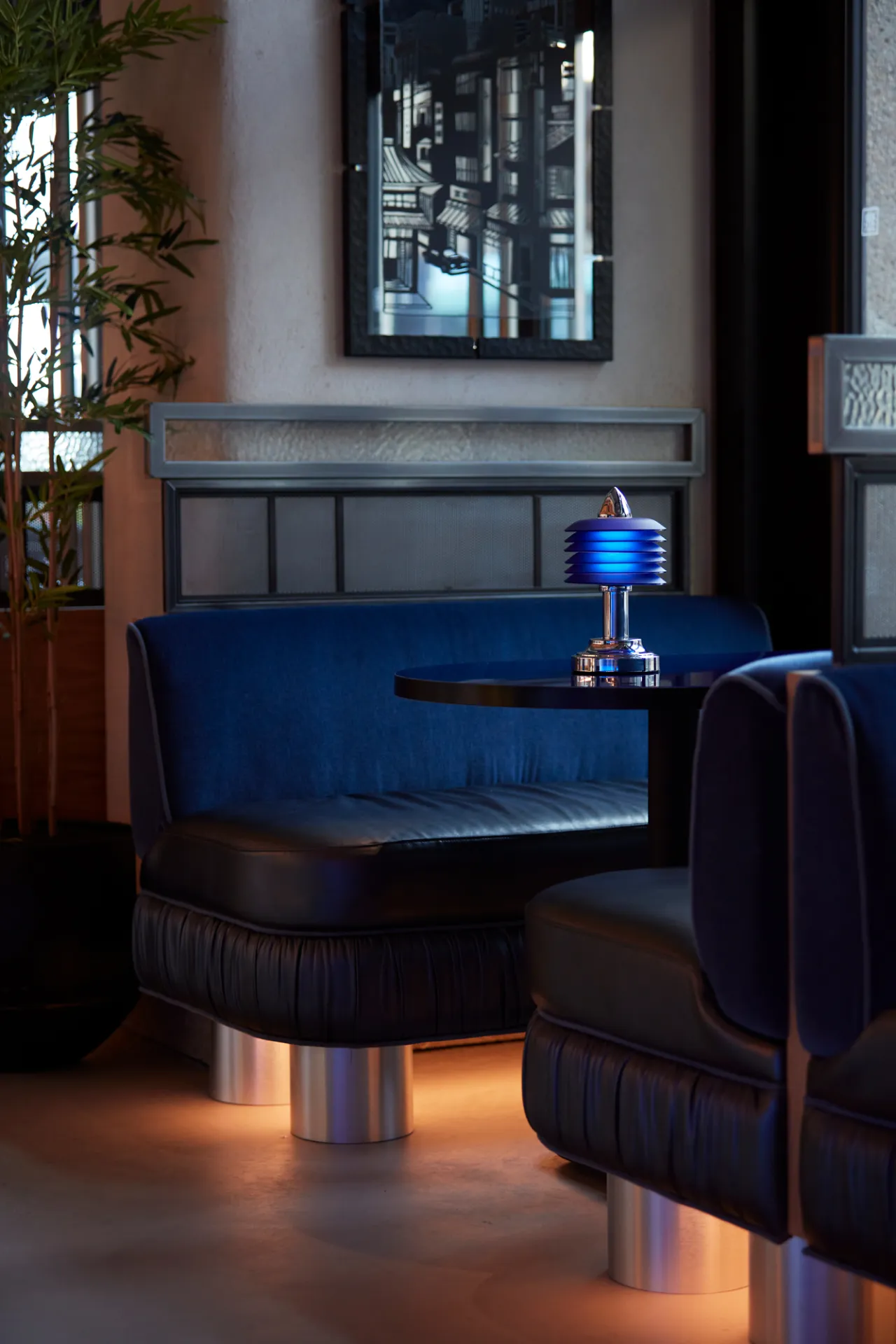
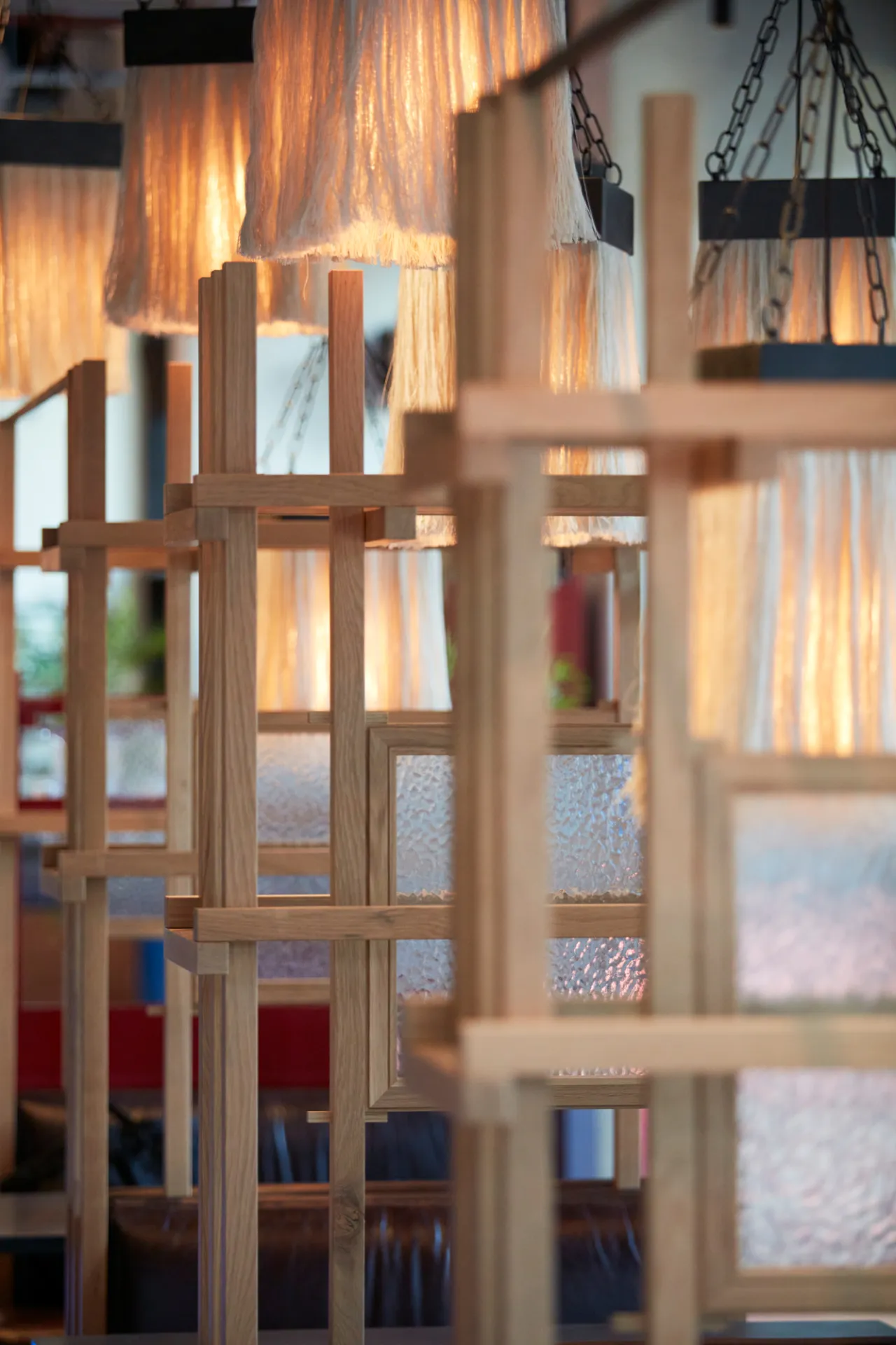
None of this stuff is obvious unless you go looking for it. But it gives the brand a depth that rewards a second look, which is precisely the point. Invisible detail is what separates a name from a world.
Every surface as brand real estate
At Wolves of Tokyo, even the bathrooms get the full treatment: deep inky tiling, ivory crackle glaze and asymmetric mirrors that make the walk back to the table feel like part of the evening rather than an interruption to it. "I think it's nice when the toilets are like an event," Chris reflects. "A lot of people judge a restaurant by the time and effort put into the toilet, and the cleanliness of it too." It's a detail too many hospitality briefs skip, much to their detriment.
I ask Chris what they want a diner to feel on walking into Wolves of Tokyo. "Like they've set foot into another world," he responds. "Like they've been transported out of London to somewhere else, because the best restaurants do that."
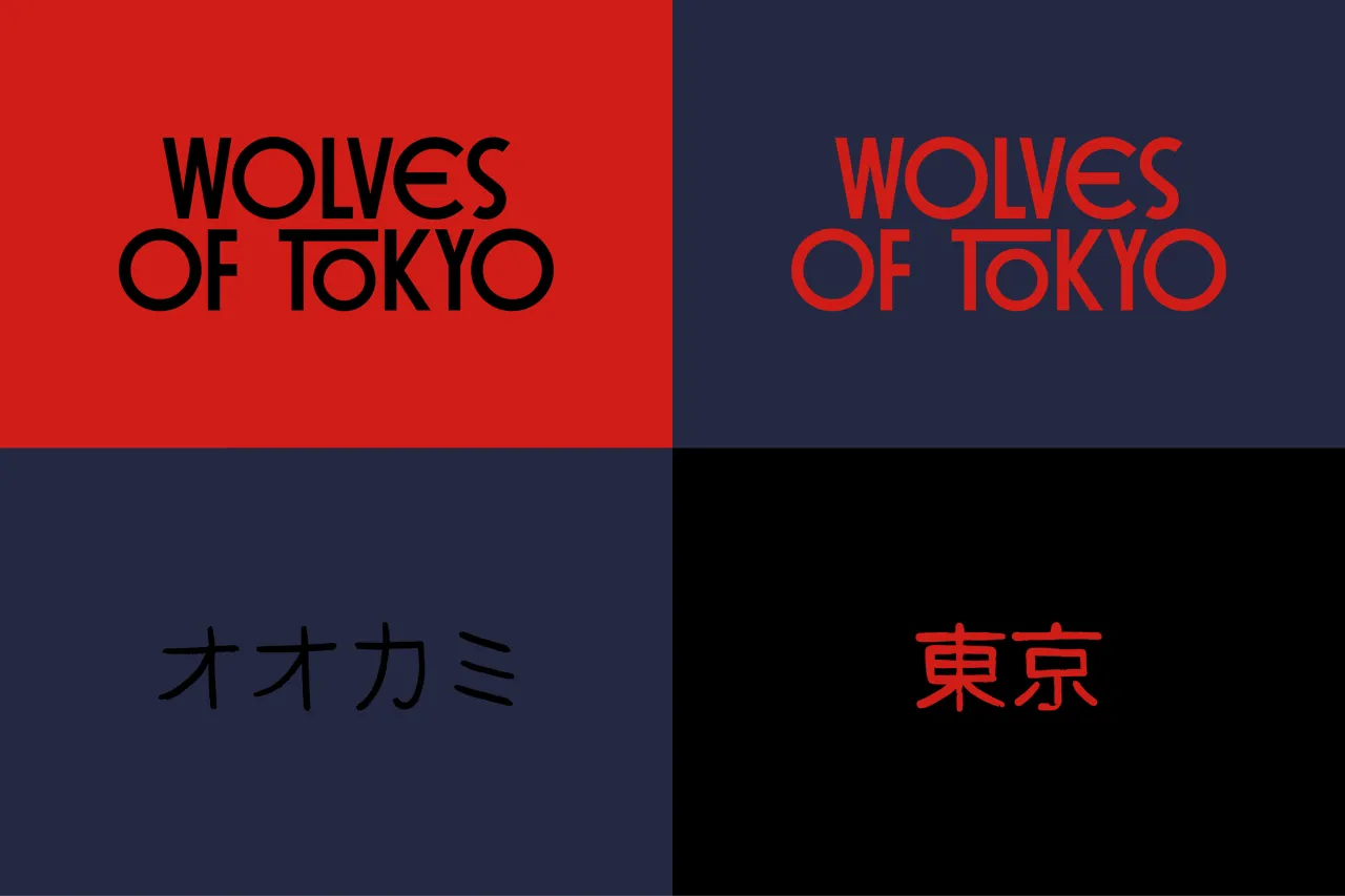
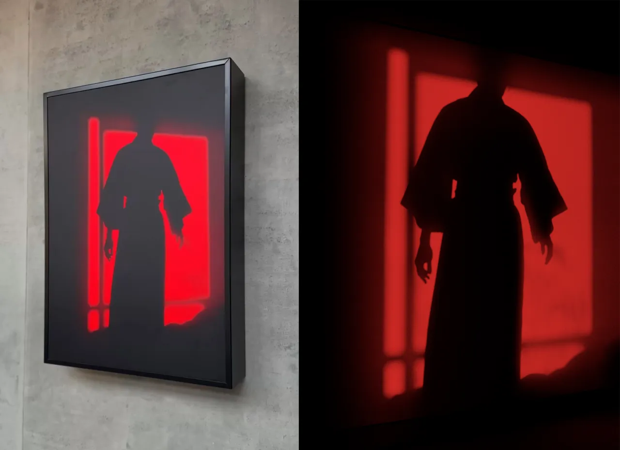
Above the restaurant, Above Wolves runs its own warmer sister palette of hammered gold and coral, distinct but never off-brief. Downstairs, the effect is quieter and more consistent, right down to the coaster under your drink. For anyone briefing a spatial or branding project this year, that consistency, built through collaboration rather than handover, is the design lesson worth taking home.
"It's invisible branding," Chris stresses. "It's not about sticking logos everywhere. All of the art we've created is from the same song sheet, so it all comes together to create a sense of occasion. Because a night out these days is a treat, isn't it?"
And ultimately, that's the throughline worth taking away from Wolves of Tokyo. Not the noir palette, not the hidden torii gate, not even the karaoke room, but the discipline of making dozens of small decisions answer to a single mood.
Editor's Picks





Trending


Latest Jobs
Brand Strategist at DNCO
Full-time·London·£45k-£60k
Senior Digital Designer at 3800
Full-time·Sheffield·£40k-60k
Senior Front End Developer at Crown Creative
Full-time·Belfast·£50k–£60k
Senior Designer at Jubba
Full-time·London·£50k-£60k
Growth Strategist (Ecommerce) at Tribe
Full-time·Exeter / London·£50k + Bonuses
Senior 2D Motion Designer at Art&Graft
Full-time·London·£50k-£65k