Glasfurd & Walker craft colourful and uplifting packaging for a Canadian beer collaboration
Standing out on the shelves is a huge challenge for any craft beer. Glasfurd & Walker teamed up with illustrator Kate Dehler to give 'Friend Zone' the visual boost needed to succeed.
In most parts of the world, if multiple companies in the same business set up on the same street, they'd be bitter rivals. But when three craft breweries emerged in Murray Street, Port Moody, British Columbia, they didn't set out to steal each other's market share.
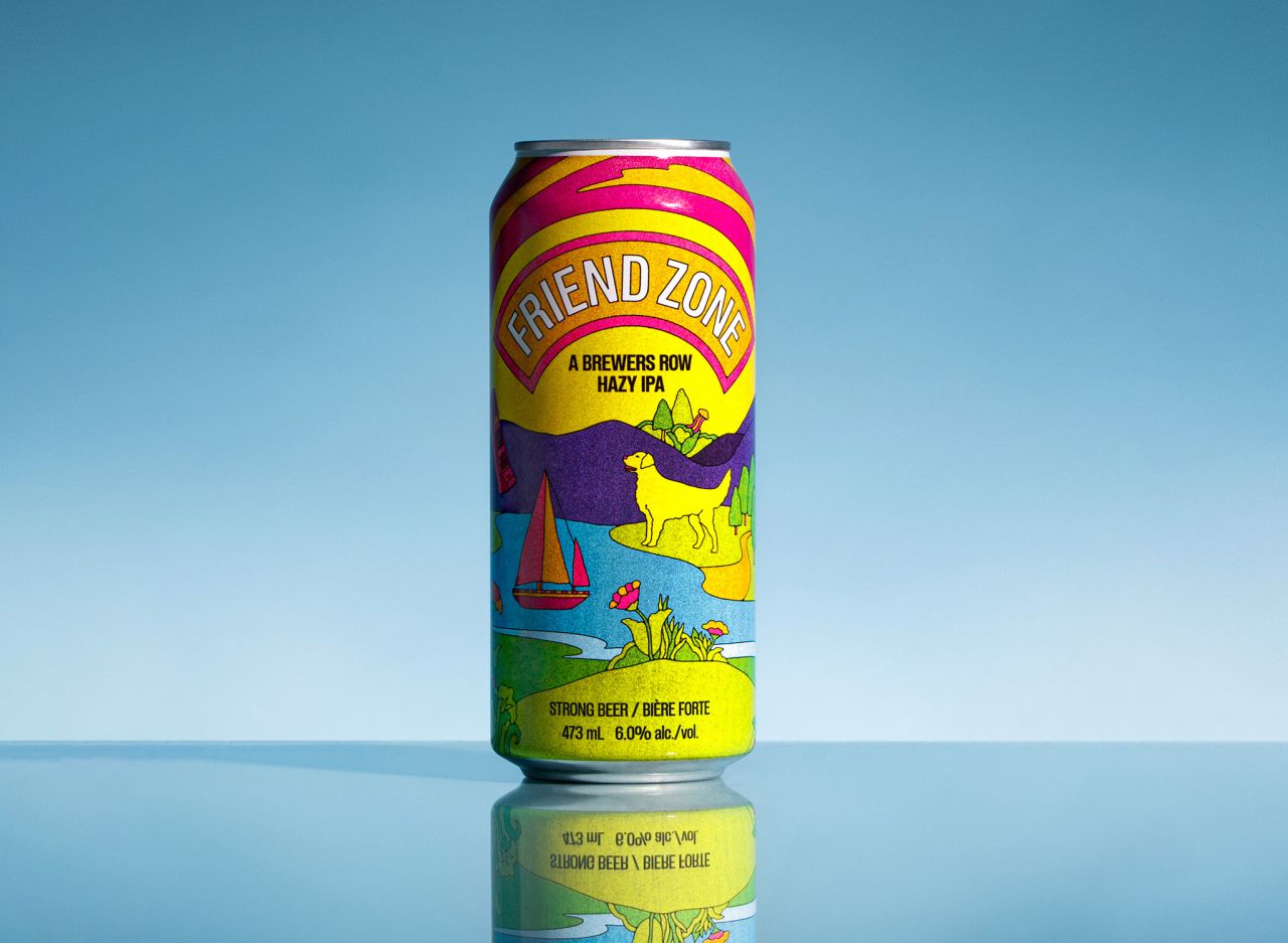
Instead, they decided to team up and collaborate on a joint beer called 'Friend Zone'. Not only that, but proceeds would go towards the Canucks Autism Network, a non-profit organisation that supports individuals and families living with autism.
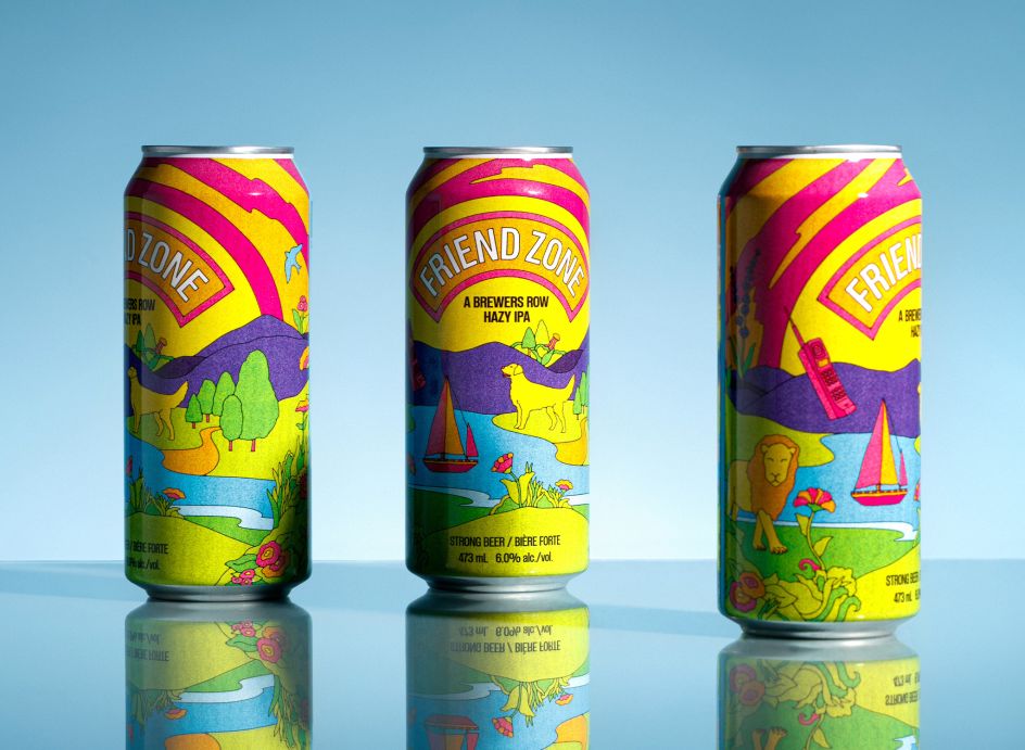
None of this has done anything to dent the stereotype of Canadians being 'overly nice'. But it has resulted in a great beer: an IPA with stone fruit notes on the nose and berry, grapefruit, and mango flavours. And the packaging, designed by Vancouver studio Glasfurd & Walker, in collaboration with illustrator Kate Dehler, hits all the right notes too.
We chatted with Kate and Phoebe Glasfurd, co-founder and creative director at Glasfurd & Walker, to find out how they approached this unique branding project.
The brief
"The brief was to create a label that was inclusive of all the breweries but with its own distinct and unique identity," explains Phoebe. "Each brewery has its own brand and design language, so the challenge was to create something that brought them all together and was distinctly different from any of their brand identities."
And distinctiveness was super-important for this new brand. "British Columbia is home to the largest number of breweries of any province in Canada, despite consuming the least amount of beer per capita Canada-wide," she explains. "So standing out on shelves is a challenge."
The illustration
Glasfurd & Walker were keen to work with Kate Dehler on the illustrations, Phoebe explains. "Kate's work is fresh, vibrant and uplifting," she says. "She manages to blend seemingly disparate elements into beautiful, cohesive, magical worlds, which made her perfect for the project.
"We're big fans of her work and felt it would be a great fit for this beer which was a limited edition and special project," says Phoebe. "Kate's work also uses colour in a unique and nostalgic way. The tasting profile of the beer immediately stood out as something that would be well suited to this approach."
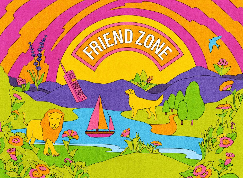
Kate takes up the story. "My brief for the illustration was to create a landscape inspired by Port Moody that incorporated signifiers from each participating brewery, she explains. "The breweries brought their ideas for how best to represent their brands, and I drew each one in a way that would unite them, reflecting the spirit of the collaboration.
"I try to balance my work between playful/whimsical and graphical, with a focus on line and colour," she adds. "A project like this one is especially fun for me, as I can combine elements from different worlds into one landscape, unified with a strong colour palette."
The resulting illustration depicts the mountains, parks, and sites of Port Moody that envelope the east end of the Burrard Inlet in Canada's nature-filled British Columbia. There's a subtle nod to each brewery woven in, too. These include a reference to Moody Ales' famed Lavender Sour, Yellow Dog's namesake, a lion for Brave Brewing, a phone for 80's-inspired Rewind, a boat for Twin Sails, and Parkside's iconic bird.
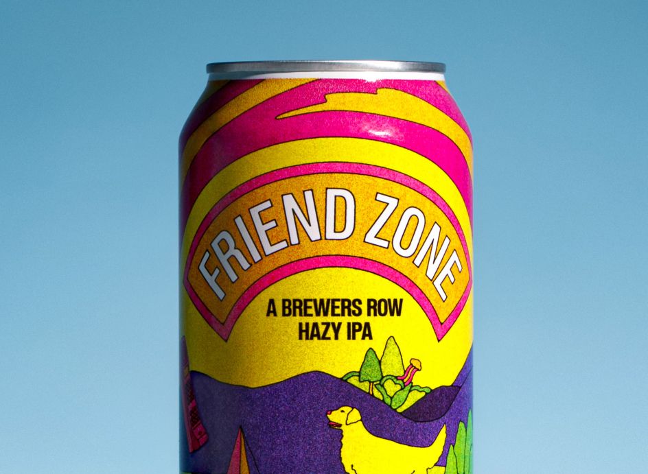
In all, the image's subtle textures and sunny colour palette are a perfect fit for the Hazy IPA. Digitally printed directly to the can, the design is transportative and nostalgic in all the right ways.
Colour and typeface
The typeface used in the designs is Etrusco Now, a revival of a typeface originally cast in lead by Italian foundry Nebiolo in the early 1920s. "This font was chosen for its strength," says Phoebe. "But we also liked how its neutrality complemented the illustration and didn't appear like any of the collaborating brand's logos."
The colour palette, meanwhile, reflects the tasting notes of the beer. "Hazy IPAs tend to be lower on the bitterness scale and offer tropical and juicy flavours," explains Phoebe. "They also have a fuller or creamier mouthfeel and are often sweet. All of this is reflected in the illustration."


 by Tüpokompanii](https://www.creativeboom.com/upload/articles/58/58684538770fb5b428dc1882f7a732f153500153_732.jpg)

 using <a href="https://www.ohnotype.co/fonts/obviously" target="_blank">Obviously</a> by Oh No Type Co., Art Director, Brand & Creative—Spotify](https://www.creativeboom.com/upload/articles/6e/6ed31eddc26fa563f213fc76d6993dab9231ffe4_732.jpg)


](https://www.creativeboom.com/upload/articles/89/8951aa7210e6c4879105a2a1e578369a82a0e734_732.jpg)
