Amazing graphic design portfolios created at an online bootcamp
With every challenge comes new opportunities. And in 2020, Shillington, one of our favourite providers of short and intensive design courses rose to that challenge. With physical classes out of the question, they quickly and efficiently launched their first-ever online courses across three global time zones.
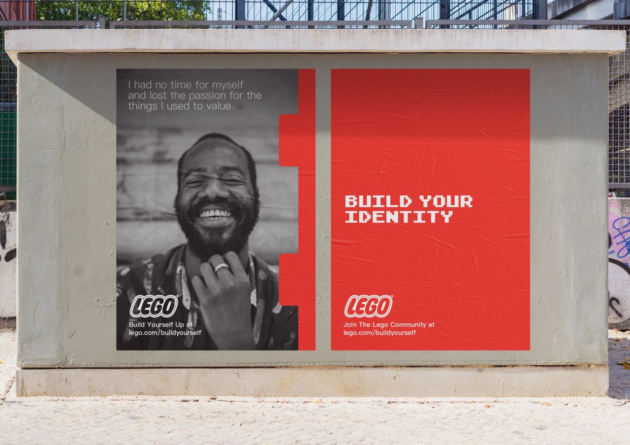
Build Yourself Up Lego Campaign by Alejandra Diaz
"The online course emulates Shillington's in-person offering as closely as possible," explains Chris Norman, head of online at Shillington. "The same experienced teachers, the same short and sweet lectures, the same engaging demonstrations, the same focus on practising newly learnt skills and, of course, the same mind-blowing student portfolios."
That means that now, Shillington can reach and help students no matter where they are in the world, from Estonia and Indonesia to Ecuador and Mexico.
And if you needed proof that this new strategy has been successful, here we share some of the incredible portfolio work they've been creating as part of their online bootcamp.
1. Alejandra Diaz
"Born out of necessity due to certain global events, Shillington's online course was started to give those outside of our campus cities the chance to create the incredible student portfolios that Shillington is known for," says Chris. And here's a shining example.
Alejandra Diaz, known as Ale, is an illustrator and designer from Mexico City. Soon after completing her degree in Industrial Design, she discovered a passion for graphic design, so she enrolled at Shillington.
The colourful and upbeat nature of his portfolio work is a real breath of fresh air. This branding and advertising work brings together his fun and lively take on illustration, an inventive and diverse approach to typography, and a strong understanding of design fundamentals. And she pulls it all together in a way that the completed piece becomes more than the sum of its parts.
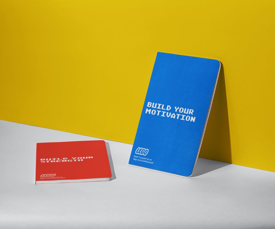
Build Yourself Up Lego Campaign by Alejandra Diaz
We're especially impressed by 'Build Yourself Up', a campaign for Lego focused on mental health during the pandemic. The focus of the campaign, in Alejandra's words, is: "We've been through a lot. It's time to put the pieces back together and build ourselves up." Genius.
While Alejandra's design work makes up the main body of her portfolio, we also love how she shares a selection of illustration work on her 'About' page. It's a nice touch that shows the two sides of her creative soul, clearly and distinctly.
2. Claudia Palacios
Hailing from Guayaquil in Ecuador, Claudia Palacios was working as a graphic designer before she decided to take Shillington's course to upskill.
The designs she showcases in her portfolio are admirably varied. But at the same time, there's a consistency of style that permeates everything and clarifies she has a distinctive point of view.
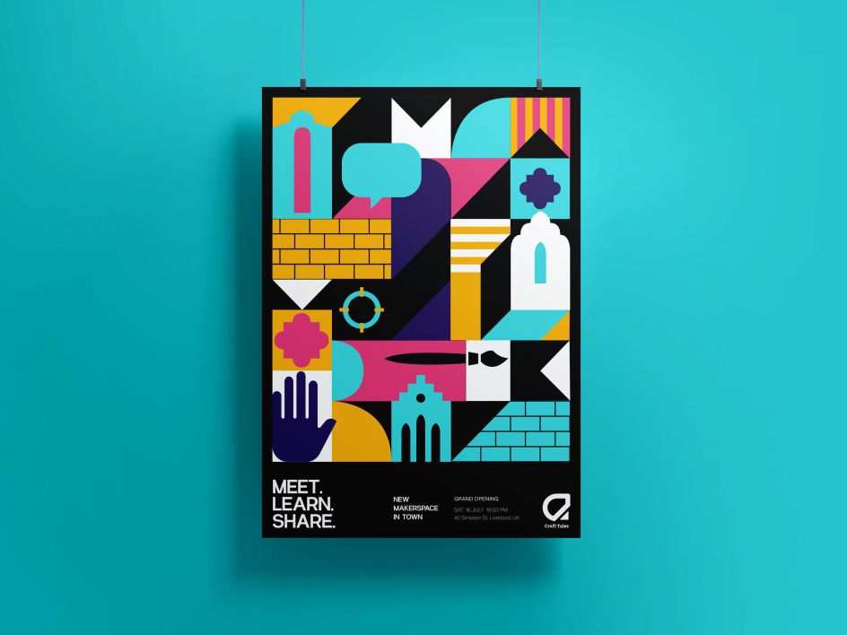
Craft Tales: Craft Space Branding by Claudia Palacios
We particularly love her project 'Craft Tales': branding for a creative maker space inspired by the Baltic Triangle in Liverpool. There's a real dynamism to Claudia's use of vector shapes that raises these designs above the norm and instantly grabs your attention.
3. Logan Beck
Originally from Boulder, Colorado, in the USA, Logan Beck was working in marketing at a tech company before studying at Shillington, which led to a new career as a designer and creative producer based both in San Francisco and Denver.
Logan's work takes a bold approach to express the core of each project's personality, with a keen understanding of colour. And given that the presentation of work and ideas is just as important as the work itself, we love how some of this work is mocked up with beautiful large-scale imagery, really helping it sing.
Our favourite project here is the Mindways Meditation app, which aims to recreate the feeling of a walk in the woods, helping adults manage their anxiety in a low-pressure, grounded digital environment. Logan's designs effortlessly convey a sense of calm and serenity and fit the brief perfectly.
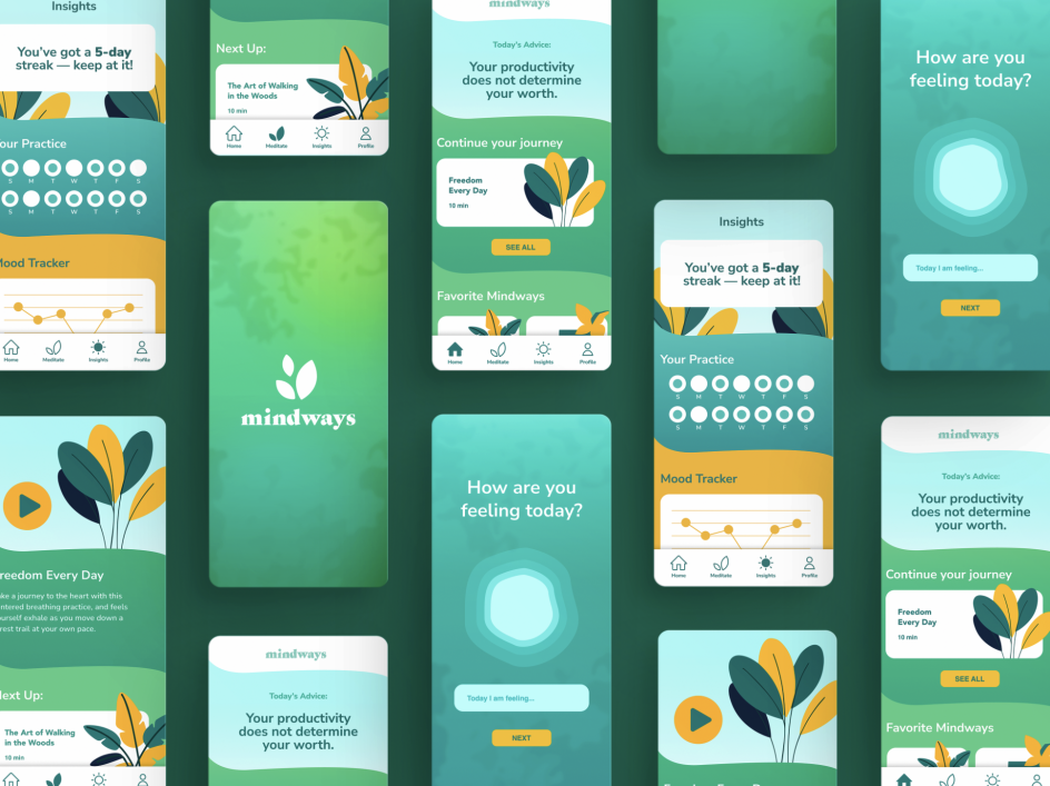
Mindways Meditation App by Logan Beck
4. Meaka Wheatley
"Portfolio time at Shillington is an important part of the beginning of our online students' careers as graphic designers," says Chris Norman. "It's the culmination of everything they've learnt during the course." And all of that is evident in the stunning portfolio of Meaka Wheatley.
From the East Midlands in the UK, Wheatley was a programme manager for the National Health Service before studying at Shillington. She's now a designer who believes art and design should be used to help change the world for the better.
And her portfolio shows how she's putting that philosophy into practice with work that conveys an uncompromising vision and a developed sense of sophistication.
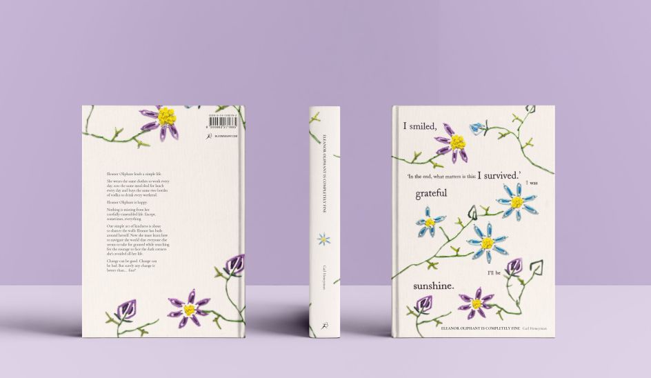
Handmade cover for Eleanor Oliphant is Completely Fine by Meaka Wheatley
Her handmade book cover for the Gail Honeyman novel Eleanor Oliphant is Completely Fine is a triumph and a true work of art. To craft it, she used a block poetry method in white paint to create a quote that embodies the book's themes. It was then embroidered onto flowers to represent small acts of kindness and convey how that can make a big impact on someone's life.
5. Reagan Trevino
From Dallas, Texas, Reagan Trevino was working in retail before she embarked on the Shillington course that would propel her into the world of design. Her portfolio highlights just how far she's come; it's full of expressive, exciting work that shows a serious level of skill and imagination.
It also stands as testimony to the success of Shillington's new online strategy. "Week in, week out, it was amazing to see this group of people come together with the shared goal of becoming designers," says Chris. "Their portfolios are a testament to the hard work, dedication and passion they showed over the nine months of the course."
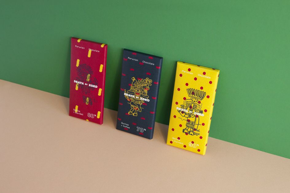
Death by Xoko, Chocolate Packaging by Reagan Trevino
The layout of Reagan's portfolio site is impressive, too, with a measured and effective use of white space, allowing each piece of work and text full space to breathe.
And wow: we're a little bit in awe of Death by Xoko, her packaging concept for a Peruvian chocolatier. To be frank, it looks as polished and professional as anything you'd expect to see on a veteran designer's portfolio.
6. Taylor Skurka
Taylor Skurka is a Toronto-based multidisciplinary designer with a background in fashion, print and digital design. After studying fashion communication, she pivoted in her career by taking a course with Shillington and currently works at Métier Creative as a graphic designer.
Her portfolio showcases her deep understanding of both fashion and beauty products and the design smarts she uses to brand them. Meanwhile, the site itself is boldly minimalist, giving the viewer what they want quickly and efficiently.

Relevé hair care packaging by Taylor Skurka
We're huge fans of her Relevé Hair Care Packaging project. It's a concept for a vegan, cruelty-free hair care system that promotes hair repair for dancers who experience stress and breakage from tight ballerina buns, sticky hairspray, and sweat—a fabulous idea and beautifully executed, with branding that's both elegant and bursting with personality.
7. Yvette Burggren
After a career in arts administration, Yvette transitioned to entrepreneurship in 2014 to co-found a beauty business. In the process, she realised what she loved most was creating visual identity and web presence. So in 2017, she sold the company, and in 2021, she went to study graphic design at Shillington.
Now based in Brooktondale, New York, her portfolio as a designer is full of stunning work, and you can easily see her world experience reflected in its sophistication, thoughtfulness and precision.
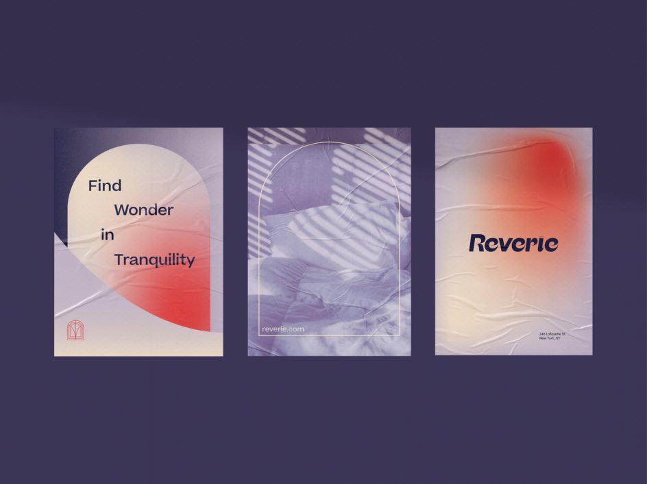
Reverie, sleep store branding by Yvette Burggren
Just take her project, Reverie, a sleep store offering an escape from city life with nap pod rentals, massage, guided meditation, and retail products based on sleep and mindfulness education. The brand was created as a "window in a dream world", and Yvette's clever use of ethereal colours, imagery, and gradients brings it to magical visual life.
Study with Shillington
Even a brief glance at these portfolios shows just what great results Shillington's new online courses are producing in practice. As Chris says: "Our recent graduating class has proved once again the determination and resilience of the creative community, finding ways to diversify and build on their skills in pursuit of a career in graphic design."
Want to find out more? Learn more about Shillington's online graphic design course today.


 by Tüpokompanii](https://www.creativeboom.com/upload/articles/58/58684538770fb5b428dc1882f7a732f153500153_732.jpg)


 using <a href="https://www.ohnotype.co/fonts/obviously" target="_blank">Obviously</a> by Oh No Type Co., Art Director, Brand & Creative—Spotify](https://www.creativeboom.com/upload/articles/6e/6ed31eddc26fa563f213fc76d6993dab9231ffe4_732.jpg)


