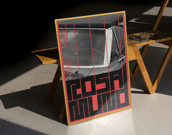
Dennis Hoelscher tricks the eye with his warping typography and motion design
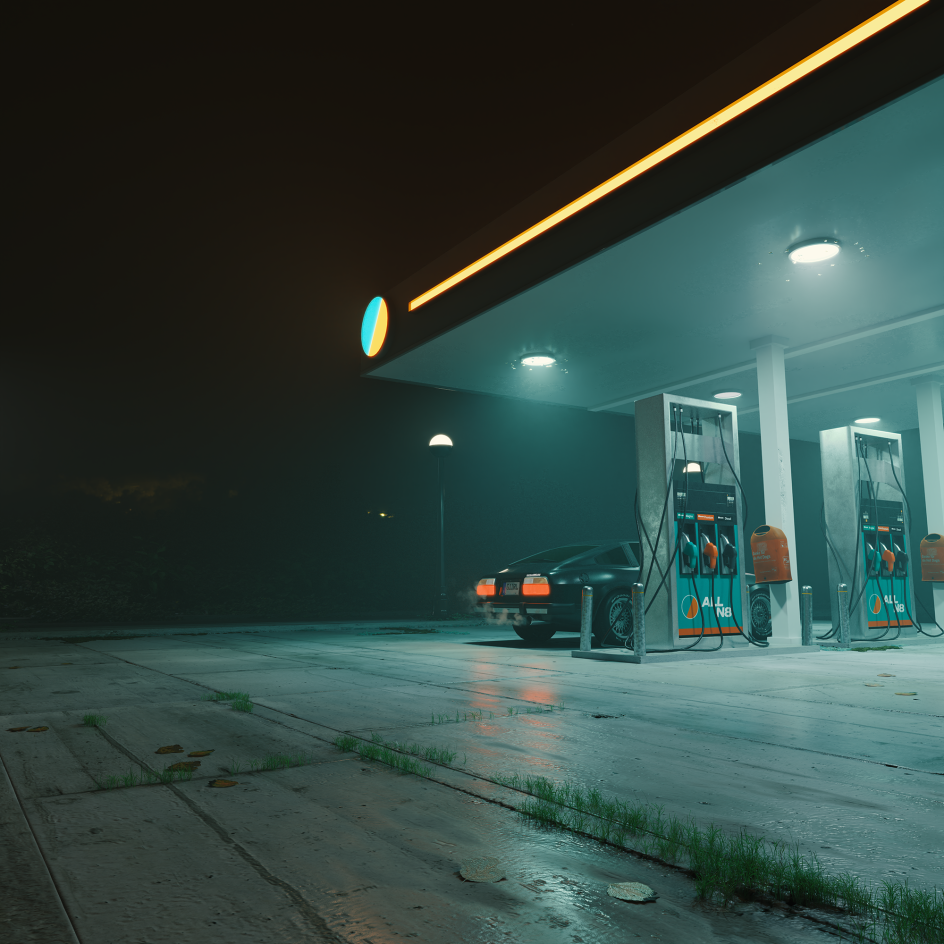
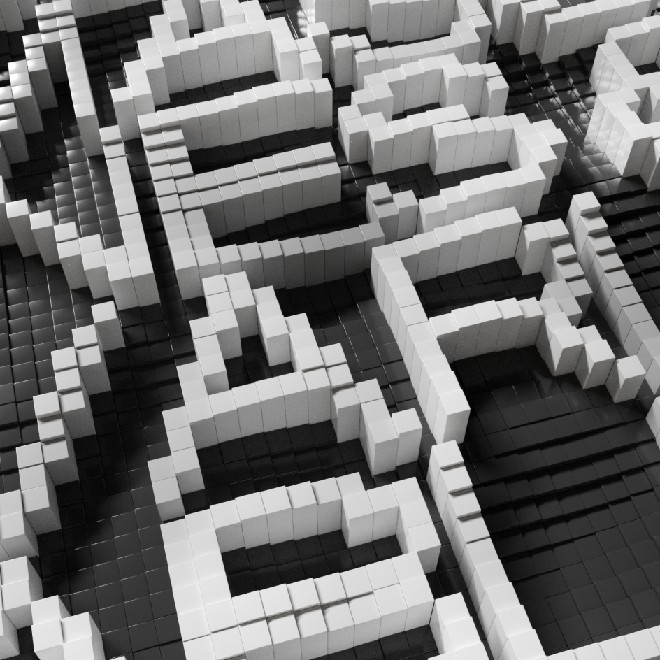
The Cologne-based artist has spent the past few years refining his craft, learning new techniques and, ultimately, creating work that a camera cannot replicate.
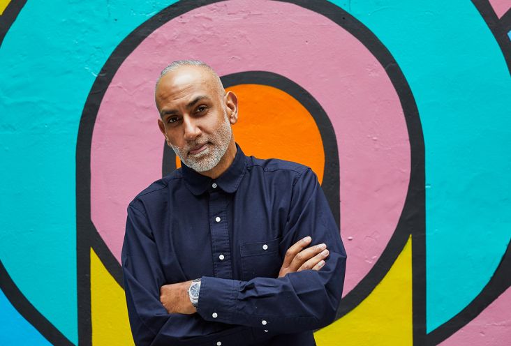
"I'm not one of those people who has painted since childhood and always knew what they wanted to be," says Dennis Hoelscher, a graphic designer born in Berlin and based in Cologne. Instead, Dennis came to his medium a little later after being inspired by his friend who was working as a graphic designer. "I liked what he was doing, so I wanted to try it out."
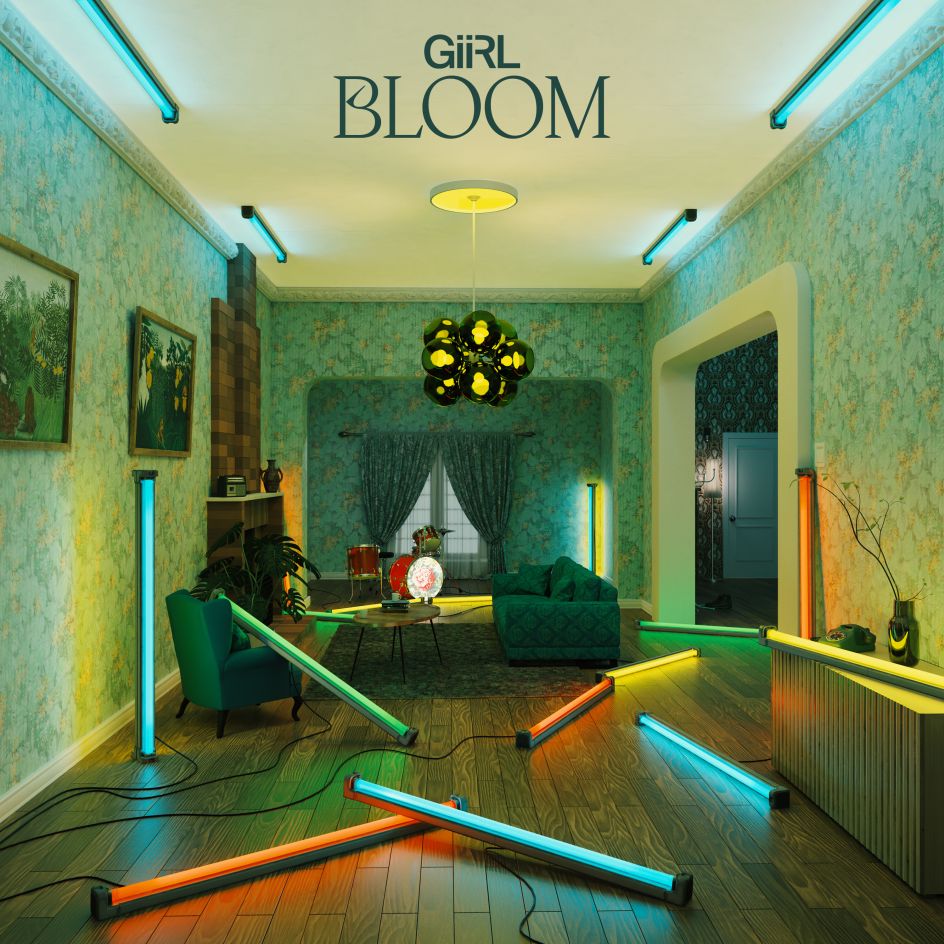
Gravitating from one experience to the next, Dennis graduated from an apprenticeship as a media designer with a portfolio full of football catalogues and advertising brochures. He then got his hands on a book by Neville Brody and became aware of how broad and varied the industry can really be; a flame was lit creatively. As such, he decided to pursue communication design in Düsseldorf and "a new world opened up". Now, the designer works across various mediums, including motion and graphics and the covers and videos for his band GiiRL. That has paved the way for an extensive skillset and thus a multitude of freelance jobs for agencies.
It wasn't the quickest journey for Dennis, but no doubt has it been a successful one. Along the way, Dennis has developed a knack for different software and techniques. He tends to draw his shapes and lines in 3D before experimenting with texture and lighting until he lands on a particular perspective. "Sometimes architecture reminds of me a certain shape that I like," he tells us. "I then abstract it on a smaller scale, and one thing leads to another."
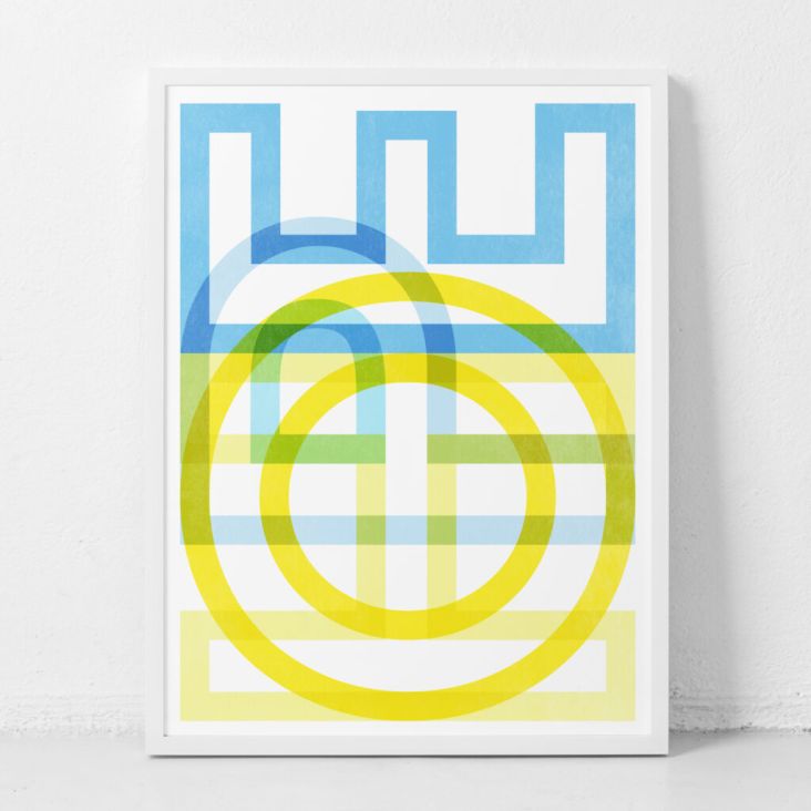
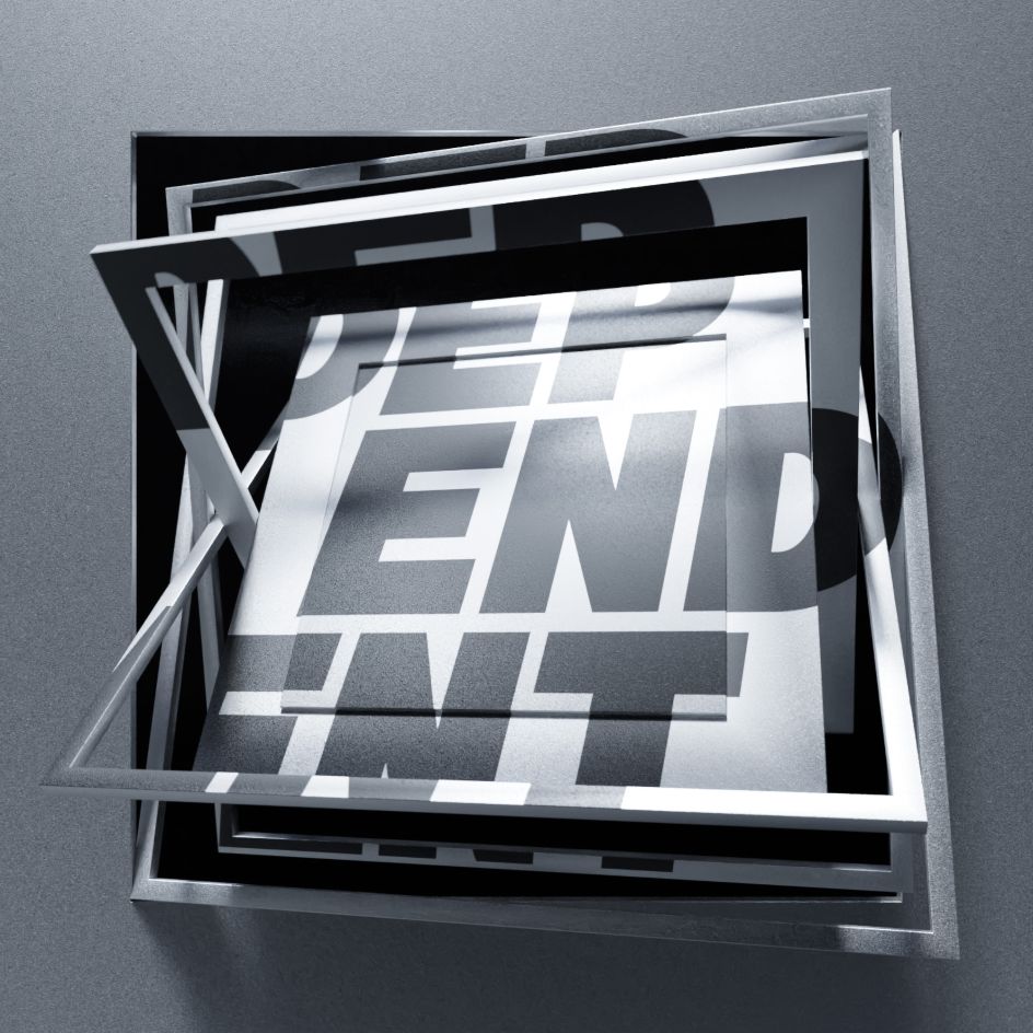
When it comes to the more variable and moving type, the designer will transform the lettering through animation. "Geometric forms that interact with each other are first populated with typographic textures in the next step," he notes. "I decide on content from an animation perspective, applying what makes sense. It's like a sketch. I then have this technique in my toolbox and can apply it to other projects as needed."
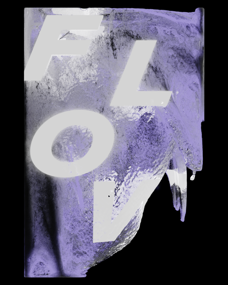
This particular tool is what's called Shape Keys, an animation technique that allows designers to mix, morph and modify different elements. Dennis uses this for his object design: "I can model multiple states of an object, for example, a cube, and save them individually then switch between them smoothly." By one glance at his portfolio, you can instantly see how much Dennis is a fan of curvy, warping visuals. In fact, the loopier, the better. "More recently, I've also tried working with a simulation of fluids. I like to set certain ground rules and then let the program randomly flesh them out. I find hard characters on organic shapes very interesting."
Above all, Dennis hopes his work will elicit an otherworldly experience for the viewer. He strives to make objects and designs that cannot be replicated by a camera. "The viewer should be amazed and wonder how something like this can be visualised," he concludes. "With an oil painting, I appreciate the technique but also have an idea of how it all came together. I will continue to work on disguising the travel of my techniques."
](https://www.creativeboom.com/upload/articles/c0/c0f4833513a758427120283374013d6da0e2b37d_732.png)


