Hingston Studio's designs for Garry Fabian Miller, the 'camera-less' fine art photographer
Dubbed 'one of the most progressive figures in fine art photography', Garry Fabian Miller's work is currently on show at the Arnolfini Gallery in Bristol.
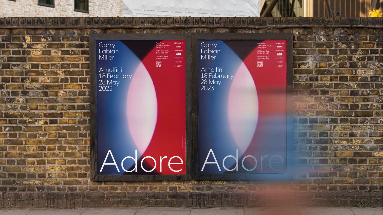
The show, titled Adore, runs until May and is a major exhibition celebrating Fabian Miller's practice throughout his life – including those featured in the artist's first-ever solo show, also at Arnolfini, back in 1979 when the artist was just 19 years old.
Tom Hingston, founder of his eponymous London-based studio, was tasked with creating the graphics for the show, working closely with the artist. Hingston had been aware of Fabian Miller's work for some time and compared his process of image-making to the way a musician composes a piece of music: "In fact, when we were first introduced, it was with a view to collaborating on a music-based project together," Hingston explains. "The project itself never came to fruition, but we agreed to stay in touch, waiting to find an opportunity to work on something in the future."
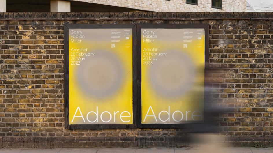
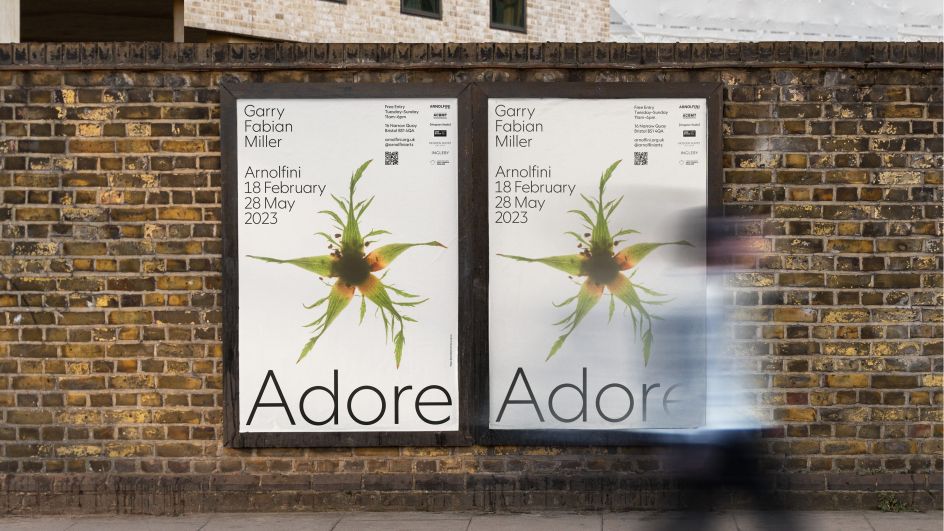
The artist and designer share a love of the process of collaboration, so the exhibition project "felt like the perfect opportunity for the two of us to create something meaningful together," says Hingston.
In early conversations together, Hingston found himself excited by the idea that the show would stretch beyond the physical confines of the gallery and into the surrounding city of Bristol as a celebratory festival of musicians, filmmakers and writers, poets and other collaborators who have contributed to Fabian Miller's practice. In that sense, the artist describes the show as an "affirmation of a life well-lived".
The posters looked to be an extension of this idea, so they were designed in series in order to bring smaller works into the streets of the city. "The idea of discovering a sequence of these on an underpass or busy road, for instance, felt really exciting and joyous to us," he explains.
Fabian Miller's works are known for their powerful compositions of colour, symmetry and form, so the typographic system needed to harmonise with that while also adding to the images' structure and rigour. It was also important that Hingston considered the scale when it came to type: "We wanted the word Adore to feel generous – playing back the idea again that the show is a gift".
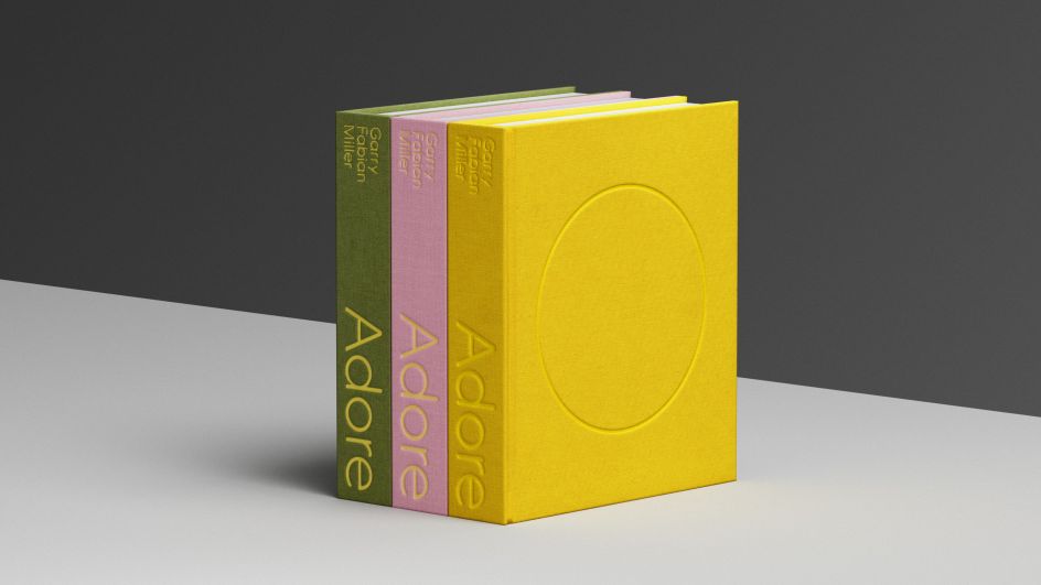
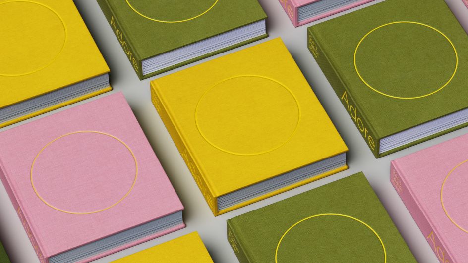
In a nod to the artist's roots in a strong community of creatives and the way his work "sits at the heart of English Modernism," as Hingston puts it, he opted to use a single cut of a humanist sans serif font by New Zealand's Klim Foundry called Geograph. According to Hingston, the typeface's strong echoes of "Johnston, Gill and geometric properties" really resonated with the artist's work.
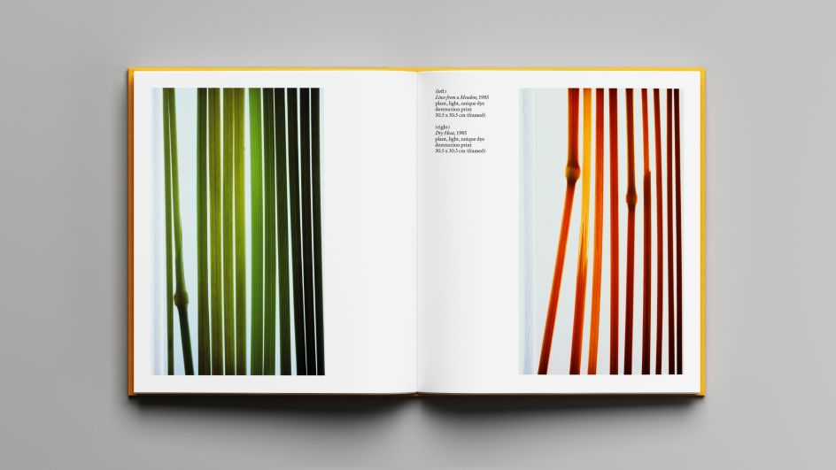
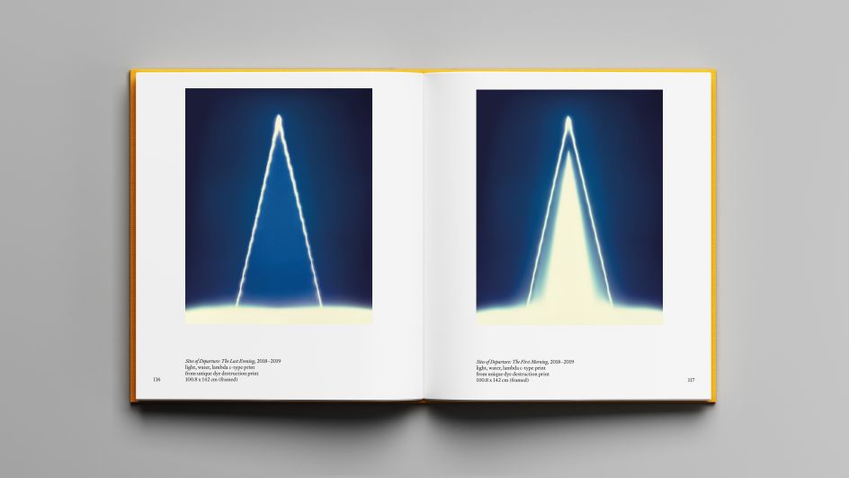
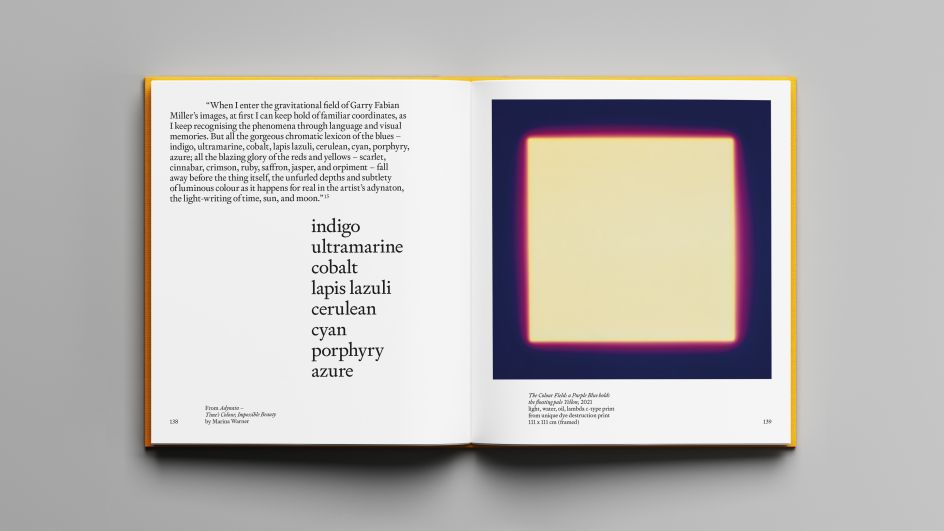
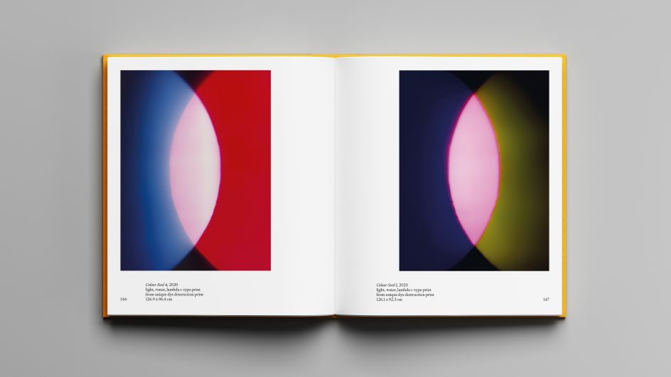
The pair also worked closely together on the book's design accompanying the show, also called Adore. The book echoes the typographic approach of the other exhibition graphics. And it looks to place Fabian Miller's 'camera-less' darkroom practice among the work of other artists, writers and thinkers that have inspired him throughout his career.
"We wanted to create something that felt precious and intimate," says Hingston of the small, handheld-format book. The limited-edition book is available in three different colours, each referencing the themes often used in Fabian Miller's work.
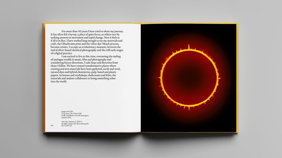
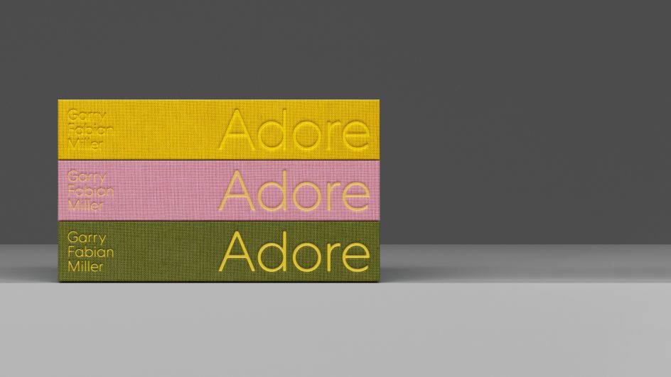
"The cover carries a single ring, a recurring motif in his work," Hingston explains. "It also suggests the completion of a life cycle and symbolises the sun – the most powerful light source of all. Our use of the yellow across all three covers was a means of illuminating both the symbol and the title – again bringing the notion of light into play."
He continues: "The project results from numerous lengthy discussions and one-to-one meetings at Fabian Miller's studio and darkroom in Dartmoor – such a close and involved process, over such a long period, one that has been full of dialogue and reward."
Garry Fabian Miller, Adore, runs until 28 May 2023 at Arnolfini, 16 Narrow Quay, Bristol BS1 4QA.


 by Tüpokompanii](https://www.creativeboom.com/upload/articles/58/58684538770fb5b428dc1882f7a732f153500153_732.jpg)

 using <a href="https://www.ohnotype.co/fonts/obviously" target="_blank">Obviously</a> by Oh No Type Co., Art Director, Brand & Creative—Spotify](https://www.creativeboom.com/upload/articles/6e/6ed31eddc26fa563f213fc76d6993dab9231ffe4_732.jpg)


