Hoi Chan draws on scientific illustrations to create 'muted but abundant' artwork
Drawing inspiration from scientific illustrations, poetry and old east Asian art, Hoi Chan creates pleasantly unusual art that's easy on the eye. And with animation projects in the works, it looks like we'll be seeing more of his softly surreal illustrations.
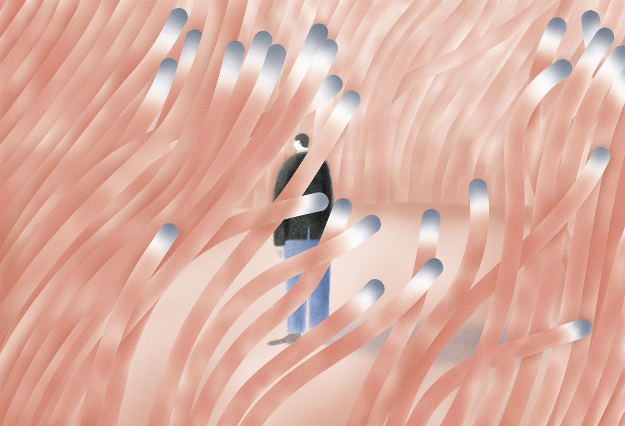
Quiet Seabed
Considering that Hoi Chan's art is soothing to look at, it's a surprise to learn that his upbringing was much more vibrant. Born and raised in Hong Kong before living in New York for nine years, his surroundings are a far cry from the vistas he manifests on the page.
He tells Creative Boom, though, that illustration is his escape from the outside world, "I find calm and serenity in it." Now based in New Orleans, the lush tropical surroundings of the local area, not to mention its rich history, have opened Hoi up to colours he has never used before. "I am surprised by how much a city can shape my illustrations."
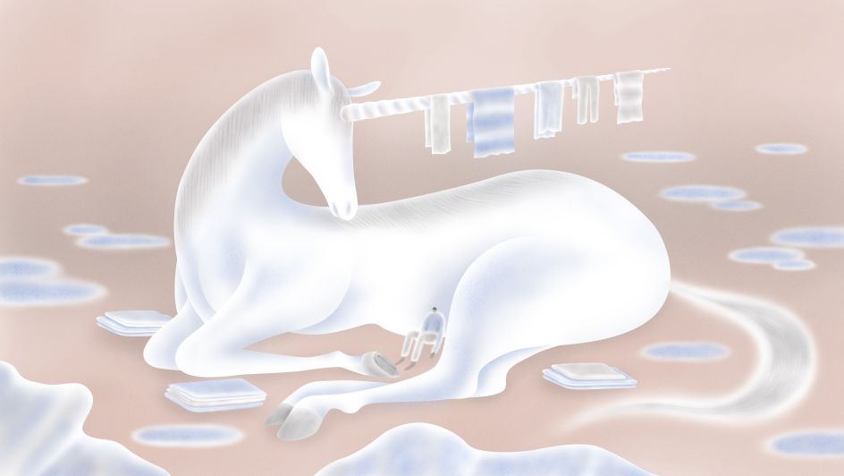
Queer Millennials Are Becoming Family Caregivers, Them@Condé Nast
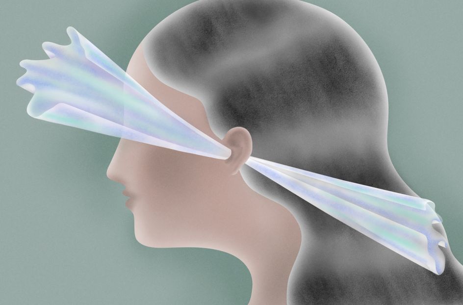
Tirzah: “Colourgrade”, The New Yorker
This isn't to say that Hoi's background hasn't played any part in his artistic development. In fact, the colours of old Chinese artefacts and Japanese paintings continue to guide him and have left a clear impression on his illustrative style. "These colour palettes are often a little unsaturated due to the lack of colour pigments," he reveals. "But I love the quietness and calmness in the colours of these paintings."
It's an admiration that seems to be popular. Hoi's distinctive style has seen him crowned a selected winner at the American Illustrator 39 and 40 awards, and his list of clients includes big names such as The New York Times, The New Yorker, The Washington Post and Spotify.
Besides expressive colours, one of Hoi's other favourite artistic elements is textures. "I believe the sense of touch can give an image a second layer of emotion, and it helps to draw the viewer closer to my work," he explains. Collecting textures and incorporating them into his illustrations had become a passion for Hoi, especially when he "slowly discovered that both digital and traditional mediums could live together in harmony."
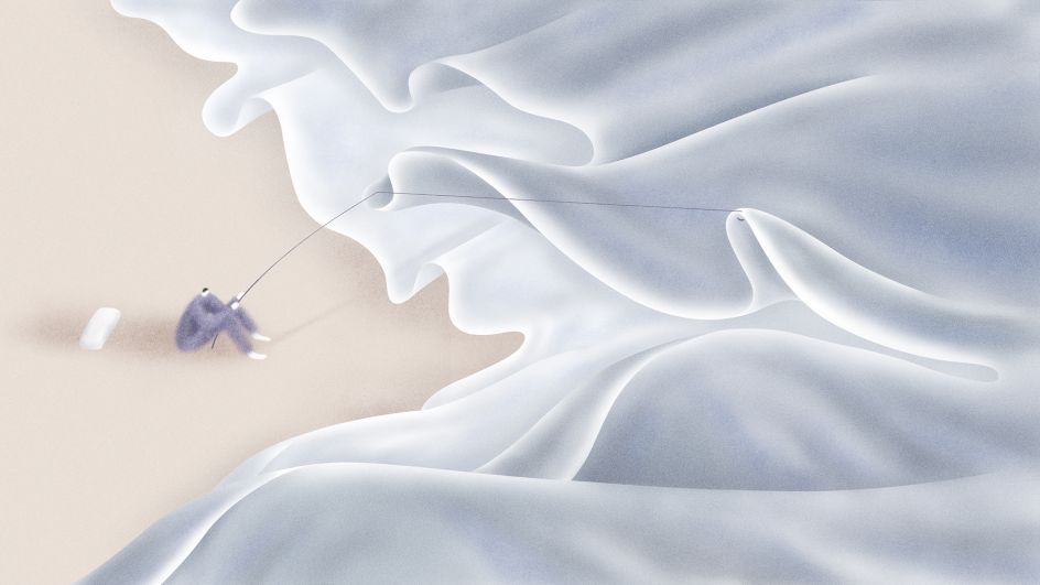
Sleep in the Age of Anxiety, Quartz
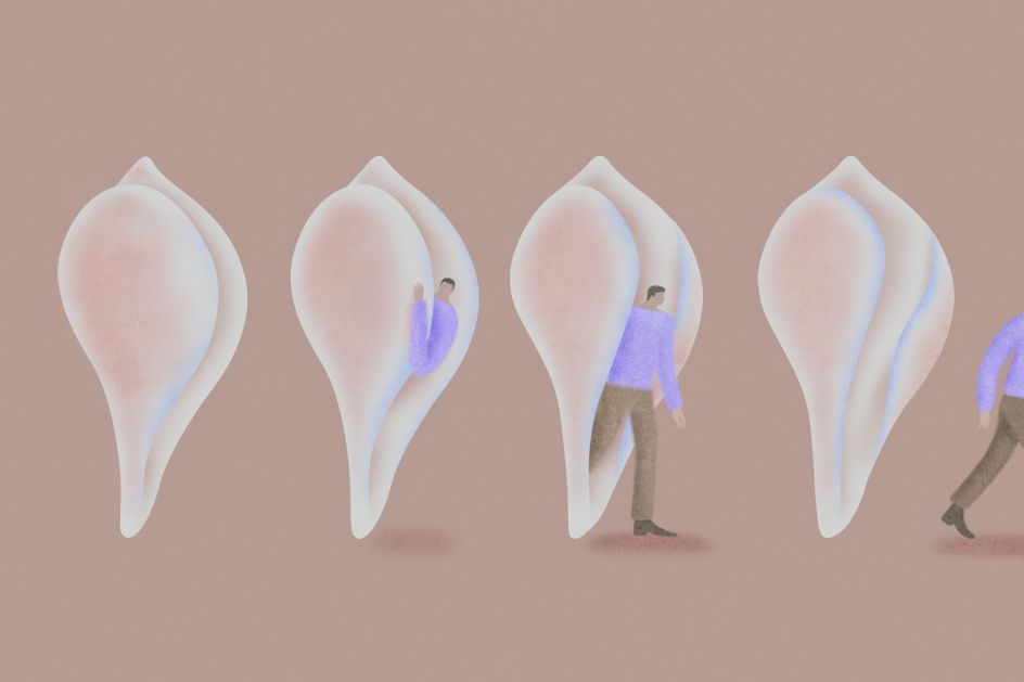
"A Twenty-Six year “Coming Out” Journey, From Self-Disappointment To Loving Myself”
Harmonious is the word. Whether he's depicting a man lost in a forest of pink fronds, or a figure snagging their fishing rod on sheet-like waves, there's a cohesion to Hoi's style. Even a landscape of towering, pastel-hued mushrooms or a man slowly emerging from an oversized conch feel unified by his hazy colour choices and velveteen textures.
And if the undulating forms in Hoi's work feel uncannily familiar, it could be because he also looks to the scientific illustrations of American ornithologist John James Audubon and German zoologist Ernst Haeckel. "I think they captured really beautiful curved lines and textures from nature, and I became very mindful of them when I used these two elements in my work."
The influence of Haeckel's famous anemone studies is clear to see, especially in Hoi's image Quiet Seabed. "I would describe my work as muted but abundant," says Hoi. "Quiet Seabed was one of the first illustrations I made at the beginning of my career, and it still acts as an anchor now when I develop new works, I like to create illustrations that are quiet but filled with colours and wonder, just like the coral reef under the sea."
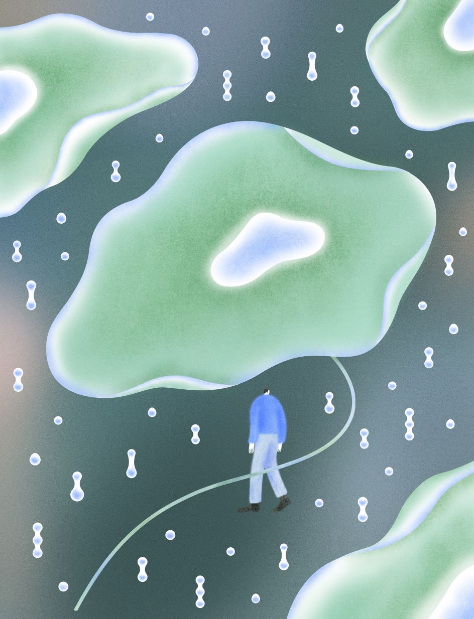
Still Healing
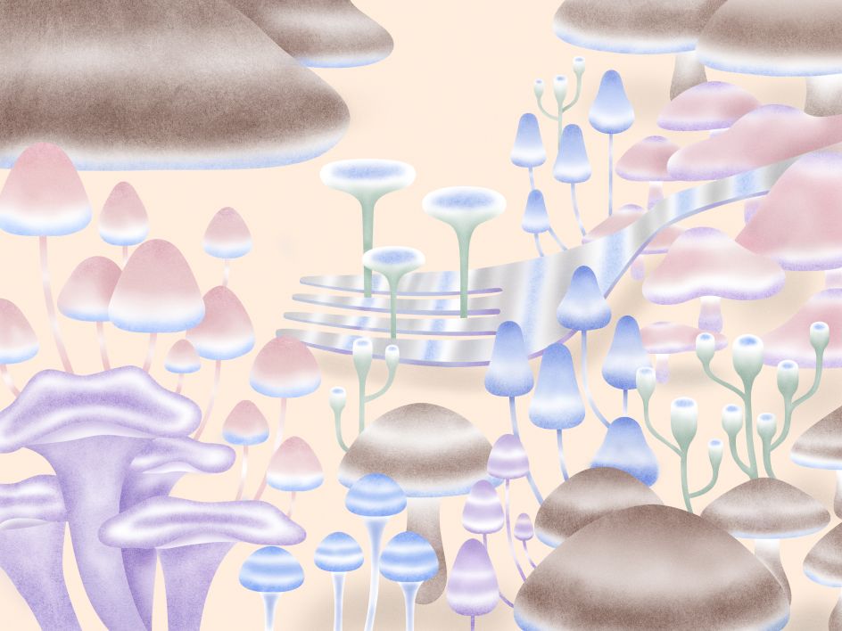
The Future of Food
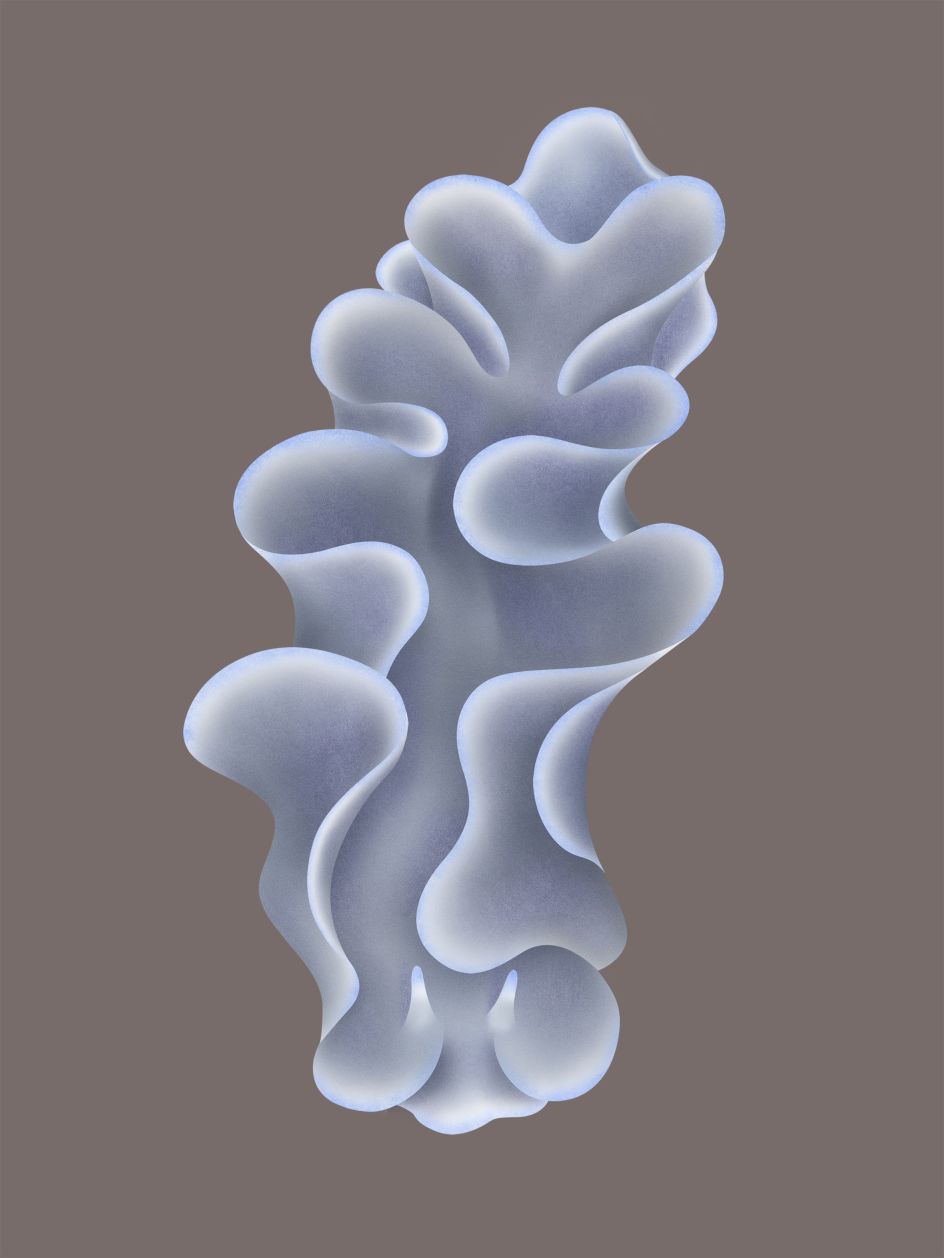
Quiet Seabed


 by Tüpokompanii](https://www.creativeboom.com/upload/articles/58/58684538770fb5b428dc1882f7a732f153500153_732.jpg)


 using <a href="https://www.ohnotype.co/fonts/obviously" target="_blank">Obviously</a> by Oh No Type Co., Art Director, Brand & Creative—Spotify](https://www.creativeboom.com/upload/articles/6e/6ed31eddc26fa563f213fc76d6993dab9231ffe4_732.jpg)


