James Olstein uses his love of screen printing to create stunning digital illustrations with an analogue feel
James Olstein chats to us about his love of zines, how web design led to his career as a freelance illustrator, and how his love of screen printing has shaped his work as a digital artist.
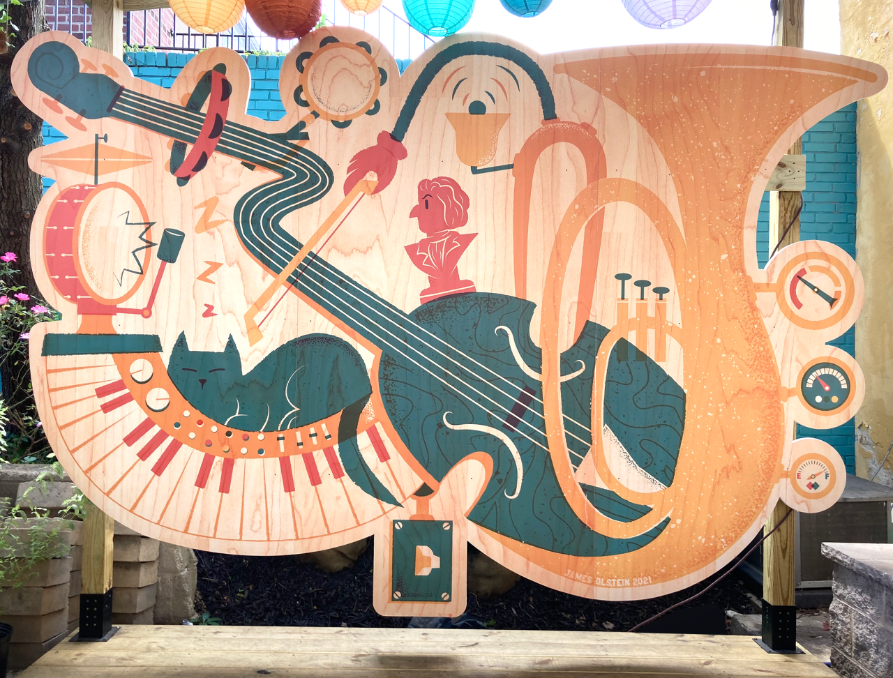
Based in Philadelphia, James Olstein is an illustrator, author and teacher specialising in creating digital art that retains an analogue look and feel. Fizzing with grainy textures and overlapping vibrant colours, his work has the curious quality of looking like it came from the 1950s, even though it contains contemporary items and characters.
As a graphic design graduate, James has collaborated with many big-name clients, including BBC Science, the Boston Globe, ESPN, FOX, MIT Technology Review, Sony Music and Warner Brothers, to name a few. And when he's not working as an artist to create his stunning illustrations, he shares his knowledge online with his own Skillshare course that covers textural illustration and editorial art.

It's a far cry from how James started as a youngster. He admits to always being an artistic kid, and his parents always encouraged his creative interests so long as they weren't too noisy. But whereas the internet makes it easier than ever for aspiring artists to access resources such as James's course, he had to make do with copying panels from Spider-Man and Star Wars comics.
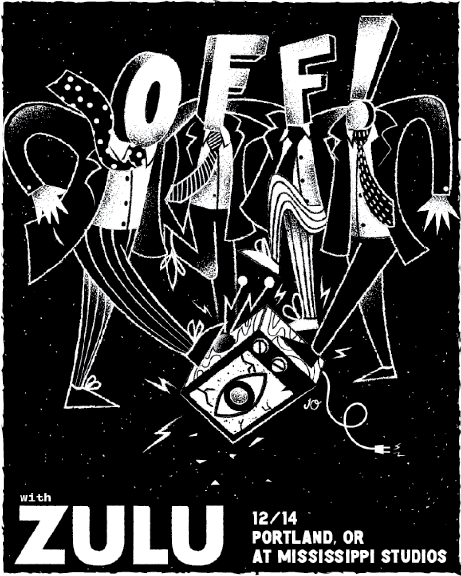
Once he was a little older, magazines and zines became his obsession. "My favourite was Nintendo Power," he reveals. "I really wanted to learn how to make my own, which is how I discovered graphic design." It was also around this time that he discovered the punk and hardcore music scenes, which further cemented his fascination with graphic design due to their Do It Yourself ethos.
"The album designs were as important to me as the music sometimes," he adds. "I would read the liner notes and see the credits for the designers on them. Once I discovered that it could be a job, I knew I wanted to go to school for it."

Illusration for Scientific American art directed by Michael Mrak
Creative careers are rarely smooth, though. Once James graduated with a bachelor's degree in graphic design. He struggled to find employment for a couple of years. "I ended up going back to school for a degree in web design and programming, which helped me get a creative job at the time," he reveals.
"Eventually, I was working at an advertising agency as an art director, and we were commissioning many bigger-name illustrators for ads like Mikey Burton and the Heads of State. Sometimes these projects required additional illustrations, so the creative director asked if anyone at the agency could do them. I volunteered and loved it.
"From there, I knew I wanted to transition to doing illustration full-time. Working with those illustrators gave me a good idea of what it took to get there. I started working on getting my own clients and building an illustration portfolio. In 2016 I had enough clients that I went out on my own as a freelancer, and I still am today."
It's taken years for James to hone his style into what you see today. His art in college was usually monochromatic ink brush drawings, and a brief foray into photo-based work in Photoshop was soon dropped because it never really clicked.

Illusration for Scientific American art directed by Michael Mrak

It wasn't until he was working on a web project that needed vector icons that he discovered the joys of using Illustrator. As well as being fun to use, Illustrator also gave him the freedom to add analogue elements, which he loved, including the colours and textures found in screen printing. "So now all my work is vector-based with added textures to give it more of a screen printing feel."
Inspired in particular by the works of Saul Bass – James can't get enough of his graphic way of telling a story – he's also influenced by the works of Corita Kent, Ed Emberley, Charles Burns, Raymond Pettibone, Christopher Ware and Saul Steinberg. All of whom have helped to shape the vibrant, somewhat scratchy illustrations James produces today. That's not to say that studying web design was a wasted effort.
"I think studying web design was pretty helpful for me getting my foot in the door at many design jobs," James explains. "Being able to design and code was pretty attractive to employers. It was in 2008, and I think web design is a bit of a different field and not as specialised. It doesn't have a huge influence on my style, but it does help when I'm creating work for sites and apps to have that knowledge. I still work on websites, but rarely code as I used to."
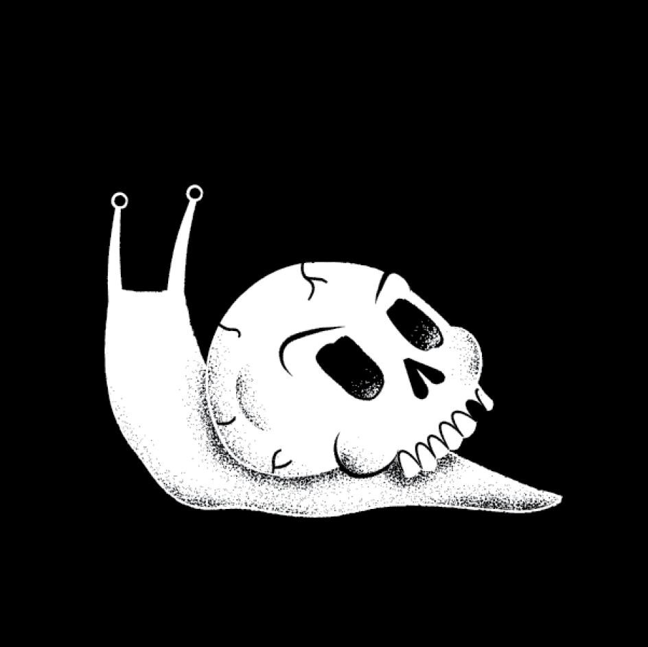

Illusration for Scientific American art directed by Michael Mrak
As for his love of bold, distinctive colours, this reaches back to his childhood love of the printed page, particularly screen printing. "For a while, I treated every piece like it was going to get screen printed one day," he says. "I feel like only using two to three colours or overlaying two colours to make a third comes directly from printing. When I find a colour scheme I like, I tend to reuse it."
Even James's creative inspirations appear rooted in the world outside the screen, as most of his best ideas come from the outdoors and nature. "I love to take my family camping. I read a lot, especially about animal facts, dinosaurs and space. I get a lot of ideas from hanging out and people-watching. I'm a big music fan and get a lot of ideas from listening."
This love of nature can be seen in what he likes to draw; now, animals have captured his interest. "I feel like my favourite things to draw switch pretty often, though," he admits. "I had a long stretch of drawing just people in odd situations. As long as I can add a little humour to a drawing, I'm normally pretty happy. Anytime I'm commissioned to draw a cat or a dinosaur, I'm pretty psyched.
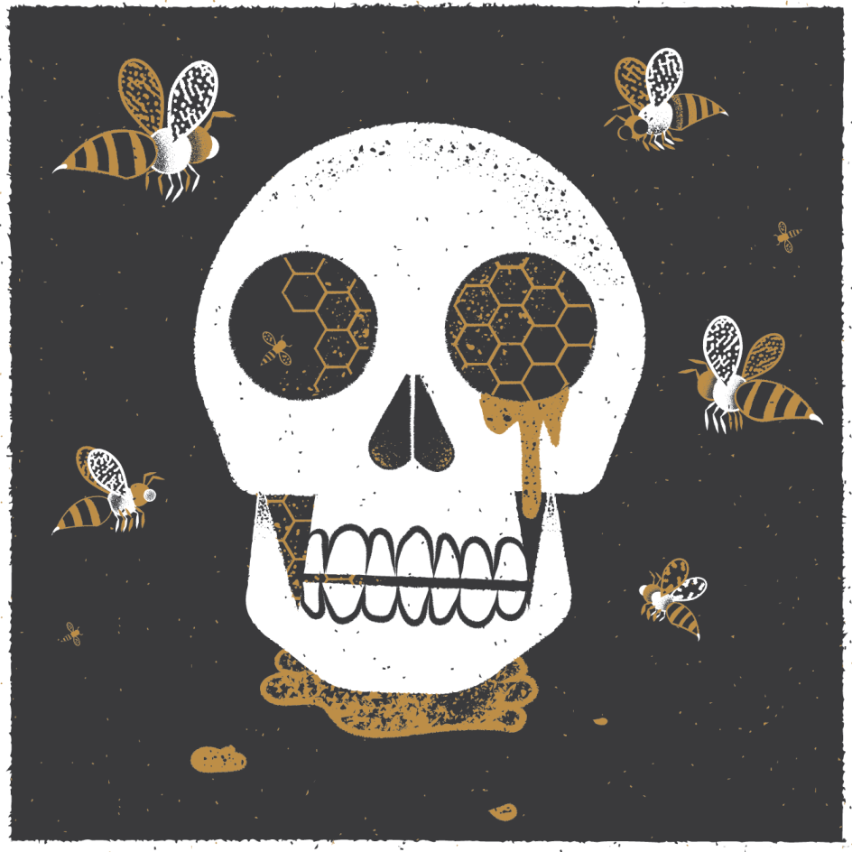
"One thing I've really been enjoying is drawing bugs," he adds. "Just randomly, I'll do a quick bug illustration when I have time. But I have no idea where they are going. Maybe a zine?"
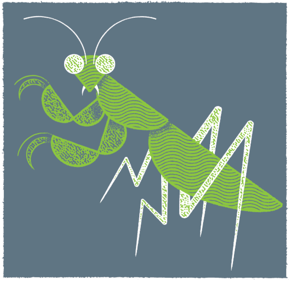
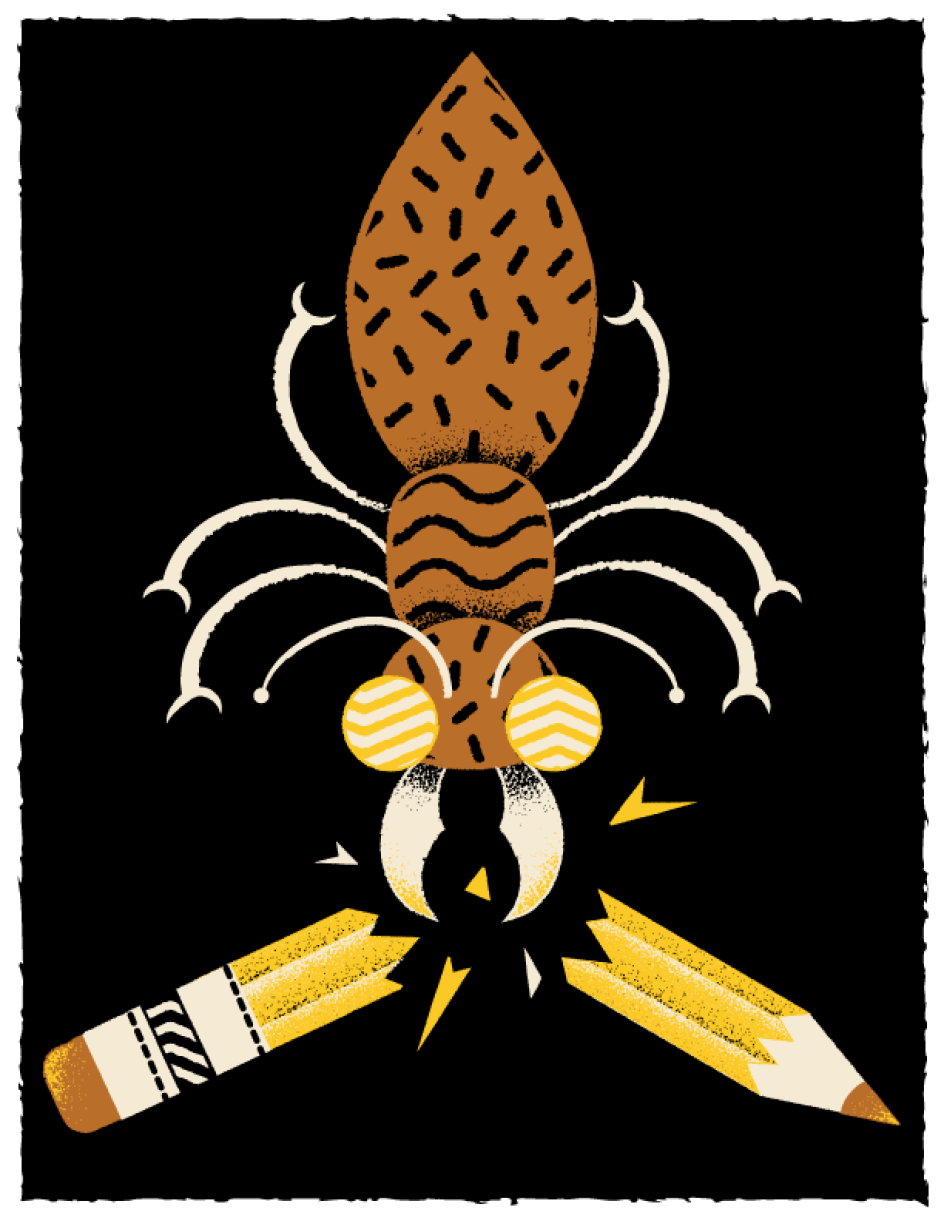

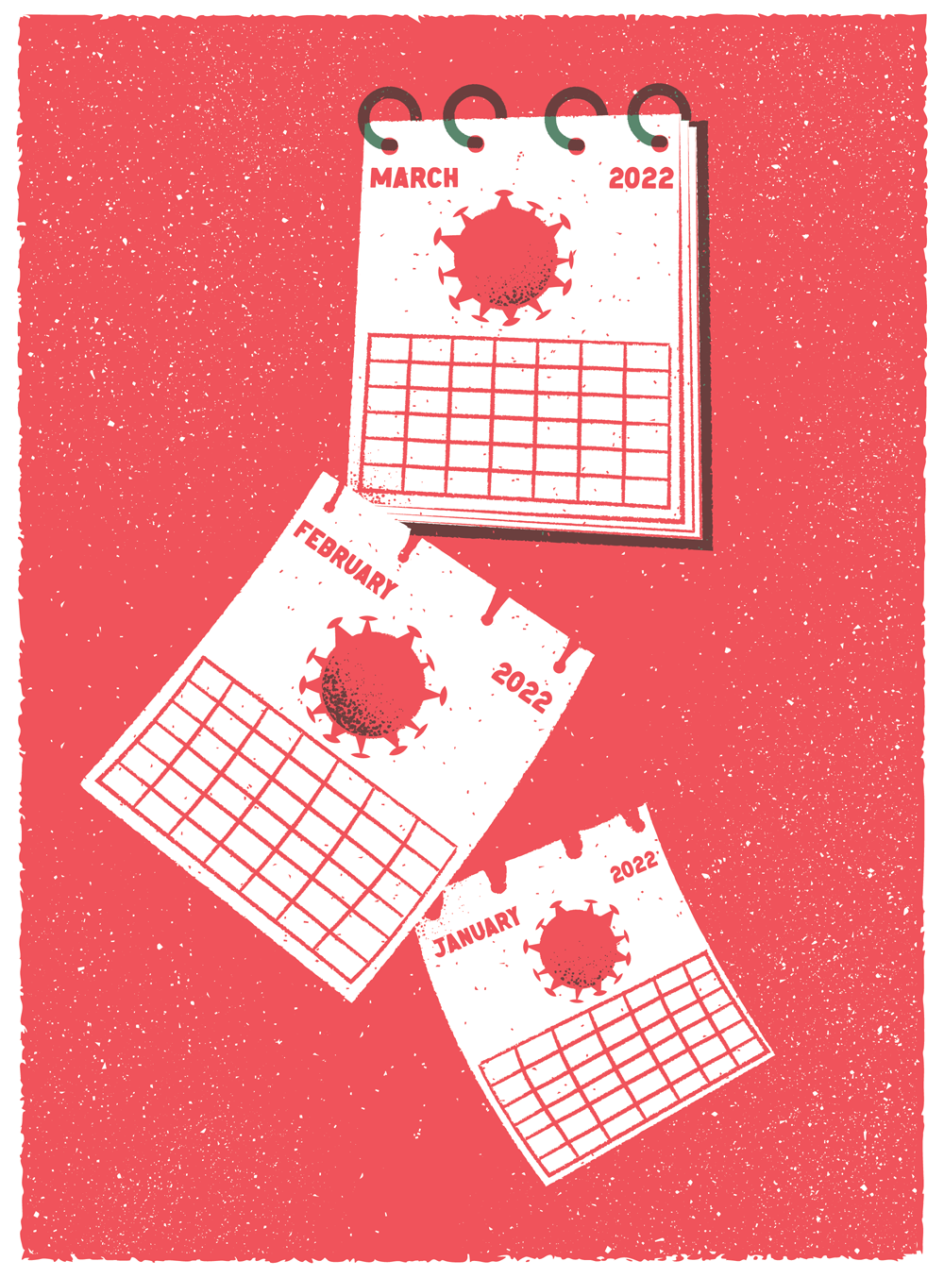
Illusration for Scientific American art directed by Michael Mrak


 by Tüpokompanii](https://www.creativeboom.com/upload/articles/58/58684538770fb5b428dc1882f7a732f153500153_732.jpg)


 using <a href="https://www.ohnotype.co/fonts/obviously" target="_blank">Obviously</a> by Oh No Type Co., Art Director, Brand & Creative—Spotify](https://www.creativeboom.com/upload/articles/6e/6ed31eddc26fa563f213fc76d6993dab9231ffe4_732.jpg)


](https://www.creativeboom.com/upload/articles/89/8951aa7210e6c4879105a2a1e578369a82a0e734_732.jpg)


