Matthew J I Wood's illustrated posters are a loving tribute to English football stadiums
Sheffield-based graphic designer Matthew J I Wood has transformed his love of football into a series of wonderfully retro illustrated posters. And they've even caught the eye of big-name clubs.
For football fans, stadiums are more than just buildings. As designer and illustrator Matthew J Wood puts it, they're the only near constant for fans to grab hold of. While players, managers and kits can change regularly, stadiums have longevity, which allows supporters to forge a deeper connection.
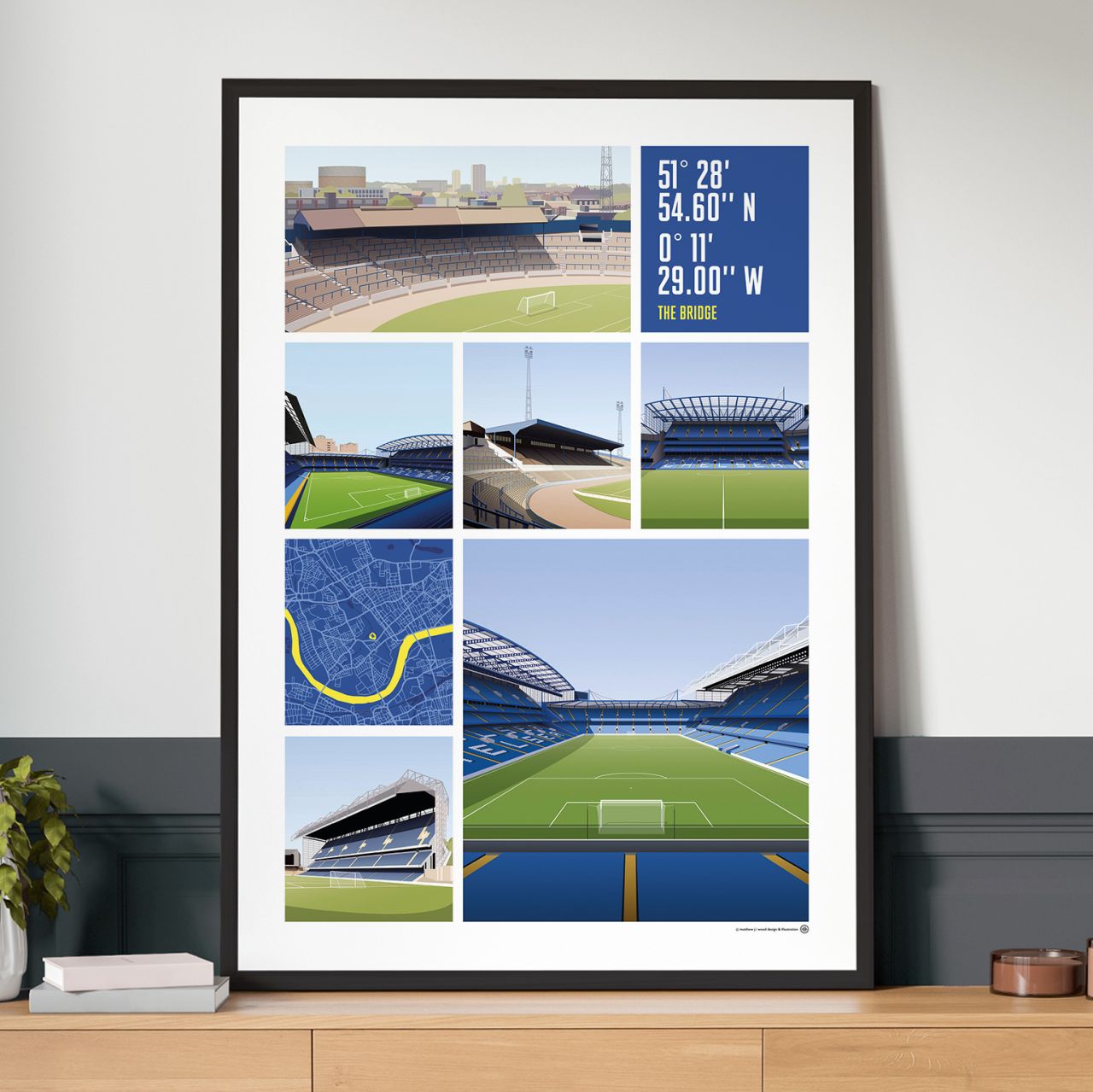
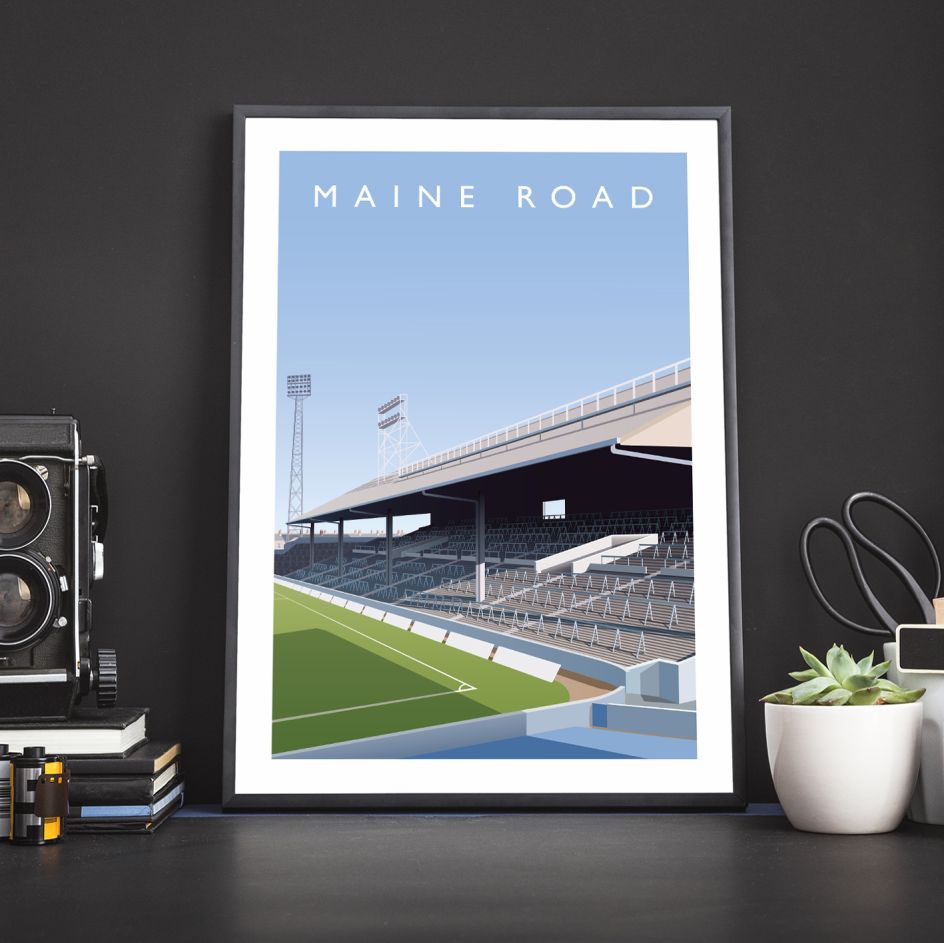
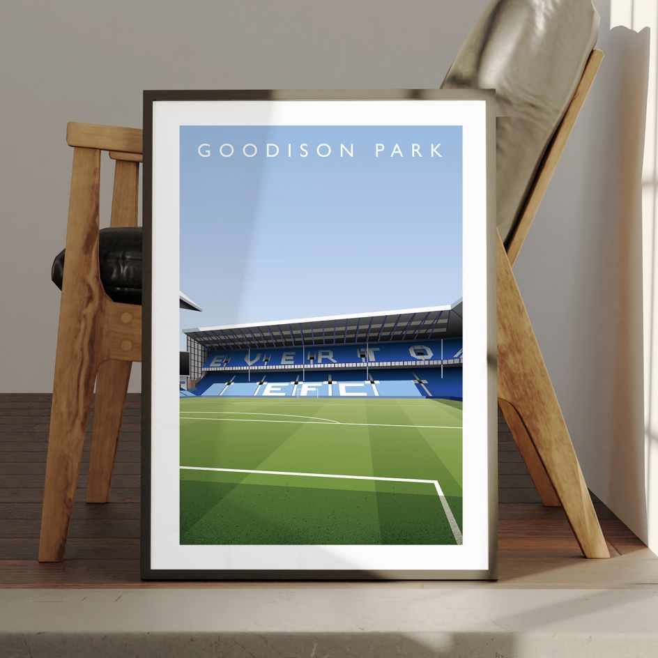
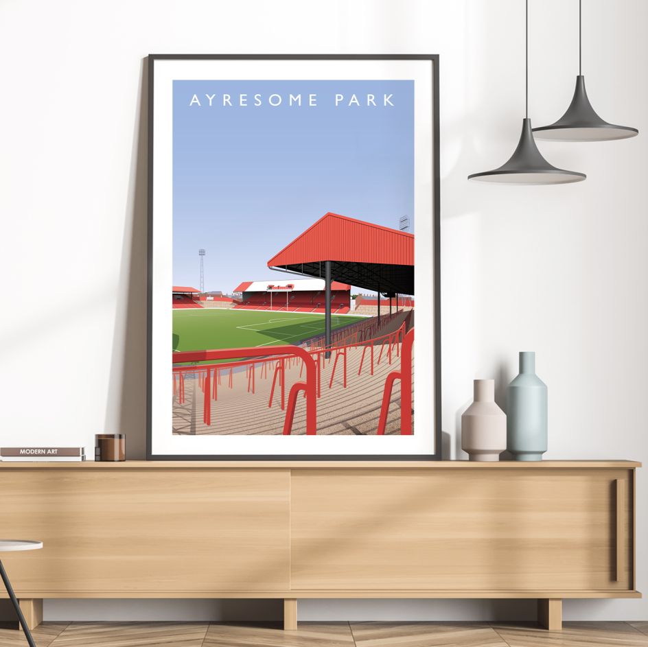
To celebrate their importance, Matthew has been working his way around the country's stadiums and immortalising them as delightfully illustrated posters. With a wide range of architectural styles to depict, including the iconic Archibald Leitch-designed stadiums from the early 1900s to the modern stadiums designed with specific aims, there's plenty of history locked away in these images.
"Further down the leagues are all sorts of architectural gems and curiosities, which I'm invariably drawn to," Matthew adds. Ultimately, I like drawing football stadiums due to my love of the game!"
To get the most out of his illustrations, Matthew ideally likes to draw the stadiums in person. However, the geographic spectrum of the grounds can make this difficult, especially considering that access is usually only granted on match days.
"At a ground, I'll try to take as many photographs as possible for reference, but it's as much about getting a sense of place as it is about working out what elements of a stadium should be focused on," he adds.
This search for a feeling taps into what makes stadiums so special for Matthew and football fans as a whole. With a spectrum of emotions experienced within their walls, they're significantly more than the sum of their parts.
"All fans remember their first visit to a ground in their childhood, perhaps more than the game itself — the dazzling green of the pitch, the echoing walls of sound, the endless amount of people, the smells (oh the smells)," Matthew explains.
"The football pyramid in this country is vast, and the fans are just as passionate at the base of the pyramid as they are at the top. The grounds become their churches and cathedrals, their weekly places of worship."
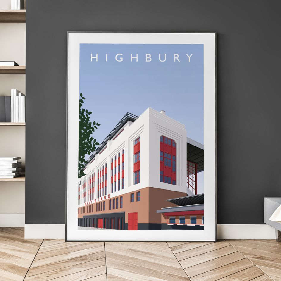
In terms of style, Matthew's main touchstones for the series are the golden era Railway posters made between 1923 and 1948. Cassandre's intimidatingly heightened sense of perspective also influences how he depicts the stadiums. "I initially wanted to focus tightly on a particular aspect of a ground (the clock at Hillsborough, Highbury's East Stand entrance, for example) but have gradually pulled back a bit more," he reveals.
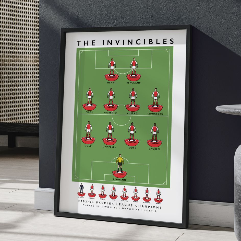
Other sporting paraphernalia have also informed his approach to depicting the beautiful game. "I'm just about old enough to have grown up with a Subbuteo set, and there's something so iconic about the figurines," he says.
"For the team designs, I wanted to simplify the illustrations of each player to make them instantly recognisable but not too detailed. The solution I found was to turn each player into a (lightly customised) Subbuteo figurine."
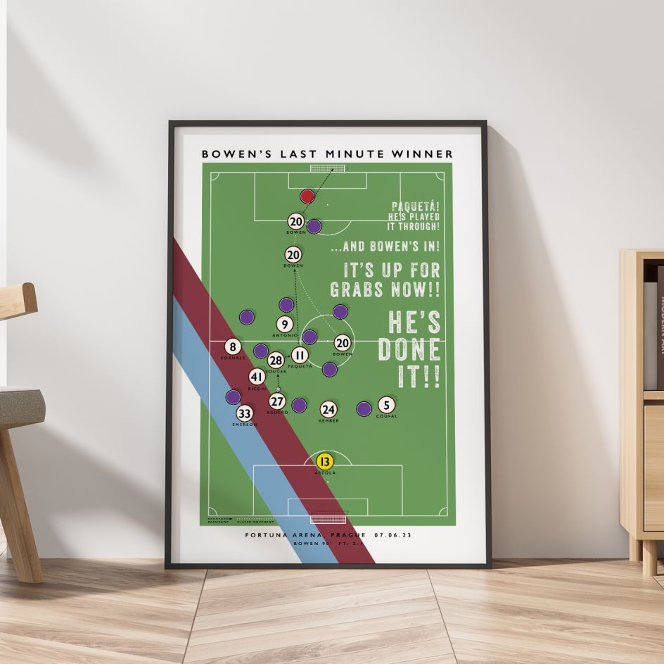
It's a creative approach that has paid off, as Matthew has been lucky enough to collaborate with various clubs. "Arsenal wanted to use one of my Subbuteo designs on their merchandise, and West Ham commissioned a design of the London Stadium for one of their match programme covers," he reveals.
"It's such an honour to be involved with clubs at any level, and the prints have ended up in the hands of some amazing figures within the game, including Marcelo Bielsa and Emma Hayes."
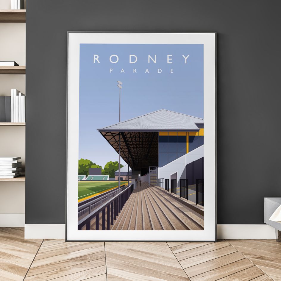
As for his own preferences, Matthew's favourite poster from the series is his design of Rodney Parada. "The composition creates so many diagonals, and it really leans into focusing on the stand itself, as opposed to the playing surface," he concludes.
"It's a stand with a huge amount of history that has witnessed all sorts of highs and lows, and the design feels like a glimpse into that, with the eye being drawn into the heart of the stand. Also, the name – Rodney Parade – is hard to beat!"
Editor's Picks


Trending


Podcasts

Editor's Picks
Further Reading