Minimal monochrome branding by a duo of Swiss designers for new arts platform Manétiz
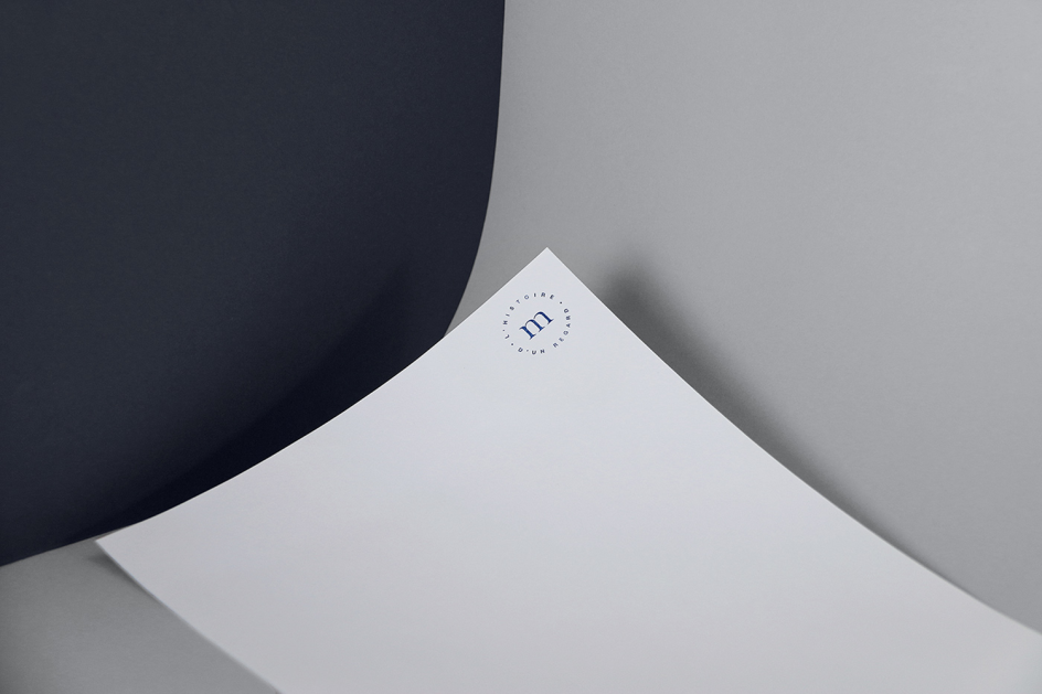
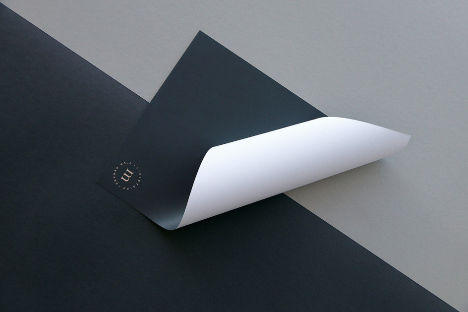
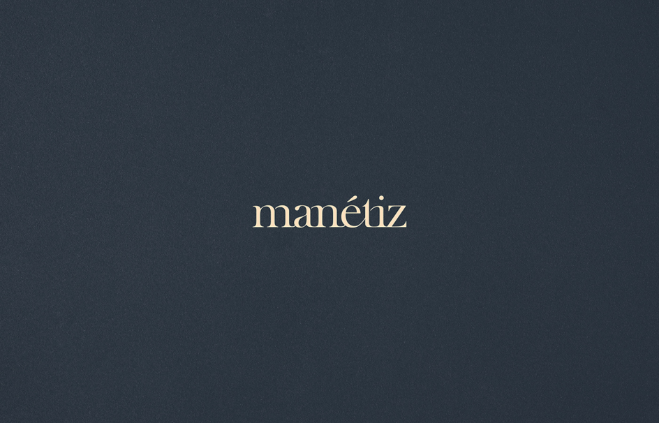
As slick and minimal as her Swiss roots would suggest, this new branding project by Alexandre Pietra is a sophisticated slice of monochrome chic. Pietra worked with Bhakti Devanthéry to create the graphic design and art direction for a new arts platform Manétiz.

The site presents a selection of work by photographers, illustrators and graphic designers for sale online, with the artists solely distributing their limited-edition pieces (with a certificate to prove it) through the platform. According to the brand, it looks to become a “circle where the emphasis is placed on the connection between creator and collector."
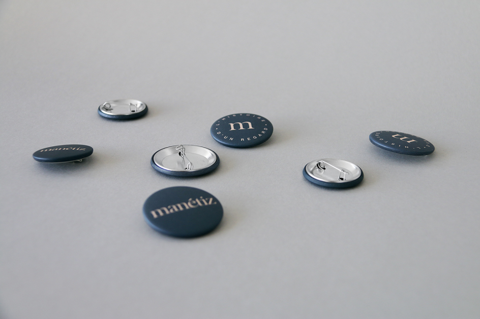
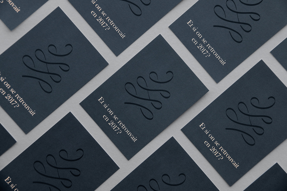
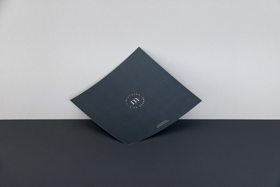
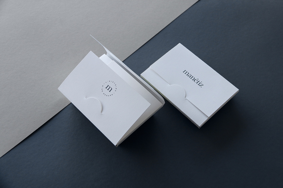
The look and feel of the branding takes a pared-back stance to let the work speak for itself, using a colour palette of white, black and shades of grey. Typefaces remain traditional, with Devanthéry and Pietra choosing to work with Baskerville Old Face and Helvetica NeueLT pro. The designs are used across all touchpoints including the website, some rather luxe embossed business cards, badges, stationery and even some just-slightly-creepy white gloves for handling artworks.
You can see more of Alexandre Pietra’s work on her Behance site.


 by Tüpokompanii](https://www.creativeboom.com/upload/articles/58/58684538770fb5b428dc1882f7a732f153500153_732.jpg)

 using <a href="https://www.ohnotype.co/fonts/obviously" target="_blank">Obviously</a> by Oh No Type Co., Art Director, Brand & Creative—Spotify](https://www.creativeboom.com/upload/articles/6e/6ed31eddc26fa563f213fc76d6993dab9231ffe4_732.jpg)





](https://www.creativeboom.com/upload/articles/d5/d5a49bf5860fff0b7b78322328b7e77f0208c7cd_732.jpeg)
