When bike brand Brompton needed a refresh, Studio Blackburn didn't mess around—they headed straight to the factory floor
Iconic bicycle manufacturer Brompton needed a global brand platform. But Studio Blackburn didn't just design a system. They went to the source and cut metal letters next to the machines that build the bikes.
It's no secret that we're big fans of Brompton at Creative Boom (watch our exclusive video Inside Brompton's London Factory if you don't believe me.) Their funky folding bike has been a design icon since 1975, and attracted the kind of cult following most brands can only dream of.
So when Studio Blackburn was brought in to build a scalable, digital-first brand platform for Brompton's global expansion across Europe, the USA and Asia, the brief wasn't "make Brompton interesting." It was already interesting. The brief was simply to take the place cyclists have in their hearts for Brompton, and amplify it around the world.
The identity was already there
The first smart decision Studio Blackburn made was to take the iconic Brompton logo and its triptych symbol and… do absolutely nothing to change them. In a world where companies often rebrand stuff without any obvious reason to (*cough Insta- *cough -gram), there's something admirably confident in that level of creative insight.
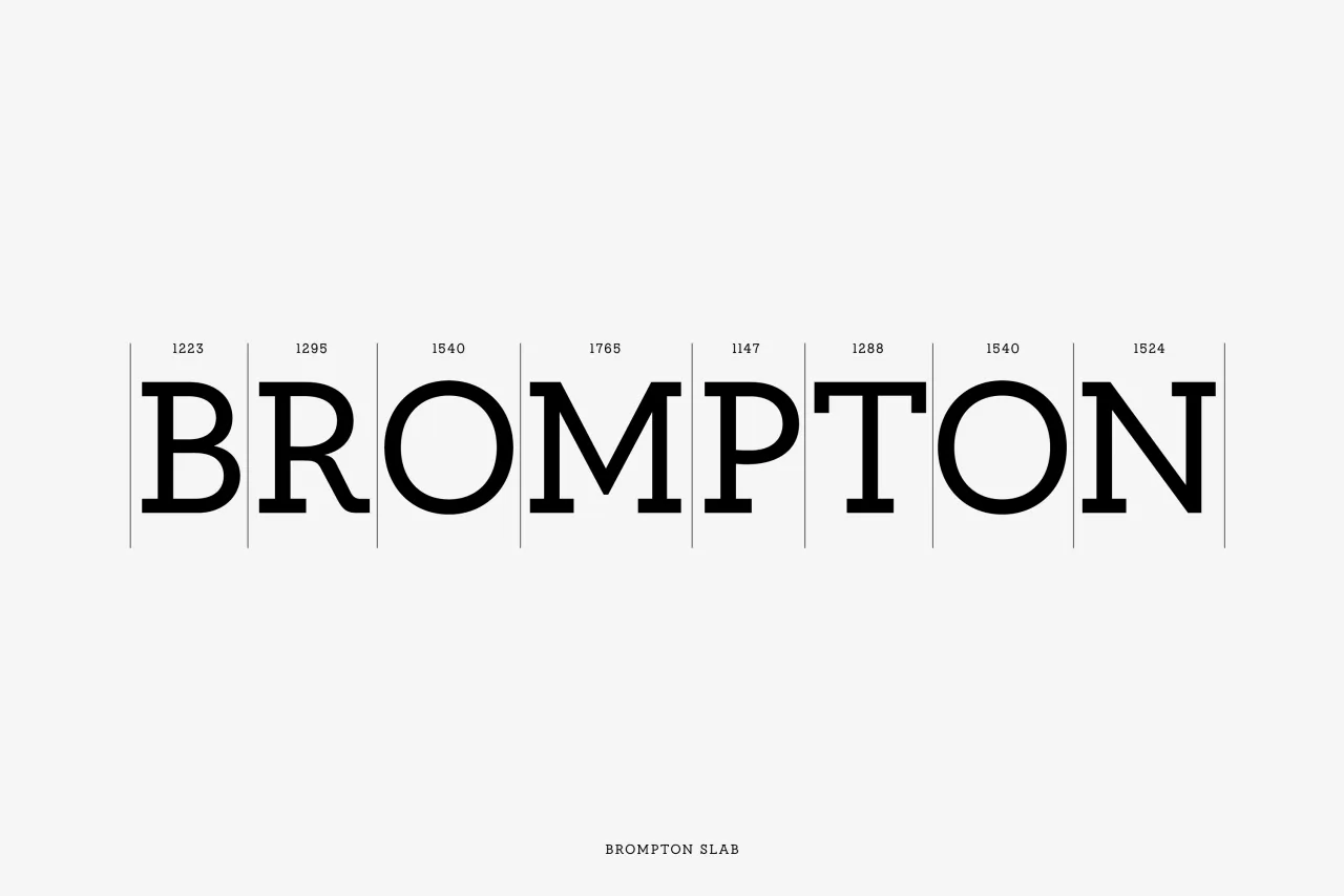
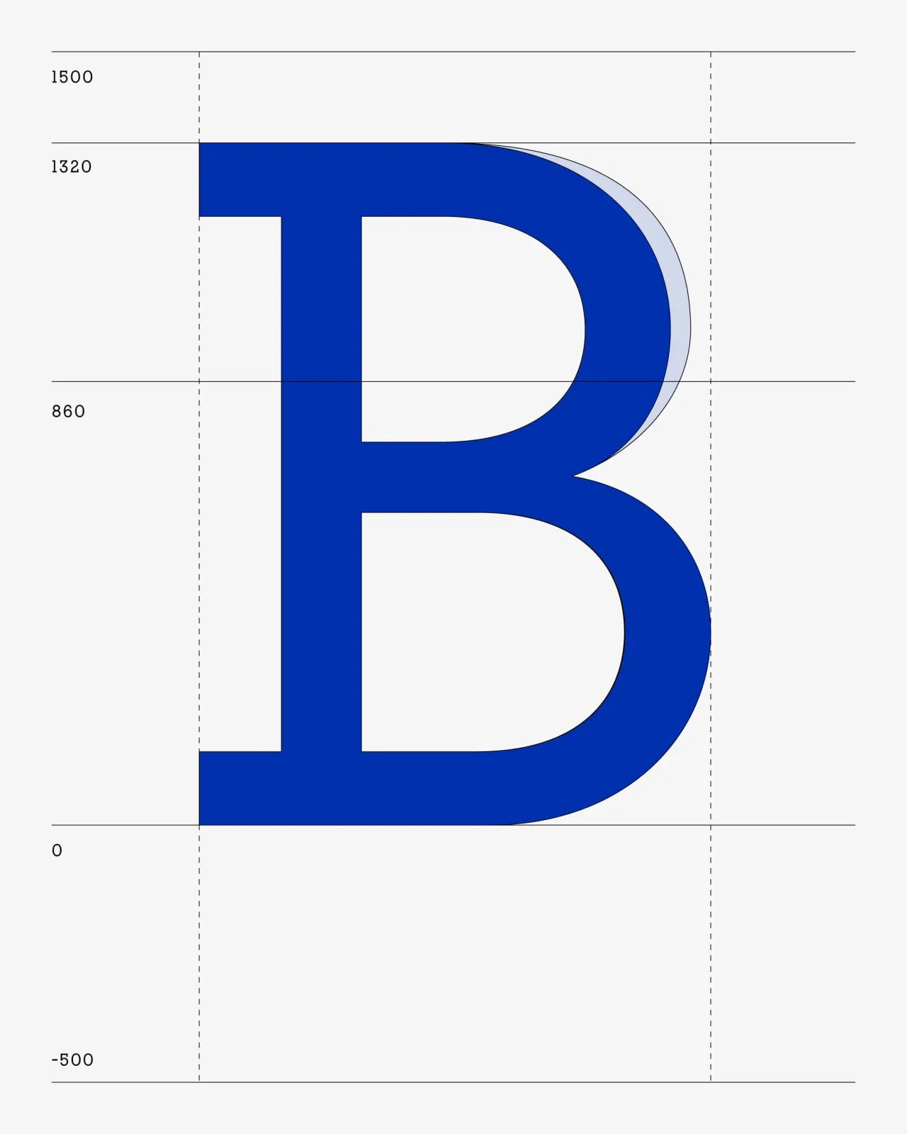
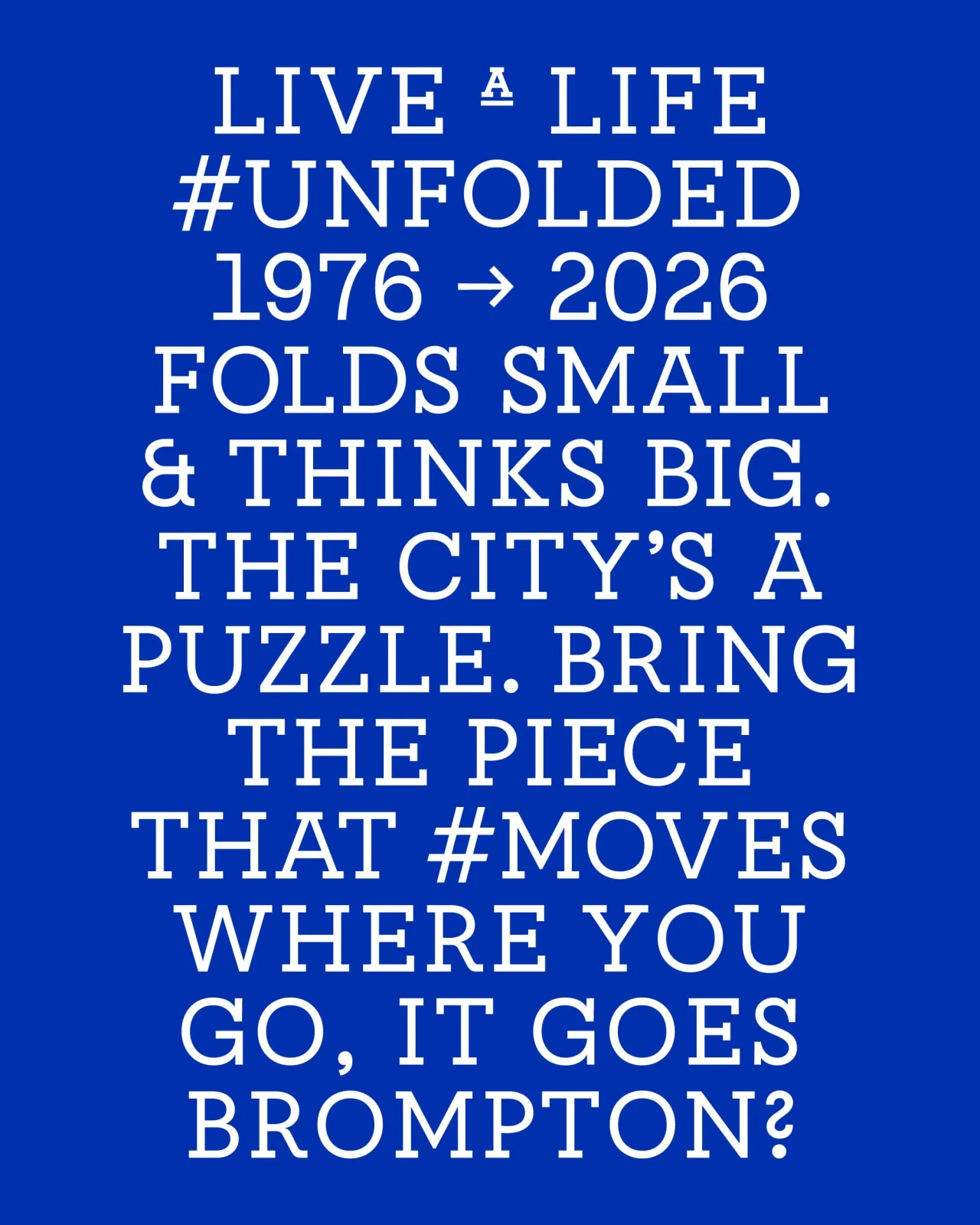
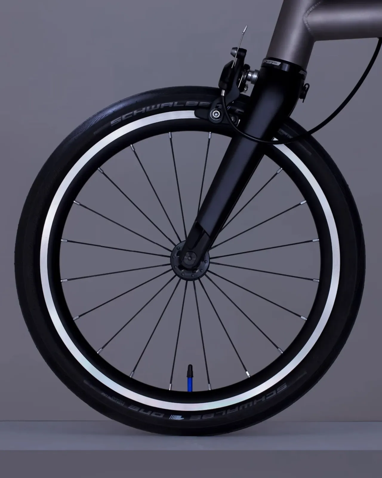
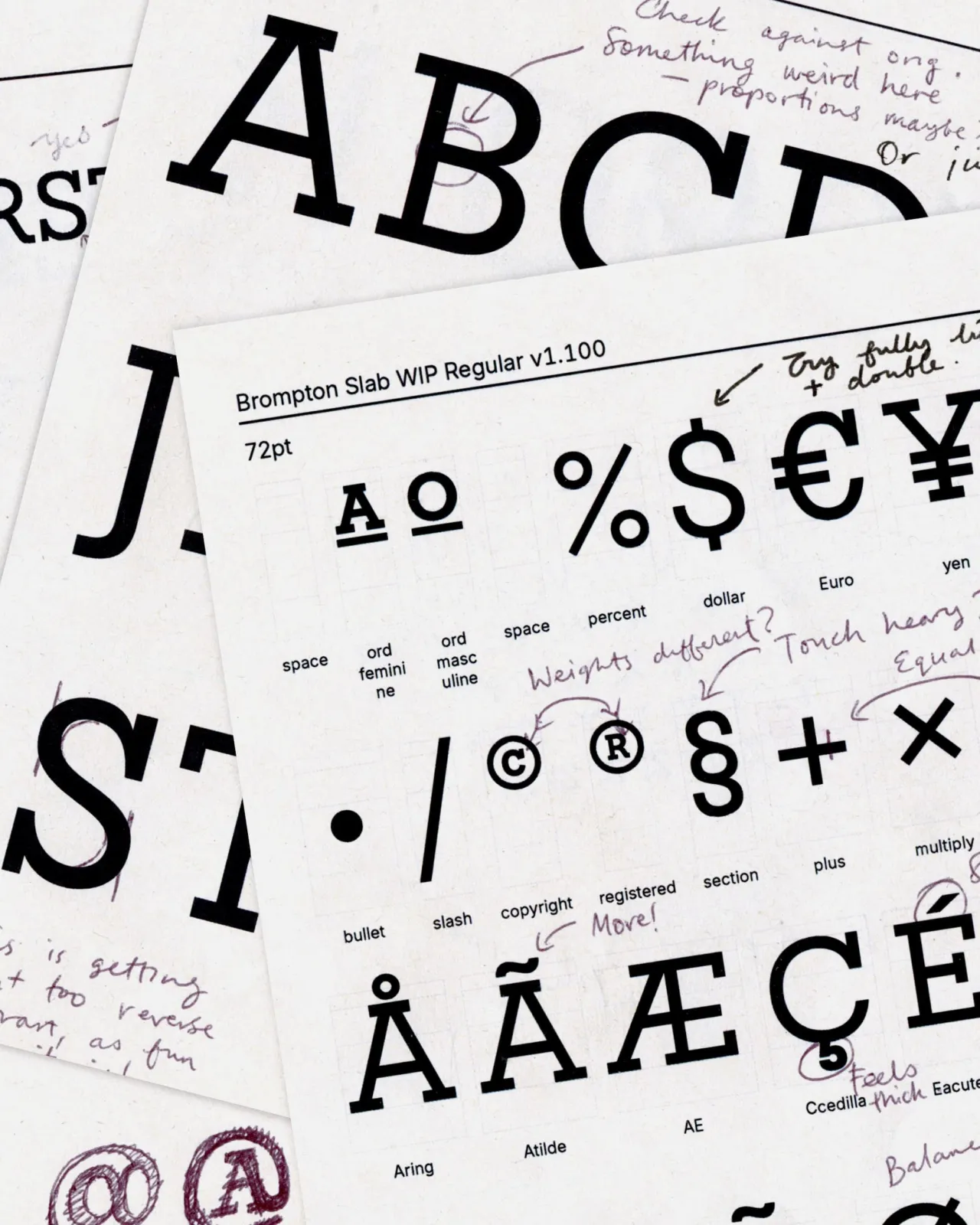
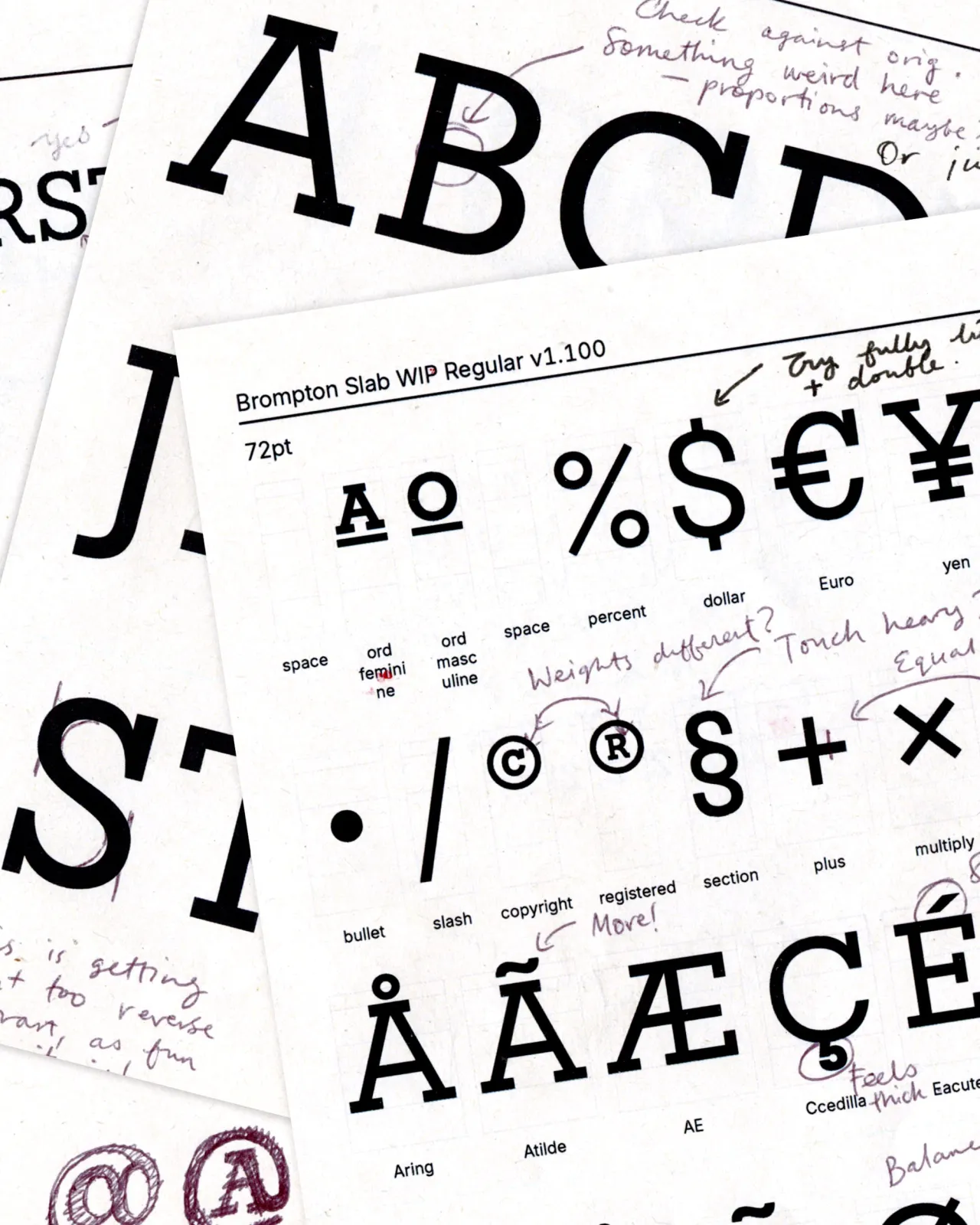
The problem wasn't the logotype itself; it was what happened when teams needed to use it in international markets. It had never been extended into a full character set, so internal teams were having to improvise. The result, across retail, online, CRM and advertising, was fragmentation.
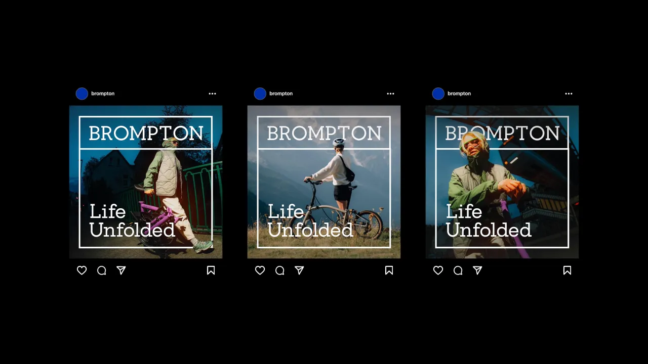
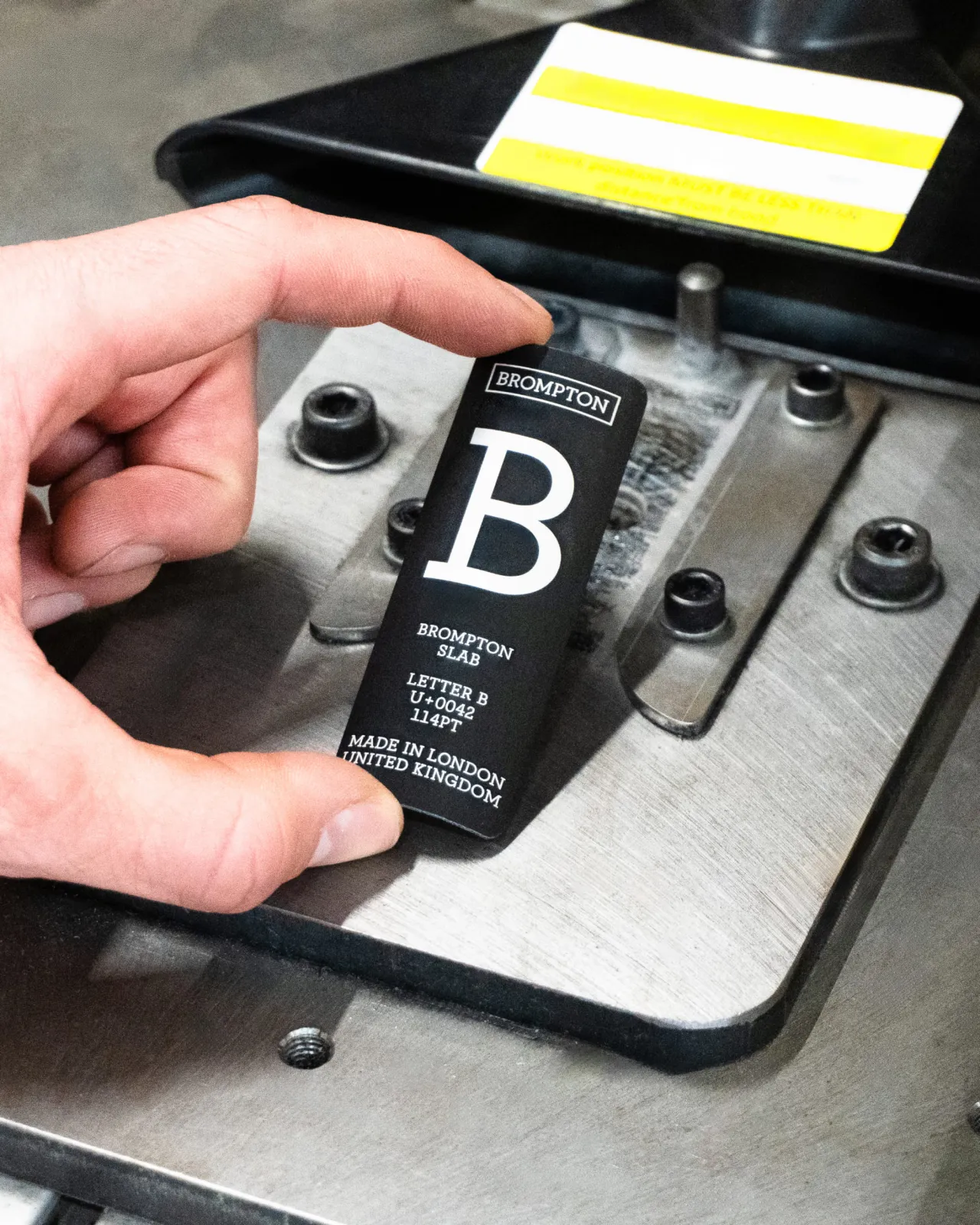
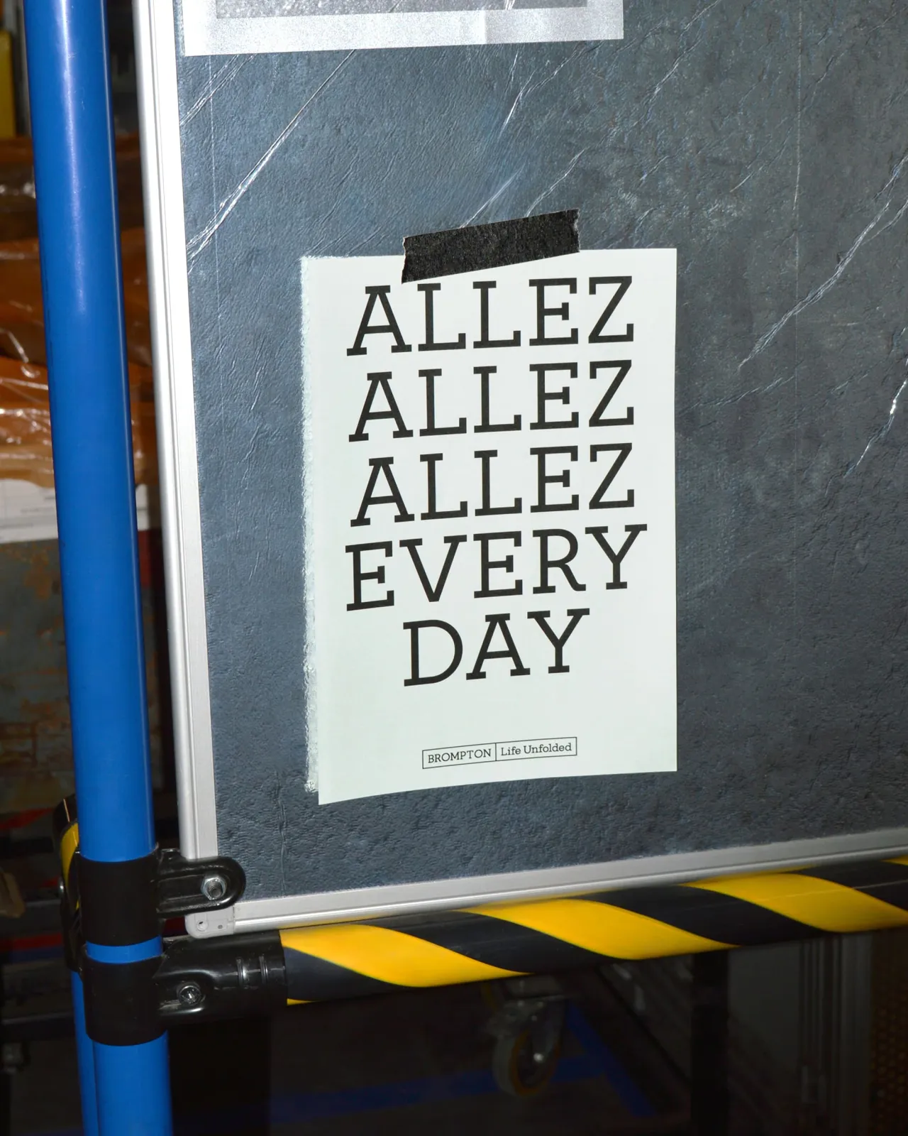
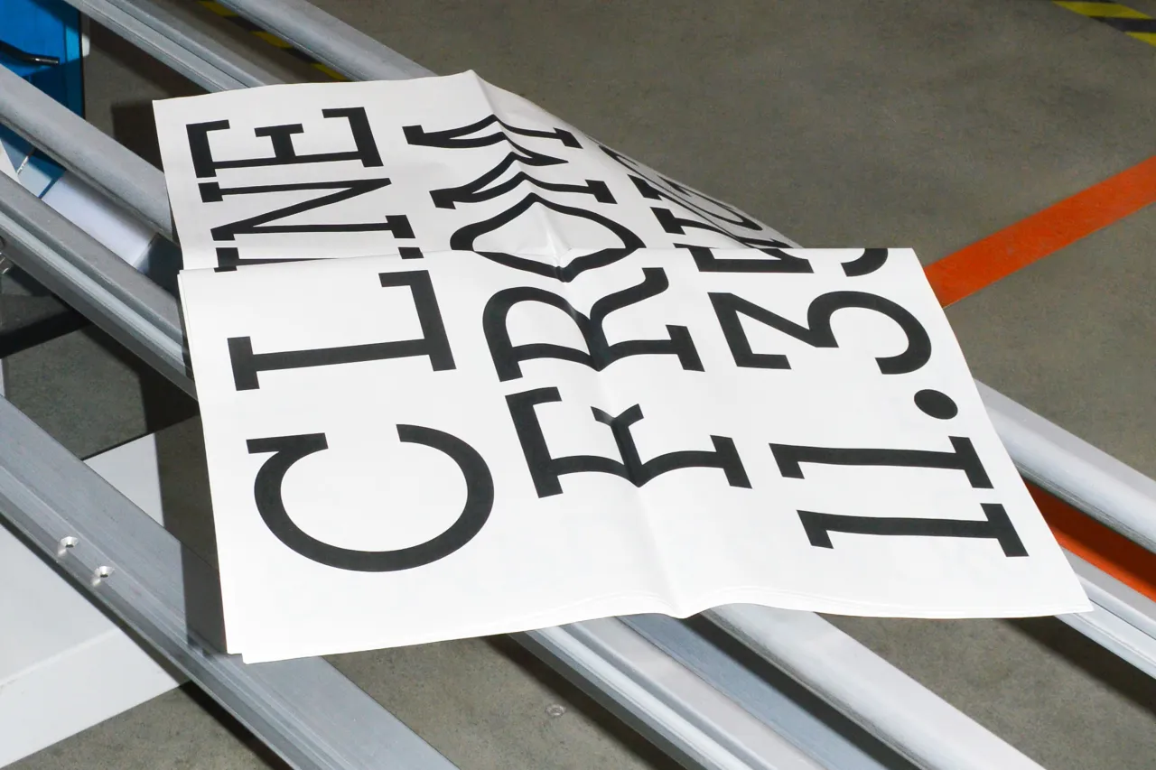
Studio Blackburn's solution was Brompton Slab: a bespoke headline typeface developed in partnership with type designer Sam White. The team adjusted the letterforms to ensure long-form legibility across global languages.
Back to the factory
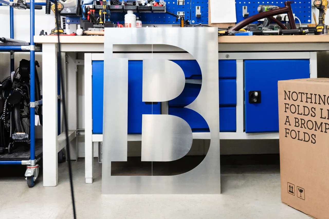
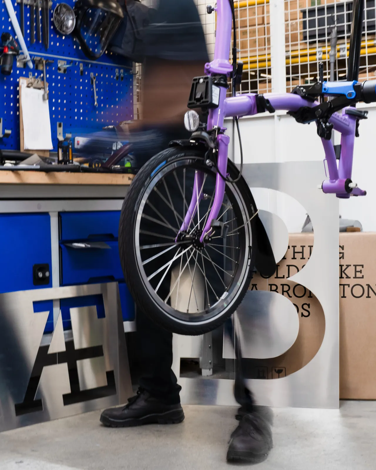
Now, here's the bit that shows just how well Studio Blackburn understood the brand. To launch Brompton Slab, the team went to the factory in Greenford, where the bikes are actually built by hand, and cut oversized metal letters.
The resulting images are some of the most striking brand photography you'll see this year. The letters don't look out of place at all; they look like they belong there, which makes perfect sense.
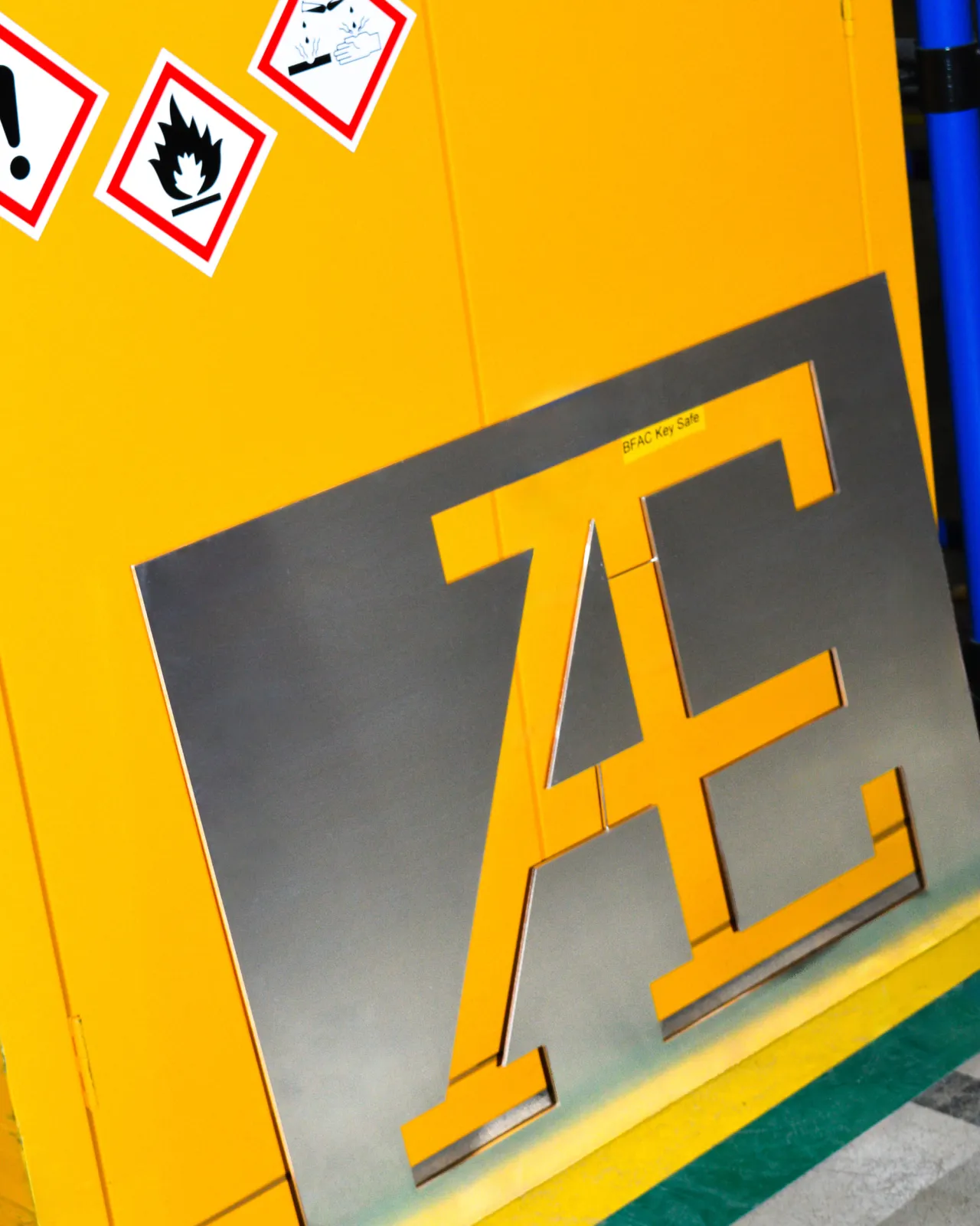
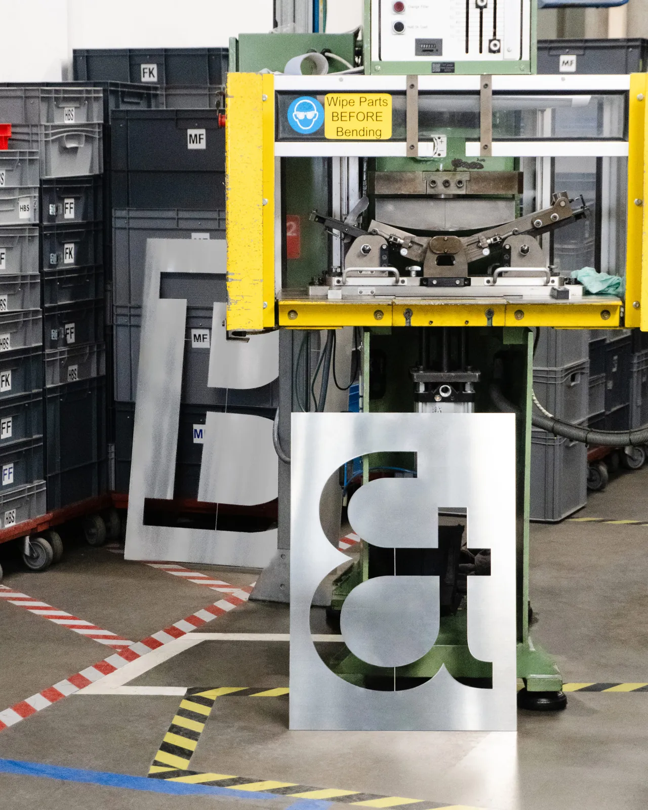
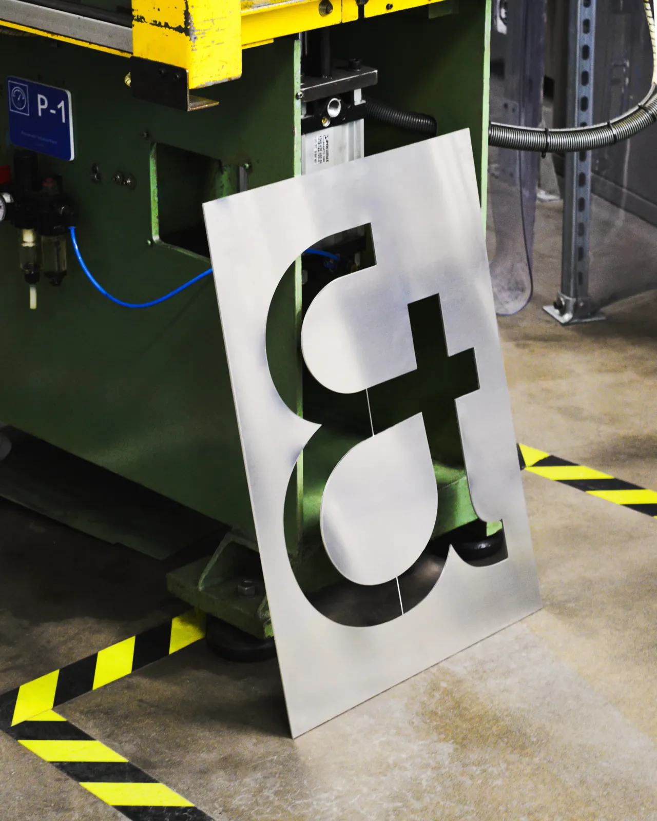
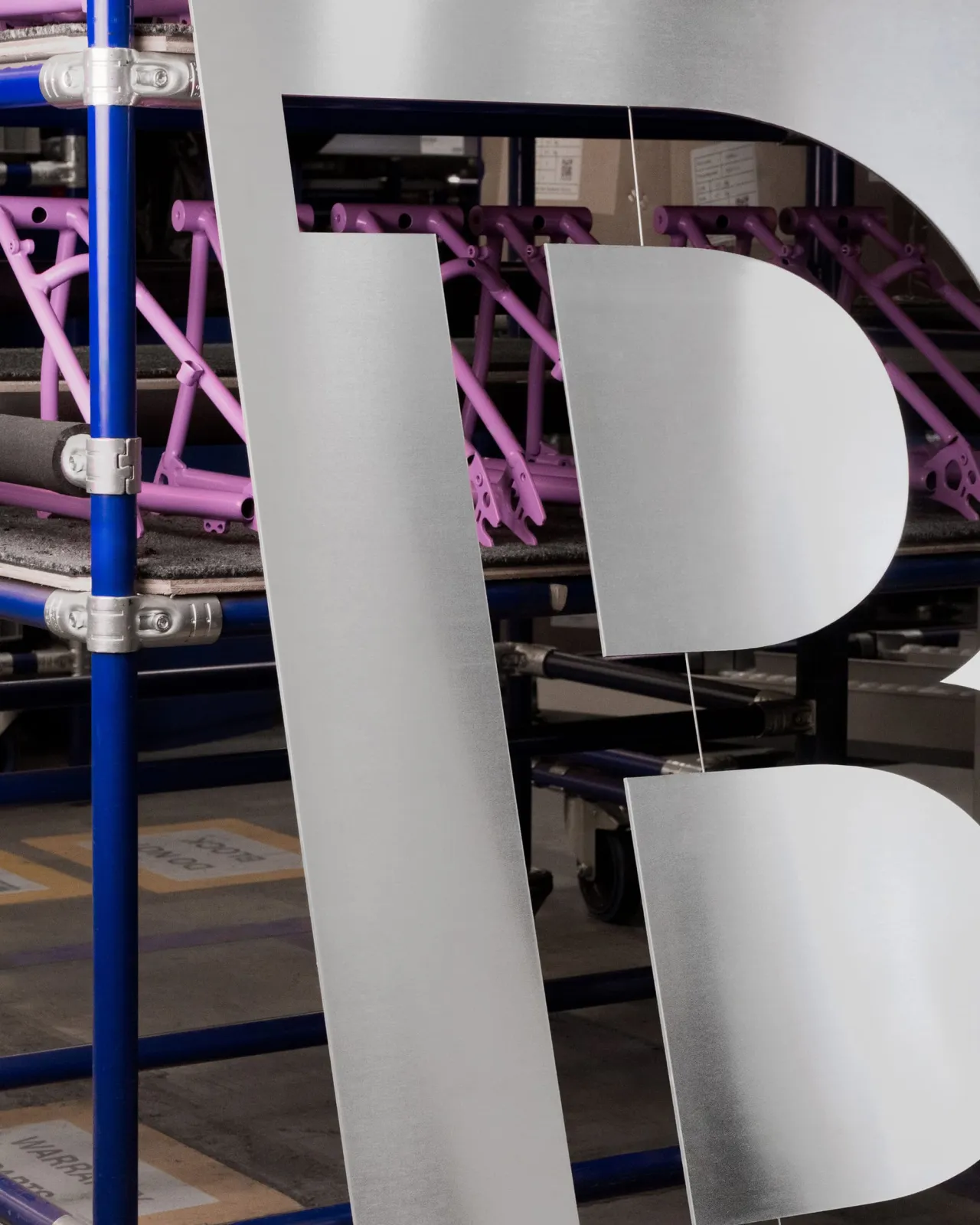
The typeface was developed from the logo; the logo came from the factory; ergo, the typeface belongs on the factory floor. It's circular logic, and Studio Blackburn pulled it off masterfully.
Brand phrase
Underpinning the whole system is a single phrase: Life Unfolded. It's clever because it works on multiple levels at once, without trying too hard.
It nods to the product's defining feature as a folding bike. It also captures how Brompton opens up the city to riders, turning a boring commute into an adventure.
The motion principles follow the same logic. Inspired by the distinctive mechanical "final flick" of the rear wheel as the bike unfolds, Studio Blackburn built a motion architecture that shifts between what they describe as smooth "3-speed" UI transitions and dynamic "12-speed" editorial layouts.
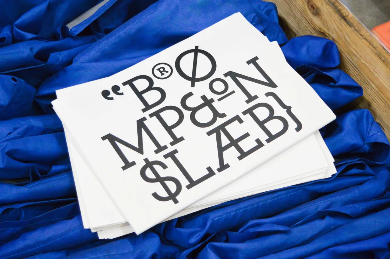
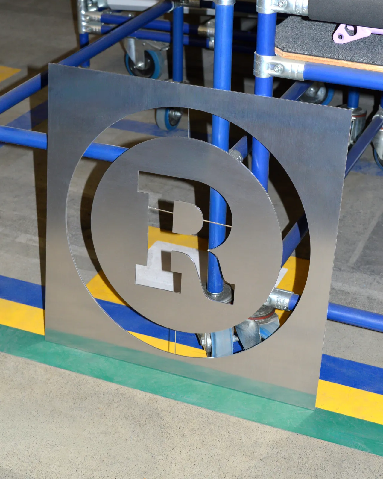
Colour-wise, Brompton Blue, a high-visibility, industrial hue directly inspired by the factory visit, serves as a visual anchor across every touchpoint, with the flexibility to shift into custom palettes for collaborations.
Key takeaway
The more you look into this work, the more impressed you get with what Studio Blackburn has achieved here. Namely, taking a brand that already had enormous equity, acknowledging what shouldn't be changed, and building the infrastructure around that, allowing the company to grow properly across the globe.
There's a version of this project that could have gone very differently. A global redesign of a beloved British icon, in the wrong hands, could have stripped out all the personality and left you with nothing but polished but empty blandness. Studio Blackburn's refresh of Brompton does the exact opposite. Brompton has been making things properly in London since 1975. Turns out their agency of choice does the same.
Editor's Picks





Trending




Latest Jobs
Senior Social Media Manager at Whitney Museum of American Art
Full-time·New York·$95,000 – $100,000
Marketing Manager at Southbank Centre
Full-time·London·£45,800
Social Media Manager at Jam
Full-time·Manchester·Circa £35,000
Associate Director of Experience Design at California Academy of Sciences
Full-time·San Francisco·$150,000 – $165,000
Senior Consultant, Strategy at Interbrand
Full-time·New York·$100,000 – $125,000
Associate Creative Director, Art at Huge
Full-time·United States·$102,000 – $135,000