A new manifesto by Zip Design covers 25 nuggets of wisdom from 25 years in the business
If you could pull together a manifesto that celebrates 25 years in design and everything you've learnt so far, what would it say? Zip Design in London has done just that and created a beautifully designed book that shares 25 of its biggest lessons.
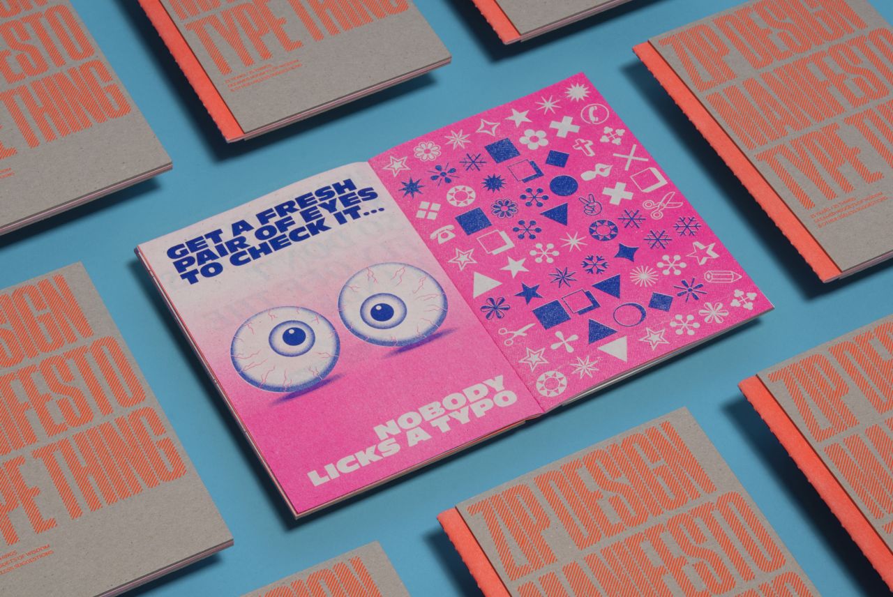
The Zip Manifesto marks 25 years since the design studio opened its doors in Camden Town. Inside, it features the "little nuggets of information and tips" its team has shared and uses the print and production techniques Zip loves and has "wanted to explore for ages".
Led by Creative Director Neil Bowen, Zip launched in the mid-90s as a collective of companies within its parent company New State Entertainment. It was initially set up as an in-house service but soon began working with all the major record labels of the time, like BMG, Sony, Polydor, Universal, EMI and Virgin. Over the years, it has moved into different sectors to work with global brands such as United Nations, Aston Martin, and Airbus. It's been a rocky road sometimes, but Zip has successfully ridden the waves. "The changes have been profound over 25 years," says Mary Patel of Zip. "To stay relevant as a creative company, we've really had to adapt to all the developments and shifts along the way."
Shifts being...the move away from print to online. "Even though all the applications we used were digital, many processes were still analogue. Fundamentally the way we approach things is still the same now, such as creative process, slick execution, attention to detail and pride in the work you produce," adds Mary. "We still apply the same level of diligence to digital, but it can be here today and gone tomorrow."
It's for this reason that Zip decided to make the manifesto. "It's important to keep this knowledge and experience alive; using multiple processes in preparing this for print ensures these skills aren't lost," Mary explains. "In a digital design world, it feels nice to make a tangible artefact that you can keep and treasure."
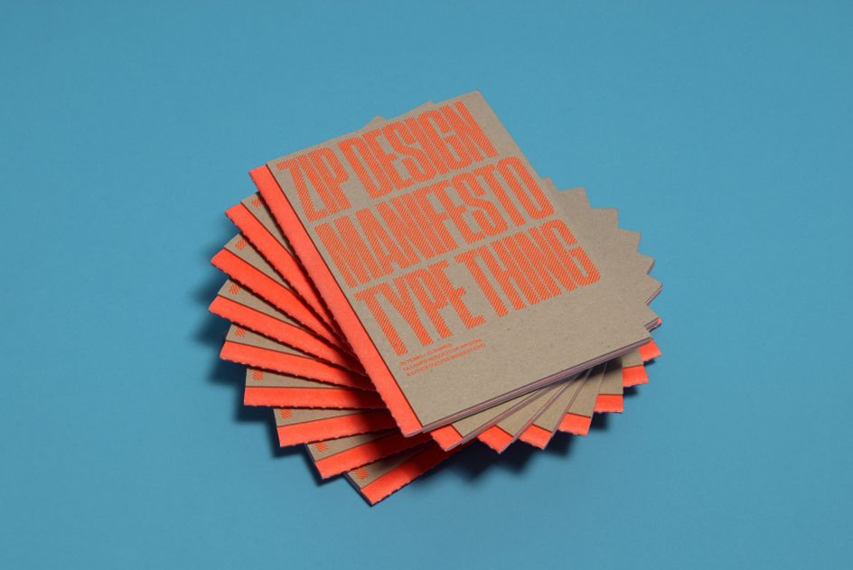
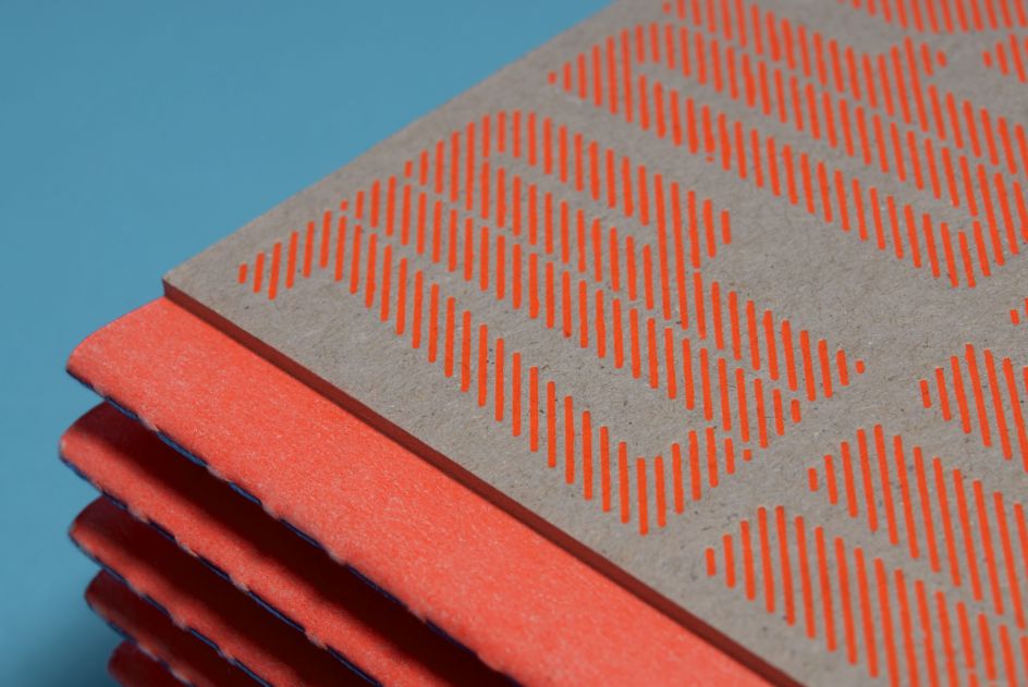
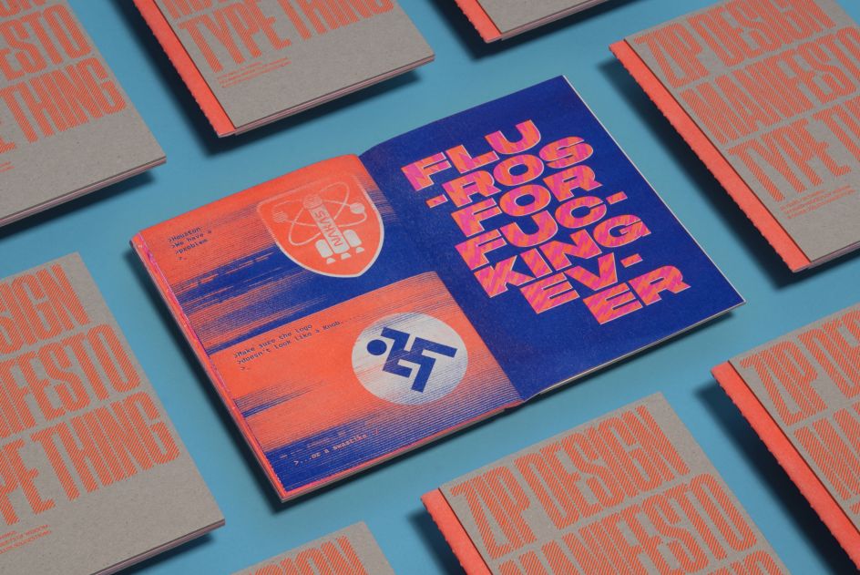
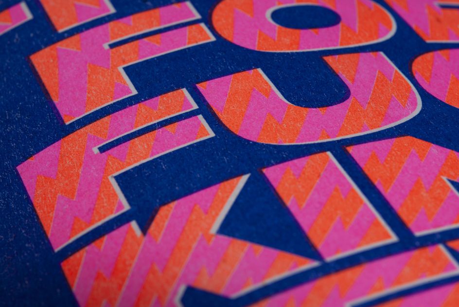
Within its pages, we immediately get a sense that Zip has a healthy sense of humour and doesn't take itself too seriously. "From the very start, we were conscious that we wanted this to be positive and somewhat tongue and cheeky, a little list of things to remember, as well as advice for a designer at the start of their career," says Mary.
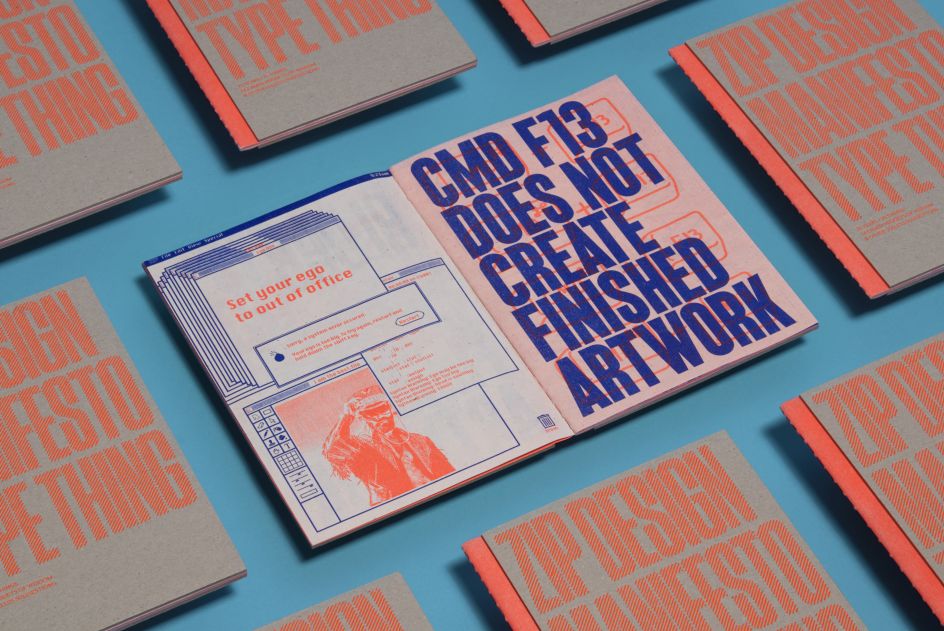
A few of their favourites include, 'Set your ego to out of office'. "Being a smaller creative agency, it's so important to be able to gel together as a studio. With different creative tastes and skills, it should be about having an open dialogue to work through to let the best ideas shine through. A nurturing and friendly environment is ultimately more productive, and with the amount of time we spend at work, we want it to be a space where you're looking forward to going, and there's no room for clashing egos. Would you want a studio like a scene from The Apprentice? Definitely not! So basically, just don't be a dick!"
Another highlight is the advice that you should 'Get a fresh pair of eyes to check it...nobody likes a typo'. Mary adds: "When you've been on a project for a long time looking at the same thing, it's easy to miss the mistakes and sometimes they can be glaringly obvious, even the client may have missed them. We've definitely learned the hard way; that it's so important to have a new person see it afresh before you send it. Over the years, we've had a few stinkers who have gotten through, no names named. On one record sleeve project about to go to print, someone luckily popped into the studio and spotted that 'rhythm' in the title was spelt wrong… proving that... rhythm really is a mystery."
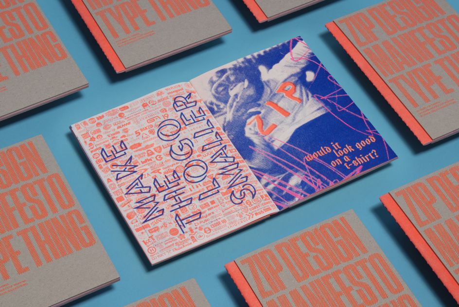

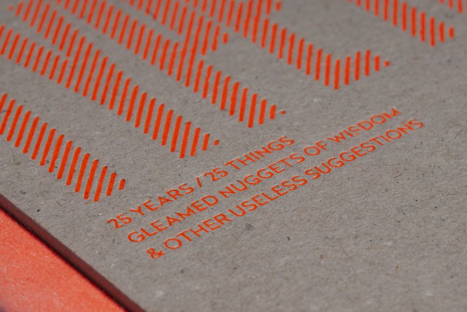
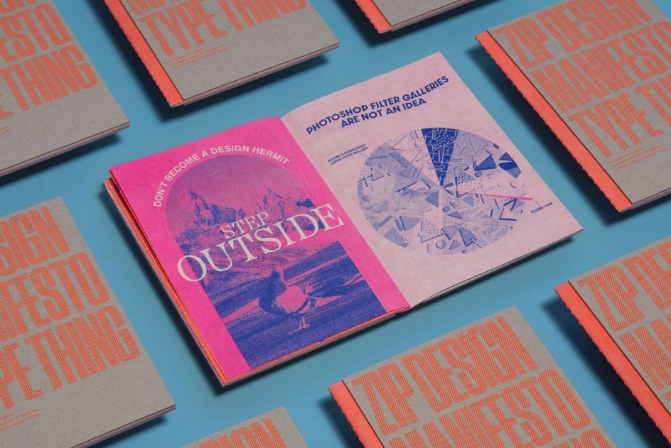
Elsewhere, Mary believes 'Don't like it, don't bloody do it' is a fine piece of advice to live by. "This is very much about the conceptual phase when you're forming ideas, recognising at this stage the options you don't really like yourself and then having the confidence to remove those before you present to the client, cos nine times out of 10 that's the option that gets picked," she says. "This can mean the whole project becomes a battle because it's not something you're feeling, so you don't enjoy doing the work; therefore, it becomes much harder to finish. You've created your own hardship; you're the only one to blame in that situation, so if you don't like it, don't bloody do it."
Amen to that! But of all the tips Zip Design shares, there's only one that resonates with the team the most, particularly now, as we approach 2023, and it's this: 'CMD F13 does not create finished artwork'. As Mary explains: "In this day and age, with so many AI pre-programmed templates and solutions, it's so important to create your own stamp on your creative output."
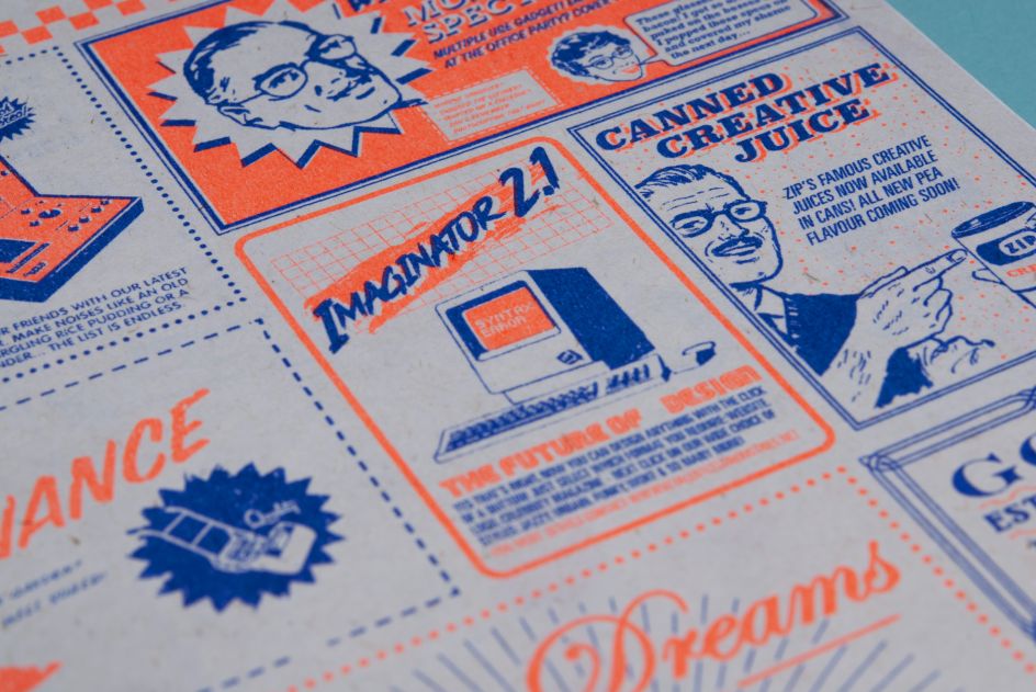
A long time ago, Zip made a short, lighthearted film looking into the future of these issues called Imaginator 2.1 – something Zip feels has become more relevant today. Incidentally, there is an advert for this at the back of its manifesto. "When using these template effects, you produce more generic and formulaic work, and it hampers any creative progression and individuality, which is why it's so important for creatives to find their own unique approach," says Mary.
What lessons will Zip learn over the next 25 years? With everything happening in the world today, it's impossible to predict, but the Zip Manifesto contains wisdom many might find helpful.


 by Tüpokompanii](https://www.creativeboom.com/upload/articles/58/58684538770fb5b428dc1882f7a732f153500153_732.jpg)


 using <a href="https://www.ohnotype.co/fonts/obviously" target="_blank">Obviously</a> by Oh No Type Co., Art Director, Brand & Creative—Spotify](https://www.creativeboom.com/upload/articles/6e/6ed31eddc26fa563f213fc76d6993dab9231ffe4_732.jpg)


