Athletics designs new website for Guild to help share inspiring career stories
Brooklyn-based brand studio Athletics is behind a new website design for Guild, a career and education platform that helps Fortune 1000 companies and America's workforce get ahead. It follows COLLINS' recent rebrand for the firm.
Guild was founded in 2015 to bridge the gap between education and employment for working adults. Today, it also connects education to outcomes, with coaching and career support to help millions of working adults advance into meaningful careers.
Guild's new brand by COLLINS marks a new chapter for the platform. "It's a big step in our evolution as a company to make opportunity as widespread as talent," says Dan Reid, creative director at Guild. As part of the refresh, Guild has introduced Career Accelerator. "It's a new product that will help millions of working adults turn skills learned in Guild programmes and on the job into real career outcomes."
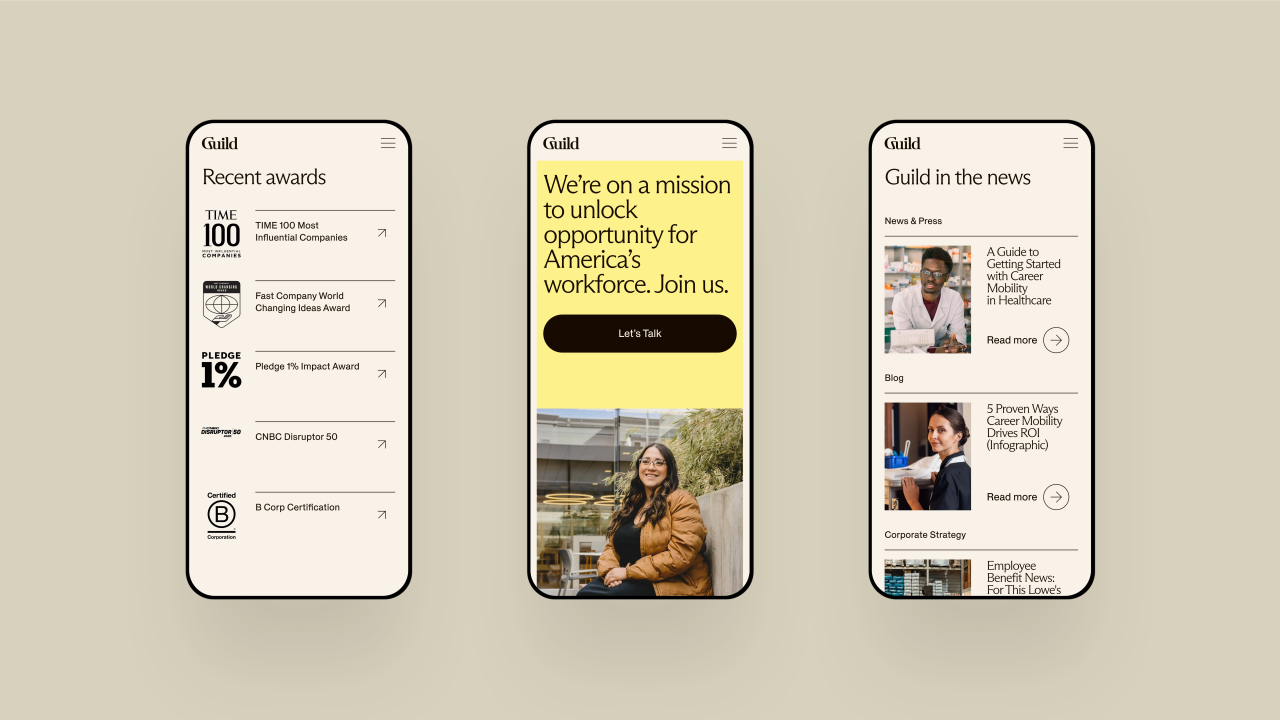
Taking its brand refresh, Athletics collaborated with Guild to design and develop its new site. The new platform focuses on Guild's primary audiences: employers, learning partners, and working adult learners, so that each can learn about Guild's unique offering and how they are instrumental in driving career mobility at scale. According to the Athletics team, "the site's unique challenge was to communicate to Guild’s different audiences in different interrelated ways while maintaining a cohesive, bold and engaging narrative flow".
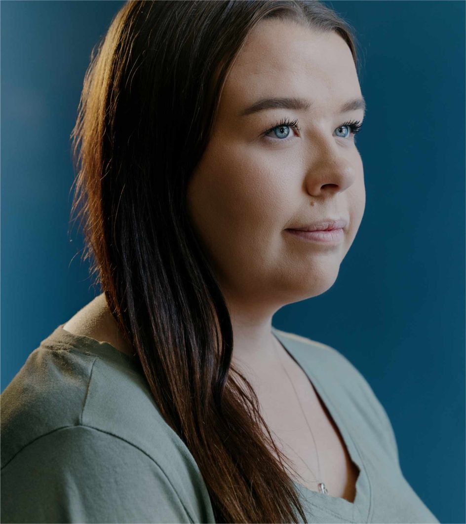
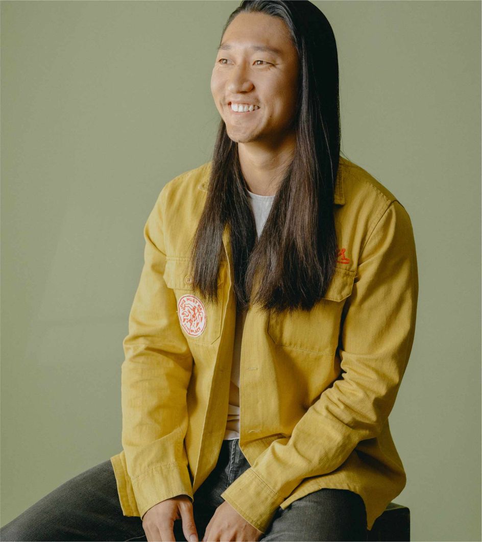
Visit the Guild site and you'll discover the many paths and experiences its students may encounter along the way. Flexible site modules were created to tell more complex student stories with imagery, headlines, bylines, and data. And as you scroll, information builds gradually to make for an easier reading experience.
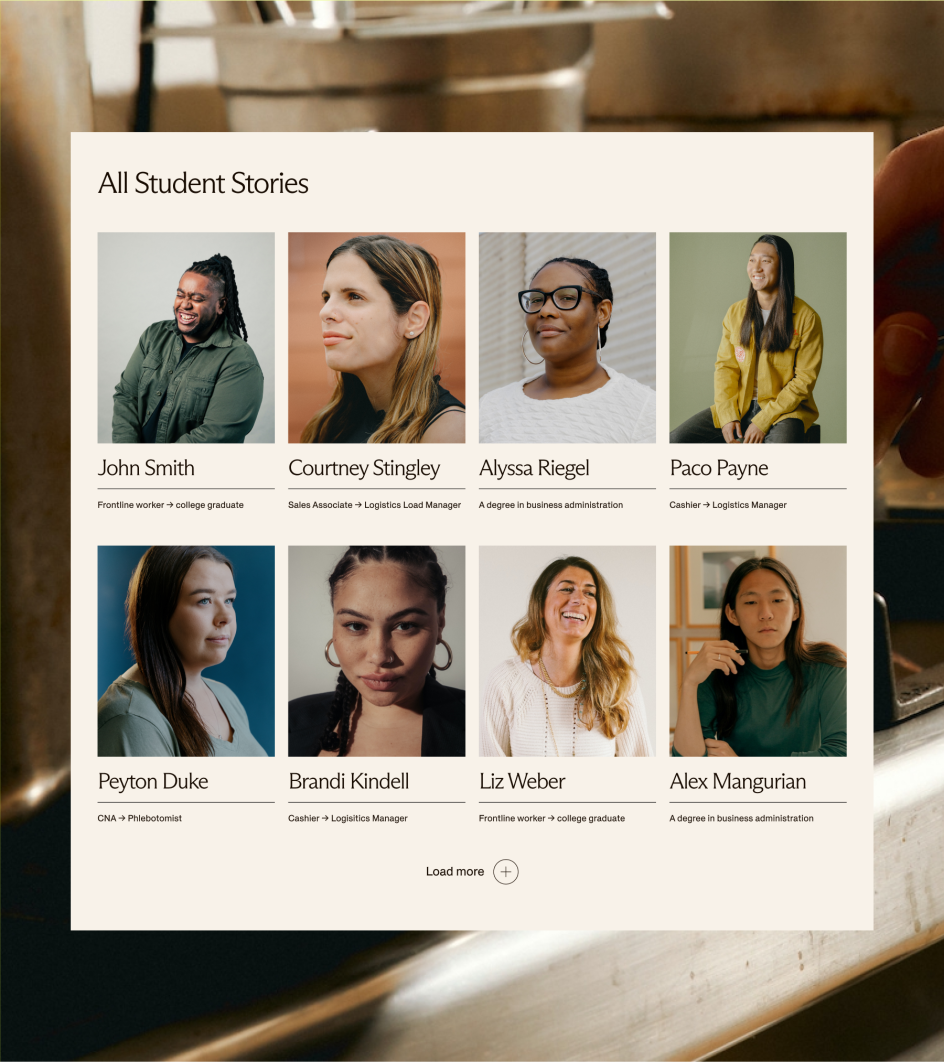
Athletics also enhanced the site to include an updated member spotlight module developed to allow you to explore multiple members' stories within a page. With this module design, the Guild team will be able to integrate images, quotes, data, video, and other content into a captivating snapshot of each student's unique journey.
Expanding on the original brand identity by COLLINS, full bleed and bold photography of real employees has been championed across the website to celebrate various student success stories. Athletics also used animated radiating forms on the photography and graphic elements as a metaphor for Guild's ability to "help learners amplify the talents they already have within".
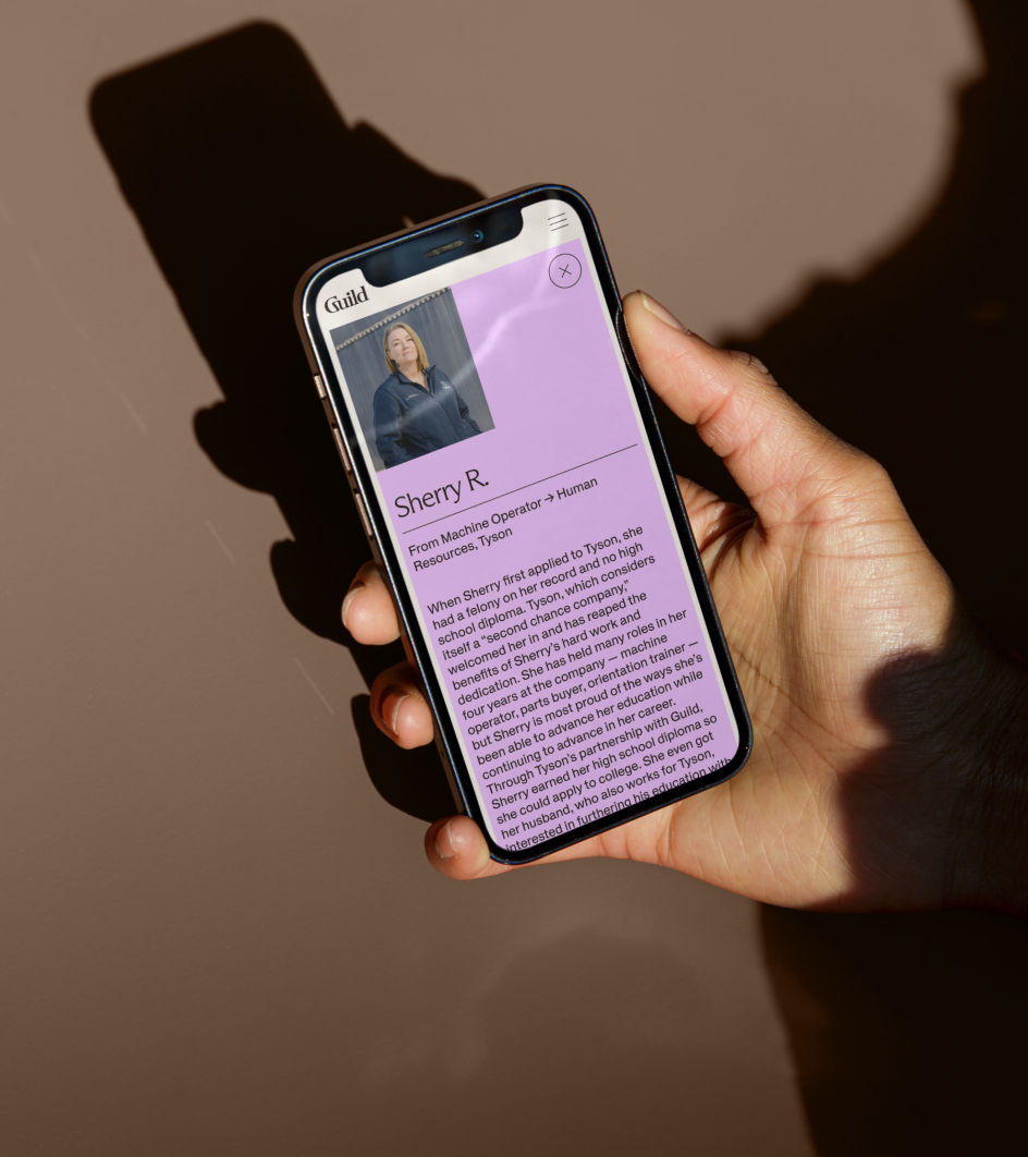
Take the story of Jarryn R., for example. With bold yellow outlines appearing after you scroll on the site's homepage, you're encouraged to click on the button to discover how she went from Floor Associate to Recruiting at Walmart.
Further inspiring stories are revealed along the way, all backed by an appealing colour palette and gorgeous typography featuring Dinamo's Arizona Flare for bold headlines and its Helveesti for body copy.Alongside this, there's a suite of micro interactions that reinforce the concept of upward momentum to reflect learners' growth and potential.


 by Tüpokompanii](https://www.creativeboom.com/upload/articles/58/58684538770fb5b428dc1882f7a732f153500153_732.jpg)

 using <a href="https://www.ohnotype.co/fonts/obviously" target="_blank">Obviously</a> by Oh No Type Co., Art Director, Brand & Creative—Spotify](https://www.creativeboom.com/upload/articles/6e/6ed31eddc26fa563f213fc76d6993dab9231ffe4_732.jpg)


