Conran Design Group crafts new logo and identity for global comms group Havas
Some of the world's biggest companies are so complex they're difficult to explain in just a few words. That's where a thoughtful rebrand can work wonders, and Conran Design Group's work for a French comms group is a case in point.

Havas is a multinational advertising and PR company headquartered in Paris with a long and illustrious history. It originally grew out of the world's first news agency, created in 1835, and most recently was integrated into media, entertainment, and communications conglomerate Vivendi in 2017.
Today, Havas operates in more than 100 countries, with more than 22,000 people, and is one of the world's largest advertising and communications groups.
The group offers digital, advertising, direct marketing, media planning and buying, corporate communications, sales promotion, design, human resources, sports marketing, multimedia interactive communications, public relations, and innovation consulting. All this is divided into three main operational divisions: Havas Creative Network, Havas Media Network and Havas Health & You.
This all makes for great global business, but with so many diverse operations, Havas needs a strong and unified identity for people to make sense of it all. And like all brand identities, that occasionally needs reinventing to bring it up-to-date for the modern world.
Recently, Havas turned to the London-headquartered strategic branding agency Conran Design Group to optimise its brand architecture and develop a new visual identity for the 188-year-old comms brand.
Conran was tasked with balancing the premium quality and sophistication of the existing brand with a new sense of dynamism and modernity.
Design elements
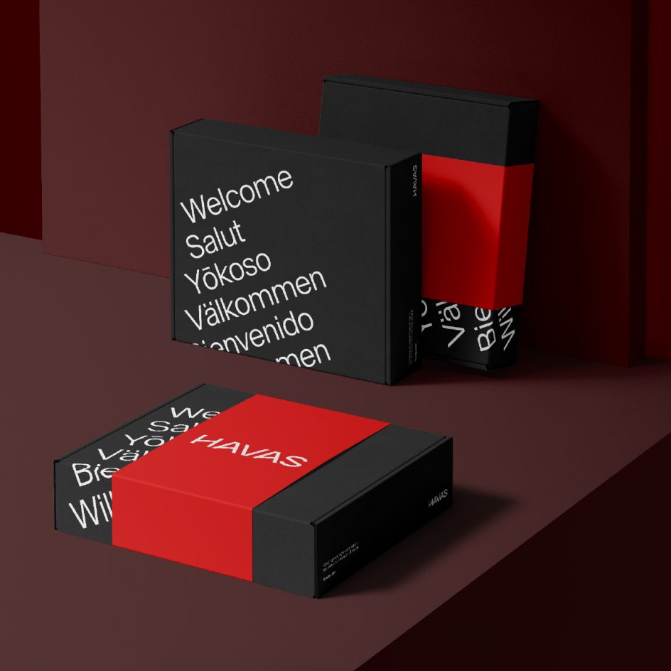
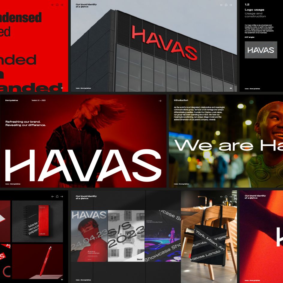
The new visual identity includes an optimised Havas red, a characterful new logotype, new supporting typefaces and a revised approach to graphic elements like photography and colour.
A 25-degree angle was introduced to signify positive momentum; the angle stems from the marque itself but runs into the wider design system to provide a robust and flexible framework for brand expression.


"Making the Havas brand a meaningful business asset meant addressing two fundamental challenges," said Thom Newton, global CEO of Conran Design Group. "The first to improve client-centricity by integrating the brand architecture system and optimising the navigation of services.
"The second is to make the Havas brand truly distinctive through a new visual identity built around a characterful, modern logotype and signature assets that represent positive momentum. The new visual identity and endorsement system will present all Havas networks and operating companies as 'One Havas', making the group more meaningful as a multiplier that adds value across the portfolio."
All-channel rollout
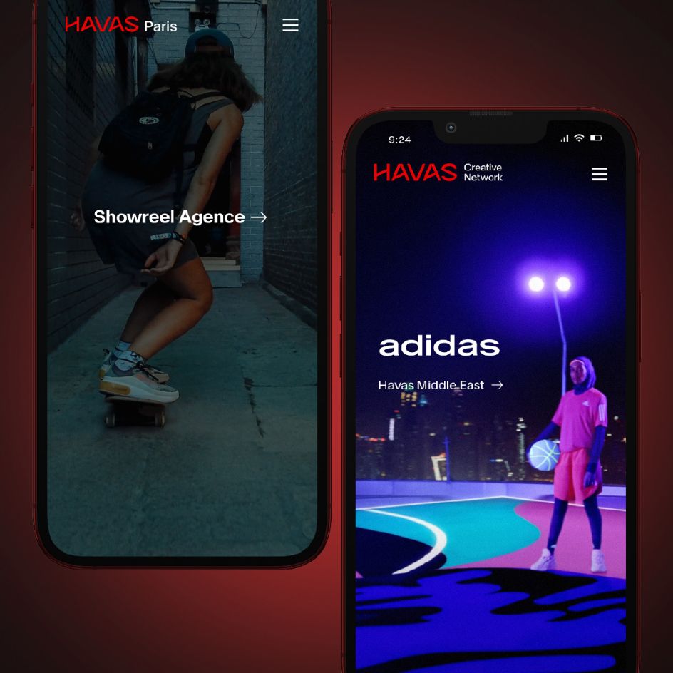
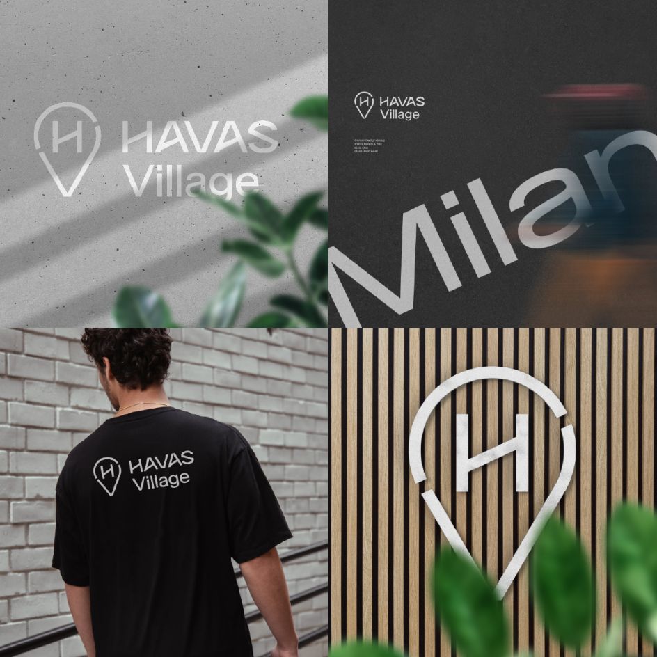
The new brand was unveiled by Havas CEO Yannick Bolloré, and it will be deployed globally over the next few months across all channels, from the Havas global website and social channels to printed materials and Village environments.
"Havas is unique in being the most integrated, meaningful, and entertainment-oriented group in our industry," said Yannick Bolloré, chairman and CEO of Havas. "Our new identity is much more than a logo tweak.
"It reinforces our difference and gives us a competitive advantage by simplifying our service lines and highlighting our core values," he continues. "It ensures we are treating our brand as a powerful, meaningful business asset and capitalising on our integrated approach to delivering seamless communications strategies that exceed our clients' expectations."
For more work from Conran Design Group, see our article on their rebrand of Design Nation Conference.


 by Tüpokompanii](https://www.creativeboom.com/upload/articles/58/58684538770fb5b428dc1882f7a732f153500153_732.jpg)


 using <a href="https://www.ohnotype.co/fonts/obviously" target="_blank">Obviously</a> by Oh No Type Co., Art Director, Brand & Creative—Spotify](https://www.creativeboom.com/upload/articles/6e/6ed31eddc26fa563f213fc76d6993dab9231ffe4_732.jpg)


