Modern Designers helps MediaCity mark a decade of success with 'optimistic' identity
It's hard to believe that it's been a decade since MediaCity opened its doors on Salford Quays, arguably marking the start of Greater Manchester's regeneration. Today, around 8,000 people live and work there, and it's become the UK's largest tech and media hub outside of London. To celebrate the occasion, it's launched a new identity, created by local studio Modern Designers.
Ten years ago, MediaCity was an exciting new development celebrating its first broadcast. Based at Salford Quays in Salford, Greater Manchester, it's now home to BBC North, ITV, and the largest TV studios in the country, dock10. It has become synonymous with some of the nation's best-loved TV shows, and produces 50,000 hours of content every year, reaching global audiences of 100 million. And, what's more, it's set to double in size in the coming decade.
To mark its 10th anniversary, Peel Media, the powerhouse behind MediaCity, commissioned Modern Designers earlier this year to develop a new brand capable of "expressing every aspect of MediaCity", as a place with a history of innovation, as a creative, playful place to live, study, work or run a business, and as a place to visit.
Research and consultation was a key starting point for Modern Designers, as it reached out to local residents, businesses, attractions, educational and public organisations to hear their thoughts on the development. Hemingway Design also led an online public consultation.
"A big part of our research was finding out what mattered to everyone," says Susie Stubbs, managing director at Modern Designers. "What unifies the place, what were the values MediaCity's different people shared? We spoke to a lot of people who live and work there and they kept returning to the sense of community. From BBC presenters to graduates, blue-chip companies to start-ups: they described casual meets, networking, helping each other out – being part of something bigger. So that sense of a community, one that shares a love of storytelling, creativity, innovation and play, became the basis for the brand."
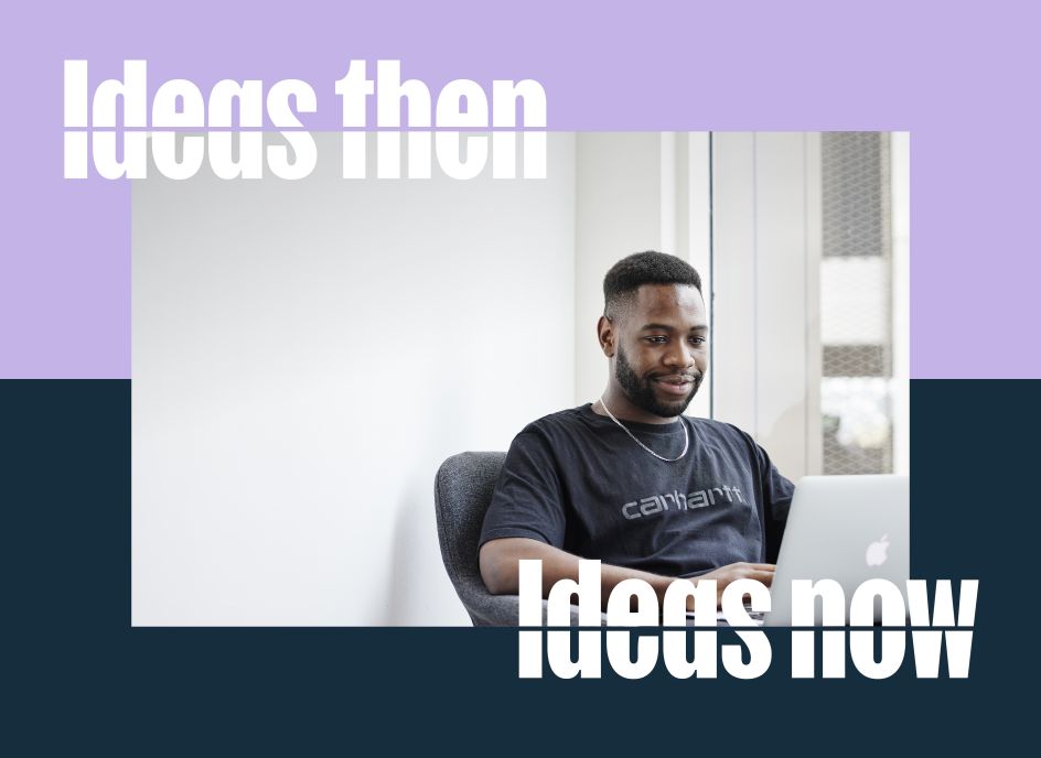
What was most surprising about the research phase was how there was no criticism about MediaCity. "When you ask for honest opinions you expect a fair bit of push-back – but there was very little criticism," adds Susie. "What we did hear was how much people love the place: the architecture, the waterfront, the sense of excitement. And then we started hearing some amazing stories about the area's history. There was one family who'd worked at the docks for three generations, only now they were making content rather than shipping goods. That link between past and present has been threaded through the new brand – ideas then, ideas now."
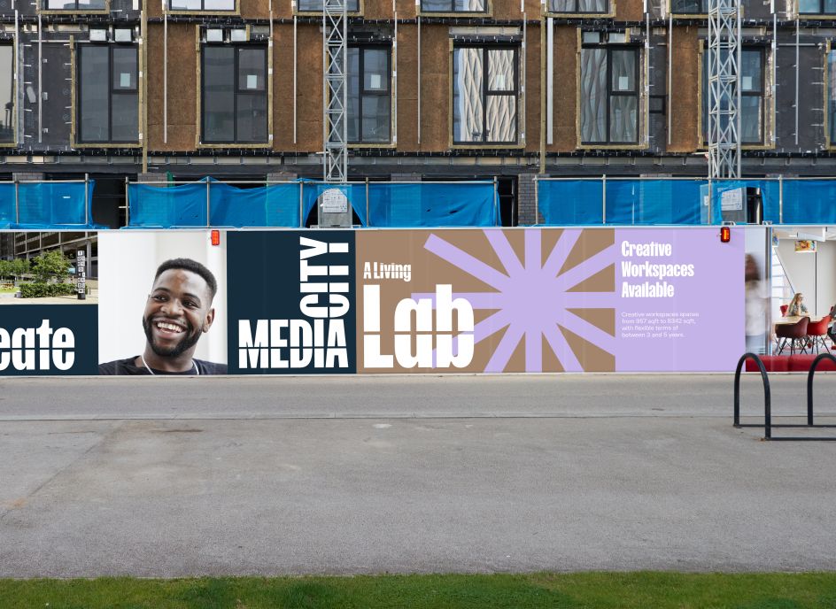
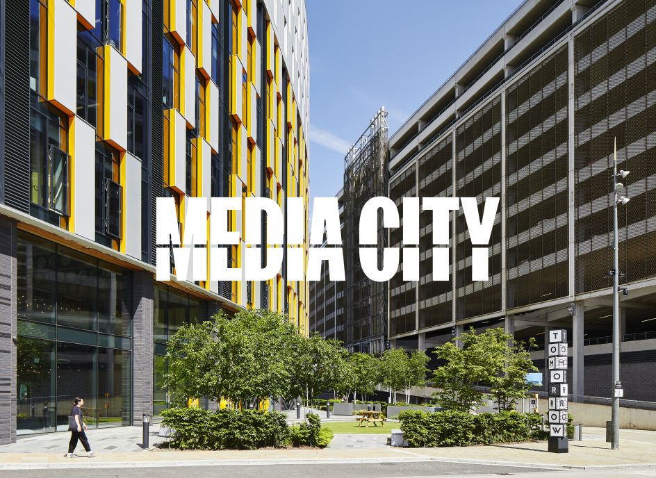
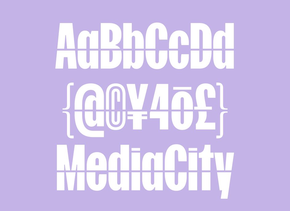
As such, the new tagline reads 'Imagine Always' to express a whole positive dollop of optimism for a future driven by creativity. The core colour palette is based on colours drawn from the urban landscape, with an extended, more energetic range inspired by digital media. Modern Designers used a bespoke typeface, Horizon Line, as one of the most essential elements of the identity. Bisected by a horizontal line, the type is a visual interpretation of the link between MediaCity's past and present. It's also seen in a series of graphic devices that form part of the wider brand toolkit: brand architecture, typography, colour, tone of voice work, iconography, brand copy, film, photography, social media content, and communications templates.
The brand launched this week and will be phased in across MediaCity's communications over time, beginning with a film, a new website and a social media campaign. Advertising campaigns and outdoor media will follow through this winter.
Susie concludes: "Media, content, tech, R&D, film, broadcast, producing, sound design, whatever – there's a tonne of kids here now who will grow up thinking yeah, I can do that. And that's because of MediaCity. It adds up to a massive perception shift – and when we're talking about brands for places, you can't really do better than that."
](https://www.creativeboom.com/upload/articles/c0/c0f4833513a758427120283374013d6da0e2b37d_732.png)


