Monotype's next typeface Ambiguity is contentious, confrontational and contrarian
Following on from the launch of its Helvetica Now typeface, Monotype has today released Ambiguity – inspired by questioning how designers should respond to typography’s esteemed history.
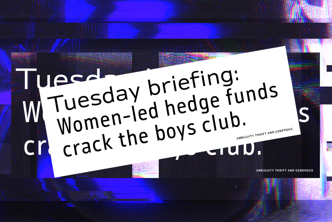
Should we follow tradition, or react against it? And with the contemporary political climate defined by division now more than ever, how can the design community remain relevant to such a multitude of perspectives? Charles Nix, the designer behind the new typeface, has an answer.
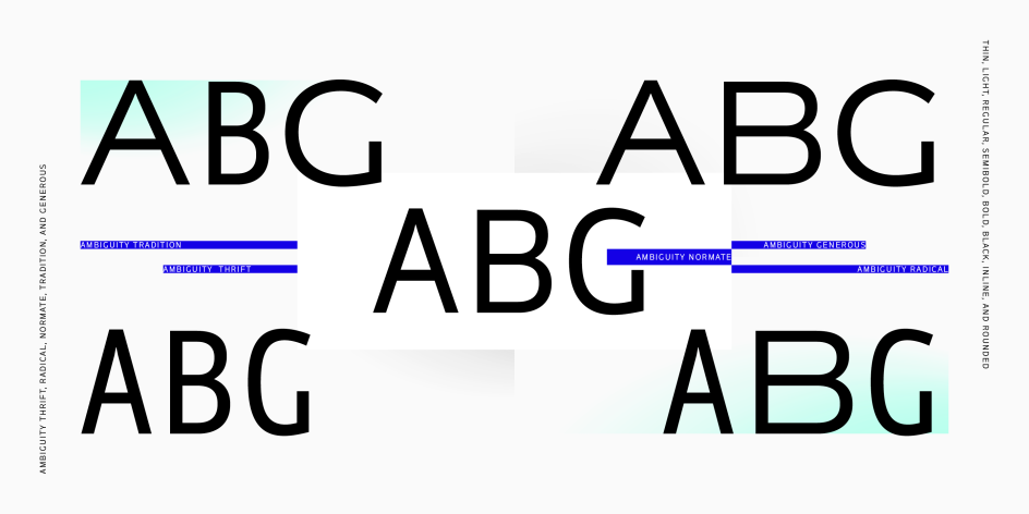
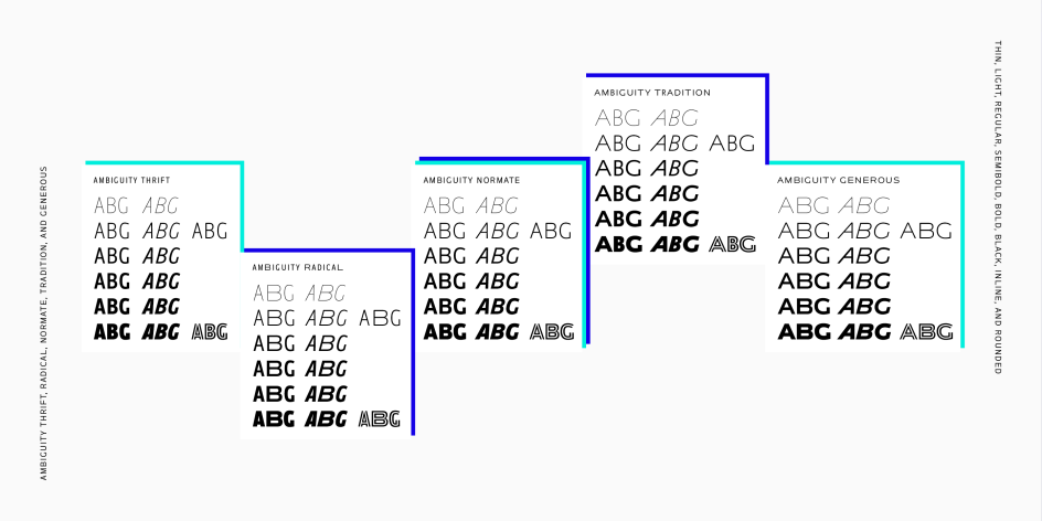
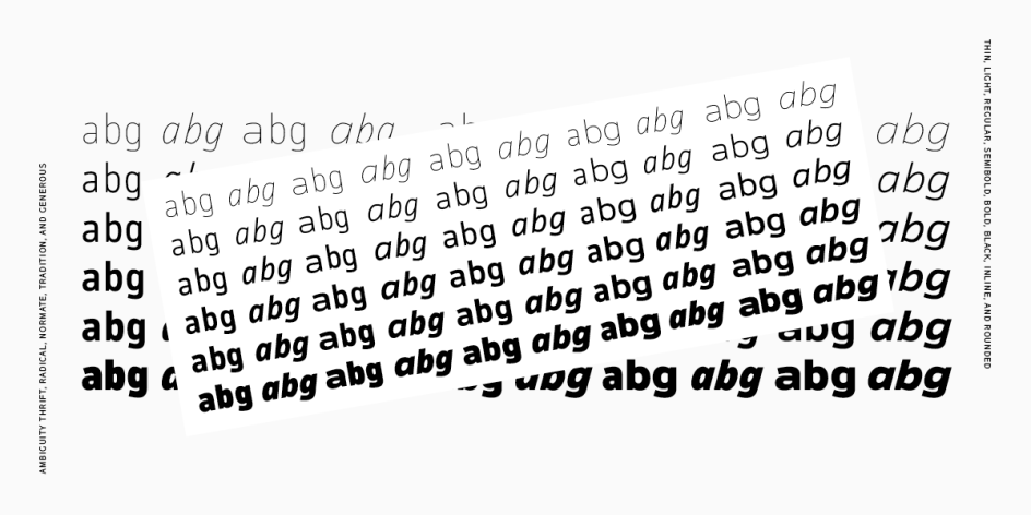
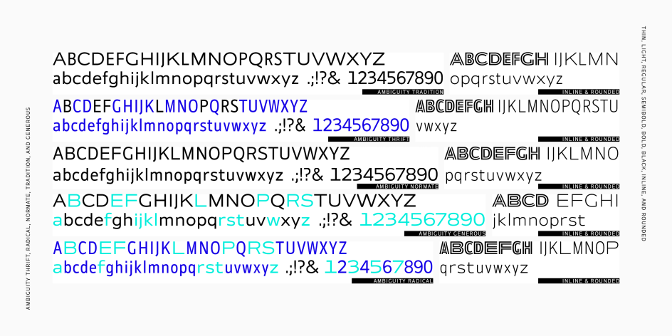
Ambiguity aims to celebrate both upholding the tenets of good type design and react against them. Featuring five different states – Tradition, Radical, Thrift, Generous and Normate – it offers a range of perspectives across the spectrum from conformist to contrarian.
As the name might suggest, Tradition follows the accepted norms of modernist type design. In contrast, Nix has challenged these values with Radical, a direct inversion of Tradition’s proportions. Thrift is a variation of the typeface that includes all the slender letters, creating a lean, economical typeface. While Generous brings together all the wide forms, with an extravagant, lavish feel. But Normate is a mixture of a very different ilk. The synthetic blend of all four cuts, it’s a perpetual fence-sitter that tries to meet all viewpoints in the middle.

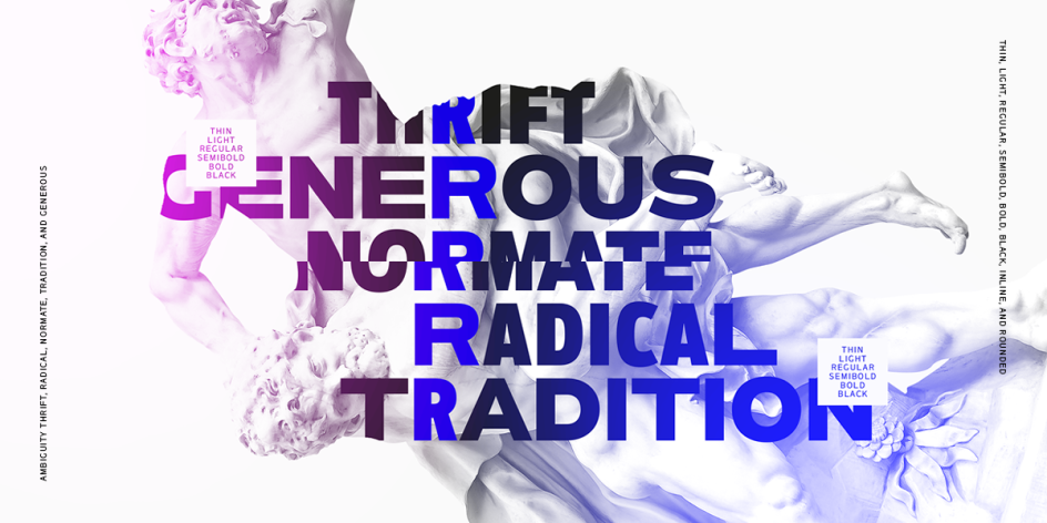
Part intellectual exercise, part challenge to today’s designers, Ambiguity's unconventional design choices mean you can be as conservative or radical as you need to be.
Why Ambiguity now? It’s a tool for fighting polarisation, for breaking down walls, apparently. For deconstructing silos. Can a typeface do all of that? No. Of course not. Not on its own. But it can remind us of how important that dialogue is – and it can look good doing it. We spoke to Nix about this and more.
So your last major typeface, Helvetica Now, is connected to traditional ideas of font design – how did the debates around this influence your thinking here?
Yes. Helvetica Now is a very traditional design, but it's a relative newcomer in relation to the ideas I'm exploring in Ambiguity Tradition. Ambiguity Tradition's proportions are referencing 2000-year-old inscriptional forms and 500-year-old calligraphic forms. Helvetica's proportions come from early 19th-century serif letters—specifically, though circuitously, Walbaum’s modern designs.
And then there's the flopped timeline. My first sketches for the Ambiguity concept are from late 2016 and early 2017. The beginnings of my involvement with Helvetica was still a year off. Jan Hendrik Weber alone was pushing the Helvetica Now project along at that point.
But all of that preamble aside, what I discovered in the early stages of Ambiguity was that Helvetica-esque grotesque proportions were latent and lurking between the Tradition and Radical. I had created a variable font with a Traditional-to-Radical slider/axis, and dialled-in a mid-way design.
That midpoint, half traditional and half contrarian, was the synthetic blend that eventually became Ambiguity Normate. It's not necessarily logical, but it is an interesting non-historical typographic space into which to insert Helvetica and other grotesques.
Incidentally, while variable fonts and the variable font format were essential tools in the development of Ambiguity, ultimately we decided to release it as individual OpenType "expressions" of the full variable spectrum to make it easier to use. It will become a variable font again—when the graphic-design tools and time are right.
Are designers too afraid to break boundaries and traditions?
Some are. Some aren't. Some clients are, and some clients aren't. And not breaking boundaries and traditions, to my mind, is not a bad thing. I'd be hypocritical if I said it was—having worked on both Walbaum and Helvetica revivals/restorations. Working within traditions and boundaries doesn't preclude critical thinking.
Of those who are afraid, where does this come from?
Fear may have something to do with sameness and lack of creativity in design, but being tired may be just as much to blame. It's simply easier not to think critically, not to question the content and form, and to apply design as a style. In respect to that, Ambiguity is a prompt rather than an answer. It's not a "use this voice" solution, but rather a voice asking "have you considered the visual voice?"
Have opinions become so loud online that it's almost paralysed creativity?
The critics have always been there. All of them. But now they have a big mouthpiece. Can they cause paralysis? I'm not so sure. Graphic designers have historically avoided the level of critical scorn heaped on architects and artists (and actors and athletes), but the public is now more aware of graphic design and branding. It's taken seriously. It's seen as an important component of culture. With that awareness comes criticism.
But the veracity of design criticism issues from multiple sources. Is the critic informed? Is the criticism warranted? Does the client/customer believe in and support the design? If the critic is informed and the critique is valid, designers can grow as a result of the criticism. If not, designers and brands can deny power to the critics—no matter how loud they are.
Unwarranted critiques still sting psychically, but creators create—by definition—and if that means tuning out social media or avoiding crowd-sourced design criticism to maintain sanity, that's what creators will do.
Do you want to see more designers be more radical?
It's not that I don't care whether designers are more radical or not. I do. But I don't care whether design looks more radical or not. Radical is not a style, it's a state: the questioning nature that's always been a part of excellent design.


 by Tüpokompanii](https://www.creativeboom.com/upload/articles/58/58684538770fb5b428dc1882f7a732f153500153_732.jpg)

 using <a href="https://www.ohnotype.co/fonts/obviously" target="_blank">Obviously</a> by Oh No Type Co., Art Director, Brand & Creative—Spotify](https://www.creativeboom.com/upload/articles/6e/6ed31eddc26fa563f213fc76d6993dab9231ffe4_732.jpg)

