Hingston Studio creates a tailor-made identity for the UK's largest sari exhibition
The UK's first large-scale exhibition dedicated to the contemporary Indian sari is coming to the Design Museum this month. Hingston Studio explains why its identity needed to feel dynamic and surprising to keep up with the garment's altered image.
Running from 19 May until 17 September, The Offbeat Sari examines the enduring appeal of the popular dress worn in India and South Asia. Curated by the Design Museum's Head of Curatorial, Priya Khanchandan, the exhibition also looks at how the sari is currently undergoing the most rapid reinvention in its 5,000-year history.
Items on display will include around 60 examples of trailblazing saris, including dresses made from woven steel, distressed denim, and the very first sari to be worn at the Met Gala, which is making its debut in Britain via this exhibition. Thanks to the unique textures, weaves and colours on display, The Offbeat Sari aims to provide a rare insight into contemporary Indian styles and the fashion revolution the sari is undergoing.
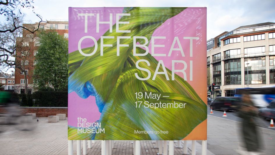
To bring these themes to life visually, The Design Museum worked with Hingston Studio to create a bold and striking identity that celebrates the "craft, form and beauty" of the sari while referencing its new modernity and evolving place in society.
"As one of today's most exciting global fashion stories, the campaign needed to feel dynamic and unexpected, reappraising people's perception of both how this garment looks and what it means," designer Tom Hingston tells Creative Boom.
This was achieved by viewing the sari as a design object and as a canvas for innovation and individual expression. "The folds, drapes and wraps of the sari that have recently been documented reveal a variation in form that expresses this diversity," Tom adds.
Settling on this approach involved early discussions with Priya Khanchandani and the museum team, which guided Hingston Studio through their vision for the exhibition and the sari's historical context. "With such rich and layered subject matter, there was so much to explore," Tom reveals. "They wanted us to capture the essence of the show whilst having the creative space to define what that visual manifestation might be."
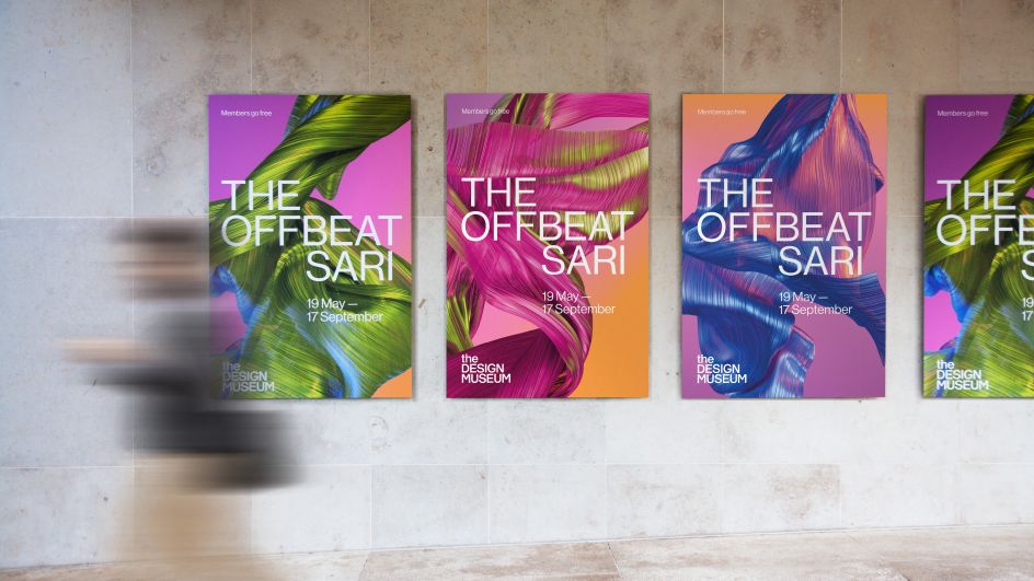
The duality between the sari's history and its contemporary upheaval was integral to the studio's approach. And from the outset, they wanted to present an image of the sari that felt alive and dynamic.
"Traditionally, the sari is an unstitched drape wrapped around the body, which can be folded and worn in multiple ways," Tom explains. "It's precisely this fluid, magical characteristic which has enabled it to morph over time and absorb a diverse range of cultural influences – so it's a truly wonderful subject matter to work with, in every sense."
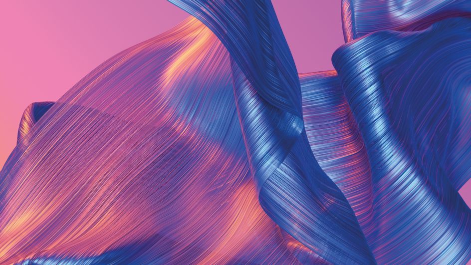
The exhibition's imagery evokes all these ideas with malleable visuals that constantly appear to change and shift in surprising ways. Created entirely in CG, these pieces are part fabric and part brush strokes in their appearance, and the digital focus helps to put the focus entirely on the sari in a modern light. "We wanted the imagery to embody human qualities of physical movement or dance whilst avoiding the need to literally place a person or figure in the mix," says Tom.
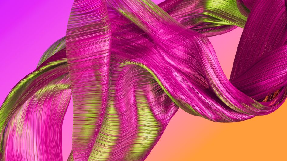
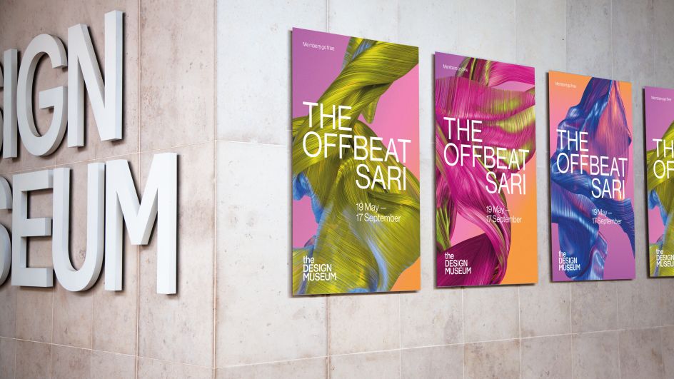
By giving the fabric a metallic finish, these visuals achieve a dynamic interplay with lighting when animated. It also refers to the craftsmanship of contemporary sari designers and the innovative materials they now use to make their dresses.
"Colour was integral too," Tom points out. "Our spectrum is a celebration of diversity, but the palette itself is derived from colours used in the traditional Indian dyeing process. Natural dyes such as indigo, turmeric or anar (pomegranate) provided a reference point that felt vibrant and alive."
As for the typography, this stays true to the themes of the exhibition and the branding as a whole by creating a deliberate juxtaposition. "Its inherent purity signifies the modernity of the show and its curatorial point of view," Tom concludes.


 by Tüpokompanii](https://www.creativeboom.com/upload/articles/58/58684538770fb5b428dc1882f7a732f153500153_732.jpg)


