Monotype celebrates seven years of its Sony SST typeface at G . F Smith's Show Space
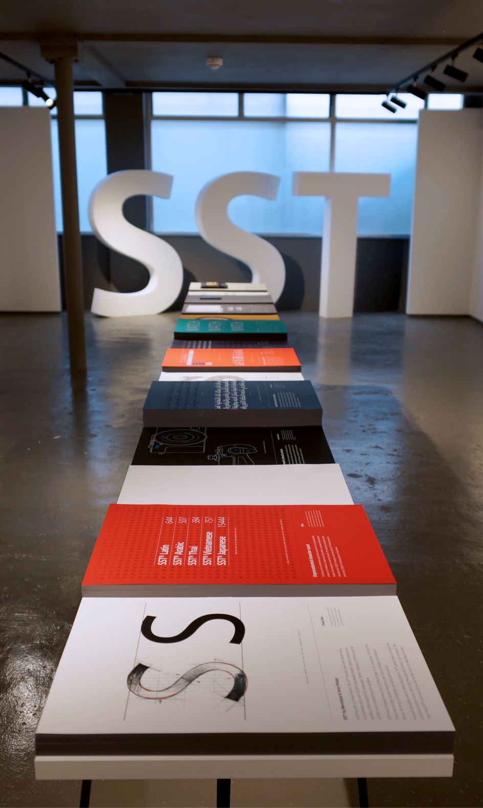
At seven years in the making, with more than 22,000 individually drawn characters and encompassing 93 languages, Sony’s SST® typeface is one of the most ambitious creations in the history of type.
All images courtesy of Monotype and G . F Smith
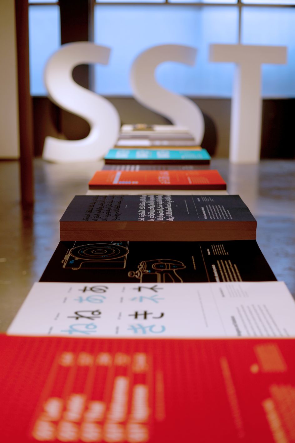
Designed by Monotype and Sony Design to unify Sony’s written expression across all the brand’s products, markets and messaging, the SST font family brings a sharp, elegant and timeless look to every alphabet it touches – the first ever typeface to apply the principles of geometric type design to the calligraphy-based Asian and Arabic scripts.
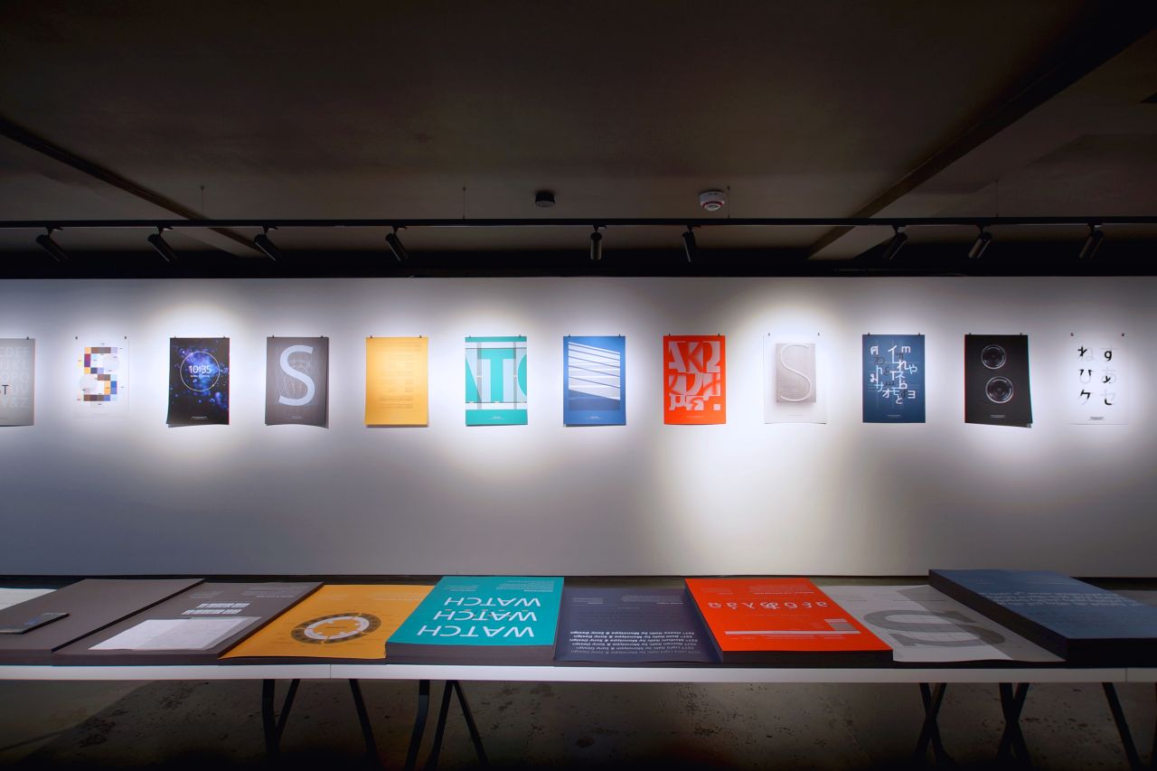
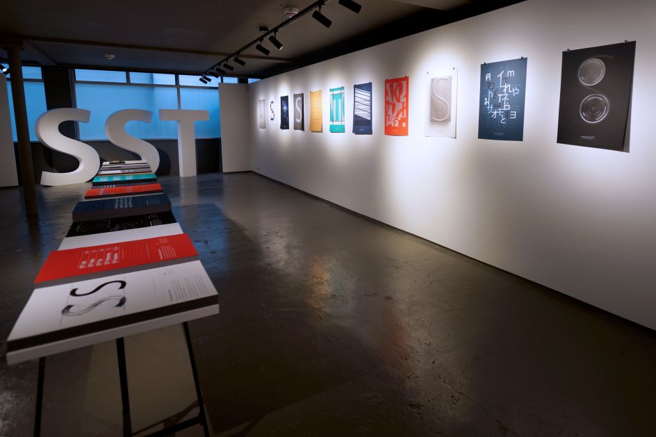
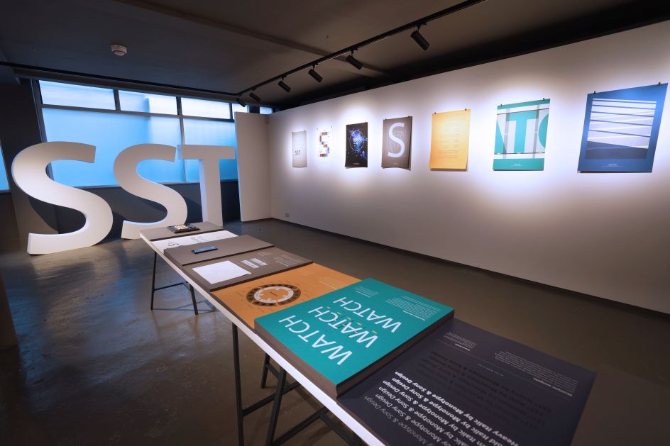
Sony and Monotype’s achievement was recognised with an iF Design Award in 2016, and the story behind its creation is being told in London for the first time, with a special exhibition at the G . F Smith Show Space in Soho.
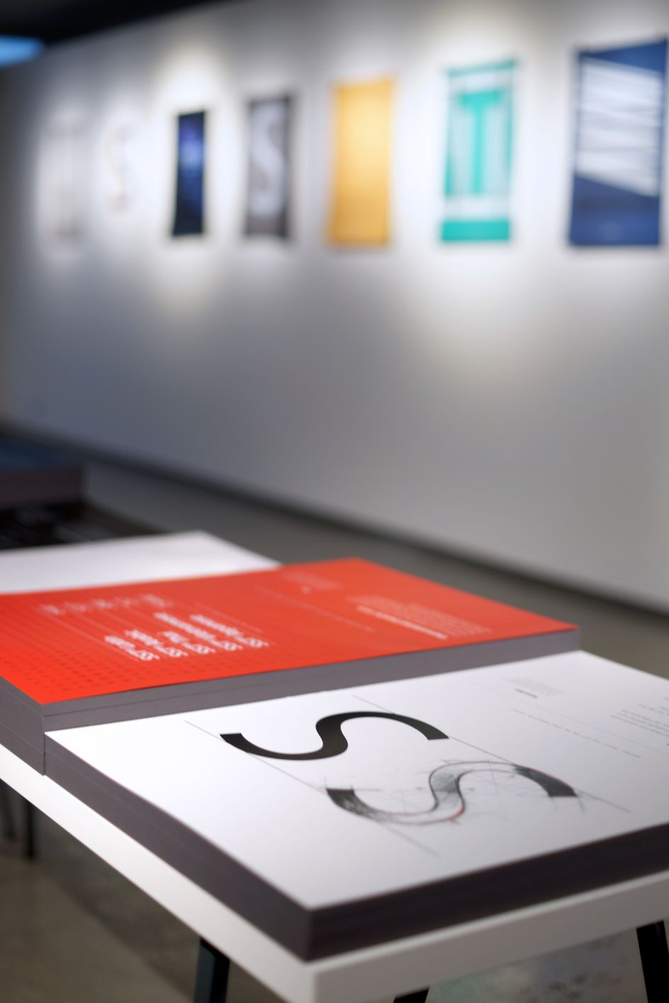
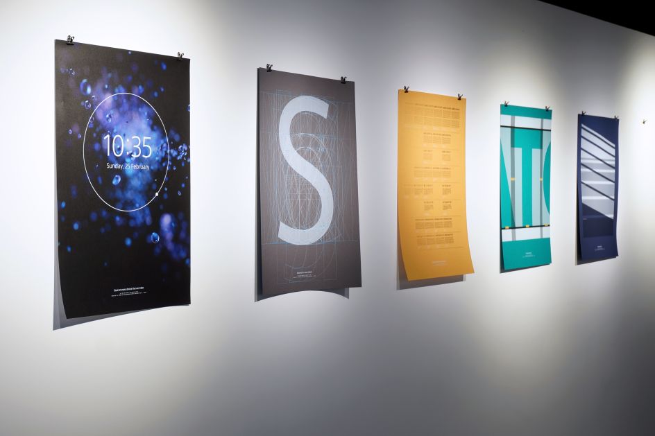
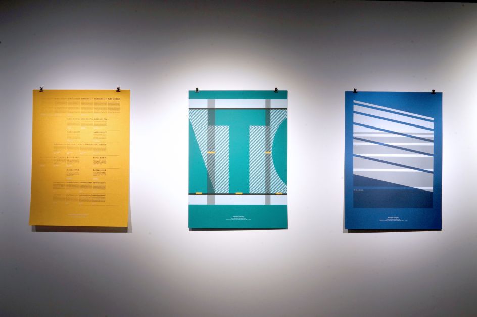
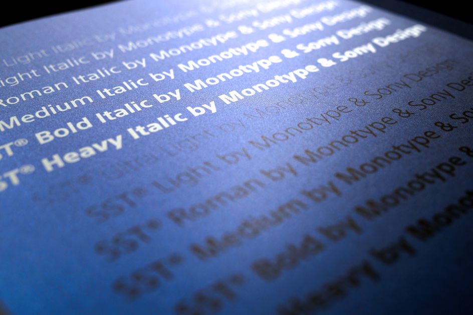
Running until 11 September, the exhibition explores the making of SST®, from the initial concept to its countless real-world applications, via the meticulous processes and rationale behind the design of each glyph – brought to life with the help of G . F Smith’s papers.
"For international brands, SST brings harmony and personality to communications across cultures and touchpoints. The SST typeface was designed to be universal and timeless, with support for 93 languages and outstanding legibility at all sizes," says Monotype.
"Monotype’s Akira Kobayashi and Sony Creative Center’s Hiroshige Fukuhara created a hybrid of two typographic styles, geometric and humanist. A sharp, solid, geometric edge is evident in uniform line widths – tempered here and there with just a few tiny optical adjustments – and balanced by softer, more organic qualities of humanist design to improve readability at all sizes."
Monotype x Sony Design at G . F Smith Show Space in Soho runs until 11 September.


 by Tüpokompanii](https://www.creativeboom.com/upload/articles/58/58684538770fb5b428dc1882f7a732f153500153_732.jpg)


