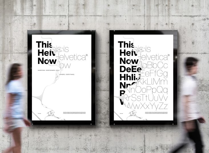
40 fonts that will be popular with designers in 2023
We reveal 40 hot typefaces to keep an eye on in 2023, including serifs and sans serifs, variable fonts, display fonts, and more. And we get pro-industry insight to discover the latest trends shaping type design right now.
. In use by [Garbett](https://garbett.com.au/) for Career Trackers](https://www.creativeboom.com/upload/articles/0f/0f4e193ba9164073646e67421eb37b4b26986c67_1280.png)
The Future Mono by Klim Type Foundry. In use by Garbett for Career Trackers
Once you've been a designer long enough, it's common to find yourself sticking to the same, tried-and-tested typefaces year in, year out. But while that may make it easy to keep churning out good, solid, dependable designs, it does run the risk of becoming... well, a little boring.
So it's always good to look for new fonts that can help you mix things up, experiment, and hopefully come up with visuals that will entice and excite you.
To help you stay abreast, each year, we put a lot of effort into researching the fonts that are currently in use throughout the design world and whittle down the most important, useful and intriguing ones for you to consider. (Check out last year's roundup here). While our list can never be fully comprehensive, we hope it gives you a flavour of how 2022 has shaped next year's big expected hitters and what fonts will likely be big in 2023.
Of course, just because a particular font is "trending" doesn't mean you should use it. But you should at least keep your mind open to the possibility. In the words of Sarah Hyndman, author of the bestselling book Why Fonts Matter: "What I'd say about type trends is for designers not to get too hung up on them and to focus on what's appropriate for the audience. However, I've always found trends fascinating because they reflect the cultural attitudes of the moment."
With that in mind, below, you'll find 40 fantastic fonts for 2023. First, though, let's set some context as our experts point to some key font trends that have characterised 2022 so far, and we can expect to see more of over the coming 12 months.
Six big font trends for 2023
1. Accessibility for all
Accessibility is vital when it comes to type. After all, if members of your audience literally can't read the text you have typeset, you have failed them 100 per cent. So it's good news that discussion around neurodiversity and inclusivity has been one of the big typography trends of 2022, says Kirsty Minns, executive creative director at Mother Design.
That said, she still feels things need to be pushed further. "Brands can do so much more than producing larger type sizes and opening up kerning," says Kirsty. "You can still be imaginative, colourful and functional at the same time. With 17% of the global population diagnosed as neurodiverse, they make up a huge portion of audiences who need catering to. Accessibility and inclusivity will hopefully be essential to type conversations next year."
As a shining example, she points to Wolff Olins' rebrand for Understood, a non-profit organisation for those who learn or think differently. "This included a collaboration with Displaay Type Foundry and focused on understanding the needs of those with dyslexia and ADHD," says Kirsty. "It was brilliantly considered, tackling legibility head-on without compromising on brand distinctiveness. Making certain characters more distinguishable for readers and improving readability is a simple but well-considered approach, and one that more brands should replicate in 2023."
 rebrand by Wolff Olins, included a collaboration with Displaay Type Foundry](https://www.creativeboom.com/upload/articles/43/43bd81f5cde2d63eddb12e882a9ea030ba1c04bb_944.png)
Understood rebrand by Wolff Olins, included a collaboration with Displaay Type Foundry
2. The trusty Geometric sans builds on its legacy
Is there no end to the enduring love of geometric sans? Inspired by near-perfect circles and squares, born out of Germany in the 1920s, its pioneers, Herbert Bayer, Jakob Erbar, and later Paul Renner, laid the foundations for what the design world still fondly uses today. But will 2023 continue to embrace this beloved group once more? Particularly as we look to timeless and familiar designs that build trust and stability in a seemingly chaotic world.
Interestingly, Creative Director Chris Skelton of branding agency Thompson believes we'll see brands actually move away from these typefaces that have prevailed for the past few years in search of "more ownable and distinctive styles". He says: "At the very least, big brands will look to customisation to ensure ownability over a very congested style — there's lots of good to be said of the geometric sans though, it's approachable, clear, accessible, unfussy and easy to use so it'll still be a fallback and easy to say 'yes' to style for many."
But Stuart de Rozario, director and designer at The Foundry Types, believes their popularity will continue in 2023. "Catering for many of the world's leading brands – Google, TikTok, Dolce & Gabbana and Toyota – they offer a timeless, classic, and minimalistic quality, a modern, open, and elemental aesthetic but sympathetic to a broad scheme of ideals and disciplines. The next big thing in type? Geometric sans – and always will be."
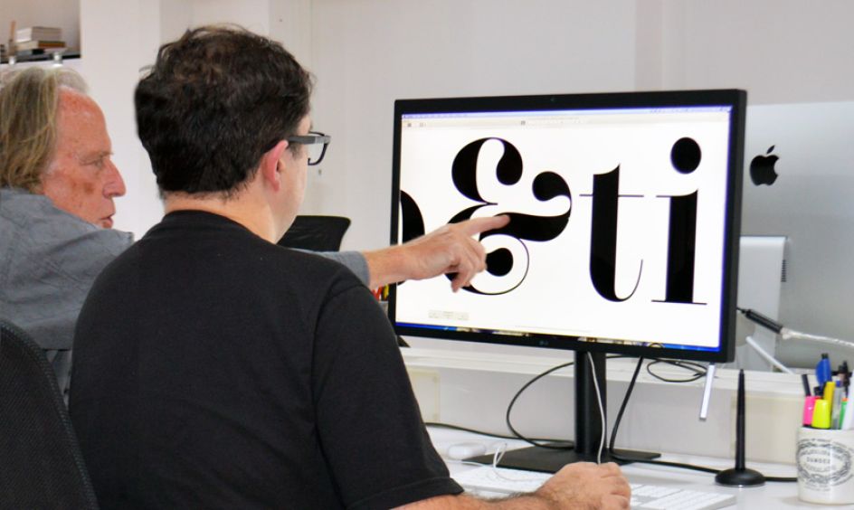
Photography by The Foundry Types
3. Nostalgia is everywhere
It's interesting to see that the creative industry continues to find comfort in retro designs, drawing upon previous fashions and trends to bring identities, packaging and campaigns dripping with nostalgia.
Marie Boulanger, brand designer at Monotype, thinks we've moved beyond the "soft serve" seventies serifs to embrace other decades, too, "We've seen a number of projects dive head first into typographic indulgence through effects such as outlines, shadows and glow," she says. "The title design for Marvel's Thor: Love and Thunder, with its strong whiff of eighties arcade range, was a wonderful example of that. And the cherry on top was the credits scene, with a wide range of eclectic design styles and effects.
"This year, we also saw Spotify's Wrapped campaign, which featured heavily stretched typography paired with bright saturated colours – an homage to club night flyers and printed ephemera of the nineties. This is a precursor for what's in store for 2023, and our ongoing cultural obsession with the decade is going to take over type too. Expect to see way more type reminiscent of the fashion, films, music videos, and magazines of this iconic era."
Creative Type Director at Monotype, Emilios Theofanous, agrees and predicts it'll be a "historical mash-up" – one that merges old with new like never before. "We are going to see a lot of movement and modulation in 2023, including a variety of organic forms and combinations of typographic genres with their own unique application," he says. "Fluffy, puffy, shiny and all sorts of living letterforms are also everywhere. Perhaps informed from nostalgia, our surroundings and even the need for more natural and environmental themes in branding."
He adds: "The increasing use of variable font technology also helps designers and brands to explore new spaces, distinguish themselves, evolve and catch-up with our constantly moving digital life. No-one did branding like this a few years ago, so it's really exciting to see where we will be in the following years!"
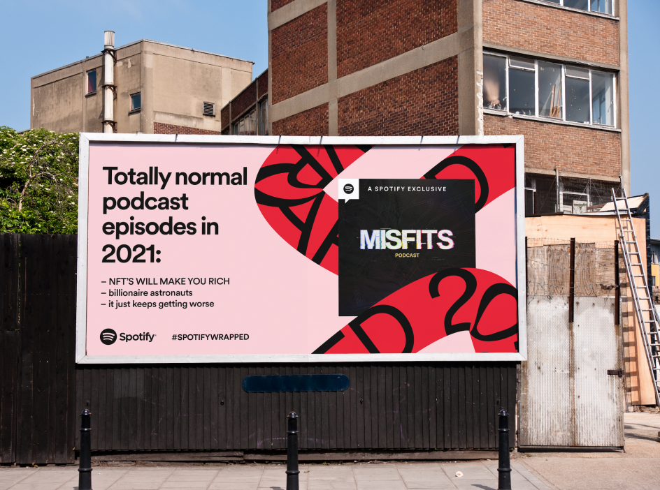
OOH - Misfits Podcast, for Spotify Wrapped
4. The importance of typography to branding
In 2022, branding needs to work harder than ever as technology pushes brand messages across multiple formats and touchpoints. So it's not surprising that font choices and bespoke type are being called on as the 'glue' that holds all this together.
"As typography has continued to evolve this year in an increasingly competitive marketplace, companies need to have a more acute awareness of how every element of their brand resonates with consumers and how audiences can better identify with what a brand has to offer," says Alex Bee, culture and trends consultant at Space Doctors, part of InSites consulting.
"Brands are essentially a collection of assets: different typeface changes how we feel about the meaning and intention behind a message. While certain fonts might seem aesthetically pleasing, brands should be mindful of the unintended meaning they might communicate through these choices."
5. Custom and variable type design takes a leading role
As brands continue to fight for recognition in increasingly crowded spaces, bespoke type is seen as a way to differentiate. Custom fonts are definitely hot right now, and Matt Taylor, senior designer at Free The Birds, thinks the trend will be huge in 2023: "We will see a continuation of brands pushing for creative expression through custom typography as they look to build a stronger connection to their consumers," he says. "This means more experimentation in letterforms; defined ink traps, inverted contrasts, and exaggerated flourishes will be key areas of interest."
Alongside these bespoke typefaces, Matt believes variable type will continue its rise and pitches tech as one of the key drivers. "With our devices knowing more and more about us comes the potential for typography to change appearance to be more inclusive and accessible. Typefaces will have variable features or stylistic differences built in to benefit not only people of different ages but also the neurodiverse community," he says.
, using Fragment by Pangram Pangram Foundry](https://www.creativeboom.com/upload/articles/ee/ee2f1cf6b54604de945dcfb3d415e18ba1efc50c_944.png)
Broche À Foin! by Oui studio créatif, using Fragment by Pangram Pangram Foundry
6. Expressive type design will shout the loudest, but with balance
Not everything needs to be bespoke, however. There are other ways to cut through the noise, and expressive serifs and sans could be the answer. "I think more brands will look to these typefaces to support the conveying of their personality through written comms," says Chris Skelton of Thompson, "as brands have simplified every element of their visual identity over the past few years." He points to all the fashion brand logos that now look the same or all the "flattening" of car brand logos as good examples. "In many cases, they are only left with type to distinguish themselves against the competition, and therefore need something more than your 'standard' typeface," he adds.
But Chris notes that there has to be a balance between creative brand expression and accessibility to ensure that "organisations aren't excluding through pursuit of individuality". He explains: "Hyperlegible or accessible fonts have tended to be fairly safe to date, so we might see more experimentation in this space. There's been a recent rise in conversation around dyslexia-friendly fonts, which embody huge personality purely due to their need to support specific needs. What other voices or needs can we cater to that might lead to more interesting and unique designs and better access for a wider demographic?"
Sans Serif fonts
1. Bull-5 by David Einwaller
Released this April, Bull-5 is a revival of a particular style of typewriter font that emerged in the 1960s, associated with Olivetti typewriters. Designer David Einwaller developed it by digitising printed type samples from labels of photographic prints from a newspaper's 1980s archive. With a raw and mechanical character, Bull-5's Regular Style offers excellent legibility; it also comes in Mono and Slab-Serif styles. Our only niggle is that it could do with some extra weights, so we're hoping they'll come in a future release.
2. Cosmica by Village
First released in 2018, this is a fun sans that offers lots of opportunities for typographic experimentation. Chester Jenkins' first release in five years abandons the rectellipse, tiptoes around the squircle, and adheres closely to the rules of geometric type construction – but not too closely. As with most of his type designs, it's an original work rather than a historical recreation and was originally developed as a personal project.
3. The Future by Klim Type Foundry
The Future is a reimagining of Paul Renner's classic font Futura as a monospaced typewriter font. What, its creator Kris Sowersby asked if Renner had moved to Japan and was asked to adapt Futura for the typewriter by Kyota Sugimoto? Released this June, the Future is inspired by Futura's geometric architecture, its avant-garde alternates, and Renner's insistence that his font was a "serifless Roman" and not a Grotesk. In short, this fascinating new font is, in the words of Sowersby, "Futura's eccentric cousin, bending its rules to the limits of rationality".
, using The Future by Klim Type Foundry](https://www.creativeboom.com/upload/articles/d8/d84f7ca1a66e79c10c6c4eab6a832094aad1cee5_944.png)
Green Dot by Goods, using The Future by Klim Type Foundry
4. Wallop by Displaay Type Foundry
Inspired by the fonts Cst Berlin West, Gill Sans and Johnston, Wallop is distinguished by its vertical terminals, which give a feeling of sharpness. That's balanced, however, by many rounded forms, giving it friendliness and a high degree of legibility overall. Originally designed by Martin Vácha for Wallop, a magazine about independent culture, it was released as a commercial typeface in 2019.
5. Plus Jakarta Sans by Gumpita Rahayu from Tokotype
Released this May, Plus Jakarta Sans is a geometric sans serif with modern and clean-cut forms. The x-height dimension is slightly taller to provide clear spaces between caps and x-height, while open counter and balanced spaces preserve legibility at various sizes. Originally commissioned for the Jakarta Provincial Government program's identity in 2020, it takes inspiration from Neuzeit Grotesk, Futura, and 1930s grotesque sans serifs.
6. Stratos by Production Type
Designed by Yoann Minet and first released in 2018, Stratos is a geometric grotesque with some interesting ideas about proportion. By eschewing conventional notions of typographic relationships, it can potentially empower designers to do more interesting things with type. There's a striking difference, for instance, between its upper and lower case sets: the caps are condensed, inspired by the gothic wood type of the 20th century, while the minuscules are akin to certain classic geometric sans serifs, with circular rounds (o, d, b, p, q) and horizontal terminals (a, c, e, g, s).
, using Stratos by Production Type](https://www.creativeboom.com/upload/articles/a1/a1f54d09f9327cbc364308eed739ff00d3d2a358_944.jpg)
Ludia by LG2, using Stratos by Production Type
7. Acumin Pro by Robert Slimbach
Acumin Pro is another classic typeface we've seen a lot of lately. That may partly be the nostalgia in the air, but it's also about how this versatile sans serif, created by Adobe type designer Robert Slimbach, brings a balanced and rational quality to design. A neo-grotesque in the Swiss modernist style, it performs beautifully at display sizes while maintaining an admirable sensitivity at text sizes.
8. Niveau Grotesk by Hannes von Döhren
Influenced by classical 19th-century typefaces, Niveau Grotesk is based on geometric forms, and its straight architecture means it makes a real impact at big sizes. At the same time, it's nice and legible in smaller sizes and longer texts, both in print and on screen. Designed by Hannes von Döhren and released in 2013, it offers plenty of weights to choose from, which is increasingly important for design projects these days.
9. Druk by Berton Hasebe
Like going to extremes? Druk features the narrowest, widest, and heaviest typefaces in Commercial Type's library to date. Starting from Medium and going up to Super, Druk was intentionally designed without a normal width, and its three widths can be mixed for bold and expressive typographic treatments. First released in 2014 and designed by Berton Hasebe, it couples well with any number of other sans serifs.
10. Frutiger by Adrian Frutiger
First released in 1976, Frutiger is a reliable classic that's seen quite the resurgence of late. Created by the iconic Swiss type designer Adrian Frutiger (1928-2015), initially for signage at Charles de Gaulle Airport in Paris, it's a humanist sans serif that's intended to be clear and highly legible, both at a distance and at small text sizes. Its continued use shows that perhaps there's power in the stability offered by a well-known and trusted workhorse.
, using Frutiger](https://www.creativeboom.com/upload/articles/73/731a5bce62dd3bfac6476e5a0d2b2f5564a902a3_944.jpg)
ISTD - A Lifes Work: Adrian Frutiger by Andrew Wolfenden, using Frutiger
Serif fonts
11. BN Viceroy by Brandon Nickerson
There's tall and thin, and then there's tall and thin. Created by graphic designer Brandon Nickerson, BN Viceroy goes to the extreme but does it in style and with a thoughtfulness that provides excellent functionality overall. This serif display typeface, which boasts over 200 glyphs, needs to be used carefully but can be a great choice when you're trying to make your design stand out.
12. Bariol Serif by Atipo Foundry
Bariol Serif is a clean, soft and friendly font that turns heads and offers fantastic readability. With a modern and functional design, it offers many ligatures and alternate forms and handles all-caps styling with aplomb. The regular and italic versions of this font are free to download in exchange for a tweet.
13. Saol Standard by Schick Toikka
Saol is a reinterpretation of serif faces of the 1800s, such as Caxton Old Style and Old West Style, that run counter to the regularity and soberness of modern type. This new font is drawn with present-day needs in mind but retains the eccentric spirit of its sources. Diagonal strokes cross conventional boundaries in the A, M, W, k, and y; shoulders are unusually taut in the h, n and u; and razor-edge details abound in the E, G, R, T, and t. All this, plus a wide range of weights, broad language support, and opulent swash italic caps. (You should also check out Saol Display for its excellent 19th-century vibes yet modern interpretation.)
, using Saol Display by Schick Toikka](https://www.creativeboom.com/upload/articles/4e/4eac25933970c8e67f8c9136eb7e363b63f4060c_944.jpg)
Gala Dalí by République Studio, using Saol Display by Schick Toikka
14. Kisba Nova Text by Identity Letters
Looking for a text font that's packed with personality? This one has some character, all right. Teaming sharp wedge serifs and spiky spurs with softball terminals and a neoclassical stroke contrast, this font comes in two optical sizes: Headline and Text; the latter is perfect for 9 to 18 point-type. Kisba Nova Text consists of seven weights, from Thin to Black, offering plenty of possibilities to set body copy and sub-headlines.
15. Archeron Pro by Mostardesign Type Foundry
Another serif with bucketloads of charm, Archeron Pro reinterprets the neo-classical style of highly contrasted serifs for contemporary graphic or editorial projects. Released in 2019, it offers high-contrast character ratios and a high x-height to give sentences of body text more rhythm and legibility. The font also offers a complete set of small capitals with a little more tension than uppercase and generous proportions to give more emphasis to the text you want to highlight.
16. Boogy Brut by Bureau Brut
Boogy Brut is not just a typeface influenced by calligraphy but one with calligraphy's DNA at its core. Sharply modelled shapes reveal the structural qualities of the written models but do away with the handmade imperfections caused by writing tools or the texture of the paper. A synthesis of various experiments by Julien Priez, aka Boogy Paper, it's a beautifully functional design that will give a highly original look to your designs.
, using Boogy Brut by Bureau Brut](https://www.creativeboom.com/upload/articles/4a/4a6ddd2d890b7782375b13c98efd12ebfe9204c2_944.jpeg)
Ndaane by The Blackpepper Studio (TBP), using Boogy Brut by Bureau Brut
17. Nan Tragedy Text by Jean-Baptiste Morizot
First released in 2019, NaN Tragedy Text is a functional text typeface with unconventional shapes. It combines an economical approach with optical corrections to display features, such as its exaggerated calligraphic contrast axis. It also mixes exaggerated and virtuoso forms, particularly in the italics, with more simple, bare-bones lines. The combination of such idiosyncrasies with a classic skeleton offers an intriguing sweet spot between classicism and modernity.
18. Novela by Atipo Foundry
You can tell by the name that Novela is a font designed for reading. But this elegant display serif is anything but bland, thanks to its generous x-height, sharp terminals and extreme stroke contrast. As well as books, magazines and online articles, it would also work for posters, packaging, logos and anywhere else where you need text that exudes class and style. Also note that the Regular style is available as a free download for personal use, and you can 'pay what you want' for the complete family.
19. Allrounder Antiqua by Identity Letters
If you need a sophisticated serif for packaging, food, fashion, consumer goods or lifestyle branding, Allrounder Antiqua is one to consider. Designed by Moritz Kleinsorge, this timeless typeface is based on classical proportions, making it a good choice for books, editorial design and branding too. Its refined shapes work flawlessly in both body copy and display sizes, and the font comes in eight styles with plenty of OpenType features.
 by Identity Letters](https://www.creativeboom.com/upload/articles/66/6640d4f611ff06945dab4f821d9827907a67420f_944.png)
Allrounder Antiqua by Identity Letters
20. Fragment by Pangram Pangram Foundry
Designed by Francesca Bolognini and Mat Desjardins and released this June, PP Fragment is inspired by vintage lettering and signs and aims to provide a bridge between 19th-century letterforms and contemporary typography. It comes in four preset cuts (Serif, Sans, Glare, and Text), each with unique quirks, and boasts 32 distinct weights. Each weight counts 581 glyphs with plenty of alternate symbols, so it couldn't be much more versatile, really. It was
21. Roman Grotesque by Bureau Brut
If you're looking for something a bit different, here's another type design that pushes the boundaries. Roman Grotesque takes two seemingly opposing traditions – the structured design of sans serifs and the calligraphic heritage of serifs – and fuses them into a new form, which its makers call "neither quite a grotesque, nor a serif typeface, but more a serif grotesque". The italic styles follow the real traditional design serif structure – in the shape of the a and g, in the bridge of the n or in the attacks of the diagonal letters v, w, x and y. Originally developed as part of a visual identity created for the National School of Architecture Paris-Belleville, this font is available in eight weights with their italic equivalents.
22. Reckless by Displaay Type Foundry
Released in 2017, Reckless is a serif text family with a renaissance look and with a significantly elevated x-height. It was designed by Martin Vácha during an internship at the London University of Arts, where he was able to study sources of serif renaissance fonts in both the UAL Saint Martins Library and the Monotype Library. Bringing the essence of calligraphy into renaissance construction, this font comes in six weights and 12 styles and includes numerous alternates. Be sure to check out Reckless Neue, too.
, using Reckless Neue by Displaay Type Foundry](https://www.creativeboom.com/upload/articles/81/810883b26a1529472797075e9007e7c6829cc00b_944.jpg)
Beaut by Craig Parsons, using Reckless Neue by Displaay Type Foundry
, using Reckless Neue by Displaay Type Foundry](https://www.creativeboom.com/upload/articles/6a/6af2280b4a18d57a0cef56b5d0f3b2ad81c2376a_944.jpg)
Beaut by Craig Parsons, using Reckless Neue by Displaay Type Foundry
Slab serif fonts
23. Glance Slab by Identity Letters
Released in 2020, Glance Slab is an experimental slab serif playing on the tension between connection and detachment. The gaps between its strokes create a stencil-like effect that's quite arresting at first glance, as some serifs may be detached, and some strokes may not connect to their stems. This makes the font a good option for branding or any other large-scale application. It comes in seven weights and 570 glyphs.
24. Newsagent by Beasts of England
Want some really expressive? Check out this eye-opening new font, designed by Simon Walker and released in September this year. Newsagent is a bold, condensed serif in a robust and formal style with some soft, modern flourishes. It also boasts a set of decorative swash caps designed to be used together and kerned together tightly. There's just one weight at the moment (Regular), but here's hoping for more in future.
25. Minipax by Velvetyne Type Foundry
Minipax is a free, open-source font inspired by George Orwell's novel 1984 and designed to evoke the atmosphere of the dystopian world it describes. Designer Raphaël Ronot wanted it to be as complete as possible (large glyph sets are rare in the world of open source), so you'll find plenty of alternates, ligatures, special characters and diacritics to play with.
 by Velvetyne Type Foundry](https://www.creativeboom.com/upload/articles/31/31ffde157ad49eb9808b8d28c422796b001349e6_944.png)
Minipax by Velvetyne Type Foundry
26. Shift by Jeremy Mickel
Designed by Jeremy Mickel, Shift is inspired by American slab serifs from the late 19th century, particularly Franklin Circular. In its lighter weight, it works well as a typewriter-style font, with flared terminals and prominent serifs. In the heavier weights, it acts as a titling Egyptian, with thin spaces between characters and small counters. Shift is available in six weights with matching italics.
27. Henrietta by Very Cool Studio
Henrietta is a fun revival of a Souvenir-inspired font that Very Cool Studio believes is from the 1980s, although they're not sure who created it and would like to find out. Henrietta has a sense of Art Nouveau, a flatness that keeps it from being an old style, a tall x-height, thick terminals, low contrast, and a lot of diagonality. Released this year, the new font comes in 18 styles.
Variable fonts
28. Void by Optimo
Void is a highly original and innovative display typeface featuring blobby shapes with a magnetic fluidity that suggests otherworldliness. Designed by Malte Bentzen and released this year, Void combines a range of references from science fiction to 1990s visual culture to create a unique visual language. Available both in a variable format and with three static weights (thin, regular, and bold), you won't fail to attract attention using this font in display applications.
29. Foundry Unie by The Foundry Types
When a font foundry creates a typeface for its very own website, you know they're going to come up with something special, and that's certainly the case with Foundry Unie, which has only just been released. A geometric sans in the European tradition, it's inspired by Universal, Futura and Avenir, as well as disparate sources like Edward Johnson's London Underground Transport typeface, the De Stijl art movement, and the 1925 facade of the Die Unie café in Rotterdam. Round, open, and minimal, it boasts a large x-height, clean appearance and optical recognition characteristics, making it a good choice for neutrality and clarity. The open terminals of C, G, J, S, a, c, e, f, g, and t do not flare or distort through the weight range, and it has an even, smooth colour when set. For ultimate flexibility, the variable fonts are available on complete, Roman and Italic family purchases.
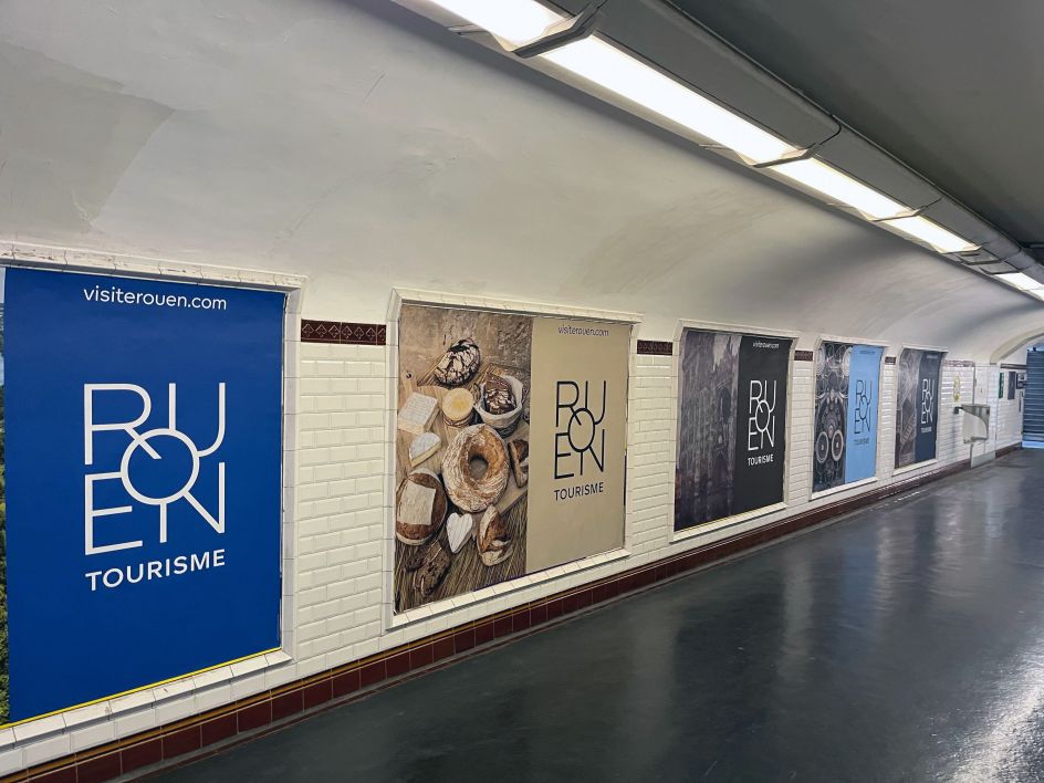
Studio Apeloig designed ‘Rouen Tourisme’ using Foundry Unie
30. GT Ultra by Grilli Type
Not sure whether you want a sans or serif style? GT Ultra is designed to offer the best of both worlds fused together in what's described as a "humanist flare sans". Released in 2021, GT Ultra draws inspiration from the clunky, chunky, and funky flare serif typefaces from the 1970s and 1980s, taking cues from their decorative aesthetic to craft something entirely new. The narrower proportions of the Italic are balanced by its lighter weight and steeper terminal strokes. This allows it to effortlessly blend into both geometric slanted sans and serif italic on an interpolable axis.
31. Maxi by Dinamo
Want to make your audience look twice? ABC Maxi is a warm and witty type system characterised by spaghetti movements and angular lines. It has an underlying skeleton referencing mid-century and post-modern Swiss designs, but as a variable font, these familiar shapes can be exaggerated and emboldened in any way you see fit, stretching from Hairline to Black to everything in-between. While designing the font, we were interested in how subtle manipulations in shape could affect the tone of the overall typeface.
, using Maxi by Dinamo](https://www.creativeboom.com/upload/articles/b4/b4fe21cbe3ad54e47ad9586dfdb4aebe5f4235ae_944.png)
Pop-Kultur 2021 by Fertig Design, using Maxi by Dinamo
Display fonts
32. Officially Funky by Silver Stag
Released in June this year, Officially Funky is a two-in-one font with a funky vibe that combines the modern cleanness of sans with alternate serif letters and cool ligatures. The font also includes over 45 ligatures, full language support, punctuation and numerals, and detailed instructions on how to use alternate letters in apps such as Canva.
33. BN Modern Ombra by Brandon Nickerson
Another gloriously OTT, 1970s-inspired font, BN Modern Ombra is a modern take on the classic Motter Ombra, originally designed by Othmar Motter in 1973 and digitised by Linotype. To create this new interpretation, Brandon Nickerson used geometric circles and teardrop shapes and completely remodelled certain letters. BN Modern Ombra would work well in layouts, headlines and logos.
34. Acma by Pangram Pangram Foundry
Acma is another unusual font that brings together a lot of competing ideas. Inspired by the Japanese modernist aesthetic as well as the fashion world, it's ultimately precise and subtle, yet it incorporates unconventional forms and rhythms, making it feel flowy and temperamental. Originally intended for editorial headlines, this highly contrasted, narrow sans serif ranges from thin to black and is best used for 12-point type and above.
 by Pangram Pangram Foundry](https://www.creativeboom.com/upload/articles/38/38907537f483feb8e81cf72f7d703f46d77df089_944.png)
Acma by Pangram Pangram Foundry
35. Sirenia by Floodfonts Type Foundry
Sirenia is a friendly display face with rounded corners and flowing transitions, giving it a very organic look and feel. Its calligraphic influences and natural, authentic feel make it a great choice for lifestyle products and food and beverage packaging. Its 1,270 characters contain many decorative letters and swash variations for initial, medial and final letters, making it a strong choice for logo design too.
36. Exposure by 205TF
Exposure pushes the boundaries of font technology into new and interesting places. With conventional variable fonts, the use of axes of variation to modify weight, set width, and optical size are all transformations inherited from previous techniques. With Exposure, though, Federico Parra Barrios breaks away to propose a new way of thinking. Exposure's axis of variation ranges from –100 to +100 and gives a feeling of adjusting the intensity of the light to which the typeface is exposed, thus affecting its outline. It's essentially a nod to another, now defunct, technique: phototypesetting. Released this April, Exposure is available in Roman and Italic,
37. Ivar Display by Letters From Sweden
Designed by Göran Söderström and released in 2017, Ivar is strongly influenced by the grace and sturdy construction of Times and comes in three optical sizes. Each sub-family consists of four weights with matching italics for 24 fonts. The names of the optical sizes, Text, Headline, and Display suggest how they should be applied; there's also a high-contrast version, Ivar Fine.
, using Ivar Display by Letters From Sweden](https://www.creativeboom.com/upload/articles/5e/5e46e038f8e1cd9291aa65958fd187e2dbcd6513_944.jpg)
Gunnel Wåhlstrand by Malmsten Hellberg, using Ivar Display by Letters From Sweden
38. Headline Display by Eko Setiawan
Since 2018, Indonesia-based graphic designer Eko Setiawan has focused on display faces with a unique, distinct look, and they're always worth checking out. His Headline Display font collection gives you 29 new typefaces designed to stop people in their tracks and are worth considering whether you're designing online content, logos and branding assets, or product packaging.
39. Gnasher by YeahRight Type
YRT Gnasher has nothing to do with The Beano character, but it has a delightfully comic-book look to it. Created by Zac Neulieb, this super blocky font is designed to remind you of the block letters that covered your notebook in high school. The lowercase and uppercase have variations between each letter to help give your type design more of a hand-rendered quality.
40. New Eddy by Eliott Grunewald
Love serifs? Want to take them to the max? New Eddy goes the extra mile with its long, spindly lines and high-waisted capitals. And while it almost reaches the level of caricature, it manages to pull it off. Released in 2020, this display face was designed by Eliott Grunewald and currently comes in just one style, in uppercase only.


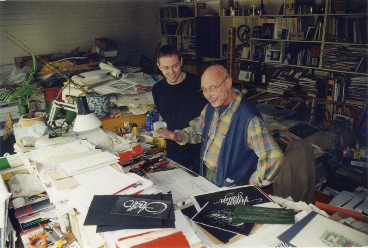
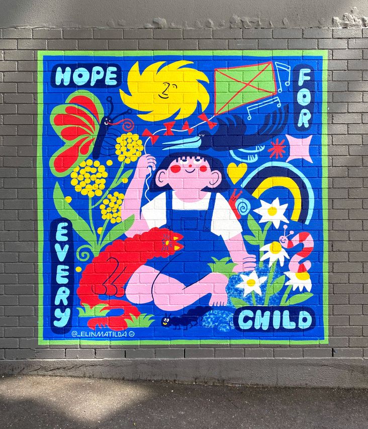
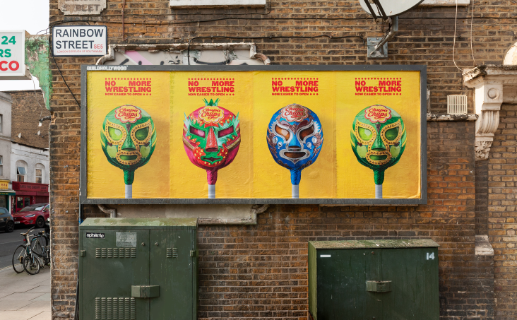
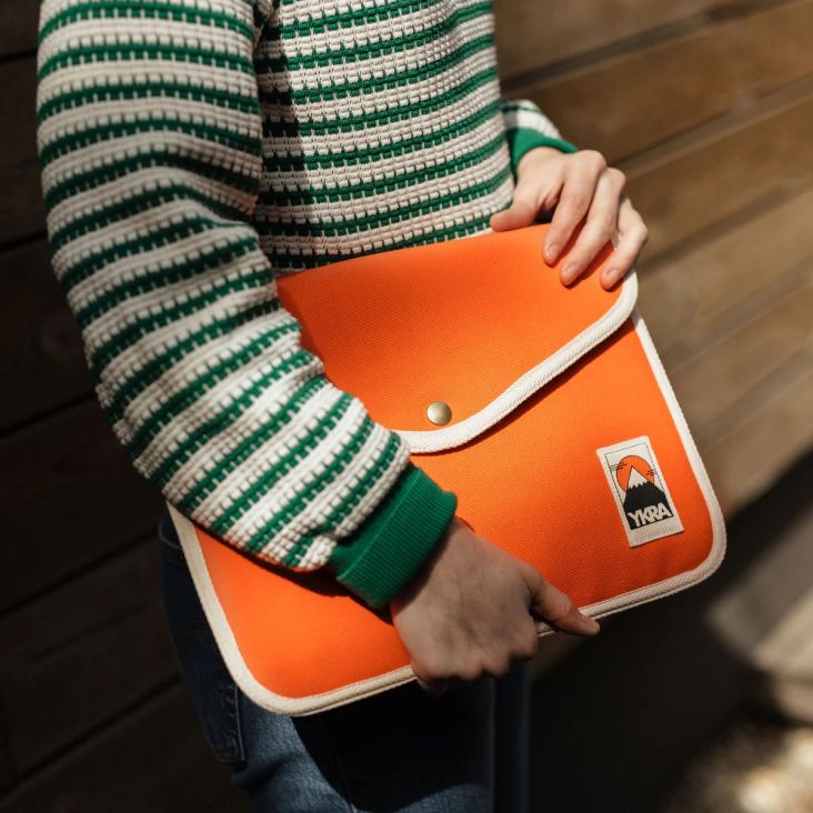
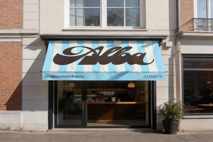
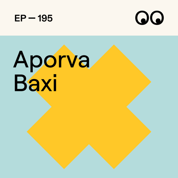
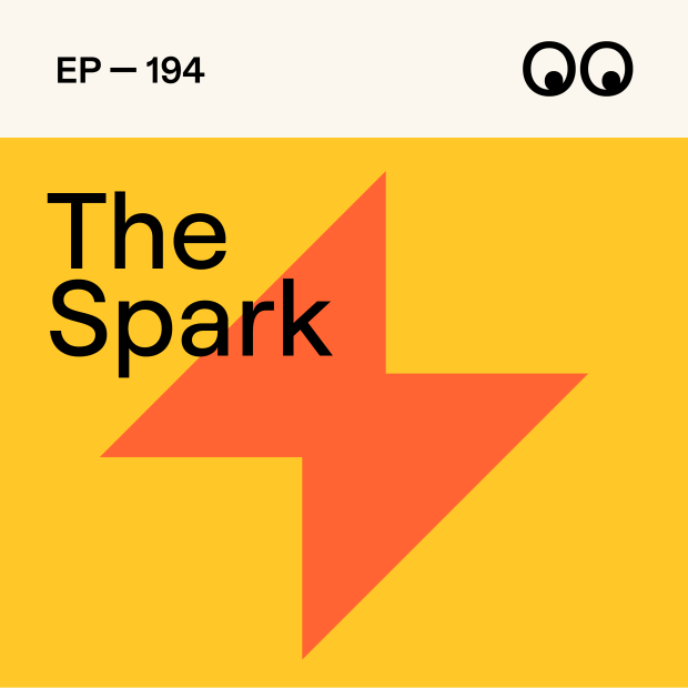

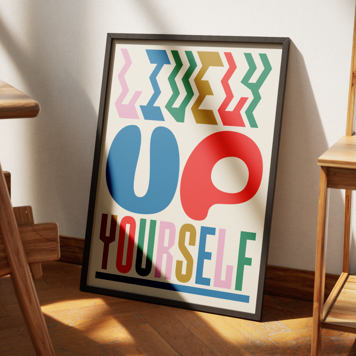
 by Tüpokompanii](https://www.creativeboom.com/upload/articles/58/58684538770fb5b428dc1882f7a732f153500153_732.jpg)
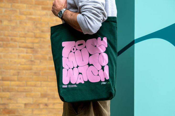
](https://www.creativeboom.com/upload/articles/7a/7a527d53fefe4f354e8489365e89db422567f281_732.jpg)
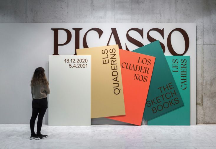
 using <a href="https://www.ohnotype.co/fonts/obviously" target="_blank">Obviously</a> by Oh No Type Co., Art Director, Brand & Creative—Spotify](https://www.creativeboom.com/upload/articles/6e/6ed31eddc26fa563f213fc76d6993dab9231ffe4_732.jpg)
