Advice on branding in the 'Screen Age' from Base Design's Jeffrey Waldman
Global branding agency Base has worked on projects for clients including The New York Times, Art Brussels, the Museum of Sex and Pantone. Here, a senior designer from its New York office, Jeffrey Waldman, looks at some landmark designs that illustrate the ever-raging debate around whether or not "good" design mimics its surroundings.
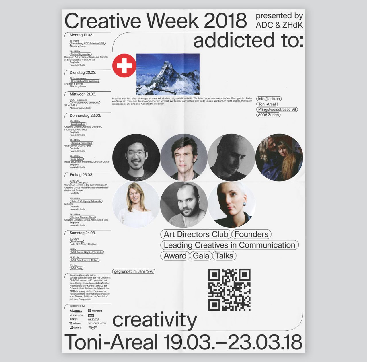
ADC Creative Week 2018 by Nayla Baumgartner, Fabio Menet, Louis Vaucher & Lucas Manser, 2018. All images courtesy of Base Design
Back in 2013, skeuomorphism was a hot term in the design world. Its use was mostly tied to the familiar, everyday objects that then made up the visual language of Apple’s software, from a bookshelf constructed out of grainy wood to yellow notepads complete with torn out pages. Shadow, glows, and complex textures brought these items to life in a kitschy, nostalgic way.
This aesthetic sparked a lively debate among designers. Supporters, backed by the theories of psychologist James J. Gibson, claimed that skeuomorphism helped people transition to new interactions with touchscreens. However, critics derided the style as unnecessary.
Either way, it fits into a long human history of trying to depict the world around us. From the early drawings of game animals on the rough walls of Lascaux to mathematical advances in perspective brought about by Renaissance painters, for thousands of years, we’ve been trying to create accurate two-dimensional depictions of our world – both natural and constructed.
A visual translation of our world
Branding has made similar attempts to produce visuals that reference our physical surroundings. Early logos were often literal manifestations of a company’s name, such as Shell Oil’s scallop-like mark; or a product, as in Paul Rand’s UPS logo complete with a parcel atop.
Some marks had a more metaphorical meaning, like Lufthansa’s crane symbolising the idea of flight. Eventually, marks came to have emotive meanings. Nike’s swoosh elicits a feeling of motion and action that isn’t literally tied to the visual.
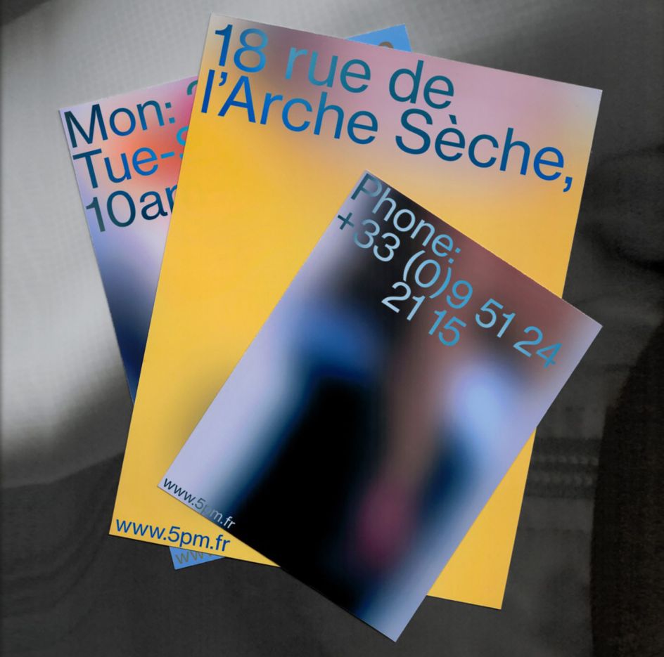
5PM, Plus Mûrs, 2017
Art imitates life
Now, we’re reaching an inflexion point in branding and visual design—creating work that references neither our physical surroundings nor our emotional sensibilities—but rather another world that we have created, the virtual one.
In some ways, this trend makes sense; visual culture as a collective whole is often a mirror of popular culture. Saarinen’s swooping TWA terminal (1962) is full of space-age optimism. Sottsass’ Carlton bookshelf (1981) seems to exude the excess that characterised the entire decade. Looking back, the collective output of visual culture creates a version of history told not through specific dates or events but rather societal ideals, hopes, and concerns, rendered as surfaces, colours, and forms.
Fast-forward to our current decade, where our popular culture is more and more defined by an endless stream of content found on our devices.
This translates into a 2016 poster, designed by Anna Kulachek for an event at Moscow’s Strelka Institute. The piece cleverly repurposes our familiar sense of “information overload” through endless open browser tabs.
Certain visual tropes, such as the gaussian blur or rounded corner rectangles, have become so ingrained in digital interfaces that we can no longer disassociate them from our screens. French studio Plus Mûrs employs the gaussian blur across its branding for high-end clothing retailer 5 PM, creating a sense of intrigue for the brand and its goods. Though for anyone who uses an iPhone, the blurs, and even the typography should feel instantly familiar.
These pieces operate at a surface level, repurposing the visuals of our screen-based zeitgeist into smart design solutions. Their use in brand and print says, “I am contemporary and with it”. Perhaps this kind of work doesn’t signify much more than a drive to be current. However, it does raise the question, "is what feels contemporary inherently connected to our devices?"
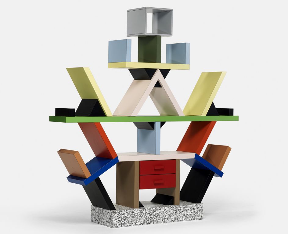
Carlton Bookcase by Ettore Sottsass, 1981
Skeuomorphism does a 180
Increasingly, designers are incorporating interactive design elements into the visual language of brands. Base’s own work has taken on this idea: in our Get With The Times branding, tag-like pop-ups form a fundamental design tool, allowing for flexibility and standing for the urgency of dialogue in today’s fraught climate. Branding for the 2018 ADC Creative Week Conference at the Zurich University of the Arts is built around a design system that allows information for events to be displayed in tag-like, softened rectangles, reminiscent of the forms used to filter online search results.
The curious result of this work is that elements which were originally interactive—clicking on one tag filters related content—are now static. In a sense, we’ve turned skeuomorphism around: we all know how to interact with a poster or ad, and now we’ve inserted the visuals of interactive technology into an established, static medium.
Taking this idea one step further is Wolff Olins’ recent rebrand of Crossover Health. Here, the iOS on/off switch comes to stand as the brand’s primary mark. The idea holds its conceptual ground as a visual metaphor for a healthcare platform targeting the tech world. Repurposing this established visual, imbued with meaning to every iPhone user, is a bold move.
While the designers were able to harness the knowledge that this mark means “on” to millions of people, can it ever become truly synonymous with the brand?
Perhaps this all seems par for the course; branding today is reflecting the aesthetics we find on our devices, and more often than not, that is where we're interacting with brands. This trend marks an important shift, referencing virtual worlds rather than the physical.
It’s easy to blindly deride this aesthetic as a numb reflection of our collective screen-based lethargy. However, we do exist in a time where real-world interactions continue to be phased out for virtual ones. In other words, this design trend offers an honest portrayal of how we communicate, learn, shop and entertain ourselves today.
In a way, we’ve created an unintentional commentary on our current society, one that will become part of our collective visual history; however, is it worth asking what else we are overlooking?
This article was written by Jeffrey Waldman of Base in New York. Discover more at www.basedesign.com.
](https://www.creativeboom.com/upload/articles/c0/c0f4833513a758427120283374013d6da0e2b37d_732.png)


](https://www.creativeboom.com/upload/articles/f0/f014ce633ae4b87812b6e1c12769900d7cc12e9a_732.jpeg)

