The best new typefaces for April from leading foundries and designers
We curate the latest fonts to help bring your designs to life, which fuse creativity, craftsmanship and cultural inspiration.
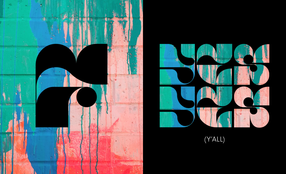
Modwood Display by Adam G
Ever feel like the design world is becoming more generic? That gut feeling is hard to quantify in any meaningful sense, but we're hearing it from many creatives right now. And it's certainly the case that the AI-fuelled direction we're heading in is pulling many things in the same visual direction.
Yet, every problem is also an opportunity. And if other people's designs are starting to look similar, why not double down on making yours stand out? One of the best tools for that is typography, so we're always looking out for exciting new fonts to share with you.
Thankfully, the art of typography continues to evolve, with designers and foundries consistently pushing the boundaries of letterform creation. And the proof of the pudding can be found among the best of this month's new typeface releases, which showcase the incredible creativity and craftsmanship within this small but highly passionate community.
From quirky, licence plate-inspired constructions to organic calligraphic scripts that capture the essence of Brazilian culture, these fonts offer a diverse array of expressive possibilities. Whether you're seeking to inject personality into headlines or hunting for highly legible workhorses for body copy, this collection represents the cutting edge of current type design trends.
In other words, the industry's best font designers have once again demonstrated their ability to transform the fundamental building blocks of communication into objects of purposeful beauty. So why not take advantage?
1. Piet by Typemates
The idea of a font inspired by Finnish licence plates is just the kind of thing that gets us excited at Creative Boom. And as ever, German foundry Typemates – aka Jakob, Lisa and Nils – didn't disappoint us.
Piet is a quirky pair of constructed sans and mono typefaces (MONO and Sans) defined by strange numbers and deep ink traps. Its shapes are practical and almost unbreakable.
With chunky forms and more and less than the expected optical corrections, it is functional, visually unbalanced and narrow. With both utilitarian and eccentric aesthetics, Piet turns typographic "limitations" into stylistic strengths.
Piet by Typemates
Piet by Typemates
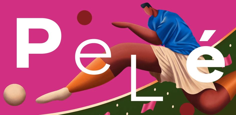
2. Pitanga by Fabio Haag
Pitanga is a new organic, calligraphic typeface designed by Sofia Mohr in collaboration with Brazilian foundry Fabio Haag.
Inspired by the diversity of their nation's culture, it features light, organic and loose strokes that add up to an expressive, free-flowing personality. And that makes it perfect for a wide range of usages.
The studio is suitably poetic about the inspiration behind the font. "Imagine a Brazil that can only be visited between the lines, with an identity that manifests in unpredictable ways," they say. "In the footballer's twisted leg, in the sudden improvisation, in the softness of Bossa, and in the infinity of colours, shapes, and expressions that make up this reliquary of peoples and cultures. [This] font absorbs the many Brazils that exist to roam freely."
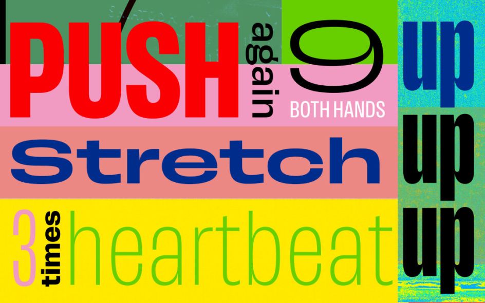
3. Push by Fontwerk
A new release from famed Berlin-based foundry Fontwerk, Push is a comprehensive, 56-style type system nodding to early Grotesque and Gothic designs. With weights spanning from hairline to ultra-black and widths from compressed to extended, it all makes for a highly versatile typographic toolkit.
Created by Swiss designer Christine Gertsch, Push echoes the letterforms of the first 100 years of sans-serifs yet carries its own weight in a very contemporary manner.
Its bold, condensed, crossbar-less capital 'G' takes inspiration from Thorowgood's 1830 Seven-Line Grotesque, while the lowercase 'a' follows in the same vein as Plak from 1930. Standout characteristics include a looped Anglo-American 'g', a Grotesk two-storey 'g' and an open-sloped 'Danish g', all adding to this magical mix of the Old and New World.
Push by Fontwerk
Push by Fontwerk
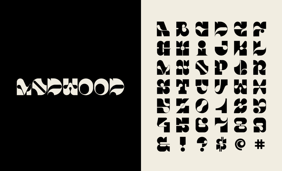
4. Modwood Display by Adam G
Modwood Display is an eclectic, personality-rich display font mixing modern, geometric, organic and whimsical aesthetics. With multiple stylistic sets and glyphs, it allows for myriad typographic voices.
The font was designed by Adam G, co-founder and creative director at TRÜF, a Los Angeles design studio specialising in visual identity and illustration.
"Modwood Display is designed to be a mix between modern, wood, geometric, organic and just plain old fun," he says. "It can be playful, serious, rebellious, tribal, artsy-fartsy or just weird, depending on how you work it. There are several glyphs, alternatives and an Easter Egg or two."
Modwood Display by Adam G
Modwood Display by Adam G
5. Renotype by Radim Peško
A straightforward archetype of letterforms, Renotype explores concepts like monolinearity in styles like its Mono and Medieval subfamilies, showcasing the Latin alphabet's structural and stylistic flexibility.
The Renotype family includes a variety of styles, going from traditional (Regular, Italic), standardised (Mono), playful (Quasitalic) or speculative (Medieval). These styles do not expand Renotype through weights but rather through the flexibility of its construction and plain character.
It's the creation of Czech designer Radim Peško, who's based in Amsterdam. "Renotype began as a formal exercise seven years ago," he says. "The objective was to create a simple, low-contrast typeface that could serve as an archetype or mould for characters of the Latin alphabet.
"Based on proportions as they were developed, changed and established over the centuries, it responds with letter shapes that are not connected to any specific epoch or tool but are instead aesthetically functional, like a bathroom."
Renotype by Radim Peško
6. Gramercy by Robert Janes
With swashes, multiple optical sizes and a striking calligraphic flavour, Gramercy is a text and display serif that balances sturdiness and painterliness with elegance and whimsy.
Designed for Berlin-based Dinamo Typefaces by their long-term collaborator, Robert Janes, a recurring theme is its overhanging, misproportioned details, including a calligraphic S, a hooded C, and a bulbous B. Where another typeface might have ball terminals, Gramercy has flared strokes; that's what makes it feel painterly.
Robert's first sketches were influenced by F.H. Ernst Schneidler's Amalthea (1956), a typeface that served as the italic companion to his eponymous Schneidler-Mediäval (1938), while its proportions borrow from a range of more rigid 16th-/17th-century French types. All these ingredients combine to create Gramercy's graceful, performative feel.
Gramercy by Robert Janes
7. Zabawa by The Northern Block
A playful handwritten brush script, Zabawa captures the energetic gestural rhythms of doodles and sketches through dynamic, rhythmic strokes full of personality.
Created by Polish type designer Joanna Angulska for The Northern Block, an independent type foundry based in Northumberland, Zabawa is a great typeface for injecting a splash of fun into your projects.
With 936 characters to play with, its dynamic and energetic vibe promises to leave a lasting impression. OpenType features, meanwhile, include alternate characters for both lowercase and uppercase, 42 ligatures, lining and old-style figures, and fractions. The font also contains 12 decorative ornaments.
Zabawa by The Northern Block